Why Planning Committees Respond to Some Visuals, Not Others.
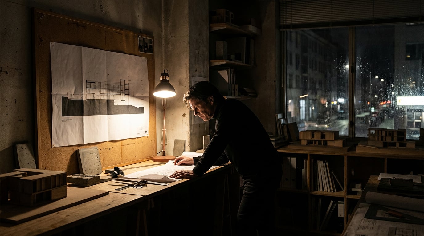
Overcast, human-scaled and context-heavy visuals win over committees more often than dramatic hero shots. Here's the pattern behind it.
Committees are not your client, and they read images differently
Planning officers and elected members are not looking at your visuals to be impressed. They are looking for risk. Overshadowing on the neighbour's garden. Massing that reads too tall against the terrace next door. Materiality that does not match what is written in the schedule of accommodation. A hero render optimised to sell a scheme to a client, all warm light and dramatic sky, can read to a committee as evasive: what is this image not showing me?[1]
The viewing conditions make this worse. A member on a planning committee often sees your visual projected on a screen for the length of one agenda item, not studied on a laptop over ten minutes. Legibility at a distance matters more than surface detail. A cinematic wide shot with a shallow depth of field and a glowing sunset might hold up in a client deck. Projected at low resolution for ninety seconds in a committee room, the same image reads as atmosphere with no information in it.
This is the instinct that trips up architects and visualisers who are used to producing marketing-grade CGI. The golden hour shot, the one built to make a scheme desirable, is precisely the one that works against you in a planning context. Plain daylight reads as honest. Drama reads as something to be suspicious of.[1][19]
Committees do not reward the render that looks best on Instagram. They reward the visual that best answers: what will this do to this street, this neighbour, and this place?[1][19]
Overcast and neutral light outperform golden hour almost every time

Golden hour is flattering for a reason: long shadows and warm colour temperature hide flaws and add drama. That is exactly why it undermines a planning submission. Officers want to see a shadow study that tells the truth about overshadowing, not one softened by a low sun that lengthens every shadow into something moody rather than measurable. A render styled for dusk can make a boundary condition look romantic when the committee needs it to look accurate.[1][19]
Guidance on CGI for planning consistently comes back to the same handful of qualities: accurate scale, correct proportion, real materials, genuine site context, natural lighting.[1] None of those qualities benefit from a dramatic sky. They benefit from consistency and neutrality, the same conditions a site photograph would give an officer walking the street on an overcast Tuesday.
In practice this means producing two versions of the same view. One for the client, built to sell the design and to sit well in a marketing deck or a competition board. One for the application, built to survive scrutiny. Retouch's six one-click re-light presets, Golden hour, Dusk, Blue hour, Night, Overcast and Sunny, let you generate the Overcast version as a new layer straight from the same base render, without starting a fresh scene or rebuilding lighting from scratch. The massing and window proportions read cleanly against the neighbouring properties because the long shadows and warm colour bias that were flattering the client's version are gone.[*vendor claim*]
Produce the emotive shot for the pitch, then regenerate the same base render in neutral daylight for the DAS and the committee report. Same building, same camera, different honesty level.
Context sells the scheme, isolation kills it

A render with no neighbouring buildings, no street furniture, no human figures for scale, reads as a fantasy image rather than a planning proposal. It might be beautifully lit and carefully modelled, but it tells the committee nothing about how the scheme sits in the street they actually know. Public-participation research on planning visualisation is consistent on this point: visuals are most persuasive when they convey the appearance, extent and location of a proposal clearly enough that a viewer can judge impacts and alternatives.[19] An isolated hero angle, cropped tight to flatter the building, cannot do that job.
Committees respond to visuals that place the application site inside its real street: the neighbour's roofline, the boundary treatment, the parking, the pavement width. This is where a proper site model earns its place in the application pack. Linea's site-placement workflow puts the scheme on a real location with the ground and surrounding buildings modelled, producing wireline and massing views that officers can cross-reference directly against the submitted site plan rather than having to take the render's word for it.
Sections and elevations cut straight from that model carry more weight again, because they are real linework rather than a rendered impression. A perspective view can be argued with. A section showing a measured relationship between ridge heights cannot, not in the same way. Cutting these directly from the Linea model and issuing them on a sheet gives the committee something to check dimensions against, not just something to look at.[1][19]
Consistency across the application set builds or breaks trust
A Design and Access Statement with five different lighting conditions, five different camera heights and two different rendering styles pasted in from different phases of the project signals one thing to a committee: this was assembled in a hurry. Public-participation literature on planning visualisation is clear that images need to be readable and self-explanatory, and that inconsistency in framing and format is one of the fastest ways to undermine confidence in a document that is meant to be a single, coherent decision record.[3][16][19]
The fix is procedural more than artistic. Layout's Design and Access Statement template keeps every image frame, scale reference and caption consistent across the document, rather than relying on visuals pasted in from five different sources at five different points in the programme. Every page reads as part of the same argument because it is built on the same grid, with the same type scale and the same caption format throughout.
Late changes are where consistency usually breaks down. A committee asks for a revised boundary treatment three weeks before the meeting, and the temptation is to knock out a quick new render from a different angle because it is faster than matching the original. Saved views in Linea solve this directly: reissue the same camera position after the model changes, and the revised drawing matches the original set exactly. A member flicking between the site plan, the elevation and the visual should see the same building, the same light, the same framing, every single time.[3][16][19]
Inconsistency does not just look sloppy. It reads as a proposal that changed shape mid-application, which is precisely the impression a committee is trained to distrust.
What to cut before it reaches committee

Cinematic camera angles, dramatic crops and extreme wide-angle lenses that bend the edges of a building all read as trying too hard in a room built to be sceptical of persuasion. A wide-angle lens that exaggerates depth might make a modest extension look generous in a marketing shot. In a committee report it distorts proportion in a way that an officer familiar with the site plan will notice immediately, and once one image looks like it is stretching the truth, every image in the pack gets read more suspiciously.[19]
Correcting these issues does not always mean a full re-render. If the specified cladding changed late, or the brick sample came back a different colour than what was rendered, Retouch's material swap replaces the texture in a selected area to match the actual reference, as a toggleable layer, so the submission reflects what is actually being built rather than an earlier assumption. If an officer asks for one clearer crop of a wide streetscape view that has gone soft in the far distance, Enhance area re-renders just that region at higher resolution and composites it back through the selection, without regenerating the whole image and risking a mismatch with everything else in the set.
Here is a simple test that holds up well: would this image survive being printed in black and white in a committee agenda pack? Most agenda documents are still printed or viewed as flat PDFs without colour correction guaranteed. If the argument for your scheme depends on a warm sky or a dramatic contrast between light and shadow, it will not survive that test. If it depends on clear massing, legible proportion and an honest relationship to the building next door, it will.[19]
| Client-facing visual | Committee-facing visual |
|---|---|
| Golden hour or dusk lighting | Overcast or neutral daylight |
| Isolated hero angle, tight crop | Full street context, neighbours included |
| Wide-angle lens for drama | Corrected proportion, standard lens |
| One striking image | Consistent set: plan, section, elevation, view |
Every visual in an application pack is being read against the others in the same document. One inconsistent image is enough to make a committee re-examine the rest.
The practical shift is small but consequential: stop treating the committee submission as a weaker version of the client render, and start treating it as a different document with a different job. The client visual has to make someone want the building. The committee visual has to make someone confident they understand exactly what they are approving, at what scale, next to what, and under what light. Build the first to sell it. Build the second, from the same model and the same base render, to survive being printed in black and white and read in ninety seconds under a strip light. That is the visual planning committees respond to.
Keep reading.
Try ArchAdemia Tools for yourself
Draw it, model it, render it, publish it. One place, built for architects and small practices. Plans from £29 a month, all in.