A1 Sheet Layout for Architecture: Grid, Margins and Title Block.
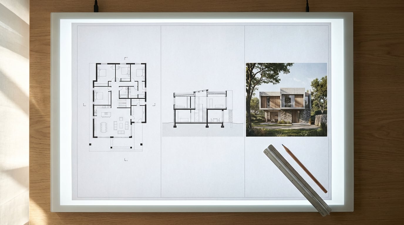
Most crit boards and competition panels fail on layout before anyone judges the design. Here's how to set up an A1 sheet that reads properly.
Why most A1 boards fail before anyone reads the design
A juror or crit tutor scans a sheet in a Z or F pattern in under three seconds before deciding whether to look closer. That is the entire window you get to earn a proper read. If the layout is weak, the eye bounces off before the drawings even register as architecture.
The failures are almost always the same three. No margin discipline, so the sheet looks like it is spilling off the edge of the paper. Drawings floating with no shared baseline, so a plan and a section that should read together instead sit at slightly different heights with no visual logic connecting them. And a title block treated as an afterthought, dropped in at the end with whatever space happens to be left.
Crits and competitions are unforgiving environments for this. A jury sees dozens of sheets in a single sitting, often back to back, and they have trained themselves, whether they realise it or not, to spot layout problems fast. A board with a clean grid and a confident hierarchy reads as considered before a single line of the design has been evaluated. A board without one reads as rushed, no matter how strong the scheme underneath actually is.
Set the expectation early: an A1 sheet is not decoration. It is a legibility and hierarchy exercise first, and a presentation of the design second. Get the first part wrong and the second part never gets a fair hearing.
A jury reads your layout before they read your design. Grid, margin and title block decide whether the architecture gets a fair look at all.

Setting up margins that actually hold the sheet together
Margins are the frame that stops a sheet from feeling like it is sliding off the page. For an A1 landscape board, a working minimum is 15 to 20mm on all sides. Go tighter than that and drawings start to feel cramped against the edge, especially once the sheet is printed and trimmed rather than viewed full-bleed on a screen.
Consistency matters more than the exact number. A 18mm margin on all four sides reads as considered. An 18mm margin on three sides and 30mm on the fourth, with no reason given, reads as a mistake, even if it was actually a deliberate choice to leave room for a binding edge or a pin-up clip strip. If you do need a wider margin for physical mounting, make it obvious that it is intentional: keep it proportionate, and repeat it consistently across every sheet in the set so it reads as a system rather than an error.
The discipline that separates a tidy board from a messy one is sequencing. Pull guides off the rulers and lock the margins before a single drawing goes on the page, not after. Placing content first and trimming margins around it later almost always produces inconsistency, because every drawing ends up negotiating its own edge relationship instead of sitting inside a fixed frame.
Lock margins before you place a single drawing. Retrofitting margins around existing content is where most inconsistency creeps in.
Building a grid that scales from concept sketch to detail
A modular or column grid gives every drawing, image and text block on the sheet a shared alignment logic. Without it, each element finds its own position by eye, and a board with six or seven elements ends up with six or seven slightly different alignment decisions competing for attention.
Column count depends on what the sheet is carrying. A competition board mixing atmospheric imagery, diagrams and short text blocks tends to work well on a 6-column grid: wide enough columns to hold a hero image or a large section, flexible enough to combine two or three columns for a wider drawing. A dense Design and Access Statement style technical sheet, carrying plans, sections, annotations and compliance notes, usually needs more structure, and a 12-column grid gives the finer control to align narrow annotation blocks against wider drawings without either one looking arbitrary.
The grid is a working reference, not a finished feature. It should guide placement while you work and disappear entirely from the final export. A grid visible in a submitted PDF reads as an unfinished production file, not a presentation board.
Test the grid against the weakest drawing on the sheet before finalising anything. That is usually a section or a detail, because these drawings carry irregular proportions and dense linework that expose misalignment faster than a clean elevation or a simple massing diagram will. If the section sits comfortably on the grid, everything else on the sheet almost certainly will too.
| Grid type | Best suited to | Typical use case |
|---|---|---|
| 6-column | Mixed image and text boards | Competition panels, concept crit sheets |
| 12-column | Dense technical content | Design and Access Statements, planning drawing sheets |
| Modular grid | Repeating small elements | Portfolio grids, image-led project books |
Title block placement and what it must contain
Two positions dominate practice: a full-width strip running along the bottom of the sheet, or a fixed-width column running down one side. Either works. What matters is that whichever you choose stays identical across every sheet in a set. A title block that shifts position or size from sheet to sheet undermines confidence in the whole submission, because it suggests the set was assembled ad hoc rather than to a system.
At minimum, a title block needs: project name, drawing title, scale, north point, revision, sheet number, and the practice or student name. Leave any of these out and the sheet reads as incomplete in a professional context, even if the drawings themselves are excellent. A planning officer or a crit panel expects to be able to identify a sheet without opening the file properties.
Typography in the title block should be smaller and quieter than the drawing titles above it. This is a hierarchy signal: the title block is metadata, not content, and it should never visually compete with the design work it is describing. A title block set in the same weight and size as a drawing label confuses the eye about what it is actually meant to be looking at first.
For a full sheet set rather than a single board, lock the title block as a repeatable element. Every DAS sheet, every planning drawing, every portfolio page in the submission should carry the same title block in the same position with the same typography, varying only the content inside it. This is one of the clearest signals of a well-run submission, and one of the easiest things to get wrong when sheets are built individually rather than from a shared template.
A title block that moves position between sheets undermines the whole set. Lock it once, repeat it everywhere.

Typography and hierarchy across the sheet
Three levels of text are usually enough for any A1 board: the sheet title, drawing labels, and annotation or body text. Add a fourth or fifth level and the sheet starts to read as noise, because the eye can no longer tell at a glance which text matters most.
Pick one typeface family for the whole sheet and vary weight rather than font. A bold weight for the sheet title, a medium weight for drawing labels, a regular weight for annotations, all from the same family, produces a calm and confident hierarchy. Mixing typefaces, even two that look compatible on screen, tends to introduce a visual inconsistency that becomes obvious the moment the sheet is printed at full size.
Scale is where digital layout habits catch people out. Annotation text that looks perfectly readable at 100% zoom on a laptop screen can all but disappear once the sheet is printed at true A1 dimensions. Always check text size against the printed output, not the screen preview, and err generously with annotation sizing on technical sheets where small labels carry real information.
Align every text baseline to the grid, not just within a single drawing but across the whole sheet. When drawing labels under a plan, a section and an elevation all sit on the same baseline, the sheet reads as a coordinated set. When each label finds its own vertical position relative to the drawing above it, the sheet reads as three separate fragments loosely stitched together.
Building the sheet without starting from a blank page
Layout's Sheet mode gives you a single A1 landscape surface built for exactly this kind of work: crit boards, competition panels, pin-ups. Rather than assembling margins, grid and title block from scratch every time, the Competition Board and Presentation Board templates come pre-populated with placeholder text and image frames, so the underlying structure exists before a single drawing goes anywhere near the page.
While placing drawings, toggle the layout grid, whether Manuscript, Columns or Modular, on as a snapping reference. Elements lock to it as you drag them into position, which solves the baseline and alignment problems described above without requiring manual measurement for every element. Switch the grid off before export and it disappears completely: it is a working overlay, never present in a shared page or a final PDF.
For type, Layout draws from a 300-family self-hosted type library covering sans, serif, mono and display faces, with Inter as the default, so building a calm three-level hierarchy across a sheet does not depend on hunting down and licensing fonts separately. Members can also upload their own brand or practice fonts if a studio has a house typeface it wants carried across every submission.
Where a whole sheet needs drafting from a prompt rather than assembled by hand, Corb can build inside a Layout document directly: select a single text frame and ask it to fill just that one in, or ask it to build a complete new document from a prompt, working through a template page by page on Claude Sonnet, Opus or Fable. Manual layout work in Layout costs no credits on any plan, including the seven-day free trial; asking Corb to write or build a document does.
Export as a true-dimension PDF at A1, with optional bleed and crop marks if the board is going to physical print, or as a PNG for a digital crit submission or online portfolio upload. Because the export holds true sheet dimensions rather than an approximation, what leaves the file is exactly what was designed, at the scale it was designed at.
A pre-built template with grid, margins and title block already in place means the layout decisions are made once, correctly, and repeated across every sheet in the set.

A strong A1 sheet is not built by adding polish at the end. It is built by fixing margins first, laying a grid before content arrives, locking a title block that repeats without variation, and holding typography to three disciplined levels. Get that sequence right and the design gets read on its own merits, which is the only outcome that was ever the point.
Keep reading.

Try ArchAdemia Tools for yourself
Draw it, model it, render it, publish it. One place, built for architects and small practices. Plans from £29 a month, all in.