Adding People to Renders Without the Cardboard Cutout Look.
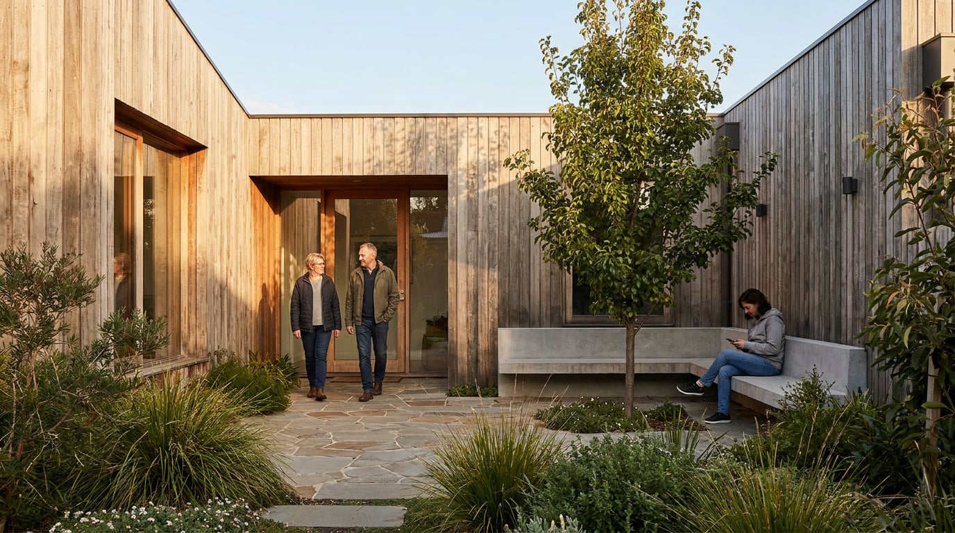
Bad entourage kills a good render faster than bad lighting. Here's how to place, scale and light people so they read as real.
Why entourage reads as fake in the first place
Most bad people-in-renders don't fail because the figure itself is badly modelled. They fail because of a handful of mismatches that the eye catches before the brain can explain why. Once you know the five failure points, you start seeing them everywhere: the client review deck, the competition panel next to yours, half the archviz portfolios on any student crit wall.
Light direction is the biggest tell. A figure lit flat from the front, dropped into a scene with a low side sun raking across the facade, will never sit right no matter how good the cutout is. Edge quality is the second: a base render with photographic depth of field and soft focus falloff exposes a hard-edged cutout instantly, because nothing else in the frame has that crispness. Then there's scale. It goes unnoticed on a laptop screen and becomes catastrophic the moment a client stands in front of an A1 print and realises the "adult" waiting at the crossing is 2.1 metres tall. Colour temperature mismatches, a warm late-afternoon scene with a figure that was clearly shot under cool studio light, and ground contact errors, feet floating half a centimetre above the paving line, round out the list.
None of these are exotic problems. They're the same five things a good compositor checks in film VFX, a product visualiser checks when dropping a hand model next to a render, and an archviz artist checks before sending a Design and Access Statement view to a planning officer. Fix these five and the "pasted-in" look mostly disappears.
If you can name which of the five failure points is wrong in an image within three seconds, you already know how to fix it. The hard part is training yourself to look for all five, every time.
Get the shadow right before anything else

Shadow is the single fastest way to sell or destroy a figure's presence in a scene. Get the direction and length right and almost everything else becomes forgiving. Get it wrong and no amount of detail in the figure itself will save the image.
Start with the sun angle already established in the base render. If the building's shadows are falling long and to the left, the figure's shadow needs to fall the same way, at the same length relative to height. This sounds obvious stated plainly, but it's the single most common error in composited entourage: shadows that point in a different direction to everything else in the frame, because the figure was lit and shot separately from the scene.
Match the shadow type to the sky condition, and never mix the two in one image:
- Overcast or diffuse daylight: soft-edged shadows, low contrast, no hard shadow line.
- Clear sun: hard-edged, high-contrast shadows with a crisp cast line.
A figure with a hard shadow dropped into an overcast scene looks like it was cut from a stock photo library, because it probably was. The contact shadow, the small, tight patch of dark directly under the foot where it meets the ground, does more work than the long cast shadow in selling weight. A figure can have an imperfect cast shadow and still read as grounded if the contact shadow is convincing. Lose the contact shadow entirely and the figure floats, no matter how good everything else is.
This is where posing figures within a genuine 3D scene beats flat compositing. In Composer, figures can be posed with gizmos directly inside the 3D environment, using a Space as the backdrop, so shadows generate from the same light source as the building rather than being faked in afterwards from a mismatched reference photo. Because the render is a single pass, the shadow direction, softness and contact point are physically consistent with everything else in frame. That's the difference between fixing the cutout problem in post and never creating it in the first place.
Before calling a shadow finished, check it against nearby context elements already in the render: trees, railings, lamp posts, anything else casting a shadow onto the same ground plane. If the tree's shadow falls at 40 degrees and the figure's falls at 15, the mismatch will be obvious even to someone who couldn't articulate why.
Contact shadows sell weight faster than cast shadows do. If you only have time to fix one thing, fix the dark patch directly under the foot.
Scale, placement and posture that survive scrutiny
Once light is sorted, scale and posture are what separate a convincing scene from a stock-photo pile-up. Both are checkable with simple rules rather than gut feel.
Set a consistent eye-line height across every figure in a scene. Average adult eye height sits close to 1.6 metres, and because perspective in an architectural render is a fixed geometric system, every standing figure's eyes should line up on the same horizon-relative height, adjusted only for their distance from camera. A figure whose eye-line sits noticeably higher or lower than others at a similar depth reads as wrong immediately, even to a viewer with no technical vocabulary for why.
Vary posture and orientation deliberately. A row of figures all facing the camera at an identical mid-stride pose is the classic tell of entourage dropped in from the same small library without thought. Real groups of people in real places are a mess of angles: someone turned away checking their phone, someone seated, someone mid-conversation with their weight on one hip. That variety is what makes a scene believable rather than staged.
Give people something specific to do in the space, rather than generic walking silhouettes:
- A figure reading on a bench, weight settled, book angled to catch the light.
- Someone waiting at a pedestrian crossing, checking a phone, weight on one foot.
- A couple pausing at a shopfront window rather than walking through it.
This single change does more for realism than any amount of shadow-matching, because it signals that the space is genuinely used rather than populated as an afterthought.
Overlap matters as much as posture. Place figures so they're partially obscured by foreground elements already in the render, planters, balustrades, columns, rather than sitting flatly on top of the image. A figure that overlaps a handrail at the correct depth reads as part of the scene; a figure that sits cleanly in front of everything, edges untouched by any foreground element, reads as a sticker. Group figures at different depths through the frame to reinforce the perspective grid the render is already built on, rather than clustering everyone at one distance from camera.
A figure doing something specific, half-obscured by a planter or railing already in the scene, will always beat a perfectly lit but generic mid-stride silhouette standing in open ground.
Matching light, colour and lens quality

Shadow and scale get a figure standing in the right place. Colour and lens quality get it to disappear into the photograph rather than sit on top of it.
Match white balance and exposure before anything else. A figure lit under cool studio light dropped into a warm late-afternoon render will always carry a faint blue cast that fights the rest of the image, even if every shadow is technically correct. Grade skin tones and clothing into the same colour palette as the render. Oversaturated stock-photo figures, the kind with punchy reds and blown highlights on white shirts, are one of the fastest ways to flag a composited scene, because nothing else in an architectural render is graded that aggressively. Distance does work too. Add a touch of atmospheric haze or lens blur to figures placed further from camera, matching the depth of field falloff already present in the base render. A tack-sharp figure standing 40 metres down a street in an image where everything else at that distance is gently softened will read as pasted in even with perfect shadows and colour.
The most reliable way to avoid all of this is to generate the figure directly within the scene rather than compositing from an external source. Typing the person directly into a scene prompt, or editing an existing render to add a figure in context, produces lighting, colour temperature and lens characteristics that are consistent by construction, because the model is generating everything as one coherent image rather than blending two different sources. This is the same logic behind posing figures inside Composer for a full 3D pass: consistency by generation, not consistency chased after the fact in post.
Finally, a small technical trick that pulls a lot of weight: slight edge softness and a touch of micro-grain on the figure. A perfectly crisp, noise-free figure against a photographically grained base image will always look slightly wrong, in a way that's hard to name but easy to feel. Matching the grain and softness of the surrounding photograph is often the last five percent that makes a figure sit inside the image rather than float above it.
Building a consistent people library for a project
Once a project has more than two or three rendered views, consistency between images becomes as important as realism within any single one. A client reviewing a Design and Access Statement will flick between views, and a recurring cast of figures reads as a coherent, lived-in scheme. A different set of strangers in every view reads as stock imagery stitched together at the last minute, even if each individual image is well composited.
Keep a fixed cast per project. Decide early: a family of three, a pair of colleagues on a lunch break, a wheelchair user crossing the courtyard, and reuse that same small group across every camera angle in the set. It costs nothing and it makes the whole submission feel like one continuous observation of the building rather than a folder of disconnected renders.
Boards is the natural place to hold this. Collect the approved figures and reference poses on one canvas so the same library gets pulled into every view of the scheme, rather than re-generating people from scratch for each new angle and ending up with a different cast every time. Because Boards also groups frames for start and end scenes, it works equally well for keeping a consistent cast across a walkthrough sequence built for a client presentation.
Batch-generate variations of each figure early: a three-quarter angle, a side profile, a version under slightly cooler light for an interior shot versus the warm exterior. Having these ready means there's always a plausible match when a new camera position gets added late in the process, rather than scrambling to match light and pose under deadline.
Note which figures were approved for the version of a set going to planning. Swapping entourage late, even for something as small as a jacket colour, can quietly break shadow continuity across a set of views if the replacement wasn't generated under the same light conditions as the rest. Treat the approved cast as fixed once a submission set is locked.
A consistent cast of figures across a project's views does more for perceived quality than any single hero shot. It signals the scheme was thought through as a place, not assembled as a set of disconnected images.
Where this fits in a real deliverable
Not every deliverable needs the same rigour, and knowing where to spend the effort matters as much as knowing the technique.
Crit boards and portfolio sheets tolerate looser entourage. A student review audience is looking at spatial ideas, massing, material logic, and a slightly soft figure reads as fine in that context, provided scale is roughly right. A Design and Access Statement view aimed at a planning officer deserves the full treatment: matched shadows, correct scale, purposeful activity. That image is doing persuasive work, not just illustrative work, and planning officers have seen enough renders to spot a lazy one.
Competition panels sit somewhere between the two, and the temptation to overpopulate a scene is worth resisting. A handful of well-placed, well-integrated figures, doing something specific, at varied depths, will read as more considered than a crowd scene that competes with the architecture for attention. Judges are assessing the building, and entourage that distracts from it works against the entry rather than for it.
The most efficient route through all of this is generating figures as part of a single photorealistic pass rather than fixing composited cutouts afterwards. Posing figures directly in Composer, using a Space as the backdrop and rendering the whole scene in one photorealistic pass, avoids the cutout problem at its source: light, shadow, colour and depth of field are all generated together, because they're all coming from the same render, not stitched from separate images with separate lighting conditions.
Once images are finished, lay the final set into Layout at true sheet dimensions rather than judging them at laptop scale. A figure that reads convincingly at a thumbnail size can fall apart at true A1 crit-board scale, where edge softness, shadow mismatch and colour grading become far more visible. Layout's Sheet mode handles the A1 crit board or competition panel directly, and Document mode handles the multi-page Design and Access Statement or portfolio at A3, so the final check happens at the actual dimensions the work will be judged at, not an approximation of it.
Takeaway: entourage stops looking pasted in the moment shadow, scale and colour stop being an afterthought and start being generated as part of the same scene as the building. Fix the light first, give people something to do, keep the same cast across every view of a project, and check the final result at the scale it will actually be seen. That's the difference between a render that persuades and one that gets flagged as fake before anyone's even looked at the architecture.
Keep reading.


Try ArchAdemia Tools for yourself
Draw it, model it, render it, publish it. One place, built for architects and small practices. Plans from £29 a month, all in.