Visualisation Craft
Warm vs Cool: Colour Temperature Choices That Sell an Interior Render.
By Adam Morgan16 November 20269 min read
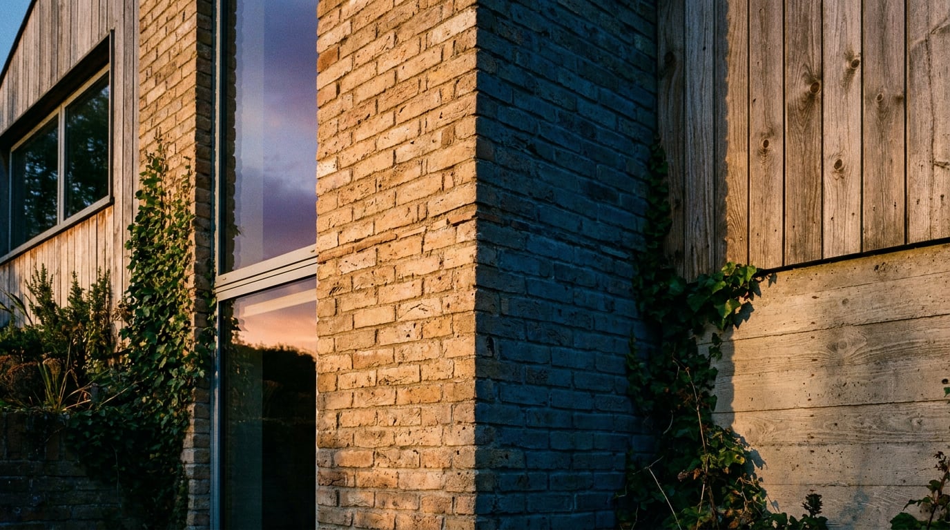
Warm light sells comfort, cool light sells clarity. How to choose colour temperature for an interior render, and how to grade it back when you get it wrong.
Colour Temperature Is a Sales Decision Before It Is a Lighting One
 A render makes a promise about how a room will feel before anyone has read a drawing. The temperature of the light is the first thing that promise is made with, and it is made in under a second.
As a working convention, warm light sits at roughly 2700K to 3500K and cool light at 5000K and above. A useful comparison for any living room is 2700K against 5500K. Warm tends to say lived in, hospitable and settled. Cool tends to say clean, precise and awake. Treat those as design heuristics rather than measured responses: no independent study was found that fixes these meanings, and the result on screen also depends on exposure, white balance, daylight contribution, material albedo and the client's display calibration. The numbers are a starting position. The decision is a judgement.
That judgement should follow the brief, not personal taste. A boutique hotel bar, a family kitchen, a clinic waiting room and a studio office each ask for a different answer. The hotel bar wants pools of amber against dark timber. The kitchen wants warmth with enough clarity to show worktops honestly. The clinic wants legibility first and softness second. The office wants an awake, even light that does not turn the floor plate into a laboratory.
Audience changes the reading too. A client who commissioned the scheme wants to feel the room. A planning committee or a group of neighbours reads the same image looking for evidence: massing, façade material, daylight. A domestic extension rendered in cold blue light can look institutional, while the same room at warm evening tones reads as a home. If the image is meant to communicate what is being built rather than how it will feel, keep the grade restrained and avoid anything obviously theatrical. No comparative research on committee response was located, so this is professional judgement, and the safest way to test it is to put both versions in front of a colleague who has not seen the scheme.
Render the same living room at 2700K and 5500K as paired stills. Ask which one the client believes they could live in, and you have your answer.
Warm Light: When It Sells and When It Muddies the Scheme
 Warm light works hardest on timber, brick, plaster and textiles. It pulls oak and walnut toward honey and richness, it gives lime plaster a soft depth, and it flatters skin tones in any entourage you place. For hospitality and residential interiors it is usually the right place to start, because those programmes are sold on hospitality and comfort, and the materials that carry them respond well to it.
The failure mode is an image that goes orange and flat. A warm cast turns pale walls beige, kills the colour of a deliberately specified green or blue joinery, and can make a white kitchen look dirty. If a scheme depends on a particular finish, a warm global grade can quietly misrepresent it. A sage-green kitchen run that reads as olive under heavy amber is a problem you create in the render and the client discovers on site.
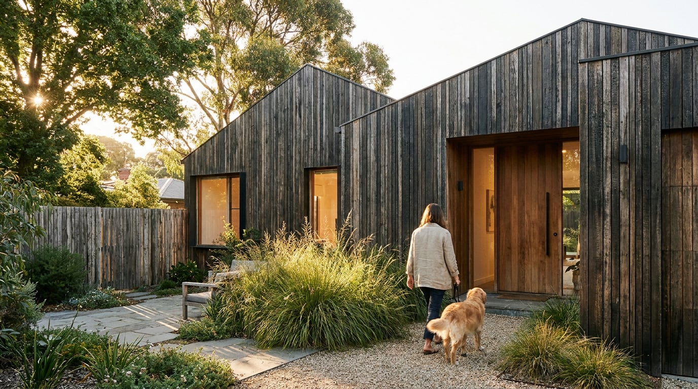
The fix is to use warmth as an accent against a neutral base rather than a wash over the whole room. Think in pools:
- A pendant pool on a dining table.
- A lit shelf niche or alcove.
- Low lamps either side of a bed.
- A glowing reception desk in an otherwise neutral lobby.
Warmth is an accent, not a wash. Light the places people will sit and eat, and leave the specified finishes close to true colour.
Cool Light: Clarity for Workplaces, Healthcare and Galleries
 Cool daylight communicates accuracy, order and cleanliness. It is the honest choice for offices, laboratories, clinics, retail frontage, and gallery or exhibition spaces where the colour fidelity of the displayed work matters. If the room exists to show something accurately, the render should not tint it. In retail and exhibition work especially, a warm global grade misrepresents finishes and displayed objects, and the image stops being a fair statement of what the visitor will see.
Overcast, north-light interiors suit minimal schemes built from concrete, white render, glass and pale stone, because shadows stay soft and material edges stay legible. There is no hard sun to blow out a highlight or bury a joint line, so the viewer reads the architecture rather than the lighting. Cool, even light is also the more convincing default for a planning or consultation image where daylight conditions and façade materials are the subject.
The failure mode is clinical and hostile. A cool-only grade drains warmth from timber, makes people look unwell, and turns a welcoming reception into a waiting room for bad news. The remedy is small. Introduce one warm element to anchor the scene: a desk lamp, a lit reception counter, a single warm spotlight on an exhibit. One warm note in a cool room is enough to tell the viewer that someone works here.
The same logic scales to a larger floor plate. Take a co-working floor rendered cool-only and set it beside the same floor with warm task lighting at the desks. The second version shows where people sit and gives the open floor a hierarchy: tenanted edge, circulation, communal heart. Which one a prospective tenant would sign for is a question you can put to the client directly. This is a comparison to run rather than a result to assume, because no independent evidence was located that one reliably outperforms the other.
Mix Temperatures Deliberately: Daylight Against Interior Lamps
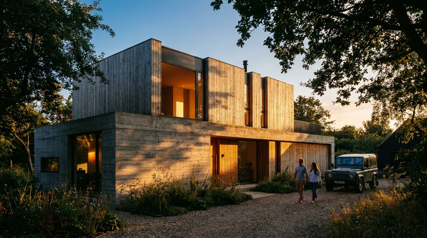
The most convincing interiors use two temperatures at once: cool daylight through the window, warm artificial light inside. The contrast is what makes a render feel photographed rather than computed. A single colour temperature across an entire image is a tell, because real rooms are never lit by one source. Control the ratio. A common starting point is dominant daylight with warm pools at roughly a third of the visual weight, then adjusting against the client's mood reference. Be clear with yourself that this is an internal workflow convention, not a standard. No primary or independent source sets that ratio, so adjust it to the room. A deep-plan room with a small window can carry more warmth. A glazed pavilion will fight you. A brief that asks for intimacy pushes the warm share up, and one that asks for clarity pulls it down. Keep the temperature logic consistent across a set. If the living room is a warm dusk, the adjoining kitchen cannot suddenly read as noon, or the scheme looks like three separate images pasted together. Decide the time of day and the dominant source once, write it on the scene, and let every view inherit it. This matters most for planning and competition sets, where a viewer flips between images and expects one building. Check the windows and glazing last. Blown-out white windows beside a warm room are a giveaway, because a real camera exposed for a lit interior would also hold some sky. Keep a little sky colour in the frame, and check that the glass reads as glass rather than as a white rectangle cut into the wall.| Programme | Starting temperature | Watch for |
|---|---|---|
| Hotel bar, restaurant | Warm pools, dusk glazing | Orange wash, dead specified colours |
| Family home | Warm accents, neutral base | Beige walls, dirty-looking white joinery |
| Office, co-working | Cool daylight, warm task lighting | Clinical feel, unwell-looking people |
| Clinic, laboratory | Cool, even, legible | Hostile grade, no warm anchor |
| Gallery, retail | Neutral to cool, true colour | Warm cast misrepresenting finishes or exhibits |
| Planning or consultation view | Restrained, daylight-led | Theatrical grade hiding massing or material |
Two temperatures in one image is what makes a render feel photographed. Warm pools at around a third of the visual weight is a starting point, not a rule: adjust it to the room and the brief.
Grade It in Retouch: Fix Temperature Without Re-Rendering
You rarely need to go back into the scene file to change a temperature. Retouch in ArchAdemia Tools handles it the way a photographer would. The Adjust panel gives you Light, Colour, point curves and HSL bands, and the grade can sit on its own adjustment layer, so it stays non-destructive and maskable. The original render is untouched underneath, and you can switch the grade off and on to compare. Masking is where the craft is. Rather than pushing a global slider, mask the grade to the area that needs it: warm the lamp pools and timber, and hold the window and ceiling cool. That reproduces the mixed-temperature logic from the previous section directly in the image, and it protects the specified colours that a global warm shift would have spoiled. You can select areas by painting a mask or by describing them, for example selecting the brickwork or the timber so the grade lands only there. If you want to test a whole different lighting condition against the same view, the six re-light presets (Golden hour, Dusk, Blue hour, Night, Overcast and Sunny) regenerate the entire render at a different time of day or weather as a new layer. That gives you a warm version and a cool version of the same view, kept as separate layers for the paired-still comparison. Treat the output as a variant to be checked rather than as a finished image: AI relighting can shift finishes in ways that matter, so compare it against the specified materials before it goes into client or planning material. Keep the original render and save each grade as its own version so you can always return to the source. Sometimes a temperature change exposes a weak surface, such as a flat floor that looked fine under neutral light. Material swap replaces a selected area's texture to match an attached reference, as a toggleable layer, and Enhance area re-renders a selected region at higher resolution and composites it back through the selection. Each of the AI actions shows its cost before it runs, so check it before you commit. This is where AI sits best in a visualisation workflow: rapid options testing, retouching, material variation and mood exploration. For flagship imagery where pixel-level control matters, physically based pipelines such as V-Ray, Corona, Blender or Cycles remain the more dependable route. Use the retouch grade to decide and refine, and keep the hero image honest about the lighting the room will have.A Quick Decision Method Before You Hit Render
Settle the temperature before you open the file, not after you see the first draft. Four steps keep it disciplined.- Write the feeling as one word from the brief. Calm, crisp, intimate or generous. Pick the temperature that delivers that word before touching a light.
- Choose the dominant source and the time of day. Daylight or interior, dusk or overcast. Write it on the scene so every view agrees.
- Add the accent that stops the grade going one-note. A warm pool in a cool room, a cool window in a warm one.
- Produce the paired stills. Same camera, same exposure, same materials, only temperature and lamp intensity changed.
Keep reading.
Try ArchAdemia Tools for yourself
Draw it, model it, render it, publish it. One place, built for architects and small practices. From £19 a month, all in.