Glass That Reads as Glass: Rendering Reflections Without the Mirror Look.
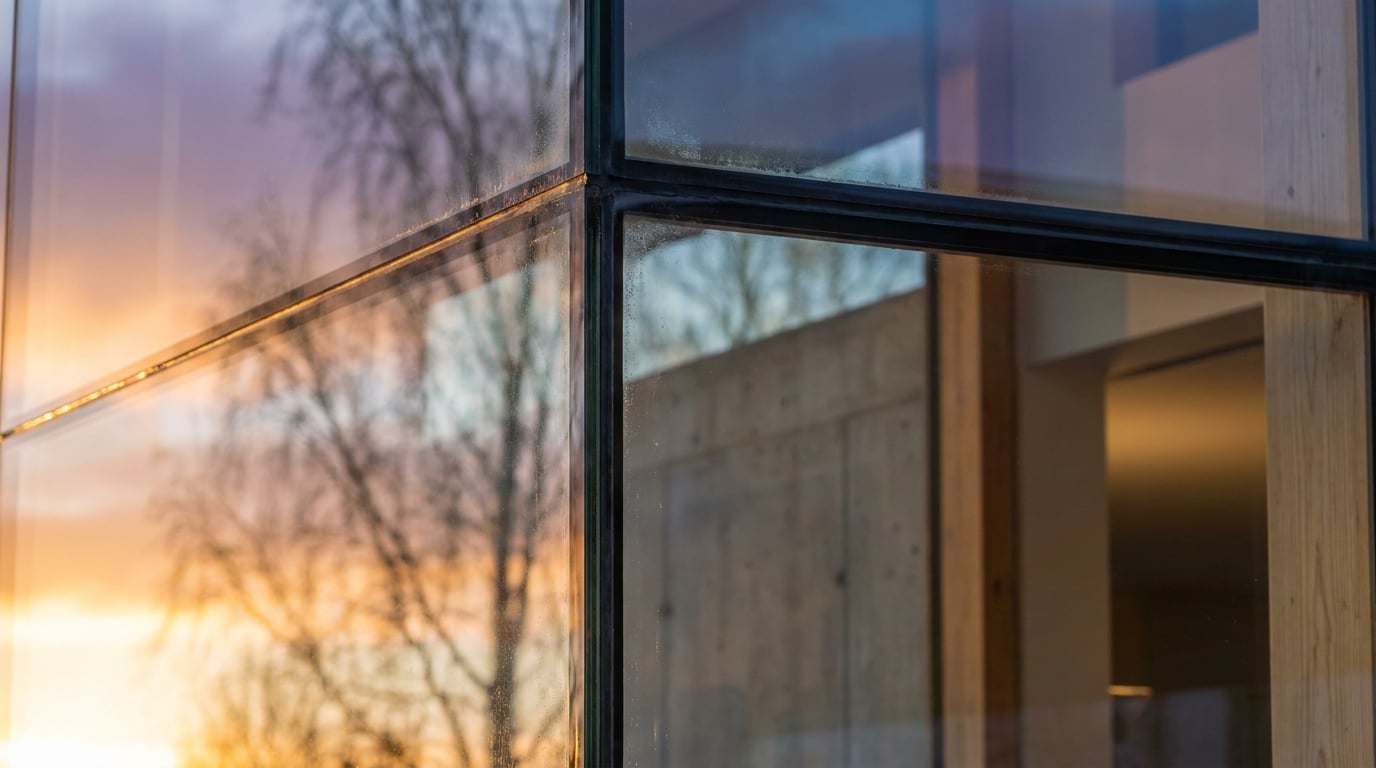
Glazing goes fake when it reflects everything or nothing. Learn to control reflectance, interior depth and light so glass reads as glass.
Why Glass Goes Wrong: Mirror, Hole or Sticker
 Most glass failures in architectural visualisation fall into one of three types: the **mirror**, the **hole** and the **sticker**. Name the failure first and the fix becomes obvious.
The **mirror** reflects a clean, empty sky across every pane. It looks polished, but it tells the viewer nothing about the building, because the glazing has become a surface to bounce a gradient off. The **hole** is the opposite: a black void where the interior should be. Nothing is modelled or lit behind the pane, so the eye finds no depth and no sign of life. The **sticker** sits between the two. It is a flat blue-grey fill, neither reflecting nor transmitting, as if a tinted film had been laid over the elevation.
All three share a cause. Real glazing is transparent and reflective at once, and the balance between the two shifts constantly. It changes with the angle you view it from, with the light on each side of the pane, and with what actually exists in front of and behind it. A render that commits to only one behaviour will always look wrong.
### Name the glass before you chase the look
A single glass shader does not represent a facade. Facade glazing is rarely mirror-clear, and the material conditions you are likely to meet behave differently from one another:
- Low-iron (extra-clear) glass: minimal green tint, so edges and thick sections read as clean and bright. Common on shopfronts, balustrades and showpiece frontages.
- Tinted glass: a body colour that darkens what you see through it and shifts the colour of what it reflects.
- Coated glass: a surface coating that changes how strongly the pane reflects and the colour cast of that reflection.
- Fritted glass: a ceramic pattern that breaks up both transparency and reflection into a partial screen.
- Spandrel glass: opaque glazing that hides the slab edge and services, so it should read as a solid, slightly reflective panel and not as a window.
Glass does not have a look. It has a behaviour that depends on the light on both sides of the pane and on what is in front of and behind it.
Light Balance Decides Everything: Reflection Versus See-Through
 As a working rule, glass leans towards reflection when the light on its outside face outweighs the light inside, and towards see-through when the interior is brighter. It is a guide, not a physical law. Apparent reflectance also depends on viewing angle (the Fresnel effect, where reflection strengthens as you view the pane more obliquely), on tint and coatings, and on what exists on both sides of the pane. Use the rule to make decisions, then judge the result by eye.
### Dusk fixes a dead facade
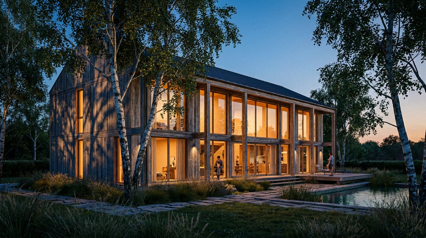
Dusk is the classic cure for a lifeless elevation. The interior lights are on, so the glazing becomes transparent and warm. The sky has dropped in brightness, so what the panes reflect is a darker, richer gradient that adds contrast without overpowering the room behind. You get both behaviours in the same pane, which is precisely what makes glass read as glass.
### Daytime glazing needs a lit interior
In flat daylight, the same facade needs help. If the interior is unlit, unfurnished and empty, the bright exterior wins and the pane reads as a black hole or a plain mirror. A furnished interior with a lit back wall and ceiling fittings gives the pane something to show. This is why a daytime render of a glazed scheme sometimes feels more convincing with the interior exposure raised than with the reflections turned up.
### Test the elevation at different times of day
Before committing to a time of day, test the same elevation under several. In Retouch, the six re-light presets (Golden hour, Dusk, Blue hour, Night, Overcast and Sunny) regenerate the whole document at a different time of day or weather and land as a new layer. That makes it a quick way to compare how one frame handles its glazing, without rebuilding the scene. Treat the results as exploratory mood studies. Check the output carefully before it goes near a client or a planning pack, because relighting changes the whole image and you need to confirm the glazing divisions and reflected context still hold.
### Worked example: bifold doors at midday and at blue hour
Take a residential rear extension with full-width bifold doors, viewed from the garden.
**At midday**, the exterior is bright. Unless the interior is furnished and adequately exposed, the doors read as a dark rectangle, a hole in the elevation. Add a dining table, pendant fittings, a pale back wall and a few books on a shelf, lift the interior exposure, and the doors become a view into a room. The reflection of the garden stays subtle and sits low in contrast across the upper panes.
**At blue hour**, the sky is darker and cooler, and the interior lighting is warm. The room glows through the glass while the exterior sky and garden reflect more clearly in the panes, so you see both at once. The warm-against-cool contrast does much of the depth work for you.
The geometry, camera and glazing are identical in both. Only the light balance has changed, and the pane has changed with it. This is a rendering demonstration, not measured research, but it is a reliable way to understand your own scene.
If a pane looks dead, check the balance before touching the material. Raise the interior or lower the exterior until both behaviours show.
Give the Reflection Something Believable to Reflect
 A mirror look usually comes from reflecting nothing. An empty gradient sky across every pane is the giveaway. Real facades reflect their surroundings, and the surroundings are rarely clean.
### Add context to the reflected scene
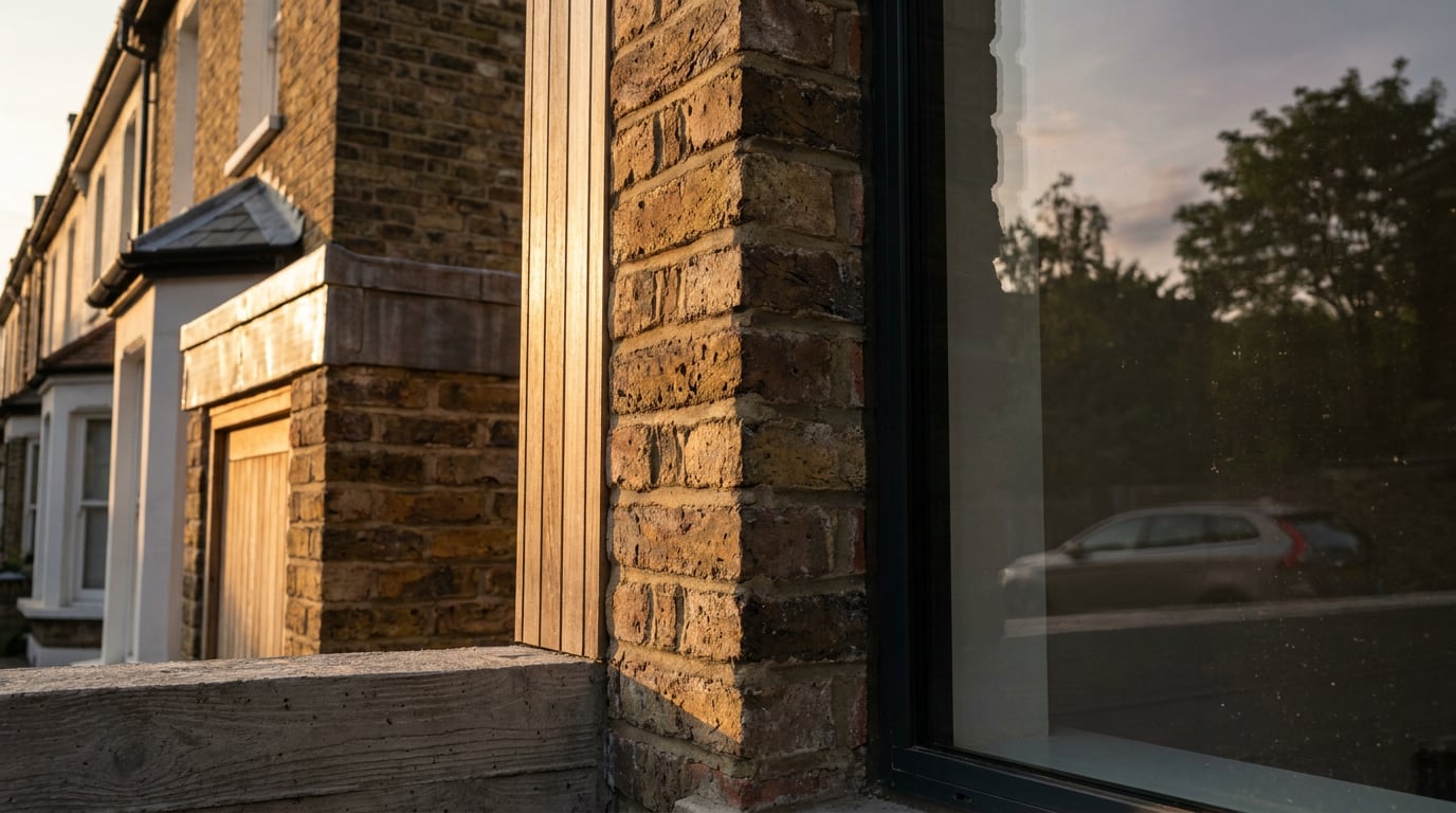
Put believable things in front of the glass so there is something for it to pick up: neighbouring buildings, street trees, variation in the sky, parked vehicles, a lamp post, a bus shelter. They do not need to be in the camera's view to appear in the reflection, because the glass sees a different direction from the camera. For a contextual view in a planning submission, reflect the real surroundings of the site. A generic backdrop reads as generic, and a reviewer who knows the street will notice that the reflected terrace is not theirs.
### Keep the reflection quieter than the room
A reflection that outshouts the interior flattens the pane. Keep reflections at lower contrast than whatever is visible through the glass. When the reflection and the interior sit at similar strength, the eye can read both layers at once, and that overlap is what sells transparency.
### Match the reflected sky to the sky in the shot
A mismatch here is one of the fastest tells in a planning-stage visual. If the sky in your image is overcast but the panes reflect a deep blue with crisp cloud, the facade looks pasted in. Check the horizon line too: a reflected horizon should sit where the geometry and camera height say it should, not wherever it landed by default.
### Let the geometry break the reflection up
Reflections should follow the form. A curved facade stretches and bends them. A faceted one splits them into planes that each reflect a different slice of the surroundings. Fritted glass fragments them into a partial screen. Flat, undistorted reflections on a complex facade tell the viewer the glazing is an afterthought.
| Facade condition | Reflection should… | Common mistake |
|---|---|---|
| Flat curtain wall | Show a coherent slice of the street and sky, shifting slightly between panes | One identical sky on every pane |
| Curved or faceted glazing | Stretch or split across planes, each reflecting a different direction | A single undistorted reflection wrapped over the form |
| Fritted glass | Break up into a partial, softened reflection | A full-strength mirror reflection through the pattern |
| Spandrel panel | Read as a solid, lightly reflective panel | Treating it as see-through with an interior behind it |
Build the Interior Behind the Pane
Depth sells glass. A pane with nothing behind it cannot read as transparent, however good the reflection. ### Put something to see Place furniture, ceiling lights, a back wall at a different tone from the facade, and some clutter behind the glazing so the eye reads through it. A back wall in a slightly darker or warmer value than the facade gives the interior a clear plane to land on. Without it, the pane has no far edge and the room reads as a flat fill. ### Vary the interior lighting Warm pendants set against cool daylight give the pane a believable colour contrast. Uniform white light across every floor and room is as flat as no light at all. Mix a lit zone, a dimmer zone and one dark corner so the interior has a rhythm. ### Break up the transparency Blinds, curtains and partial occlusion stop a facade reading as a uniform void. In practice, people close blinds, hang coats, stack boxes and leave screens glowing. Some partial occlusion is the single most convincing detail you can add to a glazed elevation. ### For interior design: edges, mullions and thickness An interior designer rendering a glass partition or shower screen needs visible edges, frames and mullions, plus the slightly green edge of a low-iron pane, to make it read as a thick sheet of glass rather than an absence. Without edges, a partition simply disappears. ### Worked example: an office curtain wall Compare two versions of the same curtain wall. In the first, every floor is identical: the same lighting, the same open-plan layout, no blinds. It reads as a repeating pattern, a wallpaper. In the second, floors vary. Some blinds are half drawn, certain zones are lit while others sit dark, and a darker plant room occupies the top level behind a louvred or fritted band. The second version looks like a building people use. The geometry is unchanged. The only difference is the life behind the glass.Reflection tells the viewer where the building is. The interior tells them whether anyone uses it. You need both.
Fix Weak Glazing in Post, Selectively
Post-production should be a selective finishing step, not a rescue for glazing that was modelled or lit wrongly. AI-assisted tools can help with exploratory mood studies, entourage variation and selective touch-ups, but they do not replace correctly modelled glazing, lighting and reflections. Geometry, camera matching and physically coherent reflections stay under your control, and every result needs a manual check. ### Select the glazing by description In Retouch you can select by typed description, so entering "all the glazing" selects the matching regions rather than masking by hand. Selections also clip the paint tools, so you can work on those regions only. On a complex elevation, verify the selection before you rely on it, because a typed selection can miss a pane or catch a similar-looking surface. Add or subtract by hand where needed. ### Re-render soft or repetitive regions If a glazed region has gone soft or repetitive, Enhance area re-renders the selected region at higher resolution with no prompt and composites it back through the selection. It suits wide renders where the glass has turned mushy. After using it, check mullions, glazing divisions, horizon lines and any reflected architecture, since a re-rendered region can drift from the original. ### Adjust reflection strength non-destructively Use an adjustment layer for the grade so it stays maskable and editable. In the Camera Raw style Adjust panel you can pull highlights down to tame a reflection that is too bright, add dehaze for contrast, and tune the point curves. Because the grade lives on its own layer, you can mask it to the glazing only and roll back wherever it overreaches. ### Add a grade and mask it back A subtle Multiply-style grade or a light vignette on the pane can deepen the glass tone and pull the eye inward. Layer masks let you paint the effect away where it is too strong, for example where a reflection needs to stay bright near a corner. ### Check at presentation size Glazing is read at scale. On an A1 crit sheet or a client presentation, the viewer is close enough to see whether the reflection holds up. Zoom in and check that mullions line up, reflections do not contradict the geometry and the interior continues believably from pane to pane. A problem you cannot see at screen size will show on the printed board.A Pre-Export Checklist for Glass
Run through this before a view goes into a pack. If you work through your visuals in ArchAdemia Tools, Layout is where the final check happens: place the view into the sheet and look at it as the reader will.- Light balance. Is the light outside the pane weaker or stronger than the light inside, and does the pane behave accordingly?
- Reflected context. Does the reflection contain believable surroundings, with a sky that matches the shot and a horizon that matches the camera?
- Interior depth. Is there something to read through: a back wall, furniture, lighting variation and some occlusion?
- Glass types. Does each condition on the facade, whether clear, tinted, fritted or spandrel, behave differently from its neighbours?
- Cropped legibility. Does the view still read when cropped into a Layout board for a Design and Access Statement or a competition sheet?
Glass reads as glass when it does two jobs at once: reflecting a believable context and showing a lived-in interior. If either one is missing, you have a mirror, a hole or a sticker.
Keep reading.
Try ArchAdemia Tools for yourself
Draw it, model it, render it, publish it. One place, built for architects and small practices. Plans from £19 a month billed yearly (£228 a year), all in.