How Interior Designers Present Materials and Furniture with AI.
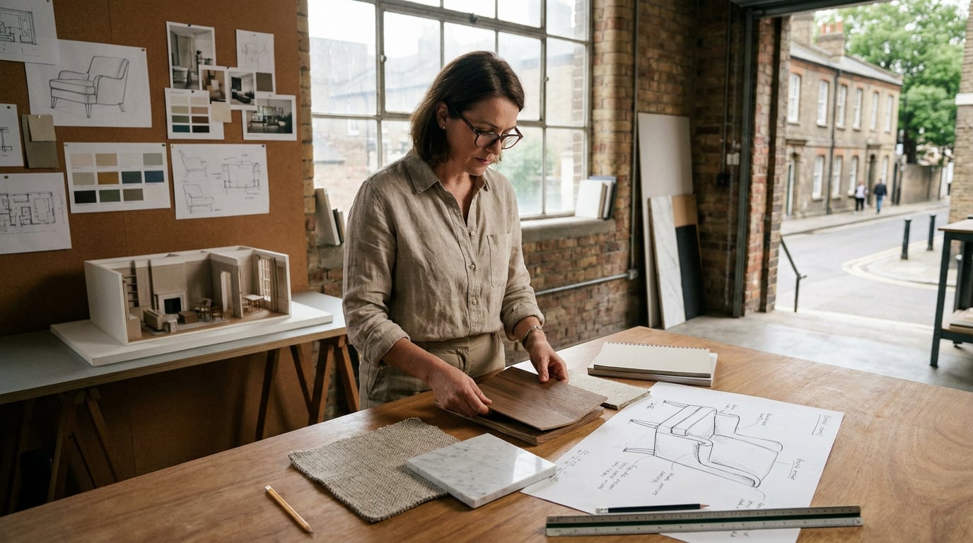
Swapping finishes and furniture live in front of clients used to mean redraws. Here's how interior designers do it in one working session instead.
The old problem: every finish change meant a redraw
A client meeting stalls the moment someone asks "can we see it in the walnut instead?" If the answer is an overnight render pass, the meeting effectively ends there. The designer promises a follow-up email, the client goes home to think it over, and momentum that took weeks to build drains out over a weekend.
Showing three material schemes properly, the honest way, used to mean three separate visualisation jobs and three waits. Each one had its own render queue, its own cost, its own chance of coming back slightly wrong and needing a second pass. Multiply that by flooring, worktop and upholstery options on the same room and a single client presentation could mean six or eight separate renders before anyone sat down at the table.
That cost is exactly why so many practices default to flat swatches and printed lookbooks instead of showing the room itself. A swatch board is fast and cheap, but it asks the client to do the hardest part of the job in their head: imagining a specific stone worktop against their actual cabinetry, in their actual kitchen light. Most clients aren't trained to make that leap. They pick the swatch that photographs well on the board, not the one that will look right at 4pm in December.
The fix isn't a faster render pipeline. It's collapsing the whole exploration into one working session, where a material swap happens in seconds rather than overnight, and the meeting keeps moving instead of pausing for a batch job.
The real gain isn't render speed. It's turning "we'll send options next week" into "let's look at that now, together."
Swapping finishes on a real interior shot without a re-render

Retouch's material swap tool works on a real photograph of the actual room, not a synthetic render of it. Select the worktop, attach a reference image of the stone or timber being considered, and the tool replaces the texture on that surface while keeping the room's geometry, shadows and reflections intact. Because the result lands on its own layer rather than overwriting the original image, the swap is toggleable: click it off, and the client is looking at their kitchen exactly as photographed.
In practice this plays out as a genuinely useful trick in the room. A client shot with three flooring options tried against the same photograph means the designer can flick between herringbone oak, large-format porcelain and a dark stained timber in the time it takes to say "or we could try it darker." Nobody is waiting. Nobody is squinting at a printed swatch trying to project it onto a floor plan.
This is where a real layer beats a flattened image. If the client says "actually, go back to the second one," that's not a re-send request, it's a click. The previous option didn't disappear, it's sitting in the layer stack exactly where it was left. That single detail changes the tone of a meeting: clients feel free to go back and forth, compare, and change their mind, because doing so costs nothing.
Pairing a material swap with the six one-click re-light presets, Golden hour, Dusk, Blue hour, Night, Overcast and Sunny, adds a dimension that swatch boards can never show: how a material reads under different light. A warm limestone that looks perfect under Overcast can go flat and grey under Blue hour. A dark timber floor that feels moody at Dusk can feel oppressive at Night. Walking a client through those presets on the actual worktop or floor they're considering, in their actual room, does more to settle a material decision than any number of physical samples on a table.
A toggleable layer means a client can ask to see the previous option again instantly, no re-send, no re-render, no lost momentum.
Generating furniture and finish options before the shoot even happens
Not every project has a finished room to photograph yet. Early in a scheme, before furniture is specified or a site photograph exists, the exploration has to start from a concept image or a rough interior sketch. Image generation across 20+ models is where that exploration happens: testing furniture arrangements, upholstery colours and material palettes against a base interior concept without committing to a single direction too early.
Composer is the more targeted route when a specific furniture piece needs testing in context, rather than a whole scene generated from scratch. Pose a model of the sofa or dining table with gizmos, place it against a backdrop, and render to a photorealistic still. This matters most for pieces where the client has narrowed to two or three options and needs to see scale and placement, not just colour: a low-slung modular sofa reads very differently in a room than a tailored three-seater, and that difference is hard to communicate with a spec sheet alone.
Where Corb, ArchAdemia Tools' AI assistant, earns its place in this stage is narrowing the field before generation starts. In a project chat, Corb reads the brief and whatever images already exist in the project and can suggest what's worth testing next: a warmer palette direction, a different furniture typology, a material family that fits the brief's language. It won't invent dimensions it hasn't been given, and it won't specify a product it hasn't seen, which is the right kind of caution for a tool sitting outside professional liability. Its job is to help a designer decide what to generate next, not to make the decision for them.
Keeping all of this inside Projects matters more than it sounds like it should. A client's preferred direction from three weeks ago, buried somewhere in a folder of a hundred image variants, is useless if nobody can find it again in the next meeting. Organised inside a project, that direction is exactly where it should be, ready to be picked up and refined rather than reconstructed from memory.
Generation at concept stage is cheap exploration. The goal isn't the perfect image, it's narrowing three unknowns (furniture, colour, material) down to one direction worth photographing properly.
Building the client-facing material board in Layout

Once a direction is chosen, it needs to leave the working session and become something a client can hold, print or forward to a partner who wasn't in the room. Layout is where the scattered material swaps, renders and furniture options become one coherent sheet. The Image-led Board and Client Deck templates are built for exactly this: swatches, renders and furniture callouts laid out on a single page with the room dominant and the supporting material and product shots arranged around it.
Before/after material comparisons work particularly well placed side by side at true print scale, either for a physical presentation printed at A1 or exported as a PDF for email. Seeing the existing floor next to the proposed one, at a size large enough to read the grain and finish, does more to settle a decision than either image shown alone.
For projects running over several weeks with meetings in between, sharing a Layout document as a read-only public webpage removes the friction of PDF attachments entirely. A client can open the link on a phone between meetings, look at the material direction again over a coffee, and come back to the next session with an opinion already formed rather than seeing the board for the first time in the room.
Manual layout work in Layout costs no credits. That matters more than it first appears, because a material board is rarely right on the first pass. Swatches get reordered, a furniture callout gets swapped for a better angle, the whole sheet gets rebalanced after a client comment. Being able to iterate that board five or six times before a sign-off meeting, without watching a credit balance drop each time, is what lets a designer treat the board as a working document rather than a one-shot deliverable.
| Stage | Tool | What it produces |
|---|---|---|
| Exploration | Image generation | Broad furniture and material directions |
| Live meeting | Retouch | Real photo, swapped materials, re-lit |
| Sign-off | Layout | Printed or shared board, the agreed record |
Where this fits a real project timeline

Mapped against how a real interior project actually moves, this isn't three separate tools bolted together, it's one workflow that changes shape as the project matures.
At concept stage, the work is broad and low-commitment. Image generation across the model library lets a designer test palette direction, furniture typology and material mood without locking into anything. Nobody is paying much attention to a single output here, because the point is volume of ideas, not precision.
At client presentation stage, the work narrows and gets sharper. This is where Retouch does its job: swapping materials on a real photograph of the actual space, re-lighting it across the six presets, and responding live to whatever the client asks for in the room. This stage is reported consistently across interior practice as the one where clients trust real photography of their space far more than a fully synthetic render, however polished. A real photo with a swapped floor reads as "your kitchen with a different floor." A synthetic render reads as "an image of a kitchen."
At sign-off stage, the work becomes a single document. The finished board in Layout, printed at A1 or shared as a webpage, becomes the record of what was actually agreed, not a scattered thread of email attachments and half-remembered meeting decisions.
On credits: a Starter plan at £29 a month includes 3,000 credits a month, which is enough headroom to cover a typical single-room material exploration and a full presentation pass, concept generation, several rounds of material swap and re-light, and the board itself, without needing to upgrade mid-project. Layout work costs nothing regardless of tier, so the board can be revised as many times as the project needs before the client actually signs off.
The workflow isn't about generating faster. It's about never having to say "let me get back to you on that" when the client is sitting across the table.
Takeaway: the shift interior designers are making isn't from slow renders to fast ones, it's from a presentation built out of static swatches and one-shot images to a working session where materials, light and furniture can all be questioned and answered in the room. Retouch handles the live moment, Image generation and Composer handle the exploration before it, and Layout turns the outcome into something the client can actually keep.
Keep reading.
Try ArchAdemia Tools for yourself
Draw it, model it, render it, publish it. One place, built for architects and small practices. Plans from £29 a month, all in.