Discipline Spotlights
Part 1 and Part 2 Portfolios Reviewers Actually Open.
By Adam Morgan7 November 20268 min read
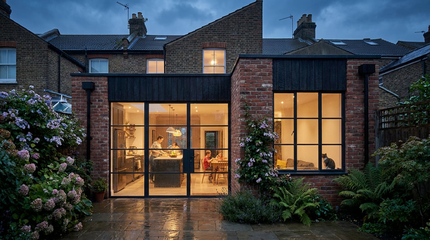
Reviewers give a portfolio about two minutes. Here is how to sequence, size and export a Part 1 or Part 2 portfolio so it survives the first pass.
What a Reviewer Does in the First Two Minutes
 A practice reviewer is usually a director or associate clearing a pile of applications between meetings. They skim before they read. The first three pages carry the whole application, and if those pages do not tell them who you are, what you can do and where to look next, the rest of the file goes unopened.
That is practice advice, not market data. No reliable source establishes a universal preference among hiring reviewers, so treat everything below as a working method for making your work easy to judge, not a guarantee of what any one office wants.
### Part 1 and Part 2 are read differently
The two stages are judged against different questions.
- **Part 1:** potential, graphic control and design thinking. The reviewer is asking whether you can draw, whether you can think spatially, and whether you will learn fast.
- **Part 2:** whether you could run a job. Technical awareness, range across project types and clear communication carry more weight than a single beautiful scheme.
A Part 1 portfolio that reads like a Part 2 one (dense construction drawings with no design story) looks misjudged. A Part 2 portfolio that is all atmosphere and no resolution looks unready.
### The usual rejections are practical, not creative
Most portfolios fail on logistics before anyone judges the design:
- A file too large to open on a laptop, or one that bounces from an inbox.
- Text so small it cannot be read at screen size.
- No sense of which project is which, or where one ends and the next begins.
- No indication of your own role in group work.
Before you design a single page, collect the reviewer's constraints: the file size limit in the job advert, the page count, and whether they want a PDF or a link.
Choosing and Sequencing Projects for Your Stage
 Selection matters more than volume. Reviewers do not reward length; they reward a clear line from your first page to your last.
### Part 1: lead with your strongest studio project
Open with the best design project you have, then add one smaller piece that shows a different skill: a physical model, a hand drawing, a short technical exercise. Three to four projects is plenty. A fourth project that repeats the strengths of the first three adds weight but no information.
### Part 2: lead with the project closest to the practice
Put the project nearest to the practice's own work first. If you are applying to an office that does housing, lead with housing. Then include at least one project that shows technical resolution: a wall section, a detail, a coordinated set of drawings. That page is your evidence that you can carry a scheme past concept.
### Open every project the same way
Start each project with a single hero image and a one-line summary: site, building type, your role. A reviewer should know what they are looking at before they read a word of body text.
| Project opener | What the reviewer learns in five seconds |
|---|---|
| Hero image only | A pretty picture, no context |
| Hero image plus "Mixed-use infill, Leeds. Studio project, sole author." | Site, type, scale of authorship |
| Hero image plus a paragraph of brief | Probably skipped |
### Cut repetition and be explicit about group work
Three near-identical section perspectives of the same scheme read as padding, not depth. Keep the strongest one and spend the pages on something that shows a different decision.
For group projects, state exactly what you drew, modelled or wrote. Reviewers discount anything they cannot attribute to you, so "Group scheme, four authors. I produced the site model, ground floor plan and Sections A and B" does more work than a shared credit line.
If a reviewer cannot tell which drawings are yours, they will assume the weakest ones are.
Laying Out Spreads That Read at Thumbnail Size
 Build the portfolio as one multi-page document, not a stack of separate boards. In ArchAdemia Tools, Layout has a Document mode for exactly this: many pages at A3, which is the standard portfolio format, with one file, one grid and consistent type throughout.
### Start from a template, then keep the grid
Layout's Portfolio template comes pre-populated with placeholder text and image frames only, so your own work fills the structure rather than competing with template imagery. A toggleable layout grid (Manuscript, Columns or Modular) keeps margins and image edges aligned across every spread. The grid is a reference overlay only. It never appears in an export or a shared page, so you can leave it on while you work.
### Two type families, tested at laptop size
Set your type from the self-hosted library and limit yourself to two families. The more important test is not aesthetic. Zoom your view out to roughly the size a spread will appear on a laptop screen, not zoomed in on a desktop monitor, and check that captions and dimensions are still legible. If you have to lean in, the reviewer will not.
### A good spread against a bad one
The difference is rarely taste. It is hierarchy.
- **Weak:** a collage of nine small, unlabelled images, each one too small to read, with no indication of which matters.
- **Strong:** a single large plan with three labelled callouts pointing to the decisions that matter: the entrance sequence, the party wall condition, the courtyard.
The strong spread tells the reviewer where to look and why. The weak one makes them guess. At thumbnail size, only one of them survives.
One large drawing with three labelled callouts beats a collage of nine unlabelled images every time.
Preparing Drawings and Images Before They Reach the Page
Drawings exported straight from CAD rarely drop onto a portfolio page cleanly. They arrive as whole sheets, with layers you do not want, scale bars that drifted and linework too fine to survive a PDF export at thumbnail size. ### Clean the drawing in Vector first In Vector, import a DWG, DXF or a vector PDF. The pre-import report draws the document that is about to be created and lets you tick which layers to keep. It also finds the separate drawings inside a sheet, which matters because a practice CAD file often holds twenty-odd drawings sharing the same layers. Click the outline of the plan you want and the import crops to that single drawing, cut clean at the edge. If detection misses it, drag your own box on the preview. Then set the drawing's real-world scale, choosing a standard ratio or calibrating against a known distance. The scale bar regenerates automatically, so a 1:200 plan carries an honest bar rather than a hand-drawn one that drifts when you resize. ### Tidy renders and photographs in Retouch For perspectives and site photographs, Retouch gives you non-destructive edits on real layers: - **Enhance area** re-renders a selected region at higher resolution with no prompt, useful for a wide perspective that has gone soft or repetitive. - **Material swap** replaces a selected surface to match an attached reference, as a toggleable layer. - **Re-light presets** (Golden hour, Dusk, Blue hour, Night, Overcast, Sunny) regenerate the whole document at a different time of day or weather as a new layer, so you can try an overcast version of a hero image without losing the original. ### A note on AI-assisted imagery Treat AI as a supporting production tool, not the portfolio's subject. Recent architecture coverage describes tools such as Nano Banana and Flux as useful for rapidly testing form, colour, material and lighting while the underlying 3D model stays unchanged. A 2026 Chaos and Architizer survey reports that 60% of respondents were experimenting with or fully embracing AI, with text-to-image, model-to-image and image enhancement among the leading uses. That is survey evidence of interest, not proof of universal professional adoption. A separate architecture-focused report puts the figure for concept imagery at roughly 44% of architects but only about 11% of practices using it in visualisation workflows; those numbers are secondary reporting and should be read that way. For your portfolio, the practical rules are simple: - At **Part 1**, enhancement can help you test atmosphere or material options, but it should not replace plans, sections, diagrams or model evidence. - At **Part 2**, AI-generated imagery is weaker evidence than coordinated technical drawings, details and clearly attributed project work. - Label AI-assisted images where they materially alter geometry, material or atmosphere, and show the drawing or model the image derives from. Authorship should be obvious at a glance. The same logic holds across disciplines. A photographer may use enhancement without claiming a new site. A product designer may use image-to-3D for form exploration but still validate dimensions. A filmmaker may use a short fly-through as presentation material, not as construction evidence. In each case the reviewer's question is the same: whose judgement is this? ### Do not over-render Reviewers distrust glossy imagery that hides weak planning. One honest hero image plus clear drawings is the stronger signal, especially at Part 1. Keep a consistent colour treatment across every project so the portfolio reads as one author, even when the studio briefs were completely different.The test for every image on every page: can a reviewer quickly see your judgement, your technical ability and your role?
Exporting a File That Opens First Time
The last step is the one most applicants rush, and it is where applications are lost to logistics. ### Export the PDF and check the size From Layout, export a multi-page vector PDF at true sheet dimensions. Check the file size against the limit in the advert before you send it. Then make a lighter version for email alongside the full-quality one, so you have a version that fits whichever route the practice asks for. ### Keep a link as a backup Layout can also share a document as a read-only public webpage, which suits reviewers who prefer a browser to an attachment. The link is revocable and re-issuable, so you can withdraw it once the application window closes. If you want a fuller web presence, Web can build a portfolio-style site with Portfolio, Gallery and About page types, and contact forms that work with no setup. Building a site is one step; publishing it live, especially to a custom domain, is a separate hosting step, so confirm that before promising a reviewer a live URL. ### Test it as a stranger would Before you send anything, run a final check on a different machine: 1. Open the PDF on a phone and on a laptop. 2. Confirm fonts and images are intact on both. 3. Read the first three pages as a stranger would, with no knowledge of your projects. 4. Check that the file opens on the first double-click, with no waiting and no warnings. ### Name it and bundle the rest Name the file properly: Surname_Firstname_Part2_Portfolio.pdf. Keep a one-page CV and cover letter ready in the same Layout document set, using the CV / cover letter template, so the whole application shares one grid and one set of type choices. The takeaway is a short checklist rather than a style: know the reviewer's file limit, lead with the project that fits your stage, label every image with your role, keep each spread to one clear idea, and test the export on a machine that is not yours. A portfolio that opens first time and explains itself in three pages will be read further than one that is cleverer and harder to open.Keep reading.
Try ArchAdemia Tools for yourself
Draw it, model it, render it, publish it. One place, built for architects and small practices. From £19 a month, all in.