From Client Mood Board to Room Visuals Before You Order a Thing.
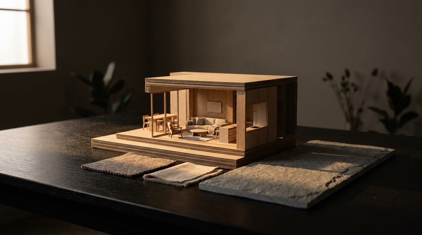
A client's mood board is a feeling, not a room. Here is how an interior designer turns it into visuals the client can react to before a single sample is ordered.
Why a Mood Board Alone Does Not Get Approval
 A mood board shows taste. It does not show proportion. A board of pinned images can tell you the client loves deep green and brushed brass, but it cannot tell you how a bold wallpaper behaves on a 3.2m wall, or what a warm palette does in a north-facing room that never sees direct sun. The photographs on the board were taken in other people's houses, in other people's light.
That gap is where the expensive misunderstandings live. The client approves a board. The fabric arrives. The room reads nothing like the pin-up, because the pin-up was never this room. By then the order is placed, the deposit is gone and the conversation has changed from design to blame.
The gap to close is narrow and specific: from "I like these images" to "I can see my own room in this mood". Only a visual of the actual space does that. Interior designers have always bridged it with sketches, collages and sample boards. Software now lets you do it faster, with the client's own room as the base.
A few boundaries before the workflow starts. The visuals here are for concept-stage sign-off. They are not construction information. A generated image cannot establish dimensions, product availability, fire performance, procurement cost or buildability. And it is never a substitute for a sample in the client's hand.
A mood board earns trust in the studio. A visual of the client's own room earns it at the kitchen table, before a single item is ordered.
Start With the Room You Actually Have
Everything that follows is built on the real space, so begin there. Photograph the existing room from the two or three angles the client will instantly recognise: standing in the doorway, from the window looking back, from the corner where they usually sit. Keep these. They become the base for every visual that follows, and the client's recognition of their own room is what makes the later images persuasive.Block out the new layout where the room is changing
If the room is being reconfigured, a photograph alone will mislead. A moved partition or a new window changes what the camera sees. In Linea, block out the proposed layout so the walls, openings and furniture positions are real rather than guessed. You work on a 2D plan and a 3D model of the same room together, so a wall moved in one is moved in the other. Linea's furniture and material libraries cover the standard pieces. Corb, the assistant chip beside the 2D/3D toggle, answers questions about the drawing for free. Once the 3D view frames the room as the client will experience it, send a perspective view straight into the rendering studio. No exporting, no re-importing, no screenshot cropped by hand.
Build the one piece the board hinges on
Most boards hinge on one or two pieces: a sculptural armchair, a particular pendant light. If the furniture library does not carry it, the Generate tab in Linea's Library can build a single 3D model from a description or a photograph and place it in the drawing. This is a paid action that uses plan credits, and its cost is shown before it runs. Drawing, modelling and walking the model remain free on every plan.Be honest about what a block model shows
An untextured block model shows proportion, circulation and window position. It says nothing about finish. New geometry in Linea is born in a flat painted colour, so a white wall is just a white wall until someone decides otherwise. Treat the block view as a spatial agreement: the client confirms that the room is the right shape and the furniture sits where they expect. Material decisions come next.Translating the Board Into a Brief the Visuals Can Follow
A board is full of adjectives: calm, earthy, layered, quietly luxurious. Visuals need decisions. Read the board and pull out four things: the palette, the dominant material, the quality of light, and the two or three pieces that carry the character. Everything else on the board is atmosphere that those four things already contain.Distil the references in Canvas
In Canvas, wire the client's board images into a Look node. It distils their shared style and colour palette into one prompt block. Feed that block to an Image node's Style port, on the Nano Banana models that carry one. Not every image model takes a Look, so check that the model you choose has a Style port before building the chain around it. This matters because it keeps the client's own references in the loop. The palette in the room visual comes from the images they pinned, not from your paraphrase of them.Let Corb write the prompt and advise on the craft
Ask Corb on the canvas to write a ready-to-use prompt from the wired references. He reads the images in his Ref ports and answers in his own thread. He also advises on render craft in photographic terms: a believable camera height, one dominant light source, a sensible lens, depth falling into haze. These are the things that make a room visual read as a photograph rather than a catalogue render. Keep a project brief in place, with the RIBA stage or equivalent, so his advice is scoped to concept design. He reads the project's brief, stage and instructions before he answers. Treat his output as a starting prompt, not a design decision. Corb advises and writes. He does not choose the scheme, and he never invents a dimension: if he needs a ceiling height, he asks for it. | Board adjective | Decision to extract | Where it goes | |---|---|---| | "Warm and earthy" | Palette: terracotta, oat, tobacco brown | Look node, Style port | | "Tactile" | Dominant material: limewashed plaster | Material swap reference later | | "Soft evening feel" | Light quality: low, warm, single source | Prompt and re-light presets | | "Collected, not matched" | Hero pieces: the rattan chair, the ceramic lamp | Linea model or Generate |Read the board for decisions, not adjectives. Palette, material, light and two hero pieces are enough to brief every visual that follows.
Testing the Mood Across Light, Finish and Time of Day
 Generate the first room visual in Image, working from the perspective view out of Linea. This is the baseline everything else is compared against, so take a moment to check it against the room itself: do the window positions, the ceiling line and the doorway match what the client knows?
Swap the finish against a reference the client chose
Open the visual in Retouch and use material swap. Select an area, attach a reference, and the selected region's texture is replaced to match it, landing as a toggleable layer. Test a different stone on the worktop, a different timber on the floor, a limewash against the painted wall. The reference should be something the client has actually chosen, ideally a photograph of the sample you intend to order. Because each swap is a toggleable layer, you can flick between two finishes in front of the client without regenerating anything.Answer "will it feel too dark in winter" before it is a complaint
The one-click re-light presets (Golden hour, Dusk, Blue hour, Night, Overcast and Sunny) regenerate the whole document at a different time of day or weather as a new layer. For the north-facing room, run Overcast and Night first. They answer the question the client was about to ask three weeks after installation, and they let you adjust the palette now, while it still costs nothing.Show four readings of one image
In Canvas, Corb can spawn a set of two to six variations off one image he has been shown, varied along a single axis: lighting, weather, camera, entourage or grade. The clause that holds the geometry, massing and openings still is written into every prompt in the set by the server. It is a preservation instruction to the model, not a geometric lock, so check each result against the base before it goes near the client. The variations land idle, so nothing is charged until you run them. Treat variations as readings of one proposal, never as alternative schemes. The client compares moods, not layouts. If a client sees four different rooms, you have reopened the design question you were trying to close.Correcting the Details Before the Client Sees Them
Generated room visuals are close, and close is where credibility breaks. A curtain that stops a hand short of the floor, a rug that blurs into the boards, a bookcase whose spines repeat like wallpaper. The client may not name these errors, but they will feel that something is off. Fix them in Retouch before the visuals leave the studio.Select by description, correct on a layer
Retouch can select a region by typed description. Type "all the curtains" and every matching region is selected. Then fill with a prompt, and the result lands on a real new layer. Keep each correction on its own non-destructive layer so any one can be switched off if it makes things worse. This is the difference between retouching and regenerating: you change the curtains without touching the sofa you have already approved.Re-render soft patches at higher resolution
Wide room views often go soft in the repetitive areas: herringbone flooring, a tiled splashback, shelving. Select the patch and use Enhance area. It re-renders the selected region at higher resolution with no prompt and composites it back through the selection. No wording to get wrong, and the rest of the image stays as it was.Grade the set as one
If the living room is warm and the hallway reads cool, the client will assume two different lighting schemes. Use the Camera Raw style Adjust panel to bring every view of the room to one colour temperature. Where one surface needs to sit differently, mask the adjustment so the correction applies only where it should. A shared grade is what makes four views feel like one room.Check the constraints yourself
No generated image settles a dimension. Clearances, door swings, the width of the walkway past the island, and the client's budget stay with the designer. Check every visual against the real room before it goes out. A visual that shows a sofa fitting beautifully into a recess proves nothing about whether the sofa fits.Fix the small errors on their own layers and grade the set as one. Dimensions, clearances and budget stay with you, whatever the image shows.
Presenting the Room and Closing the Sign-Off
The approval meeting is where the link between feeling and room has to be visible. In Layout, lay the approved visuals out as a client deck or a single A1 sheet, with the client's mood board beside the room visuals. The pairing is the argument: here is what you pinned, here is your room in that mood. A Sheet suits a pin-up or a kitchen-table conversation. A Document suits a fuller proposal with several rooms across pages.Let the client look in their own time
Share the document as a read-only public link the client can open at home, with no login. It stays current as you edit the document, and it can be revoked or re-issued whenever the scheme changes. That last part matters: if you revise the palette after a conversation, the old link stops showing the old scheme. On free-plan links a small footer appears, removed on paid plans. ### Give them something to mark up Some clients still want paper. Export a vector PDF at true sheet size, and they can print it and mark it up at the kitchen table with a pen. Their annotations come back to you as the clearest brief you will get. ### Record what was approved, then order samples Write down exactly what the client approved: which visuals, which finishes, which version of the layout. Date it. Then order samples against that record, not against memory of a conversation. The visuals reduce surprises, but the physical sample still gets the final word. A fabric that looked right on screen may behave differently under the client's own lamps, and that is what the sample is for.Show the client their own room in the mood they chose, record what they approved, and let the physical sample have the last word before anything is ordered.
Keep reading.
Try ArchAdemia Tools for yourself
Draw it, model it, render it, publish it. One place, built for architects and small practices. From £19 a month, all in.