The Archademia Method: Small Decisions That Make Output Read Professionally.
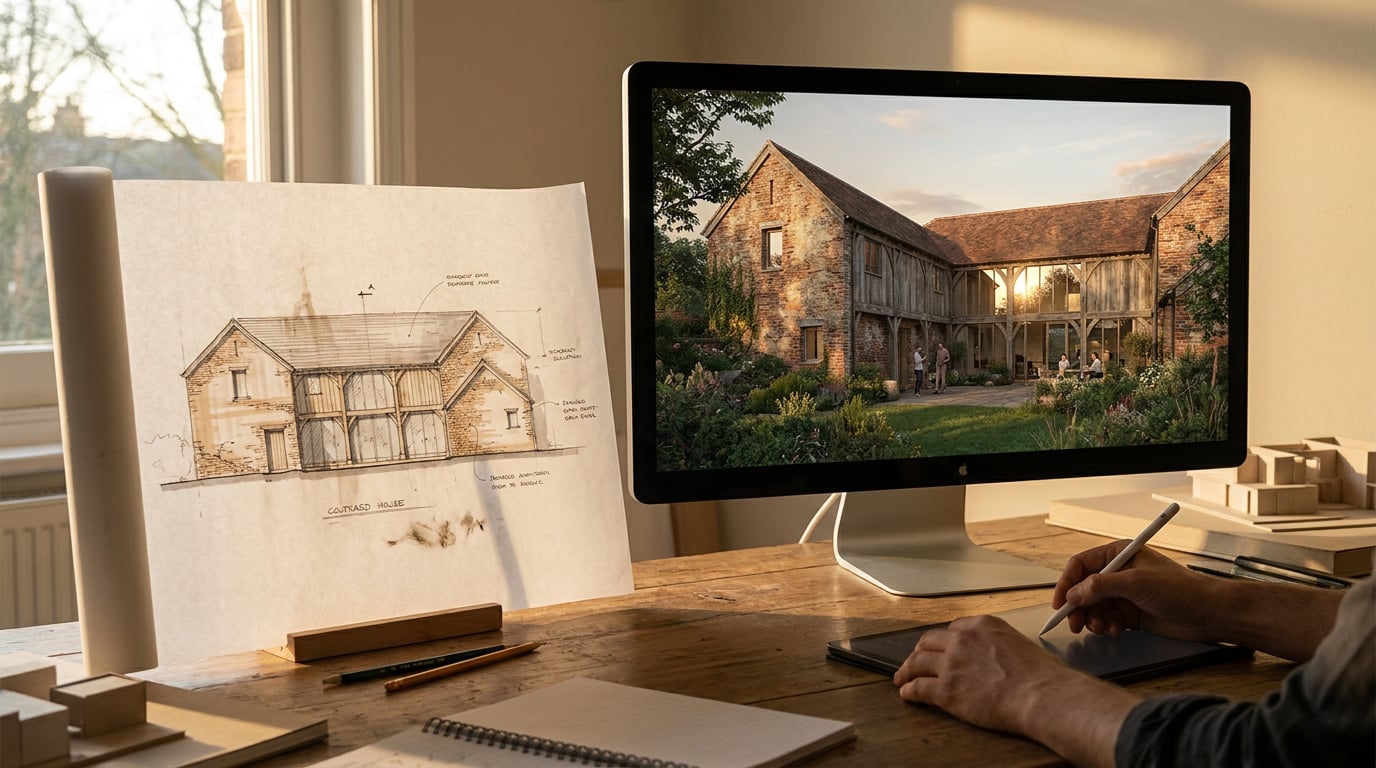
Professional architectural output comes from small decisions made early: a tight brief, disciplined iteration, a sheet that holds together. Here is the working method.
Why Most Architectural Output Looks Amateur Before You Notice
 The thing that makes a board read as amateur is rarely the render. It is a decision nobody made: what the image is for, who reads it, and what it has to prove. This is the approach we call the Archademia method, and it is not a feature. It is a habit of small, unglamorous choices made upstream of the render or the board.
You have seen the tells. A competition board with five images of equal weight, each shouting for the jury's eye, so the eye settles on none of them. A Design and Access Statement where every figure is cropped differently, one tight on the entrance, the next showing half the street, the third a wide shot with a different sky. A student crit sheet where every image has its own horizon height, so the scheme appears to sit on a different ground in each frame.
None of these is fixed by a better model or another hour of polish. They are fixed by a decision made earlier. The planning view needed a camera at eye level and a neutral sky. The competition hero needed to lead and the rest needed to support it. The crit sheet needed one horizon line, agreed before the first image was generated.
That is a briefing, selection and consistency problem, not a rendering-quality problem. It is an editorial observation from practice rather than a measured industry finding, but it holds up every time you lay a weak sheet next to a strong one. The strong one is rarely made of better pixels. It is made of fewer, clearer decisions.
This article follows the order the decisions arrive in: the brief, the iteration, the sheet setup, and finally the checks that catch what you have stopped seeing.
The thing that makes a board read as amateur is rarely the render. It is a decision nobody made: what the image is for, who reads it, and what it has to prove. This is the approach we call the Archademia method, and it is not a feature. It is a habit of small, unglamorous choices made upstream of the render or the board.
You have seen the tells. A competition board with five images of equal weight, each shouting for the jury's eye, so the eye settles on none of them. A Design and Access Statement where every figure is cropped differently, one tight on the entrance, the next showing half the street, the third a wide shot with a different sky. A student crit sheet where every image has its own horizon height, so the scheme appears to sit on a different ground in each frame.
None of these is fixed by a better model or another hour of polish. They are fixed by a decision made earlier. The planning view needed a camera at eye level and a neutral sky. The competition hero needed to lead and the rest needed to support it. The crit sheet needed one horizon line, agreed before the first image was generated.
That is a briefing, selection and consistency problem, not a rendering-quality problem. It is an editorial observation from practice rather than a measured industry finding, but it holds up every time you lay a weak sheet next to a strong one. The strong one is rarely made of better pixels. It is made of fewer, clearer decisions.
This article follows the order the decisions arrive in: the brief, the iteration, the sheet setup, and finally the checks that catch what you have stopped seeing.
Amateur output is usually an upstream failure. Fix the decision, not the pixels.
Brief Like an Architect, Not Like a Prompt Writer
A brief states the job. A planning submission view, a client mood image, a competition hero and an interior sketch for a fit-out pitch are four different jobs, and each wants a different camera, a different light and a different level of finish. The planning view is a witness statement. Eye-level camera, honest light, a sky that does not flatter, neighbours that look like the real neighbours. The client mood image is the opposite: it sells an atmosphere and can afford a lower sun and a looser finish. The competition hero has to survive being seen at thumbnail size across a room. The fit-out sketch needs to show material and lighting intent, not building massing. Write the job first. Then write the physical facts that carry credibility. ### The facts that make an image credible - **Camera height.** Around eye level, roughly 1.6m, unless you are deliberately doing an aerial. - **Lens length.** A wide lens distorts and exaggerates; a mid-range lens reads as a human view. - **Time of day and season.** Low winter sun and high summer sun give different shadows and different mood. - **Foreground.** What sits between the camera and the building. A hedge, a parked car, a lamp post. - **Neighbours.** Their material, height and roof form, because the new scheme is always read against them. ### Vague against specific Compare two briefs for the same job in the Image studio.| Vague brief | Specific brief |
|---|---|
| Modern house, nice light | Two-storey brick extension to a terraced house, low sun from the left, overcast sky, camera at 1.6m, hedge in the foreground |
| Returns: a generic villa, glossy, with no relationship to a street or a client | Returns: an image with a controlled light direction, a believable scale and a foreground that gives depth, which you can then compare against the next one in the set |
A brief that states the job and the physical facts makes the decisions for you. A vague one hands them to the model, one image at a time.
Iterate Along One Axis at a Time
 The most common failure in iteration is changing camera, light, weather and entourage in the same pass. The result might be better or worse, but you cannot tell why, so you cannot repeat it and you cannot fix it.
Pick one variable per round and work through them in a fixed order:
1. **Camera.** Get the viewpoint, height and crop right first, because everything else sits on it.
2. **Light.** Settle the direction and time of day.
3. **Weather.** Sky and atmosphere, once the light is settled.
4. **People and planting.** Entourage at a believable scale.
5. **Grade.** Last, and consistent across the set.
The order matters because each step depends on the one before it. Change the camera after you have graded and you start again.
### Variations off one image
Corb can spawn two to six variations off one image he has been shown, varied along a single axis. The clause that holds the geometry, massing and openings still is composed by the server and written into every prompt in the set, rather than left to Corb to remember.
Be clear about what that is. It is a preservation instruction to the model, not a geometric lock. Models drift, so check the set against the source for changes to the roof form, the opening rhythm or the storey heights before you trust it.
The variations land idle on the canvas and cost nothing until you run them. That is the useful part. You can look at four proposed times of day, delete the two you do not want, and spend credits only on the ones you will use.
### A good set and a bad set
A good set is the same corner at four times of day. The building does not change, the camera does not change, and the only thing moving is the light. A client or a crit panel can read that instantly: they see how the scheme behaves across a day.
A bad set is four different buildings that happen to share a brief. Each one might be handsome, but nobody can compare them, so nobody can tell what the scheme actually looks like. The first set communicates a design. The second communicates that you generated four images.
The most common failure in iteration is changing camera, light, weather and entourage in the same pass. The result might be better or worse, but you cannot tell why, so you cannot repeat it and you cannot fix it.
Pick one variable per round and work through them in a fixed order:
1. **Camera.** Get the viewpoint, height and crop right first, because everything else sits on it.
2. **Light.** Settle the direction and time of day.
3. **Weather.** Sky and atmosphere, once the light is settled.
4. **People and planting.** Entourage at a believable scale.
5. **Grade.** Last, and consistent across the set.
The order matters because each step depends on the one before it. Change the camera after you have graded and you start again.
### Variations off one image
Corb can spawn two to six variations off one image he has been shown, varied along a single axis. The clause that holds the geometry, massing and openings still is composed by the server and written into every prompt in the set, rather than left to Corb to remember.
Be clear about what that is. It is a preservation instruction to the model, not a geometric lock. Models drift, so check the set against the source for changes to the roof form, the opening rhythm or the storey heights before you trust it.
The variations land idle on the canvas and cost nothing until you run them. That is the useful part. You can look at four proposed times of day, delete the two you do not want, and spend credits only on the ones you will use.
### A good set and a bad set
A good set is the same corner at four times of day. The building does not change, the camera does not change, and the only thing moving is the light. A client or a crit panel can read that instantly: they see how the scheme behaves across a day.
A bad set is four different buildings that happen to share a brief. Each one might be handsome, but nobody can compare them, so nobody can tell what the scheme actually looks like. The first set communicates a design. The second communicates that you generated four images.
If you cannot say which single variable changed between two images, the set has stopped being evidence and become decoration.
Fix the Last 10 Percent in Retouch, Not by Regenerating
Regenerating a whole image to fix one soft patch throws away everything that was already right. The sky was good, the brickwork was good, the shadows were good, and you have traded all of it for another roll of the dice on one weak corner. Retouch is built for the last 10 percent, and it works non-destructively, so each change lands on its own layer. ### Targeted fixes - **Mask plus prompt fill.** Mask the problem area, describe what should be there, and the change lands as a real new layer you can toggle or discard. - **Enhance area.** On a wide render that has gone soft or repetitive, select the region and Enhance area re-renders it at higher resolution with no prompt, then composites it back through your selection. A long run of identical windows or a blurred paving pattern is the usual candidate. - **Material swap.** Select an area and attach a reference, and the texture is replaced to match it, as a toggleable layer. Useful when a client prefers a different brick after the render is already done. - **Re-light presets.** One-click presets for Golden hour, Dusk, Blue hour, Night, Overcast and Sunny regenerate the whole document at a different time or weather as a new layer, so you can test the light without touching the original. ### Select by description, grade without damage Selection can be made by typed description. Type "all the brickwork" and every matching region is selected, which is quicker than tracing and more reliable than a magic wand across a textured facade. Use it for grading and clean-up, then apply the grade through a maskable adjustment layer so the whole pass stays non-destructive. ### One hand across the set The final job is consistency. Match grade and contrast across the set so six views read as one hand, not six. This is the difference between a project and a folder of renders, and it is a ten-minute job when the earlier decisions were made properly.Repair on a layer, not by regenerating. The parts that were already right are the ones you cannot afford to lose.
Set the Sheet Before You Place a Single Image
 Most weak sheets were composed image by image, each dropped in where there was room. A strong sheet was decided first and filled second.
### Choose the format
In Layout, pick the format before you place anything:
- **Sheet mode** for a crit board or competition panel, which is A1 landscape by default.
- **Document mode** for a Design and Access Statement, portfolio or project book, which is many pages at A3.
Start from a founding template: Competition Board, Design and Access Statement, Portfolio or Project Book. Then turn on the Manuscript, Columns or Modular grid so every element snaps to a structure. The grid is a reference overlay only. It never appears in an export or a shared page, so you can lean on it without it leaving a trace.
### Pick the type once
Inter is the default. A small number of weights does more for a professional read than any number of faces. Two or three weights, applied consistently for title, label and caption, will outperform five typefaces fighting for attention. If the practice has brand fonts, upload them and use those instead.
### Crops, horizon and hierarchy
Hold consistent crops and a shared horizon line across the images on a sheet. This is the fix for the crit-sheet problem from the start of the article: one agreed horizon height means the scheme sits on the same ground in every frame.
Then let one hero image lead. Five images of equal weight is the competition-board failure. One large image and a quieter supporting cast gives the jury somewhere to start and somewhere to go next.
### Export
Export a vector PDF at true sheet dimensions, with bleed and crop marks if it is going to print, or share a read-only webpage link. Manual layout costs no credits, and it is on every plan including Free.
Most weak sheets were composed image by image, each dropped in where there was room. A strong sheet was decided first and filled second.
### Choose the format
In Layout, pick the format before you place anything:
- **Sheet mode** for a crit board or competition panel, which is A1 landscape by default.
- **Document mode** for a Design and Access Statement, portfolio or project book, which is many pages at A3.
Start from a founding template: Competition Board, Design and Access Statement, Portfolio or Project Book. Then turn on the Manuscript, Columns or Modular grid so every element snaps to a structure. The grid is a reference overlay only. It never appears in an export or a shared page, so you can lean on it without it leaving a trace.
### Pick the type once
Inter is the default. A small number of weights does more for a professional read than any number of faces. Two or three weights, applied consistently for title, label and caption, will outperform five typefaces fighting for attention. If the practice has brand fonts, upload them and use those instead.
### Crops, horizon and hierarchy
Hold consistent crops and a shared horizon line across the images on a sheet. This is the fix for the crit-sheet problem from the start of the article: one agreed horizon height means the scheme sits on the same ground in every frame.
Then let one hero image lead. Five images of equal weight is the competition-board failure. One large image and a quieter supporting cast gives the jury somewhere to start and somewhere to go next.
### Export
Export a vector PDF at true sheet dimensions, with bleed and crop marks if it is going to print, or share a read-only webpage link. Manual layout costs no credits, and it is on every plan including Free.
Decide what the image is for before you generate it. Everything downstream, the brief, the set, the sheet, gets easier.
A Pre-Issue Checklist for Anything Leaving the Practice
By the time a sheet is ready to issue, you have looked at it too long to see it. The checks below are designed to catch what familiarity hides. ### Read it cold Print it, or view it at the size it will actually be seen, and ask what it says from three metres away. A competition panel is judged across a room. If the hero does not land from there, the detail will not save it. ### Check the facts against the project, not the picture A render is a picture, and a persuasive one. Check storey heights, roof form, opening rhythm and neighbour relationships against the drawings, because none of these is proved by the image. A render that looks right can still be wrong about the thing that matters. ### Keep compliance out of the image An image can communicate a proposal. It does not establish that a scheme meets planning policy, building regulations or daylight requirements. That call belongs to whoever carries the professional liability. Corb will name an issue and say who decides it, but he never rules on it. Treat visual output the same way: it supports the argument, it is not the argument. ### The consistency list Run down the set and confirm: - Same camera height - Same light direction - Same entourage scale - Same grade - Same type across the sheet Any one of these slipping is the kind of tell that makes output read as assembled rather than designed. ### One rule to take away Decide what the image is for before you generate it. Who reads it, what it has to prove, and where it sits on the sheet. Every decision after that, the camera, the light, the crop, the grade, is easier because the first one was made. The tools in ArchAdemia Tools, from the brief in a Project through to the vector PDF, are there to hold those decisions steady. The decisions themselves are yours.Keep reading.
Try ArchAdemia Tools for yourself
Draw it, model it, render it, publish it. One place, built for architects and small practices. Plans from £29 a month, all in.