Sheet Craft: The Small Decisions That Make Work Read Pro.
The gap between an amateur board and a professional one is rarely the design. It's briefing, iteration and sheet setup done with discipline.
Why the sheet loses commissions the design didn't lose
A jury reads legibility before it reads concept. Give a panel a crowded board with six competing type sizes, a north point that doesn't match the scale bar, and a hero image jammed against three thumbnails with no breathing room, and they will conclude the idea is unresolved, even when the idea underneath is sound. Reviewers don't have time to excavate a good scheme from a messy sheet. They assume the sheet is a proxy for the thinking.
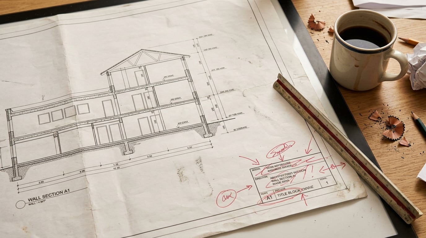
The failure points repeat across student crits, planning submissions and competition boards alike: scale bars that don't match between plan and section, a title block copied from an old template with the wrong project name still in it, orphaned white space where a caption should sit, type sizes picked by eye rather than by a system so nothing lines up column to column. None of this is a design failure. It's a craft failure, and it's entirely preventable.
The fix doesn't start in the layout software. It starts at the brief, before a single frame is placed: what does this sheet need to prove, to whom, and in how long a glance? A planning officer scanning a Design and Access Statement wants different information, in a different order, to a crit panel scanning an A1 board for thirty seconds before questions start. The rest of this article is about closing that gap, in three stages: brief clearly, iterate with intent, then set the sheet up with rules that hold across every page.
A jury judges legibility in the first five seconds and concept in the next thirty. If the sheet fails the first test, the second one never properly happens.
Briefing yourself before you brief the software

Write a one-line brief for every sheet before you open any layout tool. Who is the audience: planning officer, client, crit panel? What is the one thing they must take away? And in what order should they encounter the information? A DAS page justifying massing against a conservation area needs the policy reference before the render. A competition board selling atmosphere needs the image before the text. Decide this on paper first.
Do this properly in Documents rather than in your head. A brief that lives only as a vague intention drifts: page four of a Design and Access Statement starts contradicting page one because nobody wrote down what page one was supposed to establish. A short written brief, drafted and kept alongside the document, keeps the narrative consistent as the statement grows to twenty or thirty pages.
The model you pick for this matters more than it might seem. Claude Sonnet 5 is well suited to structured planning narrative: it holds a long, consistent argument across many pages without losing the thread between the heritage section and the access section. Claude Opus 5 is the step up for the most demanding structured reasoning, where a submission has to hold together against detailed policy scrutiny. GPT‑5.6 Terra earns its place for quicker, client-facing copy: rephrasing a project description for a brochure page, tightening an executive summary, adjusting tone for a specific client rather than a planning officer. Both are available from the same writing-model picker in Documents, so switching between "narrative" and "quick copy" mode doesn't mean switching tools.
Corb is useful here as a sounding board rather than a drafting engine. Describe the scheme in a project chat and ask it to sanity-check whether the written brief actually matches what the drawings show. It's a fast way to catch the gap between what you meant to argue and what a stranger reading the sheet would actually conclude, before that gap becomes a question from the panel.
A brief that never gets written down is a brief that drifts, sheet to sheet. Writing three lines before you open the layout tool is the cheapest hour you'll spend on the whole submission.
Iteration that narrows rather than just multiplies options
Generating fifty variations of a hero render feels like progress. It isn't, if none of them differ on purpose. Change one variable at a time in Image: material, time of day, camera height. Keep everything else fixed. That way, when you compare version three against version seven, you're actually comparing two decisions, not two accidents.
Once you've got a render you're close to committing to, use Retouch's re-light presets, Golden hour, Dusk, Blue hour, Night, Overcast, Sunny, to test how that single image reads under different conditions before it goes on the board. This is a much better use of iteration than regenerating the whole scene from scratch each time you want to check whether the entrance reads better at dusk than at midday. The geometry, the composition, the framing all stay locked. Only the light changes.
Keep a working set of three to five strong options per view, not twenty near-duplicates. The actual work of putting a sheet together is choosing, not generating, and a shortlist of five forces a decision faster than a folder of forty ever will.
Twenty near-identical renders don't give you more choice. They give you more scrolling. Five deliberately different options, varied on purpose, get chosen faster and defended better in a crit.
If you've picked the shot and the only problem is that a wide exterior has gone soft at the edges, don't re-render the whole scene. Use the Enhance area tool in Retouch to rescue just that region, re-rendered at higher resolution and composited back through the selection. It's the difference between fixing a corner of a drawing and redrawing the whole sheet because one detail bothered you.
Close every round of iteration with a decision recorded somewhere, even a single line in Documents: "Hero view: dusk, low camera, brick warmed slightly, agreed." That line stops the next sheet in the set from re-litigating an argument you already settled.
Sheet setup: the rules that make a board look considered

Start from a template, not a blank page. Layout's founding templates, including the Competition Board, the Presentation Board and the Image-led Board, come pre-populated with placeholder text and image frames only. The structural decisions, margins, frame proportions, where the title block sits, are already made. You're filling in content, not inventing a grid under deadline pressure.
Turn on the layout grid, whether Manuscript, Columns or Modular, and let every element snap to it. This is what separates a board that looks planned from one that looks assembled. Consistent margins and column widths read as discipline to a reviewer even if they never consciously notice the grid. The grid is a reference overlay only; it won't appear in the export or the shared page, so there's no cost to leaving it visible while you work.
Set type once, from the 300-family self-hosted library, and then stop touching it. Pick one display face for titles and one text face for body copy, and hold that pairing across every sheet in the set. A DAS that uses three different fonts across thirty pages looks like it was assembled by three different people, even when one person wrote every word. If your practice has its own brand typeface, upload it: brand fonts (TTF/OTF/WOFF/WOFF2, variable fonts included) can be added and used the same way as the built-in library.
| Sheet element | Rule to lock | Why it matters |
|---|---|---|
| Type | One display face, one body face, fixed sizes | Prevents the "assembled by committee" look |
| Grid | Manuscript, Columns or Modular, snapped throughout | Consistent margins read as intent, not accident |
| Scale bars & north points | Same position, same size, every sheet | Drift here is the fastest way to look unresolved |
| Export | Vector PDF, true sheet size, crop marks for print | What the reviewer sees on paper must match the screen |
Use guides and snapping, to page edges, the grid and other elements, to align scale bars, north points and title blocks across a multi-sheet set. A scale bar that shifts two millimetres between sheet three and sheet seven is invisible to you at 100% zoom and obvious to a panel looking at printed boards side by side.
When the set is heading to print, export at true sheet dimensions as a vector PDF, with crop marks if needed. This is the step that closes the loop between what you designed on screen and what the reviewer actually holds. A raster export at the wrong scale is where months of careful work on the drawings gets undone in the final ten minutes before submission.
Document sheets versus board sheets: know which one you're building
A Design and Access Statement or a portfolio is a Document: many pages, narrative-led. Pacing across pages matters as much as any single page does. You're building an argument that unfolds, so a reader who skims page six should still be able to follow the thread from page one, and the pacing of image-heavy pages against text-heavy pages needs to feel deliberate rather than exhausting.
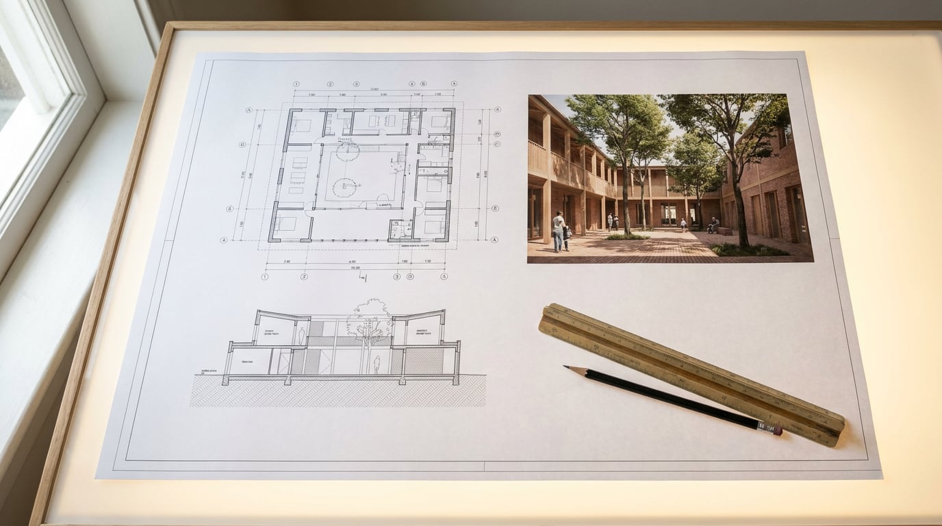
A crit board or a competition entry is a Sheet: one large A1 surface, everything visible at once. There's no page order to lean on. Hierarchy has to be set by size, position and contrast, because a viewer's eye will land wherever the biggest, boldest, most contrasted element is, whether or not that's the most important thing on the board. These are genuinely different design problems, and treating a Sheet like a shrunk-down Document (or a Document like a stretched-out Sheet) is a common source of confused layouts.
Corb works across both. Select a single text frame and ask it to fill that one frame, useful for a caption or a short project summary you don't want to draft from scratch. Or ask it to build a whole new document, page by page, from a prompt, working from one of the templates and using whichever writing model you choose, Sonnet, Opus or Fable. This is a strong way to get a first-pass structure for a Design and Access Statement, one you then edit by hand rather than one you submit unread. It gets you past the blank page; it doesn't replace your judgement about what the statement actually needs to argue.
A Sheet and a Document solve different problems. One competes for attention all at once; the other paces an argument across pages. Design the hierarchy for the one you're actually building.
Once a Document is in a reviewable state, share it as a read-only public link rather than exporting a fresh PDF every time a tutor or client wants to see progress. The link stays current as you keep editing, so there's no version confusion over which PDF is the latest one sitting in someone's inbox.
The habit that actually compounds

None of these decisions look significant in isolation. A locked type scale. A consistent margin. A one-line brief written down before the layout starts. On a single sheet, none of it is the difference between a good scheme and a bad one. Across a full portfolio, or a multi-stage planning submission with a DAS, a set of boards and a set of drawings all needing to feel like one project, it's the difference between work that reads as considered and work that reads as rushed, even when the underlying design effort was identical.
Build a personal template once, in Layout, and reuse it project to project. Set your type pairing, your grid preference, your title block position, your export settings, once, properly, and every future deadline starts from a position of discipline rather than reconstruction. The professionalism becomes automatic. You stop spending the last night before a crit fighting with margins and start spending it checking the argument instead.
Craft isn't a separate skill from design. It's the last ten percent that decides whether the first ninety percent gets seen properly.
The written brief is cheap to get right, and the visual iteration is where cost and discretion actually diverge, video renders and animated sequences carry real cost per second while a rewritten paragraph costs almost nothing, so spend your deliberate iterations on clarifying the argument and choosing between a handful of strong options, not on regenerating everything in the hope something better turns up. That asymmetry is worth building into how you work: write more drafts, generate fewer accidental options, and let the sheet rules do the rest of the work automatically.
Keep reading.
Try ArchAdemia Tools for yourself
Draw it, model it, render it, publish it. One place, built for architects and small practices. Plans from £29 a month, all in.