Building a Standout Architecture Portfolio Without Five Apps.
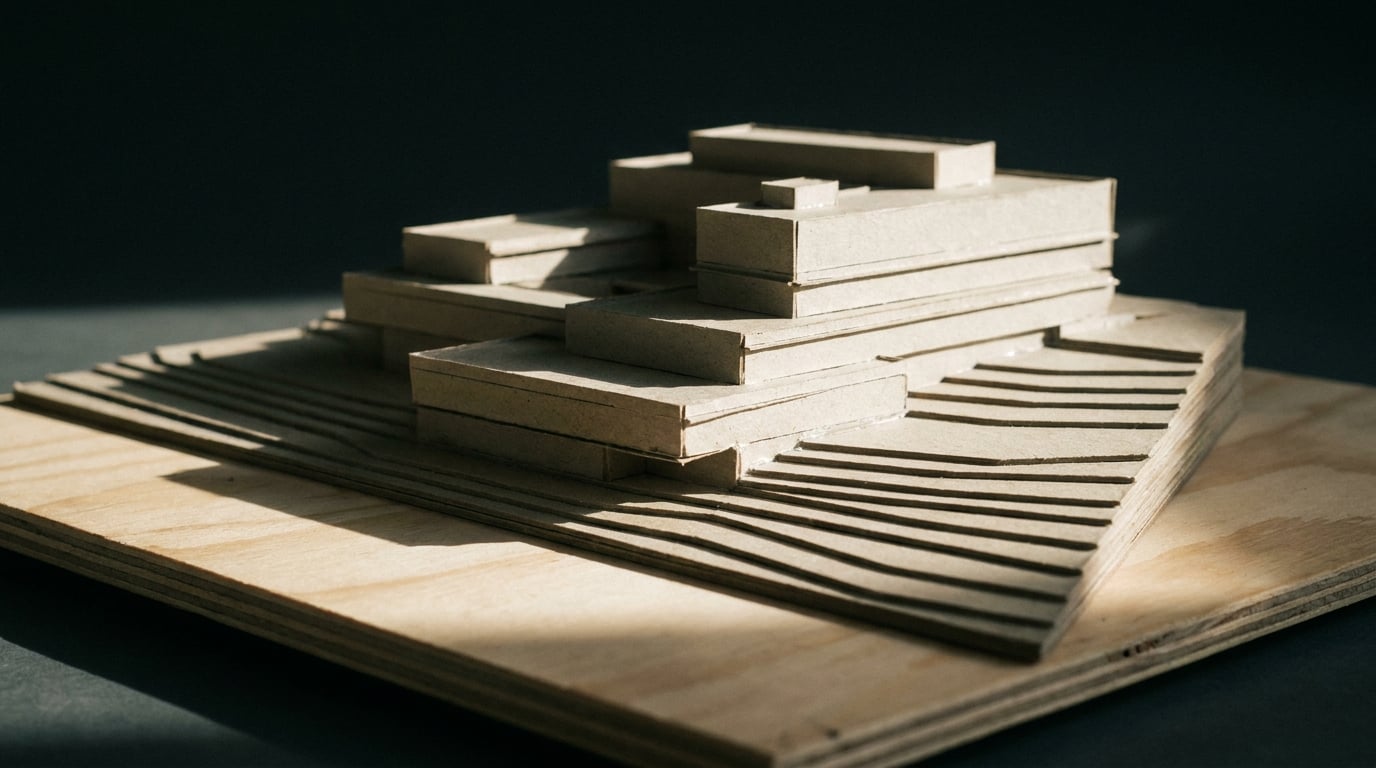
Most students stitch a portfolio together from InDesign, Photoshop, Miro and a render app. Here's how to build one crit-ready document in a single workflow instead.
Why the Five-App Portfolio Workflow Falls Apart Before the Deadline
The typical student portfolio stack looks something like this: Photoshop for image editing, InDesign for layout, a separate render engine, Miro or PowerPoint for early layout thinking, and a PDF export step that quietly breaks formatting somewhere between file four and file five. Each of those apps has its own idea of margins, its own type rendering, its own export dialogue. None of them talk to each other.
Every switch between apps is a chance to lose something. A grid that lined up in InDesign shifts by two millimetres when the render gets dropped in at a different resolution. A crit board built at A1 gets exported at the wrong page size for the A3 leave-behind version, and nobody notices until it prints wrong. Type that looked crisp in one app turns to mush after three rounds of copy-paste between programs that handle fonts differently.
Then there's version control. Five files, five separate export histories, and no single source of truth. When a tutor asks for a same-day revision to one sheet, the student has to work out which of five open documents actually holds the current version, fix it there, then re-export and re-align it against the other four. That's not designing. That's file admin dressed up as productivity.
The real cost of the five-app workflow isn't licence fees. It's the hours lost every deadline week to re-exporting, re-aligning and re-checking consistency instead of refining the actual work. Architecture school portfolio guidance is consistent on what actually gets rewarded: a concise, highly curated set of pages with a consistent visual system throughout, alongside strong process material such as sketches and study models. None of that requires five pieces of software. It requires one coherent workflow and the discipline to use it well.
Deadline chaos is usually a workflow problem wearing a design problem's clothes. Fix the pipeline and the design decisions get easier to see clearly.
One Document Model: Sheet for the Crit, Document for the Portfolio

Layout, ArchAdemia Tools' sheet and document studio, is built around one document model with two modes, which maps directly onto the two different problems students actually have. The first is the pin-up: a single big surface, A1 landscape by default, built for the crit board or the competition panel where everything needs to be legible from across the room. The second is the portfolio: a multi-page document at A3, built for a Design and Access Statement or a full body of work that a tutor or employer reads page by page.
These are genuinely different design problems. A crit board is read in seconds, from a distance, and needs one dominant hierarchy. A portfolio is read closely, page by page, and needs a consistent rhythm across many spreads. Trying to force one document to do both jobs is part of why students end up juggling apps in the first place: PowerPoint for the pin-up thinking, InDesign for the portfolio pagination, and neither one talking to the other.
Because both modes live inside the same tool, a student builds visual literacy once, in one interface, and reuses it for every deliverable across the year. The same drag-and-drop placement, the same type library, the same alignment tools apply whether it's a first-year sheet for a tutor group crit or a final portfolio going out to practices in third or fifth year.
Page presets cover the full ISO A series, plus 16:9 and 4:3 for slide-style presentations, and a custom millimetre size for the odd panel dimension a unit brief or competition brief sometimes demands. That last point matters more than it sounds: a competition that specifies a non-standard panel size shouldn't force a student into manually setting up guides in a generic app and hoping the maths holds up.
Layout carries no credit cost and sits on every plan, including the 7-day free trial. That's a genuine point in its favour for students: there's no spending decision to make before a first-year student can start building good layout habits. It's just there, from day one.
A student doesn't need five subscriptions to produce work that reads as professional. They need one layout system used consistently, and the discipline to stick to it from first year through to the final portfolio.
Getting Type and Grid Right Without Learning InDesign
Most students never get formally taught typography or grid systems. They pick it up by trial and error, usually under deadline pressure, in software that wasn't designed to teach anyone anything. Layout's type library is 300 self-hosted families across sans, serif, mono and display, all openly licensed, so the register almost every portfolio needs is already in there. A few worth knowing by name.
- IBM Plex Mono for technical annotation, dimensions and drawing labels, the kind of thing that reads as considered rather than decorative
- EB Garamond or Instrument Serif for a statement page or a written design narrative, where a portfolio needs to slow the reader down and sound like a piece of writing rather than a caption
- Space Grotesk or Archivo Narrow for section headers and project titles, giving each spread a clear entry point
- Helvetica Now, Inter or IBM Plex Sans as the workhorse body text for captions and brief project descriptions
That's the full range most portfolios ask for, without needing a font foundry's worth of choices that only invite inconsistency. Portland State's student guidance is blunt about this: use a consistent format throughout, and don't let the graphics or layout style shift page to page. Eight families, chosen with intent, does that job better than an unlimited font list ever could.
Grid discipline is the other half of the problem, and it's the part that eats an evening in generic slide software. Rulers, guides and snap-to behaviour, snapping to page edges, to guides, and to other elements on the page, replace the fiddly manual alignment that turns a simple task into a late night of nudging boxes by one pixel at a time. Align and distribute tools mean a sheet carrying floor plans, a section and a render can share one grid without the student eyeballing the gaps between them and hoping it looks even.
This is the unglamorous part of portfolio work, but it's exactly what separates a portfolio that reads as professional from one that reads as a student project. Archisoup's guidance on portfolio practicality backs this up directly: one to two drawings or images per page, with a format that stays consistent and doesn't ask the reader to recalibrate their eye on every spread.

A consistent grid isn't a style choice. It's what lets a tutor or reviewer focus on the design decisions instead of getting distracted by inconsistent margins.
From Render to Layout Without Leaving the Platform
The render-to-layout handoff is where most student workflows lose the most time, because it usually involves at least three separate pieces of software and three separate file formats: a modelling tool, a render engine, and a layout app, none of which were built to pass work between each other cleanly.
A massing model built in Linea, ArchAdemia Tools' 2D CAD surface, generates a 3D massing straight from the plan: mitred walls, punched openings at the correct sill and head height, floor slabs and glazing, all derived automatically from the drawing. That model exports as a GLB. From there it goes one of two ways depending on what the deliverable needs.
For a still image, the GLB goes into Composer, where the model can be posed, dropped onto a backdrop and rendered to a photoreal image. For something a tutor or client needs to move through rather than just look at, the same GLB goes into Linea, which drops a viewer inside the scheme at eye level for a first-person walk in any browser, with no software installed on their end.
Either output, the render or the walkthrough capture, drags straight into Layout from the gallery or the desktop. No exporting to a folder, no re-importing into a separate layout app, no hunting for where the file landed. The plan, the massing model, the render and the finished sheet all stay inside one connected chain rather than becoming three separate projects with three separate export histories to keep straight.

This matters for portfolio quality specifically because student portfolio guidance consistently asks for process to sit alongside outcome: sketches, study models, section cuts and site photos next to the final render, not instead of it. When all of that material already lives in one project space, building a spread that shows process and outcome together is a drag-and-drop exercise, not a scavenger hunt across five folders on a desktop that hasn't been tidied since October.
Exporting for Crit Day and for the Job Application
Different deliverables need different exports, and Layout covers the range a student actually encounters across a year.
| Deliverable | Export | Why |
|---|---|---|
| Quick tutor review | PNG | Fast to share, easy to open on any device |
| Portfolio submission | Multi-page PDF at true sheet dimensions | Keeps geometry and scale accurate |
| Platforms wanting individual images | ZIP of every page | One file per page, no manual splitting |
One thing worth knowing before a submission deadline, not after: the PDF places each page as a high-resolution image at exact millimetre dimensions. That keeps the geometry true to scale, which matters for anything read against a drawn dimension. But it also means the text on that page is not selectable or searchable. If a submission portal specifically expects a text-based PDF, plan around that rather than discovering it at the upload screen an hour before the deadline.
Laying a portfolio out properly is desk work, and it's worth building the habit around early. A phone or a smaller tablet does open a stripped-back version of Layout, enough to review your pages and push out a PDF the night before a deadline, so you are not locked out at the worst possible moment. The real layout work still wants a proper screen. And there's no live collaboration or shared editing yet, so for a group project portfolio, agree early on who is actually driving the layout file. One person owns the document, everyone else feeds them material. That's a much better system than five people expecting to edit the same file at once and finding out on submission morning that isn't how it works.
Know your export path before deadline week, not during it. A true-dimension PDF is exactly what most portfolio reviewers want. A searchable, text-based PDF is a different thing, and worth checking against the submission brief in advance.
What This Actually Saves a Student in Deadline Week
Strip away the feature list and the saving is straightforward: one consistent grid and type system runs across every sheet a student produces all year, rather than reconciling three different apps' competing idea of what a margin is. The render-to-layout handoff has no gap in it, because the GLB moving from Linea through Composer into Layout never leaves the same connected project.
Layout itself costs nothing beyond the plan a student is already on, free on the trial and free on every paid tier alongside it. That means whatever budget a student does spend goes toward image or 3D generation credits for the work that actually needs generating, rather than toward a second design app subscription just to lay pages out.
None of this replaces design judgement. A tight grid doesn't make a weak scheme stronger, and no software substitutes for editing a portfolio down to the strongest work and cutting the rest, which is the advice every serious portfolio guide converges on regardless of school or country. What a connected workflow does is remove the noise around that judgement, so the hours in deadline week go toward deciding which drawing earns its place on the page, not toward working out why the render came out at the wrong resolution for the third time.
A portfolio that looks considered usually is one, and it got that way because the workflow behind it was considered too, not because five separate tools happened to line up correctly on the night before submission.
That's the actual takeaway for anyone building a portfolio under deadline pressure: the software choice isn't the creative decision, but it decides how much time is left for the creative decisions that matter. Spend the time on the work. Let the layout system take care of itself.
Keep reading.
Try ArchAdemia Tools for yourself
Draw it, model it, render it, publish it. One place, built for architects and small practices. Plans from £29 a month, all in.