One Thesis, One Platform: Killing the Five-App Workflow.
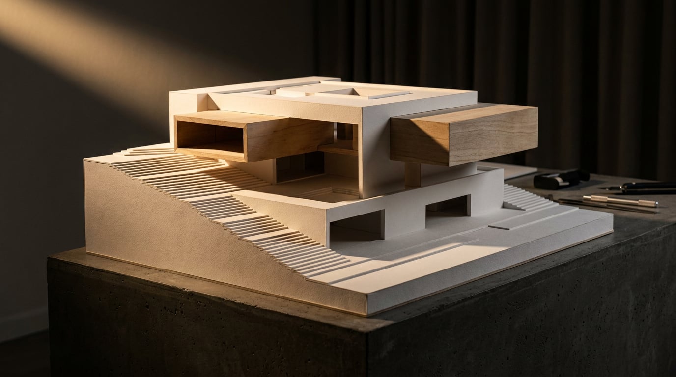
Renders in one app, diagrams in another, the DAS in a third. Here's how to build a full thesis presentation without the file-juggling.
Why the five-app thesis workflow breaks down at the worst moment
The standard thesis stack looks something like this: SketchUp or Revit for the model, a separate renderer, Photoshop for post-production, InDesign for layout, PowerPoint for the crit deck itself. Four programs, four file formats, four places where something can quietly go wrong.
Every export in that chain is a version fork. Change the massing in week two, and the render, the Photoshop composite, the InDesign board and the PowerPoint slide all become stale at once, without telling you. Nothing flags it. You find out in week eleven when you open the board and the render still shows the old roofline.
Final-week crit prep is where this actually bites. It stops being design time and becomes file management: re-exporting a render because a wall moved 200mm, relinking an image in InDesign because the file path changed when you moved folders, discovering the section you cut in SketchUp doesn't match the plan you cut separately because you built them as two different exports. None of this is design thinking. It's overhead, and it lands in exactly the week you have none to spare.
The real cost is hours: relinking images that moved, fonts that don't travel between your laptop and the print shop's machine, page sizes that were A3 in InDesign and print as A4 because a preset changed. None of it is dramatic on its own. All of it adds up to the last 48 hours before a crit being spent on plumbing instead of argument.
The fix isn't a single miracle app that does everything badly. It's consolidating the handoffs: keeping the model, the renders, the fixes and the final document inside one project, so a change in one place is a change everywhere, not a five-step relay.
The five-app workflow doesn't fail because any one tool is bad. It fails at the seams, where a changed file has to be manually carried from one program to the next.
Start in Linea: one model that feeds the plan, the section and the render

Linea draws the 2D plan and the 3D model together, so you're not modelling the scheme twice: once loosely for the drawings, once properly for the renders. It's browser-based, and it's a credible alternative to SketchUp or AutoCAD for the kind of everyday drawing and modelling a thesis actually needs.
Use Massing to block out the scheme fast. Place footprints, push them into solids, drag an edge up to pitch a roof, punch openings on a face. This is the stage where you're testing whether the idea holds at all, and you don't want to be modelling doors and window frames while you're still deciding whether the building should be one volume or three.
Once the concept survives that scrutiny, switch to Build for real walls, doors and windows. It's the same model, the same file, no import step between the two.
Because the plan and the model are the same drawing, sections and elevations cut straight out as real linework, issued on a sheet the way a plan would be. No exporting to a renderer to get a section look; no redrawing a section in a separate 2D package because the 3D export came out wrong. If the massing shifts, the section updates because it's cut from the same geometry, not traced from a snapshot of it. You can also save a walk-through eye-height view mid-crit-prep, so the angle you pitch from matches the angle in your render exactly. No more guessing at camera height in a separate renderer and hoping it reads the way you remember standing in the model.
When a perspective view is ready, it goes straight into the rendering studio. No export, no re-import, no scale drift between what you modelled and what gets rendered.
One model feeding the plan, section, elevation and render eliminates the single biggest source of late-stage errors: a drawing set that no longer agrees with itself.
Render without leaving the project: Shoot and Corb's design read
ArchAdemia says Shoot generates a full set of camera angles for a scheme, with exterior and interior views handled separately. For a thesis, a complete set of stills can be the finished outcome. There's no obligation to animate anything unless the project genuinely needs to communicate movement through a space, and for most thesis submissions, a still that holds a clear camera position, material read and spatial relationship is more defensible in a crit than a generated clip that might introduce a continuity error a panel member will spot in the first five seconds.
Before you spend render credits on a scheme that isn't resolved, there's a cheaper check available. On Canvas, ArchAdemia says Corb can read an untextured Linea or SketchUp massing shot against your project brief and comment on the design read: footprint, roof form, entrance sequence, how the building meets the ground. This is useful precisely because it's cheap and early. You're not asking for a finished render to find out the entrance doesn't work; you're asking a massing screenshot.
Corb has real limits, and they matter for a thesis specifically. He never rules on compliance and he never invents a dimension your project notes don't already contain. He'll name a planning or accessibility issue and say why it matters and who actually decides it, but he won't tell you the scheme complies or doesn't. Use him to pressure-test the design read before you commit to a full render set, not as a substitute for your tutor's sign-off.
| Discipline | What the still-first approach tests |
|---|---|
| Landscape architecture thesis | Ground-plane treatment and planting atmosphere across seasons |
| Interior design thesis | Material palette comparisons in the same space, side by side |
| Urban design thesis | Pedestrian sequence and street-level activation at key nodes |
| Conservation thesis | Lighting studies without implying a historical record that doesn't exist |
A finished set of stills is a complete deliverable. Motion is optional communication, not the default outcome of a rendering pass.
Fix and finesse in Retouch instead of round-tripping to Photoshop

The old workflow sends a render out to Photoshop, and from that point on the render and the source model are two unrelated files. Retouch keeps the edit on the actual render, inside the same project, and does it non-destructively: a mask paired with generative fill lands on a real new layer, nothing baked into the base image. That matters for a thesis crit specifically, because you'll get asked to justify a material choice or a lighting decision on the spot, and being able to toggle a layer off in front of a panel is a far stronger position than saying "that's just how it rendered."
If a wide render has gone soft or repetitive in one patch, Enhance area re-renders that region at higher resolution without needing a new prompt. It composites straight back into the same document.
Material swap lets you test a facade finish against a reference image, as a layer you can toggle on or off. If a crit panel questions whether brick or render is the right call for your scheme, you can show both without leaving the room.
Six one-click re-light presets, including Golden hour, Dusk and Overcast, let you show the same scheme in different conditions without re-rendering from scratch. That's a genuinely useful move for a thesis appendix: the same view at three times of day says something about how the design responds to light, and it costs a preset click rather than three separate render runs.
Twelve blend modes and adjustment layers sit on top of all this, and because nothing is flattened until export, the grade on your hero image stays editable right up to the night before submission.
Build the actual submission in Layout: DAS, portfolio and crit board from one document model
Layout runs on two modes over a single document model. Document mode, at A3, is where the written thesis or the Design and Access Statement lives, paginated like a report. Sheet mode is a single large surface, A1 landscape by default, for the crit board or the competition panel. Both modes sit inside the same document, so there's no switching tools to move between the written statement and the visual board.
Founding templates give you a structured start rather than a blank page: Design and Access Statement, Portfolio, Presentation Board and Competition Board are among the seven on offer, pre-populated with placeholder text and image frames. That's a meaningfully different starting point than opening a blank A1 canvas at 11pm.
Renders drag straight in from your gallery. No re-export from Retouch, no resolution loss from repeated saving and reopening in different programs, which is exactly how a hero image quietly degrades over a few weeks of thesis production.
A Pen tool draws diagram lines and arrows directly on the board, with arrowhead presets at each end, so annotation happens where the drawing already lives rather than in a separate diagramming app that then has to be exported back in as a flat image.
When it's time to submit, export as a true-scale vector PDF, with optional bleed and crop marks if it's going to print. If the review is remote, share a read-only link instead, one that stays current if you edit the document afterwards.
A Design and Access Statement and a crit board are the same underlying document. Update a render once, and it's current in both, not just the one you remembered to fix.
The workflow end to end: what actually stays in one place

Model and drawings in Linea. Renders in Shoot. Fixes in Retouch. Submission in Layout. One project, four surfaces, and no export step required to move between them.
Set against the five-app version, the difference is in what happens when something changes. In the old workflow, a changed render means re-exporting from the renderer, replacing the file in Photoshop, re-exporting from Photoshop, relinking in InDesign, and re-pasting into PowerPoint. Five manual steps for one edit. In a consolidated project, a changed render updates wherever it's placed, because it never left the project to begin with.
What that buys you in the final week is time spent on the argument rather than the plumbing: refining the DAS narrative, sharpening which views actually earn their place on the board, deciding whether the section or the axonometric tells the story better. Not re-linking images, not chasing a font that didn't travel, not discovering the page size in the print-ready PDF doesn't match what the print shop expects.
A closing note on scope, because it matters: this replaces the export chain, not the thinking. Consolidating tools doesn't make a weak concept stronger, and it doesn't write the argument in your Design and Access Statement for you. The thesis still has to be good. What a single project buys you is the certainty that when it's good, the drawing set, the renders and the board all agree with each other, and none of your crit-week hours went missing to a broken link.
Consolidation doesn't do the design work. It removes the tax you were paying just to keep four separate files telling the same story.
Takeaway: the five-app thesis workflow doesn't cost you at the start, when everything's fresh and files are new. It costs you at the end, in the week you have the least time to lose. Keeping the model, the render, the edit and the final document in one project turns that final week back into design time.
Keep reading.
Try ArchAdemia Tools for yourself
Draw it, model it, render it, publish it. One place, built for architects and small practices. Plans from £29 a month, all in.