How to Blend a Photomontage Render Into a Real Site Photo.
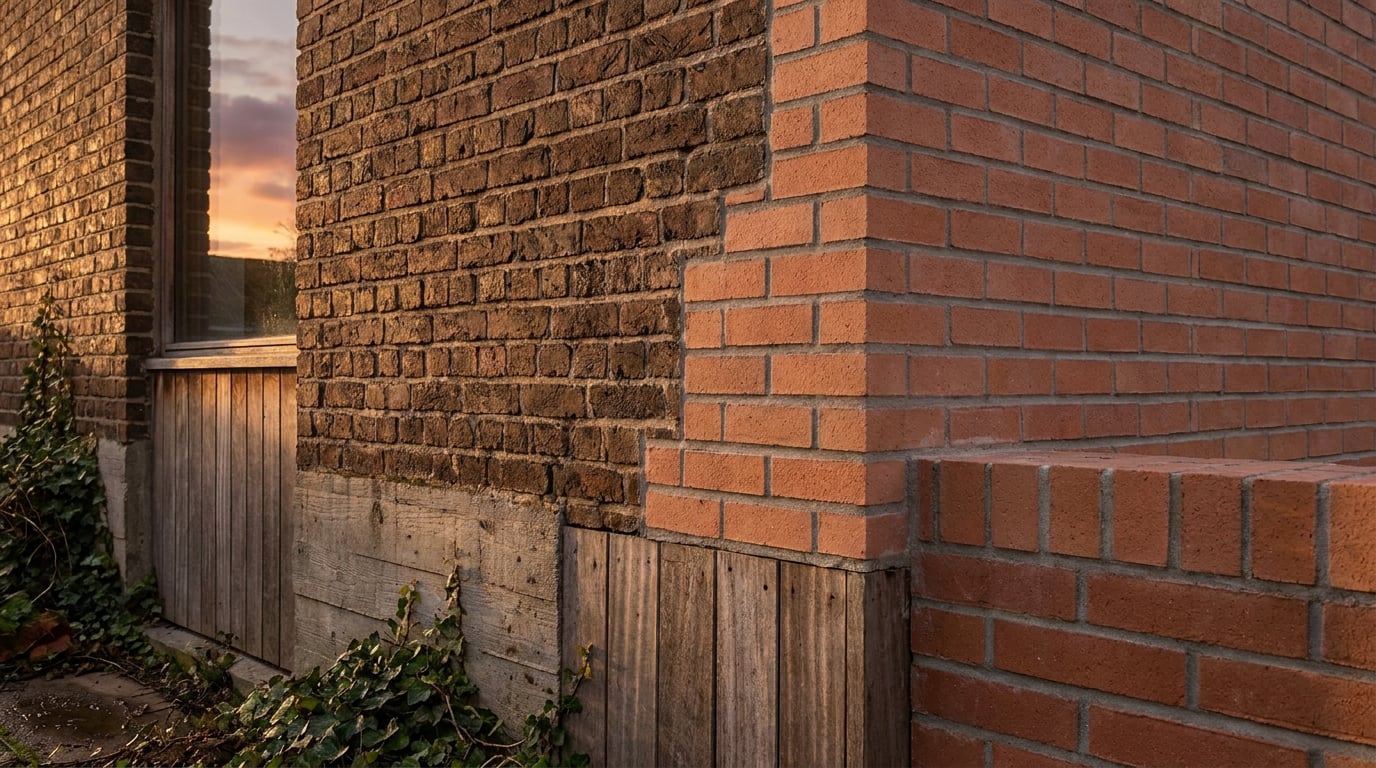
A convincing photomontage lives or dies on ten details most architects skip. Here's the sequence that actually holds up under client scrutiny.
Why most photomontages read as fake in the first second
A bad photomontage doesn't fail because the model is weak. It fails because something in the composite disagrees with the photograph it's sitting inside. The shadow falls the wrong way. The lens compresses the street differently to the camera that took the site photo. The render is spotlessly clean against a slightly noisy phone shot. None of these are modelling problems. They're compositing problems, and they're the reason a technically accurate building can still look pasted on.
This matters because the people judging your montage aren't trained in CGI. A planning officer or a client doesn't know what a vanishing point is, but they've spent a lifetime looking at real light hitting real surfaces. That instinct catches wrong shadow direction faster than any technical critique would. You don't need to explain why a montage looks off. People just feel it.
Before any compositing starts, run five checks against the site photograph:
- Camera match: does the render's camera height and position correspond to where the photo was actually taken?
- Horizon line: does it sit at the same height in both images?
- Light direction: does the sun in the render fall the same way as the shadows already visible in the photo?
- Focal length: does the render's perspective compression match the lens used for the photo?
- Ground plane contact: does the new building actually touch the ground, or does it float half a pixel above it?
Get these five right and the render is already most of the way to convincing, regardless of material quality. Get any one wrong and no amount of post-production rescues it.
The tell isn't the model, it's the mismatch. Photomontage is a camera-matching and post-production discipline first, and a rendering exercise second.
Matching the render to the photo before you composite anything

The single biggest mistake in photomontage work is trying to fix camera alignment in Photoshop after the render is out. By that point you're fighting perspective with warp tools and hoping nobody looks too closely at the roofline. It's much faster, and far more convincing, to solve the camera problem before you ever hit render.
Start with the site photo itself. Its EXIF data, or a physical site survey if you have one, tells you the focal length the photo was taken with and roughly where the camera stood. Bring that information into your modelling environment and set your render camera to match: same focal length, same height off the ground, same standing position relative to the building line. If you're working in Linea, this is exactly the kind of setup worth doing at the viewport stage, placing the scheme on its real location with the ground and surrounding context in view, so the perspective you're building towards from the very first camera placement is the one the final photomontage needs.
Once the focal length and height are set, place the model against the photo as a background plate inside the 3D viewport and align the horizon line and vanishing points by eye, in 3D, not later in a 2D editor. A vanishing point that's a few degrees off in the model will never look right no matter how it's nudged in post. Fix it where the geometry actually lives.
Sun position deserves the same discipline. Rather than guessing where the light should fall, pull the date, time and location from the photo and set your render sun to match. This single move fixes both shadow direction and shadow length at once, and it's far more reliable than eyeballing a shadow angle and hoping.
Finally, export at the same resolution and aspect ratio as the source photo. Cropping a render after the fact changes the relationship between its vanishing points and the photo's, even if the crop looks harmless. If the photo is 4:3, render 4:3. If it's a wide site panorama, match that ratio exactly.
Camera matching happens in the 3D viewport, not in the editor. Every correction made after export is a compromise; every correction made before it is free.
Compositing the render into the photo in Retouch

With the camera and light matched, the actual compositing is where the montage gets built or broken. In Retouch, bring the render in as a layer sitting over the site photo and use non-destructive masking to cut it into the scene. Working non-destructively matters here specifically because photomontage decisions get revisited constantly: a planning officer asks for a different tree to stay visible, a client wants the massing pulled back from a boundary, and you don't want to have flattened your compositing choices before you know what's going to change.
The edges are where most montages fall apart. A hard-clipped mask around a building against a tree canopy or a parked car reads as exactly that: a cut-out. Instead, use mask and prompt generative fill to extend or clean up those edges, letting foliage overlap the new facade or letting a bit of existing pavement texture bridge the join, rather than drawing a clean vector line between old and new. The join should be ambiguous, not precise.
Once the render is sitting in the scene, run the 8-slider Adjust panel to bring its exposure, contrast and colour temperature into line with the photograph before touching anything else. A render that's colour-graded to its own internal logic will almost never match a photograph shot under real, slightly inconsistent daylight. Match the render to the photo's tonal range, not the other way round.
Last, and easy to forget: keep foreground elements from the original photograph in front of the new building. A bollard, a street tree, a parked van, a bin store. Anything in the original photo that sits between the camera and where the new building will stand should stay exactly where it was, occluding part of the new geometry. Nothing sells depth and physical presence in a scene faster than an existing object correctly overlapping the new one.
Generative fill at the mask edge does the job a hard clip never can: it removes the seam instead of hiding it.
The details that sell realism: grain, reflection, atmosphere

Once the big structural pieces are right, camera, light, ground contact, the remaining gap between a good montage and a great one comes down to small physical details that most viewers never consciously notice but always subconsciously register.
Grain and noise are the first giveaway. A pristine, denoised render dropped into a slightly grainy phone photograph or a photo shot in low light will look razor sharp in exactly the way nothing in the real world is. Match the render's noise level to the photo's, even if that means deliberately adding grain back into a clean output.
Contact shadows and ambient occlusion at the ground line are non-negotiable. This is the single most common failure in amateur photomontage work: a building that's otherwise well matched but appears to hover slightly above the pavement because there's no soft shadow gathering where the two surfaces meet. Add a tight, dark contact shadow directly under the building line, distinct from the longer cast shadow running away from the sun. Buildings that touch the ground have both.
Colour bounce is subtler but just as important. A real building picks up reflected colour from its surroundings: green from adjacent foliage, warm brick tones from a neighbouring facade, blue-grey from an overcast sky. Sample colour from the existing photo and bleed a touch of it into the render's material tones, and do the reverse too, letting a little of the new building's material colour tint the pavement or the glass of a neighbouring shopfront it would realistically reflect in.
Finally, soften any remaining hard edges with atmospheric haze or a touch of depth of field matched to the photo's own focus falloff. A photograph taken with a real lens has a specific way that distance softens detail. A CGI render usually doesn't, by default, and that crispness at long range is another quiet tell.
Shadows are never pure black. Sample the shadow colour directly from the photograph and match your render's shadow tones to it before adjusting anything else.
Building this into a planning or client submission
A photomontage produced for a Design and Access Statement has a job beyond looking convincing: it needs to demonstrate, clearly and honestly, what will change. That means showing the existing view and the proposed view side by side, framed identically, taken from the same camera position, at the same focal length, under comparable light. Anything less makes the comparison harder to trust, and planning officers are specifically looking for that trust.
Once your montages are finished, lay them into Layout using the Document mode and the Design and Access Statement template. Keep page dimensions and caption placement consistent across every viewpoint in the statement; a reader flicking between pages should never have to re-orient themselves because the layout shifted. The same document mode handles the paired existing-and-proposed layout cleanly at A3, with the montage large enough to read the detail that actually matters, roofline, massing, material tone.
For client-facing work rather than statutory submission, switch modes. Use Sheet mode at A1, or the Client Deck template, to present the montage full-bleed with minimal competing text. A client reviewing a montage on screen or in a room wants to look at the building in its context, not read a paragraph of justification alongside it. Save the argument for the statement; save the image for the deck.
Keep a locked, uncropped version of every finished montage on file regardless of which mode it ends up in. Planning officers occasionally ask to see the unedited comparison, and having the original camera-matched frame ready, with nothing cropped or repositioned since export, avoids any suggestion that the framing was chosen to flatter the proposal.
A montage built for a statement and a montage built for a client deck are the same image doing two different jobs. Layout's Document and Sheet modes exist precisely so you don't have to rebuild it twice.
The takeaway
A convincing photomontage is decided long before the final Retouch layer goes down. It's decided the moment you set the render camera's focal length to match the photo, the moment you pull the sun position from the timestamp instead of guessing, and the moment you decide the aspect ratio before export rather than cropping afterwards. Everything that follows, grain matching, contact shadows, colour bounce, is refinement on top of a foundation that was either solid or wasn't.
Treat the render as a plate to be matched, not a finished image waiting to be dropped in. Match the camera, match the light, then let the compositing tools do what they're good at: blending the seam until there isn't one.
Keep reading.


Try ArchAdemia Tools for yourself
Draw it, model it, render it, publish it. One place, built for architects and small practices. Plans from £29 a month, all in.