Composition Rules for Architectural Renders That Actually Work.
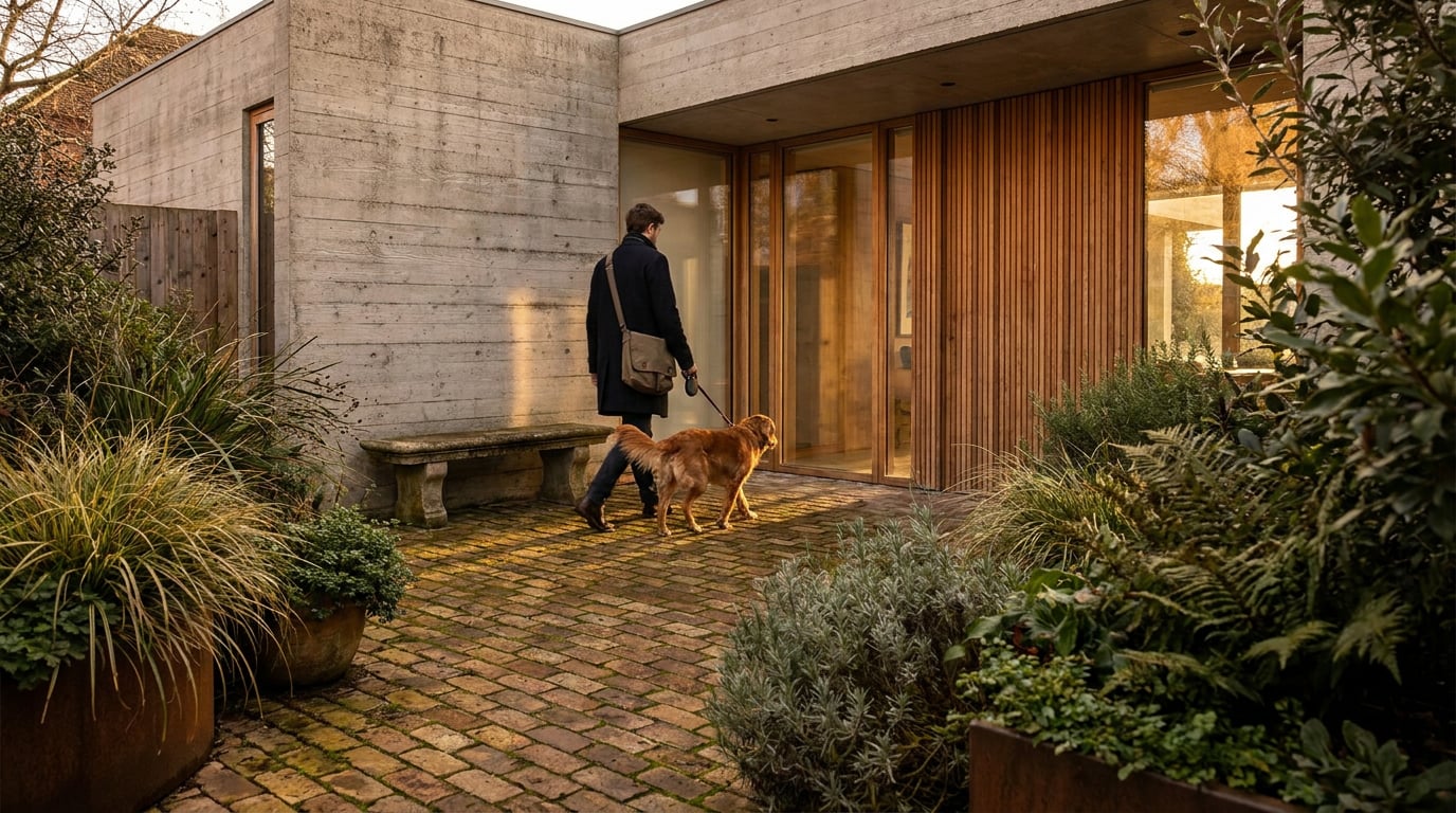
Eye level, framing and the rule of thirds decide whether a render reads as a place or a picture. Here's how to use all three on purpose.
Why composition is doing more work than your lighting setup
A reviewer reads composition before they read anything else. Before a planning officer notices the brick specification or a crit panel registers the roof detail, they have already absorbed where the camera stands, what fills the frame, and what the image is asking them to look at. That reading happens in under a second, and it happens whether or not you designed for it.
This is why a technically flawless render with weak framing still feels generic, and a modest render with strong composition reads as considered. Lighting and materiality convince a viewer the building is real. Composition convinces them the building is understood, by you, before they've read a word of the accompanying text.
Eye level, framing and the rule of thirds aren't camera tricks bolted on after modelling finishes. They're design decisions that communicate how a building wants to be experienced: approached at street level, surveyed from above, or studied in close-up detail. Treat them as tools you choose deliberately for a planning visual, a competition board or a client hero shot, not defaults you accept because that's where the camera preset happened to land.
Composition decides what a reviewer understands first. Get it wrong and no amount of lighting work will save the image.
Eye level: the single decision that changes what a building says

Standing eye level, roughly 1.5 to 1.7 metres, is the strongest default for street-level views, entrance sequences and interior shots. It reads as human and approachable because it matches how a person actually experiences the threshold of a building. This is the viewpoint a Design and Access Statement wants for its key entrance and street-scene visuals: credible, walkable, honest about scale.
A raised or aerial eye level tells a different story. Use it when the relationship to site is what needs explaining, a masterplan, a landscape strategy, the way a scheme sits against neighbouring plots. An elevated camera is the right choice for showing how a new block negotiates its street frontage or how a housing scheme's shared gardens knit into the wider block. It's the wrong choice for selling atmosphere, because nobody experiences a building from 40 metres up.
A lowered eye level, closer to child height or skimming the ground plane, exaggerates scale and drama. It's a legitimate move for a competition hero image where the job is to make a panel stop scrolling. It's the wrong move for a planning committee, who need a legible, honest view they can trust, not a heroic angle that flatters proportions they'll later question on site.
Match eye level to the document it lives in before you match it to the building. A Design and Access Statement and a portfolio board are asking for different things from the same scene, and the same render rarely serves both well.
| Eye level | Reads as | Best suited to |
|---|---|---|
| Standing (1.5–1.7m) | Human, walkable, credible | DAS entrance views, interiors, street scenes |
| Raised / aerial | Context, masterplan, relationships | Site strategy, landscape, urban context |
| Lowered / ground-skimming | Dramatic, monumental | Competition hero shots, crit boards |
It's worth testing the same scene at two or three eye levels before committing to a full render pass. In Composer, you can pose a scene and adjust camera height directly against the model, checking how the composition shifts, before spending credits on a render you might not use. Posing and testing here is faster than re-rendering blind and hoping the second attempt reads better than the first.
A Design and Access Statement wants credible, walkable viewpoints. A portfolio or crit board can take more editorial risk. Decide which document you're serving before you set the camera.
Framing: what you crop out matters as much as what you keep
Tight framing on a facade detail, a material junction, an entrance canopy, a window reveal, tells the reviewer this is the part worth studying. Wide framing tells them to read the whole composition instead. Neither is more correct. They're different instructions to the eye, and confusing them is one of the most common composition mistakes in a render set.
A close crop on where a stone plinth meets a timber-clad upper storey says: look at this junction, we've resolved it. A wide shot of the same building's full elevation says: judge the massing, the proportions, the relationship to the street. If your Design and Access Statement needs both arguments made, it needs both framings, not one image doing double duty badly.
Foreground framing devices add depth and stop a render looking like a cut-out floating on a blank site. A tree branch crossing the top of frame, a neighbouring wall at the edge, the underside of a canopy, these all give the eye a sense of layering: foreground, midground, background. Pull entourage from the actual context where possible rather than generic stock trees that don't match the site's planting palette. A render for a conservation-area infill reads more credibly with foliage that matches what's actually on the street.

Negative space, sky, ground plane, water, gives the eye somewhere to rest and gives a presentation board somewhere to breathe. This matters more than it sounds. An image with no negative space fights the caption, the north point and the scale bar for every millimetre of the sheet. An image with generous sky or foreground gives a layout designer room to place text without covering the building.
There's a failure mode at both ends of this scale. Crop too tight on a full elevation and you remove the context a planning officer needs to judge the scheme against its neighbours, undermining the very case the statement is trying to make. Crop too wide and you dilute the architectural idea a crit panel is meant to focus on, burying the detail that actually earns the mark.
Build a few framings of the same scene before locking one in for the final sheet. Composer lets you test compositions against a modelled or Worlds backdrop before committing to a full render, and Linea lets you walk a scheme at eye level to find framings you wouldn't have thought to set up manually. Framing decisions are cheap to test early and expensive to redo once a layout has been built around the wrong crop.
Tight framing says "study this detail." Wide framing says "judge the whole." Decide which argument the image needs to make before you set the crop.
The rule of thirds: useful shorthand, not a substitute for judgement
Placing a building's dominant vertical, a corner, a tower, a stair core, on a third line rather than dead centre gives a composition tension that a symmetrical crop doesn't. It's the reason an off-centre hero shot of an asymmetric scheme often feels more dynamic than the "correct" straight-on version. The eye has somewhere to travel across the frame instead of landing once and stopping.
Horizon and ground-plane placement matters too. Keeping the ground line on the lower third keeps attention on the building mass, which is usually what you want for a hero elevation. Pushing the horizon higher, giving more of the frame to sky, emphasises setting and skyline, useful when the roofscape or the silhouette against the sky is genuinely the point of the scheme, less useful when it just leaves an awkward band of empty sky above a building nobody asked to see more sky above.
But thirds are a starting grid, not a rule to force onto every scene. A genuinely symmetrical building, a formal civic entrance, a classical facade, an axial masterplan approach, often wants a centred composition. Thirds would actually undermine the architectural intent here: the whole point of a symmetrical civic frontage is the order and balance of a centred view, and nudging the camera off-axis to satisfy a compositional rule works against the building rather than for it.
Thirds suit asymmetry and tension. Symmetry wants the centre. Match the grid to the building's own logic, not the other way round.
This is where composition has to answer to the architecture rather than to a preset. A render of an axial civic building, forced onto a thirds grid because that's the habit, will always look slightly wrong to anyone who understands why the building was designed the way it was. Judgement beats shorthand here, every time.
Thirds are also useful for placing entourage, not just the building itself. A figure positioned on a third line reads as observed, caught mid-stride, part of the life of the place. A figure placed dead centre reads as staged, planted there to prove scale rather than to suggest use. If a render needs a human figure to establish scale credibly for a planning submission, where it stands in the frame changes whether that figure feels incidental or artificial.
When placing a finished render onto a sheet, Layout's toggleable layout grid, in Manuscript, Columns or Modular form, gives you a way to check that the image's internal composition and the page's own grid are actually talking to each other. A render composed with its subject on an internal third can still fight a page grid that puts margins and text blocks somewhere unhelpful. Checking both together, rather than trusting the render in isolation, catches that clash before it's locked into a PDF.
Composing for the sheet, not just the frame

A render composed in isolation often fights the page once it lands in a Design and Access Statement or a competition board. Framing that looked balanced full-screen on a monitor can suddenly feel cramped once a caption, a north point or a scale bar needs to sit somewhere within it. Leave headroom or footroom deliberately if you know a layout will need to place text over or beside the image.
The most reliable way to catch this is to drop the same render into both a Sheet and a Document in Layout before finalising the crop. A Sheet is one large surface, A1 landscape by default, the format for a crit board, a competition panel, a pin-up. A Document runs many pages at A3, the format for a Design and Access Statement, a portfolio, a project report. The same image, the same eye level, the same framing, can read as generous at A1 and cramped at A3, or the reverse. Seeing both before you finalise saves a re-render later.
Coordinating composition across a set matters as much as getting any single image right. If every hero image on a Portfolio template uses a similar eye level and a similar thirds placement, the set reads as authored, as a body of work with a considered point of view. If eye levels jump from ground-skimming to aerial to standing height with no logic between them, the set reads as assembled from whatever renders happened to exist, even if each individual image is strong.
The cheapest place to test all of this is before the render pass, not after. Testing eye level and framing directly in Composer, or against a Worlds backdrop, lets you lock a composition with confidence before committing credits to a full photorealistic render. Adjustments made after the fact, once a render is finished and placed on a sheet, cost time and credits that a few minutes of composition testing upfront would have saved.
Composition decisions are the cheapest thing to get right early and the most expensive thing to fix late.
Takeaway: Eye level, framing and the rule of thirds are not finishing touches, they're the argument the image is making before anyone reads the drawings behind it. Choose eye level to match the document, not the mood. Choose framing to match the question the reviewer is meant to ask. Use thirds where the building's own geometry wants tension, and abandon them where it wants order. Test all three before you commit to a full render, and check the result against the actual sheet it will live on. A render that's composed for its audience will always outperform one that's simply well lit.
Keep reading.


Try ArchAdemia Tools for yourself
Draw it, model it, render it, publish it. One place, built for architects and small practices. Plans from £29 a month, all in.