How to Design a Crit Board That Reads From the Back Row.
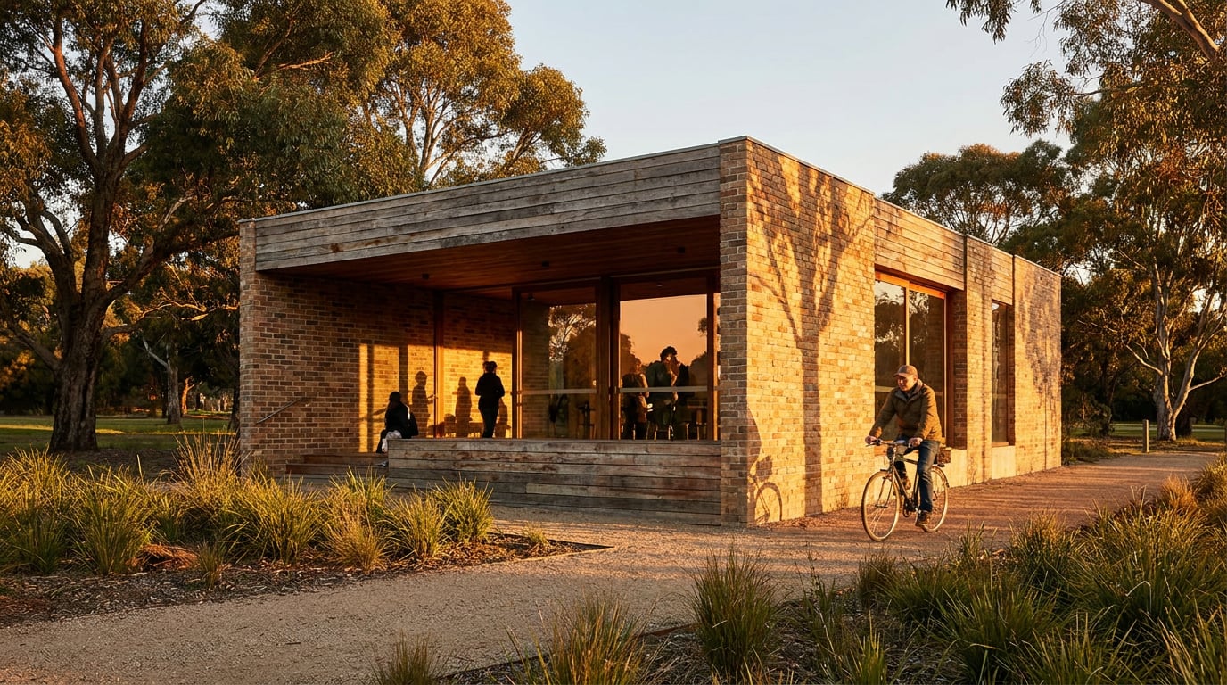
Most crit boards fail at three metres, not thirty centimetres. Here's how to design one that holds up under real pin-up conditions.
Why Your Screen Lies to You About Legibility
Most crit boards are designed at 50 to 70 centimetres from a monitor and judged from 3 to 5 metres in a studio, a corridor, or a hired-out gallery space. That gap is the single biggest reason boards fail. A caption that sits comfortably at 100% zoom on your laptop is, at pin-up distance, the visual equivalent of asking a juror to read 2 to 3 point type from across the room. It doesn't matter how good the idea is if nobody past the second row can see it.
Environmental graphic design and signage guidance gives a useful anchor here, even though it wasn't written for architecture juries. As a rule of thumb, headings intended to be read at 3 to 4 metres need roughly 25 to 30mm cap height. Text at 10 to 15mm reads fine at 1 to 2 metres, but drops out entirely once you're standing at the back of a crit room. Translate that to an A1 sheet and it means your project title needs to be genuinely large, not "large for a monitor". What looks oversized on your screen is very often just correct on paper.
There's no rigorous, published study measuring exactly how architecture crit boards perform at distance. What exists is signage research, print design convention, and the accumulated instinct of studio culture. So treat the numbers above as a starting point, not gospel, and do the one thing that actually settles the argument: print a test crop of your title and one key image at true scale, pin it up, and walk backwards until it either holds or doesn't. Do this before you commit to the full sheet, not after you've already built the whole board around type sizes that felt right on a screen.
If you can't read your own title from across the room you're standing in right now, it will fail at the back of the crit.

One Idea Per Board, Ruthlessly Enforced
A board trying to answer five questions at once answers none of them from six feet away. This is the same lesson design crit culture in UX and product teams has learned the hard way: a review works when it's framed around one clear question, not a grab-bag of every concern the designer has ever had about the project. Time-boxing forces focus. A crit board needs the same discipline, because a juror standing at distance doesn't get the luxury of lingering over eight competing diagrams to work out which one matters.
Architecture jury guidance says much the same thing in different language: decide up front whether the board is telling the story of your explorations or presenting your final outcome, and then commit. Trying to do both dilutes the message. Every drawing you add that doesn't change a juror's understanding of the scheme is a drawing competing for attention against the one that actually does.
Practically, this means being willing to cut a floor plan that's technically correct but adds nothing new, or a materials diagram that repeats what the section already shows. Pick the single image or diagram that carries the argument. Everything else on the sheet should support that image, not compete with it.
Layout's Sheet mode is built around exactly this discipline. It defaults to A1 landscape: one large continuous surface, not a slide deck squeezed awkwardly onto a page. There's no instinct to fill four quadrants with four equally-weighted panels because the format itself is one big canvas asking for one big idea.
A crit board answering five questions from six feet away answers none of them. Pick one argument and build the whole sheet around it.
Hierarchy That Works Without Colour or Proximity
Back-of-room legibility comes from scale contrast and weight, not colour. Studio lighting is inconsistent at the best of times, and colour differences that read clearly on a calibrated monitor flatten out under harsh strip lighting or dim corridor bulbs. Design-system guidance is consistent on this point: build hierarchy through scale, weight and spacing first, and treat colour as a bonus layer rather than the mechanism doing the actual work. It's also the more accessible approach, since relying on colour alone excludes colour-blind readers and anyone viewing the board in poor light.
Set a strict type scale before you touch layout: one size for the project title, one size for section headers, one size for captions, and nothing in between. Three sizes, used consistently, will always read more clearly than five sizes used loosely. Jurors scanning a board from distance are pattern-matching on scale jumps, not reading every word, so the jumps need to be decisive.
Layout's eight-family type library, which includes Helvetica Now, IBM Plex Sans and Archivo Narrow, gives enough weight range within a single family to build that hierarchy without switching typefaces. Mixing three typefaces on one board reads as noise from three metres away; mixing three weights of one typeface reads as structure. If you need to check alignment while you're building, the toggleable layout grid (Manuscript, Columns or Modular) keeps everything honest without cluttering the final export. It's a reference overlay only, so it never appears on the printed sheet or the shared page.
Hierarchy that survives bad lighting is built from scale and weight, not colour. Colour is the first thing a dim room takes away from you.
Choosing and Cropping Images for Distance, Not Detail
A hero render packed with fine material detail, careful reflections and subtle tonal gradation reads as a flat grey smudge at three metres. This is the opposite of how most students choose their lead image, because on a monitor that same render looks impressive precisely because of the detail. Detail is a screen virtue. At distance, what actually reads is silhouette and tonal contrast: a strong dark-against-light shape, a clear horizon line, an obvious figure-ground relationship between building and sky or building and ground.
Jury guidance for architecture presentations makes a related point: have at least one piece of material that captures the essence of the concept on its own, whether that's a process sketch, a diagram, or a single evocative image. The moment a juror gets it, they stop trying to decode the scheme and start critically engaging with it. That's the job of your hero image, and it's a completely different job to the job your technical drawings are doing.
Crop tight on the decisive moment rather than showing the whole scheme small. If the idea lives in the way a threshold frames a view, crop to the threshold and let it fill a third of the sheet, rather than showing a full elevation where the threshold is a detail nobody at the back row will ever notice. The same goes for a section cut that reveals the real move, or a massing diagram where the important gesture is a single volume rotation. Show the moment, not the whole set.
Drag renders straight from your gallery or desktop into the Sheet in Layout, then check them at actual export resolution before you finalise anything. It's easy to place an image at a size that looks fine in the editing view and discover on export that it's pixelating because the source file was never large enough for the space you gave it. Pair one large dominant image with two or three small supporting frames. Four images of equal size on one sheet fight each other for attention and the eye has nowhere obvious to land first.

Building and Exporting the Board So It Prints True
Set the page preset to the actual paper size the board will be pinned or printed at from the start, not as an afterthought. Layout's page presets cover the full ISO A series alongside 16:9 and 4:3 for slide-based work, plus custom sizes in millimetres if your crit has unusual constraints. Working at the true size from the first placement means every type choice and every crop decision you make is already calibrated to the physical object, rather than something you'll need to rescale and re-check later.
Export as a PNG for a digital crit shared on screen, or a PDF for anything going to print. Both hold the true sheet dimensions the board was built at, so there's no surprise resizing between what you designed and what comes off the printer. Worth knowing: the PDF places each page as a high-resolution image at exact millimetre dimensions. That means geometry is true to scale, but the text on the page is not selectable or searchable. This is standard behaviour across most layout tools when boards are built as flattened visual documents rather than structured text layouts, so plan your export expectations accordingly, particularly if a tutor wants to copy text out of your PDF rather than just view it.
For remote crits or async tutor review, share a read-only public link. It stays current as you keep editing the board, which matters when a crit gets rescheduled and you're still refining the sheet the night before. On paid plans, that shared link carries no footer, which matters if you're sending a portfolio-adjacent board out for review beyond the studio.
| Export type | Use case | What's preserved |
|---|---|---|
| PNG | Digital crit shown on a projector or screen | Exact pixel dimensions at the sheet's true scale |
| Print pin-up, physical crit board | True millimetre dimensions, geometry accurate; text not selectable | |
| Shared public link | Remote or async tutor review | Stays live and current as the board is edited |
Work at the true paper size from the first placement. Rescaling a board designed at the wrong preset almost always breaks the type hierarchy you carefully built.
The Five-Second Test Before You Print
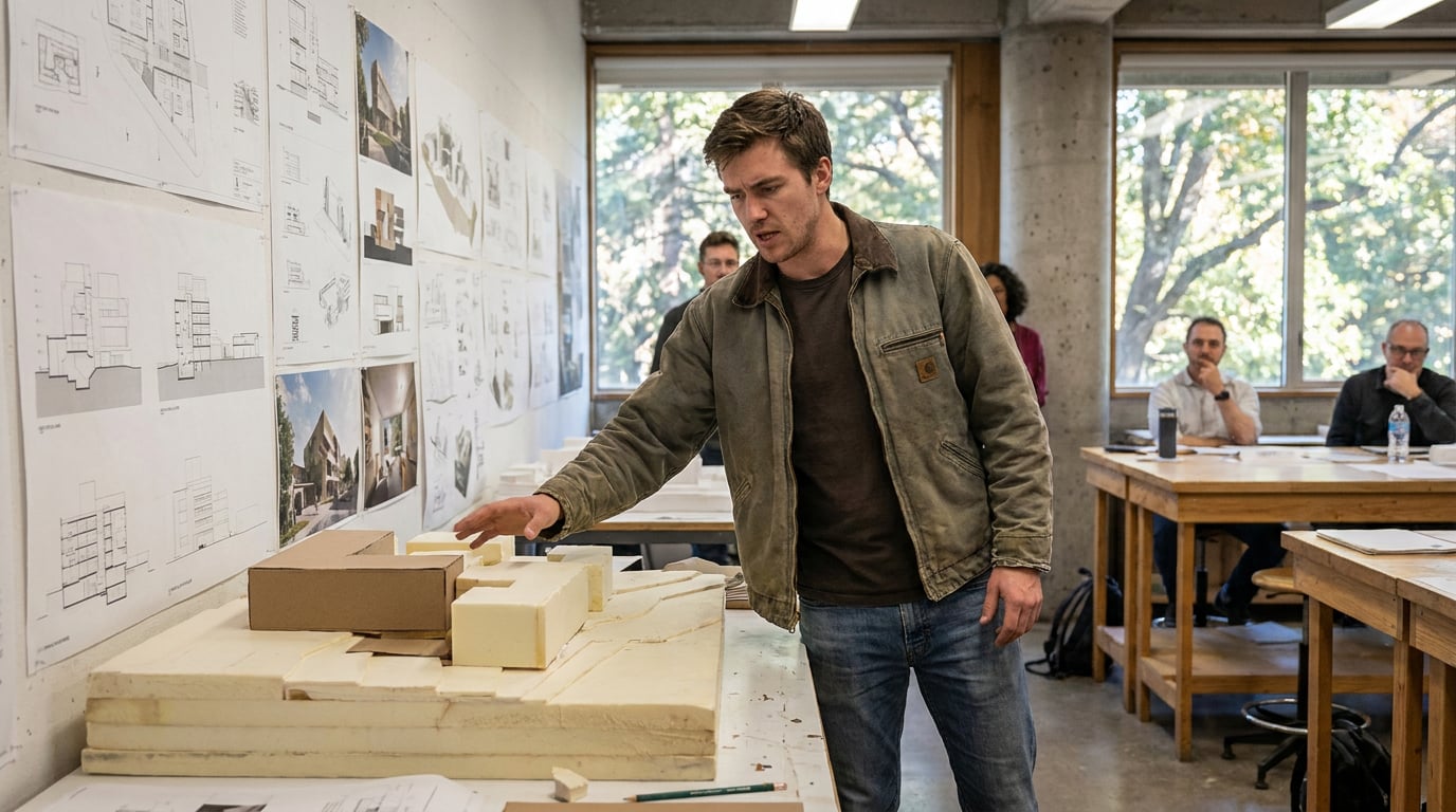
Pin the board to a wall, or prop it against a chair if you don't have a pinboard free, and walk to the back of the room. Give yourself five seconds, no more, and ask whether you can name the project, the big idea, and the killer image. This borrows directly from crit and design review habits in other creative fields, where teams routinely do a "squint test" or view work at actual size before calling it finished. Architecture rarely formalises this step, but it should, because it's the cheapest and most honest test available to you.
If the answer after five seconds is no, resist the instinct to add more explanation. The fix is almost never more clarity through addition. It's removal. A board that fails the five-second test usually has too much competing for the eye's attention, not too little information. Cut the smallest, least load-bearing element first and test again.
Run the test twice: once in daylight, once under the room's actual lighting, whatever that happens to be. Crits rarely happen in ideal, evenly-lit conditions. Studios have mixed fluorescent and daylight, corridors have patchy spotlighting, and exhibition spaces sometimes dim the lights entirely for a projected presentation running alongside the physical board. A board that only works under one lighting condition is a board that will fail on the day it matters, so test it under the worst light you're likely to get, not the best.
If a board fails the five-second test, remove something. It is almost never a clarity problem solved by adding more.
Where AI-Generated Imagery Fits, and Where It Falls Down
Students and small practices are increasingly generating hero renders, concept stills and short walkthrough sequences with AI tools rather than building everything from scratch in a rendering package. Tools such as Runway and Luma's Dream Machine can produce cinematic stills and short concept animations from a prompt or a reference image, and it's now common to pull individual frames from these sequences to use as narrative beats on a board rather than treating the whole clip as the deliverable.
The problem is that these tools tend to default toward cinematic exposure and fine micro-detail, exactly the kind of image that looks striking on a monitor and disappears at A1 scale. A frame with rich shadow gradation and soft atmospheric haze might be beautiful up close and read as an undifferentiated grey rectangle from the back row. If you're pulling stills from AI-generated sequences, cherry-pick for strong silhouette and tonal separation, the same criteria you'd apply to any hero render, and be prepared to push contrast and levels harder in post than you would for an image destined for a screen.
Within ArchAdemia Tools, the Image surface gives access to a wide range of generation models for producing that hero still directly, and Corb, the platform's assistant, can help you work out which model suits a particular brief, whether you need a photoreal hero shot or a looser diagrammatic image. For a full concept sequence rather than a single still, Film handles multi-scene cinematic generation. Once you've got a strong image, whichever tool produced it, the job of testing it at true scale and cropping it for distance still falls to you. No generation model knows how big your crit room is.
Writing captions, titles and the narrative structure of a board benefits from the same discipline that structures a good crit: frame the problem, state what you want feedback on, and keep the walkthrough tight. Drafting this kind of text is a reasonable use for a writing model. Documents in ArchAdemia Tools gives you a multi-model picker across GPT-5.6, Gemini and Claude for exactly this kind of long-form drafting, useful for working out board narrative before you ever open Layout.
AI-generated stills often default to cinematic detail that flattens at A1 scale. Pick for silhouette and contrast, then grade harder than you would for a screen.
The Takeaway
A crit board isn't judged at arm's length from a monitor, it's judged from across a room, often in bad light, by people who will decide within five seconds whether to keep looking. Every rule here traces back to that one fact: build hierarchy from scale and weight rather than colour, commit to one idea rather than five, crop images for silhouette rather than detail, and always test the printed sheet at true distance before you call it finished. The tools you use to generate the imagery matter less than the discipline of testing what they produce against the room the board will actually hang in.
Keep reading.
Try ArchAdemia Tools for yourself
Draw it, model it, render it, publish it. One place, built for architects and small practices. Plans from £29 a month, all in.