Fake Bounce Light and AO: The Interior Render Fix Nobody Sees.

Flat interior renders usually fail for one reason: no bounce light, no contact shadow. Here's how to fix both without a lighting engine.
Why flat interiors give the render away instantly
Real rooms have no pure black shadows and no pure white walls. Every surface in an interior is bouncing colour onto its neighbours: a red rug throws warmth up onto a pale wall, a timber floor sends amber light climbing the skirting, a north-facing window fills a corner with cool grey instead of nothing at all. Ambient occlusion is the quieter half of the same story: the soft darkening that gathers wherever two surfaces meet and light struggles to reach. Skirting boards, ceiling corners, the underside of a coffee table, the gap behind a curtain. These aren't dramatic shadows. They're a fraction of a stop darker than the surrounding surface, and they're the reason a photograph of a room reads as a room rather than a diagram of one.
A render can nail materials, get the camera height right and still look unmistakably CG if it's missing both of these. That's because the eye reads lighting logic before it reads detail. You clock whether a space feels lit before you notice the timber species or the sofa fabric.
Picture two versions of the same corridor render. In the first, the walls are evenly lit from top to bottom, the ceiling-wall junction is the same flat white as the wall itself, and the skirting sits crisp and untouched by shadow. In the second, that same junction has gone a shade darker where the ceiling meets the wall, and the skirting has a narrow, soft line of occlusion running along its top edge. The first looks modelled. The second looks built.
A render can have perfect materials and still read as fake. Bounce light and AO are what convince the eye it's looking at a real, occupied space rather than a lit 3D model.
Read a real room before you try to fake one
Before you paint a single bounce pass, spend ten minutes looking at an actual room. Photograph an interior with a white wall opposite something saturated: a coloured sofa, a rug, a piece of joinery in a strong timber tone. Look closely at the wall. It isn't neutral. It has picked up a faint tint from whatever is facing it. That's bounce light, and it's happening in every room you've ever stood in whether you noticed it or not.
Now look at a junction: where a floor meets a wall, or a door meets its frame. The shadow there is soft, narrow, and never fully black, even in a dim room. It has a gradient. It fades out over a centimetre or two rather than stopping dead.
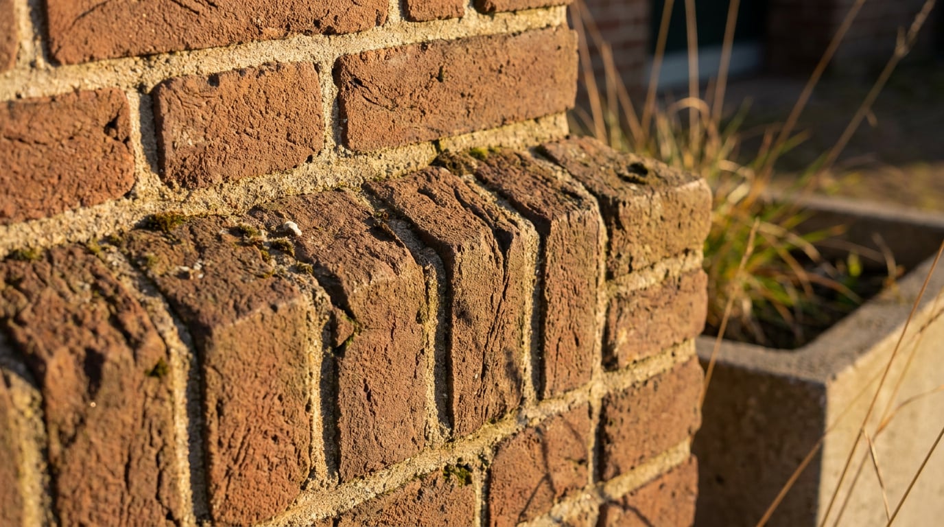
Colour temperature carries across too. Warm surfaces bounce warm light, cool surfaces bounce cool. A red brick internal wall throws a warm amber cast onto an adjacent white ceiling; a blue-grey polished concrete floor sends a cooler, more neutral bounce upward. This isn't decoration, it's physics, and it's the detail that separates a render that looks staged from one that looks inhabited.
This groundwork matters as much for a Design and Access Statement interior view as it does for a hero marketing shot. A planning officer or a client reviewing a proposed space is responding to whether the light feels convincing, even if they'd never use that language. Convincing light sells the spatial quality of a room. Geometry alone doesn't.

Build bounce light into the base render before you touch a single layer
The easiest bounce and AO to work with is the bounce and AO you don't have to invent from scratch. If you're generating a base interior in an image model through Image, the prompt itself is your first lighting tool, and it's worth treating it that way rather than defaulting to a generic "warm lighting, cosy interior" line.
Be specific about physics, not mood. Instead of "warm lighting", try "a warm timber floor throwing amber bounce light up onto the pale walls, strongest near the skirting and fading by mid-height." Name the dominant light source and its colour temperature explicitly: a low afternoon sun through a west-facing window, a 3000K pendant over a dining table, overcast daylight through a rooflight. Then let secondary surfaces pick up that colour rather than leaving them neutral, because that's what actually happens in a lit room.
Describe occlusion directly too. Most image models will respond to plain instructions like "shadow gathering under the kitchen island", "soft darkening in the corner behind the bookshelf", or "occlusion along the base of the staircase where the treads meet the wall." You're not asking for a lighting simulation. You're asking the model to draw what it already associates with those junctions in real photographs, which is usually enough to get a workable starting point.
Generate a handful of variants and be selective. Don't pick the cleanest-looking one. Pick the one where some occlusion logic already exists, even faintly, because it's far easier to deepen a shadow that's already there than to invent one on a completely flat surface.
Physically-based renderers like D5 or Lumion calculate bounce light and AO from real geometry and materials. Image and video models approximate it from pattern recognition. Treat the prompt as your first lighting pass, not the finished one.
Paint in bounce colour and contact shadow by hand in Retouch
This is where an interior actually gets convincing, and it's manual work regardless of which model produced the base image. In Retouch, build your bounce and AO as separate, editable passes rather than trying to get everything right in the generation.
Start with bounce colour. Add an adjustment layer with a soft radial gradient, tinted to the colour of a nearby saturated surface, and mask it onto the wall or ceiling that would realistically catch that light. Keep opacity low, somewhere in the 10 to 25 percent range. You want a suggestion of colour, not a visible wash. Use Retouch's select-by-typed-description tool to isolate the source fast, typing something like "the rug" or "the sofa fabric" to grab the region, then sample it directly with the Eyedropper so your bounce tint is accurate rather than guessed.
For occlusion, work on a new layer set to Multiply. Use the Brush tool to deepen ceiling corners, skirting lines and the underside of furniture, feathering heavily so it reads as a soft gradient rather than a painted stripe. The goal is invisible: nobody should be able to point at the shadow and say "that's been added." They should just feel that the corner has depth.
Keep every pass on its own layer with the appropriate blend mode: Multiply for shadow and occlusion, Overlay or Screen for bounce colour. This matters beyond convenience. A client or crit panel will ask for a colour change to a floor or a wall finish, and if your bounce and shadow work is baked into a flattened image, you're starting over. On separate layers, you nudge the mask and move on.

Push it further with layer styles and material swap
Once the base bounce and AO passes are in, a few targeted tools in Retouch add depth without much manual effort. An Inner Shadow layer style applied to a window reveal or a door recess gives that recess convincing depth in seconds, no painting required. It's a small effect, but reveals are exactly the kind of junction that reads as flat and unconvincing when a render skips them.
If one surface in the scene looks dull or flatly lit compared to the rest, a **material swap** lets you replace it to match a reference that already carries believable ambient response, a photograph of a real oak floor with natural sheen variation, for instance. Once that surface is swapped in, your existing bounce and shadow layers sitting above it will unify it with the rest of the scene rather than leaving it looking pasted in.
Retouch's six one-click **re-light presets**, Golden hour, Dusk, Blue hour, Night, Overcast and Sunny, are worth running at this stage too. Each regenerates the whole document as a new layer under a genuinely different light source, which means you're bouncing light off a different colour temperature and direction entirely rather than just grading the same flat lighting warmer or cooler. An overcast interior study for a north-facing extension reads completely differently to a golden hour version of the same room, and testing both is often faster than trying to manually re-grade one into the other.

Where this pays off in real practice work
The value of this work shows up quietly, in the pieces that get looked at longest. A competition board interior view stands out the moment corners and reveals have real depth instead of flat colour fields sitting next to each other. Judges and panels look at dozens of boards; the ones with convincing light are the ones they remember without being able to say exactly why.
Client presentation stills of a proposed kitchen or living space cross a threshold once bounce and occlusion are in place. They stop reading as "a render of the idea" and start reading as "a photograph of the finished room", which changes how a client responds to the proposal. It's the difference between approving a concept and being able to picture living in it.
Portfolio interiors benefit most of all. A crit panel or a hiring reviewer looks at your work more than once, and lighting quality is exactly the kind of detail that registers on a second or third pass even when nobody can articulate why one image feels more resolved than another sitting next to it.
| Output type | Rough cost per shot/clip | Best use |
|---|---|---|
| Still image, bounce/AO retouched by hand | A few credits per pass | Portfolio hero shots, competition boards, DAS interiors |
| Video corridor/interior loop, 720p-1080p, 5-10 seconds | Roughly $1-3 per clip | Client walkthroughs, marketing reels, phasing animations |
When you finish painting in bounce and shadow on a hero interior shot, run Enhance area over the sections you've been working into. It re-renders the selected region at higher resolution and composites it back through the selection, bringing sharpness back to areas that have gone slightly soft from repeated painting and grading. It's a small last step, but on a hero shot going onto a board or into a portfolio, it's the difference between a finish that holds up in print and one that only works at screen size.
An interior that costs pennies to touch up in Retouch can outperform an expensive walkthrough clip, because the eye judges light quality in a still just as harshly as it does in motion.
The takeaway: physically-based renderers calculate bounce and AO from real geometry. Every AI-assisted image and video tool approximates it, some better than others, but none of them get it fully right without help. The gap between a render that looks generated and one that looks photographed is rarely the model. It's the ten minutes you spend afterwards, painting soft colour into corners and darkening the junctions nobody consciously notices but everybody unconsciously trusts.
Keep reading.


Try ArchAdemia Tools for yourself
Draw it, model it, render it, publish it. One place, built for architects and small practices. Plans from £29 a month, all in.