From Finished Scheme to Case Study Page, Start to Finish.
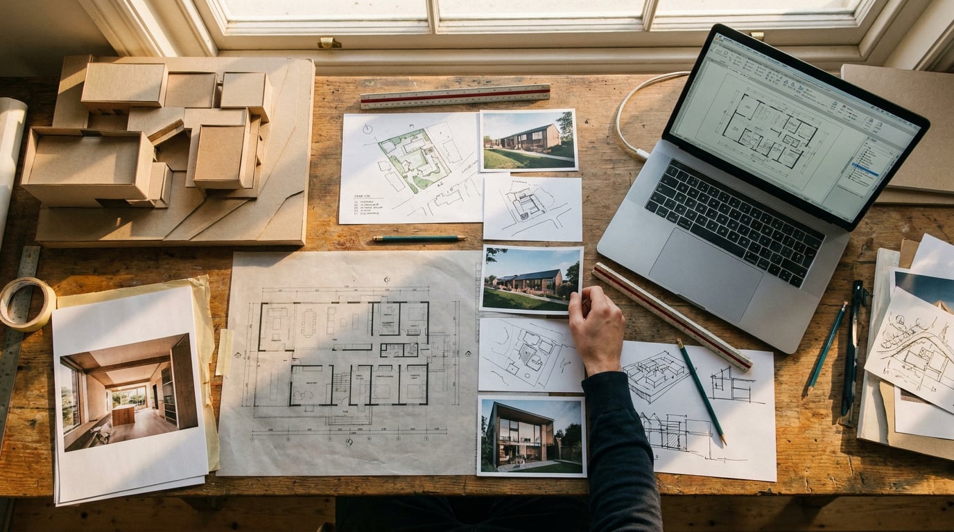
A completed project is only half the job. Here's the practice workflow for turning drawings and stills into a case study page that actually gets read.
Why most practice websites bury their best work
The common failure mode is a scroll of renders with no story attached: a lobby shot, a facade shot, a night shot, and nothing that explains the brief, the site, or the thinking that got the scheme from problem to solution. It looks like a portfolio slide. It reads like nothing at all.
Prospective clients and planning contacts do not click through a practice's work to admire finishes. They are trying to work out how the practice thinks: how it handles a difficult site, how it responds to a brief, whether it can be trusted with the next commission. A gallery of pretty images cannot answer that question. A case study can.
A case study page needs three things a portfolio slide does not: context (who, where, what constraints), sequence (how the idea developed), and proof of thinking (why the final scheme answers the brief). Set the target before you start building: one page that could stand alone as a single link, even if the reader never sees the rest of your website.
A case study page should survive being the only thing a prospective client ever sees of your practice. If it can't stand alone, it isn't finished.
Step 1: Pull the assets that actually tell the story

Before touching layout, go back into the project folder and pull everything that shows reasoning, not just outcome. That means site photos from the first visit, early concept sketches, working plans and sections, model photography if you built physical models, and the final render set. A case study built entirely from finished stills tells the reader nothing about how you got there.
Old site photos and scanned sketches are often the weakest link visually, faded phone shots, pencil lines gone grey, a scan with a shadow across one corner. Clean these up in Retouch before they go anywhere near the page. Dodge and burn to even out exposure on a site photo, run the healing brush over dust and scanner marks on a scanned sketch, crop tightly so the drawing reads as intentional rather than incidental. None of this needs to look polished to the point of losing authenticity, it just needs to look deliberate.
If the render set is thin, that is, three angles of the same facade and nothing else, it is worth generating a couple of missing angles in Shoot rather than reusing one hero image four times at different crops. A short-stay interior view, an approach shot from the street, a view back towards a neighbouring context building: these round out the sequence and stop the page reading as one image stretched too far.
Aim for a spread that mixes drawing, model, and photography. A page built from three renders in a row reads as marketing. A page that moves from a hand sketch, to a working section, to a site photo, to a final still reads as a project.
The strongest case study pages mix media types deliberately: sketch, drawing, photo, render. A page of renders only, however good, reads as a brochure rather than a project.
Step 2: Write the narrative, not the spec sheet
Draft the text in Documents before you go anywhere near layout. Four short paragraphs, written in this order: brief, site constraints, design response, outcome. That order matters more than the polish of any single sentence, because it mirrors how a reader actually processes a project: what was asked, what made it hard, what you did, what happened.
Keep each paragraph short. A case study page is read in under a minute by someone scanning a website, not studied in the way a planning officer reads a Design and Access Statement. If a paragraph runs past four or five sentences, cut it and move the detail into a caption instead.
The writing picker in Documents gives you a genuine choice of tone rather than one default voice. Claude Sonnet 5 tends to produce a measured, practice voice, useful when the reader might be a planning contact or a fellow professional judging competence. GPT-5.6 Terra tends to land punchier and more client-facing, useful when the case study is aimed at a prospective residential client browsing on a phone. Draft in both if you are unsure which register the project needs, and keep the version that reads more like your practice and less like a template.
If you ran the project through project chats during design, ask Corb to sense-check the draft against that history. It can pull language you already used to describe the scheme, the phrases you reached for when explaining the concept to a client or consultant, which usually sound more convincing than anything written cold after the fact.
The order is brief, constraints, response, outcome. Skip the order and the reader has to work to find the story. Keep it and the story finds them.
Step 3: Lay the page out in Layout

Open Layout and start from the Portfolio or Project Book template if the case study is going to run to a few pages, or build a single Sheet if you want a genuine one-page case study rather than a multi-page document. Both are legitimate choices: a single Sheet suits a project you want to link directly from an email or a LinkedIn post; a short Document suits a case study that needs room for more drawings.
Turn on the layout grid, Columns or Modular depending on how many image blocks you are working with, and let elements snap to it rather than eyeballing alignment. This is the difference between a page that looks considered and one that looks like assets were dropped in wherever there was space. The grid is a reference overlay only, it never shows up in the export or the published page, so there is no reason not to use it.
Set type from the 300-family type library rather than defaulting to whatever the template ships with. If your practice has a licensed typeface for web use, upload it, Layout supports custom font uploads and it will carry your practice identity through onto the page rather than reading as generic.
Drag in the cleaned-up sketches and site photos alongside the final renders, and use align and distribute to bring everything onto consistent margins. The goal is a page where a reader's eye moves through brief, drawing, photo, render, outcome without stopping to notice that the spacing is uneven or that one image sits slightly off the grid from the next.
Alignment is doing more work than people think. A page where every image sits on the same grid reads as considered even before anyone reads a word of the text.
Step 4: Publish and connect it to the rest of the site
Once the page is built, share the finished document directly from Layout as a read-only public webpage. There is no separate export step: the document you have been editing becomes the page a client clicks through to.
If the case study needs to live inside a fuller practice website rather than as a standalone link, build it as a page inside Web. Set the SEO panel for that specific page: a title and description that name the project and the place, and a social image so the link looks intentional when it's shared or pasted into an email. A page titled "Case Study" tells a search engine and a scanning reader nothing; a page titled with the project name and location does real work.
Add a contact form to the page. It works with zero setup, submissions land in a Forms inbox, and it means a reader who likes the project can enquire without hunting through the site for an email address. That single addition turns a case study from a nice-to-look-at page into a page that can generate a lead on its own.
One distinction worth knowing before you plan a launch: publishing a page to a custom domain is a Pro plan step. Building and previewing the page itself is not gated, so there is no reason to hold off on constructing the case study while you sort out domain and hosting decisions separately.
Step 5: Keep the page alive after launch
A case study page is not a one-off export, it is a living document. Layout's public pages stay current as the source document is edited, so a correction to the text or a swapped image does not require republishing, just edit and the live link updates.
Revisit the page once the building is actually occupied. Render-only pages are a reasonable stand-in before completion, but nothing replaces a properly shot photograph of a finished, occupied building. Swap renders for real photography as it becomes available and the case study gets stronger with time rather than staler.
Track which case studies actually generate enquiries through the contact form. This is more useful than it sounds: if your extension and retrofit case studies bring in enquiries and your competition entries do not, that tells you something about where your next piece of business development effort should go, not just which project to feature next in the portfolio.
| Stage | Tool | Output |
|---|---|---|
| Gather and clean assets | Retouch, Shoot | Sketches, site photos and renders ready to place |
| Write the narrative | Documents, Corb | Four-paragraph brief-to-outcome draft |
| Build the page | Layout | Aligned, gridded case study sheet or document |
| Publish | Layout / Web | Public link or page inside the full site |
The takeaway
A case study page earns its place on a practice website when it reads as a short, honest account of a problem and a response, not as a repeat of the same hero render at different crops. Pull the full range of assets, write in the order brief, constraints, response, outcome, lay it out on a grid so nothing looks stacked at random, and publish it somewhere a reader can act on immediately with a contact form to hand. Do that once, well, and the page keeps working long after the launch email has been sent.
Keep reading.

Try ArchAdemia Tools for yourself
Draw it, model it, render it, publish it. One place, built for architects and small practices. Plans from £29 a month, all in.