How Many Concept Render Rounds Until a Client Signs Off?.
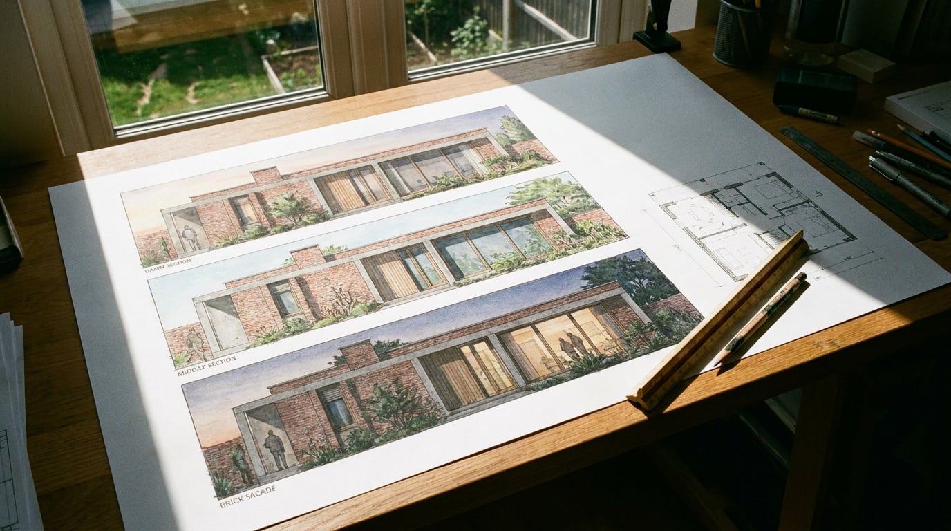
Most concept renders don't fail on quality, they fail on structure. Here's the round count that actually gets a scheme signed off, and why it's lower than you think.
Why the question is wrong: it's not about round count, it's about round structure
Practices that iterate forever are usually solving the wrong problem at each stage. A client says "I'm not sure" on round one, and the next render arrives with a different roof pitch, a different brick colour and a different sky. Nobody agreed to any of that. The client didn't ask for three changes, they asked for one, and the render answered three questions nobody had framed properly.
Three structured rounds beat nine unstructured ones every time. The number three isn't magic; it maps onto three genuinely separate design questions that concept visualisation has to answer: does the form sit correctly on the site, does the material and light read correctly, and does the detail hold up under scrutiny. Collapse those into one open-ended "send me some options" and you get exactly what the phrase promises: options, plural, with no mechanism for narrowing down.
A round that mixes questions produces feedback that contradicts itself. Ask "is the roof form right and is the brick colour right?" in the same image and you'll get an answer like "I like the brick but can we try the roof lower". Now you don't know if the brick approval was conditional on the roof changing, or independent of it. The client isn't being difficult. You gave them a compound question and got a compound answer back.
The fix is procedural, not technical. Frame each round with one explicit question the client is being asked to answer, in writing, before the render goes out. "Round one: does this massing and siting work for you, yes or no, and if no, which alternative below is closer?" is answerable in a sentence. "What do you think?" is not.
Three focused rounds, each closing one question, will out-perform nine rounds that each reopen every question at once.
Round one: massing and siting, nothing else

Use flat, unlit studies for this round. Block massing pushed straight into a perspective view and sent to a rendering studio is enough here. There should be no attempt at photorealism, no golden-hour glow, no brick texture. Resist adding material or dramatic lighting at this stage, because it invites feedback on finish when the client should be judging form and site relationship. A beautifully lit render of the wrong massing wastes everyone's time twice: once to admire the lighting, once to notice the massing is wrong underneath it.
Show the scheme against its neighbours and the ground plane, not floating in a void. A concept render that isolates the building on a white background answers a question nobody is asking. Clients, planning officers and design review panels all judge a scheme in relation to what's either side of it and how it meets the pavement or garden. If the massing study doesn't show that relationship, the client can't actually approve what you're asking them to approve.
One client-facing image plus one alternative massing option is normally enough for this round. Two isn't a menu, it's a comparison. A recommended option and a genuine alternative gives the client something to react against, rather than a blank page to project unlimited scepticism onto. Three or four massing variants at this stage usually signals the brief wasn't tight enough before modelling started, not that the client is unusually indecisive.
A flat, unlit massing study against real neighbours does more useful work in round one than a photorealistic hero shot of the wrong building.
Round two: material and light, once form is agreed
This is where a fixed camera and a material picker earn their keep. Same massing, same viewpoint, different render passes testing brick against render, warm light against overcast. In Retouch, that means holding the base image constant and using material swap to replace a selected area's texture against a reference, kept as a toggleable layer so the client can be shown a genuine side-by-side rather than two separately generated images that quietly differ in a dozen small ways neither of you notice.
Retouch's one-click re-light presets regenerate the whole document under a different time of day or weather condition: Golden hour, Dusk, Blue hour, Night, Overcast, Sunny. Run the same massing through two or three of these and the client is comparing light, not comparing different buildings. That distinction matters more than it sounds. If the camera angle or the massing shifts even slightly between two images, a client will often respond to the change they can't consciously name, and the feedback comes back muddled: "I preferred the first one" without being able to say why.
Keep the camera angle fixed across variations. Changing viewpoint and material in the same round makes comparison impossible; the client is now solving two unknowns with one piece of feedback, and that's exactly the trap round one was designed to avoid repeating.

This is also where atmosphere studies, rather than fully rendered stills, can earn their place if a scheme's lighting story is unusually important, a coastal site with strong seasonal light shifts, for example. Keep that work distinct from the video generation surfaces in the platform, which are built for a different kind of deliverable, animated walkthroughs and short films rather than the fixed, directly comparable stills a material and light round depends on. Comparing two stills side by side on a desk is a fundamentally different exercise to comparing two video clips, and a sign-off round works better with the former.
Fix the camera, fix the massing, and let only the material or the light condition change. That's the entire discipline of round two.
Round three: detail, context and the sign-off image
This round adds entourage, planting, people at correct scale, and the neighbouring context that a planning officer or a client's board will actually scrutinise. It's easy to under-resource this stage because the "hard" decisions, form and material, feel already settled. But a Design and Access Statement gets picked apart on exactly this level of detail: does a person standing at the front door look plausible against the door height, does the tree in the foreground read as a mature specimen or a sapling that undersells the landscaping proposal, does the neighbouring roofline actually match what's on the site survey.
Use enhance area in Retouch to sharpen a hero view that's gone soft, rather than re-rendering the whole scene from zero. If the wider composition works and only a section, the entrance detail, a material junction, has lost definition, re-render just that region at higher resolution and composite it back through a selection. That's a targeted fix, not a full regeneration that risks disturbing everything that's already been approved in rounds one and two.
This is the round to produce the actual sign-off asset: the one image that goes into the Design and Access Statement or the client deck, not a rough placeholder standing in until "the real one" gets made later. Treat round three's output as final from the start. A Layout document built from the Design and Access Statement template can carry this image straight through into the submission, with the surrounding text and site context already structured around it.
If round three still triggers big-picture pushback, "actually, can we revisit the massing", the process has failed, not the render. That feedback belongs in round one. Its arrival in round three means either round one wasn't genuinely closed off before the project moved on, or the client wasn't told clearly enough that massing was no longer open for debate at this stage.
If a client reopens massing during the detail round, the render didn't fail: the round structure wasn't communicated clearly enough at the start.
What causes rounds four, five and six
Vague briefs at the start are the single biggest cause. "Make it feel more premium" has no visual definition and produces guesswork, not iteration. Ask instead: premium compared to what reference, achieved through what specific change, brick colour, glazing proportion, roof material? A brief that names a visual target produces a render that can be judged against it. A brief that names a feeling produces an argument about what the feeling means.
No fixed viewpoint is the second cause. If every round shows a different camera angle, the client can never build confidence in a single reading of the scheme. Each new angle resets their mental model of the building from scratch, and every reset is an opportunity for fresh, unstructured doubt to creep back in on decisions that were meant to be closed.
Skipping a written brief entirely is the third. Drafting a one-page visual brief in Documents before the first render goes out costs almost nothing and closes off most of the ambiguity that later turns into extra rounds. Name the material, the light condition, the camera height, and what the client is specifically being asked to approve at each stage. Documents offers a choice of writing models, Claude Sonnet 5 and Opus 5, GPT-5.6 Sol, Terra and Luna, and Gemini Flash and Pro, so a practice can draft that brief quickly and route it through whichever model suits the tone the client is used to seeing.
Presenting options without a recommendation is the fourth, and probably the most avoidable. Three unranked renders invite the client to design by committee, which multiplies rounds rather than closing them. If a practice genuinely can't choose between two schemes, that's a legitimate reason to show two, but say so, and say which one the practice would build if the decision were theirs alone.
| Cause | What it produces | Fix |
|---|---|---|
| Vague brief | Guesswork disguised as iteration | Name the material, light, and question in writing |
| Shifting viewpoint | No stable mental model for the client | Fix the camera across a round |
| No written brief | Feedback with no shared reference point | One-page brief drafted before round one |
| Unranked options | Design by committee | Always name a recommendation |
Setting client expectations before round one
State the round structure up front, in the brief or on the kickoff call: "round one is form, round two is material and light, round three is the final image." Said plainly, before any render exists, this single sentence does more to control the number of rounds than any technical choice made afterwards.
Put this structure into the Design and Access Statement or client deck built in Layout, so it's visible to everyone, not just remembered from a meeting. A client's board, a planning case officer, or a colleague joining the project midway all benefit from seeing the same staged structure written down rather than reconstructing it from a chain of emails. Layout's Client Deck template gives a natural home for a short page laying this out before the visual content begins.
A named structure with a fixed number of rounds gives the client permission to hold detailed feedback until the round it belongs to. Without that permission, a client who notices the brick colour in round one will mention it, because nothing has told them not to. With it, they'll note it down and raise it properly in round two, where it can actually be acted on without disturbing a decision that was never meant to be reopened.
Three focused rounds, each closing a specific question, reads as more professional than an open-ended "send me some options". It signals a practice that knows exactly what it's asking and exactly what it needs back, which is, in the end, the entire point of a concept render.
Takeaway: Stop counting rounds and start naming them. Fix the question, fix the camera, and tell the client which round they're in before the image lands in their inbox.
Keep reading.

Try ArchAdemia Tools for yourself
Draw it, model it, render it, publish it. One place, built for architects and small practices. Plans from £29 a month, all in.