How Interior Designers Go From Mood Board to Client Render.
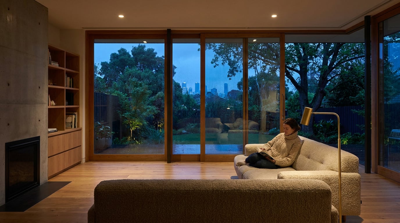
One workflow, one credit system: how interior designers move from reference gathering to a finished, presentable render without switching tabs.
The problem with the mood-board-to-render handoff
Most interior schemes die a small death somewhere between the mood board and the final render. Not the design itself, but the intent behind it. A designer pins a dozen tearsheets to Pinterest or PureRef, distils them into a material story, then has to re-explain that story to a rendering engine, a retoucher and a layout tool in turn. Each handoff is a translation, and every translation loses something.
The typical toolchain runs something like this: Pinterest or Milanote for references, Photoshop or Figma for early layouts, Enscape, Twinmotion, Corona or V-Ray for the render itself, then PowerPoint or Notion to actually show the client anything. Four or five separate applications, each with its own file format, its own way of describing colour and material, and none of them aware that the others exist. The palette a client fell in love with on the mood board can quietly drift by the time it reaches a rendered image, because nobody carried the reference forward, they just carried a verbal description of it.
Client-ready has a specific meaning in this context. It isn't a rough AI generation with six fingers on a cushion or a light switch floating mid-wall. It's a space that reads as finished: correct perspective, coherent lighting, materials that hold up at print resolution, nothing that pulls the eye toward an artefact instead of the design. Getting there consistently is less about finding a better render model and more about removing the number of times a scheme has to be re-briefed to a new piece of software.
The fix for weak client renders usually isn't a better render engine. It's fewer handoffs between reference, generation and presentation.
Starting with reference: building the mood board in Canvas

Canvas is where an interior scheme starts, and where the reference material stays visible for the rest of the job. The Find Images drawer in the canvas toolbar pulls whole-web reference results on any paid plan, or free stock search on every plan including trial. A designer can search directly for "warm timber living room" or "boucle and brass bathroom" without leaving the canvas, and pinning a result drops it straight in as a Reference Image node. No screenshot, no folder of downloaded JPEGs with generic filenames, no separate mood-board app.
The step that actually changes the workflow is the Look node. Wire in two or more references and Look distils their shared style and colour palette into a single prompt block. That block wires directly into an Image node's Style port on the Nano Banana models, which are the ones that expose that port. In practice, a designer pins three tearsheets of a warm, timber-heavy living space, wires them into a Look node, and lets it extract the shared material language before generating variations. The palette that came from the client's own reference images is the palette that drives the render, not a paraphrased version of it typed into a prompt box from memory.
This replaces the cut-and-paste mood board entirely. The references live on the same canvas that generates the render, so there's no point in the process where the palette has to be re-described to a new tool. Compare that to the Flux or Ideogram route, where an image model produces a strong still but leaves reference gathering and layout to Figma or Canva on the outside. Those tools are excellent at typography and brand marks, but they were never built to carry a mood board's intent through to a rendered scene.
A Look node built from pinned references keeps a scheme's palette intact from the first tearsheet to the last render, because nothing gets typed from memory.
Generating the space: Image and 3D working together
Once the palette is set, the actual space needs generating, and different projects call for different starting points. For quick interior concepts, the Image surface offers generation across 20+ models from a prompt or a reference image, useful for testing a direction before committing time to a full model.
Where there's a real plan behind the scheme, that quick-concept approach isn't enough on its own. Linea's furniture and material libraries let a designer model the space properly in 3D, working from the same plan that will eventually go into a planning submission or a construction pack, and send a chosen perspective straight into rendering. This matters for interior work in a way it doesn't for a purely conceptual image: a client's actual room proportions, window positions and door swings carry through, rather than being approximated by a model that's never seen the plan.
Specific furniture is where Composer earns its place. When a client's own sofa needs to appear in the render, or a specified pendant light has to sit exactly where the lighting designer put it, posing models with gizmos in a scene and rendering to a photorealistic image gets far closer to the truth than hoping a generative model invents something similar. This is the same discipline furniture and product visualisers already use when reusing 3D assets across catalogues and configurators. Interior designers are doing the equivalent: placing known, specified pieces rather than generic approximations, because a client render that shows the wrong armchair isn't client-ready no matter how good the lighting looks.
For early-stage massing, before finishes are even decided, Corb on the canvas can read an untextured Linea or SketchUp massing shot and comment on proportion and layout: how a room reads against the plan, whether an opening rhythm feels right, how a space meets its entrance. He won't invent a material or finish he can't see in an untextured model, and he won't rule on whether a layout complies with anything. What he offers is a second pair of eyes on spatial proportion at a stage where most designers are working from instinct alone.
Composer's ability to pose a client's specified furniture, rather than a generic substitute, is what separates a genuinely client-ready render from a plausible-looking placeholder.
Refining the render until it looks client-ready

A first-pass render rarely arrives client-ready, and pretending otherwise is where a lot of AI-assisted interior work falls down. This is where Retouch earns its keep, because the adjustments an interior scheme actually needs are specific and repeatable.
Material swap replaces a selected surface's texture to match an attached reference, landing as a toggleable layer rather than overwriting anything. If a client wants to see the same room with a different floor finish or a fabric swapped on the sofa, that's a targeted change rather than a full re-render from scratch, and it's reversible if the client prefers the original.
Lighting is often the difference between a render that looks generated and one that looks lived-in. Six one-click re-light presets, Golden hour, Dusk, Blue hour, Night, Overcast and Sunny, regenerate the whole scene at a different time of day as a new layer. A north-facing kitchen extension photographs very differently at 8am and 6pm, and a client deciding whether to commit to a scheme benefits from seeing the space in the light they'll actually live with, not just the light that happened to render best first time.
Wide interior shots are also where detail tends to fall apart. A rug pattern gone soft, or joinery lines that have blurred into a mush of pixels, undermines an otherwise strong image. Enhance area re-renders that specific region at higher resolution and composites it back through the selection, with no prompt required, fixing the weak spot without touching the rest of the composition.
Every one of these sits on layer masks and adjustment layers, so a colour grade tuned for one client presentation doesn't quietly overwrite the master file. That non-destructive stack is closer to a V-Ray or Corona post pipeline running through Photoshop render elements, except it's inside the same environment as the render itself, with no export-and-reimport step in between.
Presenting the scheme: from render to client deck
A finished render still needs somewhere to live, and this is usually where a fifth tool enters the chain: InDesign for the deck, PowerPoint for the pitch, a separate PDF export for the planning submission. Layout removes that step. Its Client Deck template turns a set of finished renders into a structured presentation without leaving the platform.
Layout runs two modes over one document model. Sheet mode suits a single pin-up image, the kind of board used in a crit or a competition submission. Document mode handles a multi-page client deck or a full project book, where renders sit alongside material call-outs and plan extracts on facing pages. The same self-hosted type library and layout grid apply across both, so a designer isn't reformatting text every time the output changes shape.
Corb can also write directly into a Layout document: select a text frame and ask him to fill just that one in, or ask him to build a whole document from a prompt, working through a template page by page on a chosen model, Sonnet, Opus or Fable. That's useful for the narrative sections of a client deck or a Design and Access Statement, where the render does the visual work but someone still has to write the accompanying paragraph explaining material choices or spatial reasoning.
Once finished, a document exports as a vector PDF at true dimensions for print, ready for a planning submission or a physical presentation, or shares as a revocable, always-current read-only link so a client can review the scheme remotely. If a floor finish changes after the client review, the link stays live rather than needing a fresh export sent by email.
A Client Deck built in Layout carries the same render, the same palette and the same material call-outs straight through to a printable PDF or a shareable link, with nothing re-typed along the way.
Why one credit system beats five subscriptions

Credit-metered access to flagship generative models is already standard practice across creative software. Multi-model bundles built around models like Nano Banana or Seedance now charge per generation from a shared pool rather than per feature, and interior designers benefit from the same logic without needing to think in seconds of video or per-image cents. What matters for a design practice is that reference gathering, rendering, retouching and presentation all draw from the same pool.
| Plan | Price | Credits | Best suited to |
|---|---|---|---|
| Starter | £29/mo | 3,000 | Solo designer running occasional client renders |
| Pro | £49/mo | 7,000 | Small studio with several live projects, unlimited chat-widget use |
| Max | £79/mo | 13,000 | Busier practice running renders, retouching and layout in parallel |
Every model, including the priciest flagships, is selectable on every plan. There's no tier lock stopping a Starter subscriber reaching for a high-end model when a job calls for it, only the credit balance to manage. That's a meaningful difference from toolchains where a designer pays separately for a mood-board app, a render engine subscription and a layout licence, none of which share a budget or a login.
The practical payoff isn't really about cost, though. It's that a scheme's palette, references and finishes stay consistent from the first pinned image to the final client PDF, because nothing gets re-explained to a new tool along the way. The mood board that set the material language is still sitting on the same canvas as the render that used it, which is still one click from the deck the client actually opens.
Takeaway: the gap between a mood board and a client-ready render has always been a workflow problem more than a rendering-quality problem. Fewer handoffs, not fancier prompts, is what keeps a scheme's intent intact from tearsheet to presentation.
Keep reading.
Try ArchAdemia Tools for yourself
Draw it, model it, render it, publish it. One place, built for architects and small practices. Plans from £29 a month, all in.