Material Boards That Actually Persuade Clients.
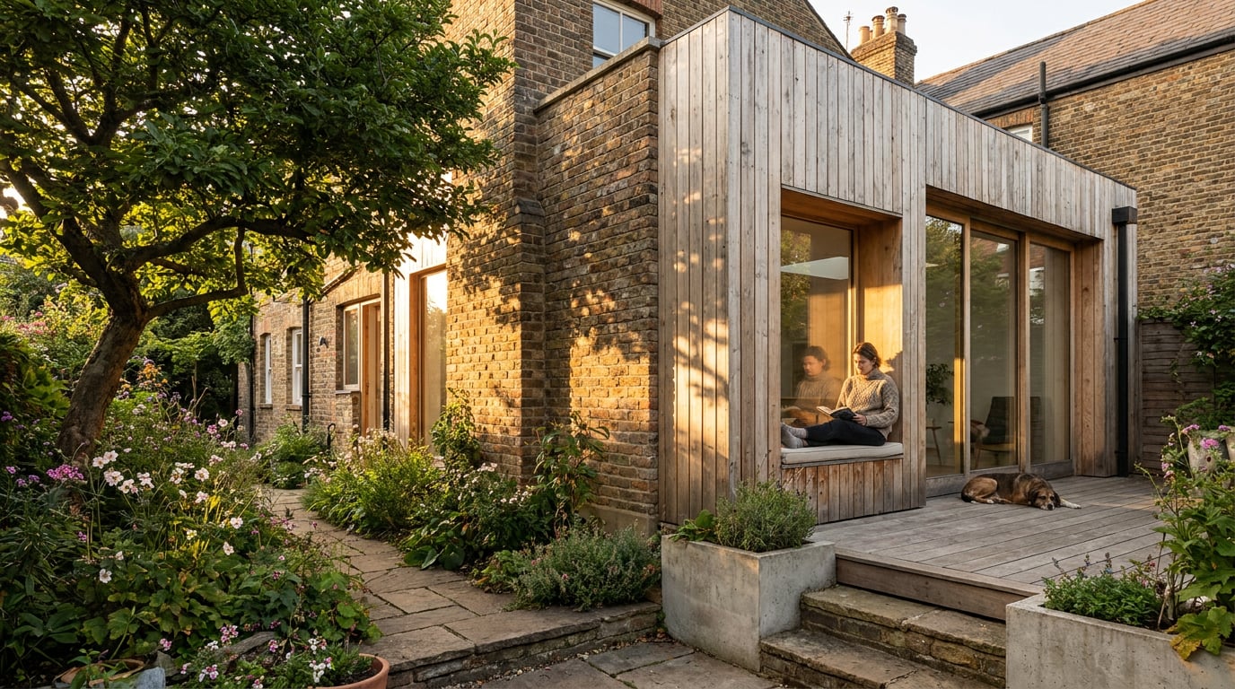
Most material boards get nodded at, not approved. Here's a workflow for building boards that hold up under real client scrutiny.
Why most material boards fail at the moment that matters
The problem isn't taste. Most designers pick materials well. The problem is context: a swatch pinned flat to foamcore tells a client nothing about how a limestone reads against their actual joinery colour, under their actual window orientation, in a room they haven't stood in yet. You know the finish works. They're being asked to trust you.
Clients don't reject materials, they reject uncertainty. Hand someone a grid of nine swatches and one line of text under each, and you've handed them a puzzle, not a proposal. They have to imagine the stone on the floor, the veneer on the run of joinery, the fabric on a chair that doesn't exist yet in their head. Imagination is where deals stall. Not because the material was wrong, but because the client couldn't get from swatch to room without help, and they didn't want to say so in the meeting.
Compare the two boards side by side. A generic swatch grid gets a nod and "let me think about it." A board that shows the same stone, veneer and fabric applied to a rendered corner of the client's actual room gets a decision in the room. The difference isn't production value. It's that one board asks the client to do the spatial reasoning themselves, and the other does it for them.
Name the real failure mode plainly: most boards are built for the designer's eye, not the client's. You've spent years reading material palettes. Your client hasn't. A board that assumes fluency it doesn't have is a board that gets filed, not approved.
A material only means something to a client once it's shown doing its job, in their room, under real light. Everything else is a swatch waiting to be interpreted.

Step one: generate the room before you pick the materials
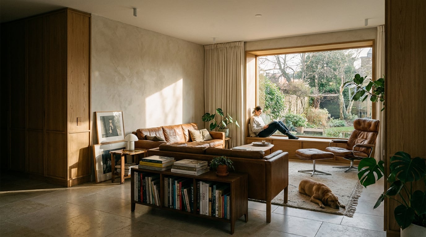
Start with the space, not the samples. Use Image in ArchAdemia Tools to produce a base render of the room at concept stage, working from the client's real room proportions and existing architecture rather than a stock interior. If you're proposing a change to an alcove, a chimney breast, a run of joinery, model that geometry loosely and let the render sit close to what's actually there. The materials get tested against this, so the canvas needs to be honest about scale and light before anything else happens.
Generate two or three lighting variants of the same view early. A stone that reads warm and inviting under a gallery downlight can go flat and grey under north-facing daylight. Clients need to see both conditions before they commit, not after the flooring is ordered. This is a five-minute step at concept stage that saves a much harder conversation later, when someone stands in their actual kitchen at 4pm in December and wonders why it doesn't look like the render.
Keep this base render loose. It is not the final visual, it's the canvas the materials get tested against. Resist the urge to polish it. A base render that's too finished starts to look like a decision rather than a starting point, and clients read finish as commitment. You want them focused on the surfaces, not admiring the render.
Architects already work this way with massing. A competition scheme gets tested under summer sun, winter sun, overcast sky, before the design is locked. Interior designers should treat finishes with the same discipline: test the material under more than one condition before you fall in love with it, and before your client does either.
Test the room under multiple lighting conditions before you introduce a single material. A finish that only works in one light isn't ready to be presented.
Step two: apply real materials, not stock textures
This is where most boards quietly lose credibility: the "stone" in the render is a stock texture that resembles nothing the client has actually selected. Use Retouch's material swap to replace a selected surface's texture with the client's real reference: the actual stone slab they chose at the showroom, the joinery veneer sample photographed on your desk, the fabric swatch shot under real daylight rather than pulled off a manufacturer's website. The gap between "a nice stone" and "your stone" is the gap between a board that gets questioned and one that gets approved.
Because material swap sits as a toggleable layer rather than a baked-in edit, you can present three flooring options on the same render and switch between them live in the meeting. That's a materially different experience for a client than being shown three separate static images. Flicking between option A, B and C on the same view, in real time, while they're sitting in front of you, turns the meeting into a conversation about preference rather than a memory test across three disconnected pictures.
Layer styles, stroke, bevel, glow, stay editable rather than baked in, so a metal trim or an inlay detail can be adjusted on the spot. A client asks "what if that edge was darker, more brushed?" and you're not promising a follow-up render sent next Tuesday. You're showing them the answer before they've finished the sentence.
This is the difference between a board that says "trust me" and one that says "here it is, applied, in your room."
Worth being precise about what this step is and isn't. It's a decision-support tool: it shows a client how a material reads at scale, in context, against their other finishes. It is not a substitute for the physical sample, the manufacturer spec sheet, or the fire and durability data the finish still needs to be signed off against. Show the render to build confidence. Confirm the specification with the actual product documentation, every time.

Step three: build the board itself, not a photo dump
A strong render and three good material swaps still aren't a board until they're structured for someone else to read. This is where the temptation to just export a folder of images and drop them into an email needs resisting. A material board earns the name when it has a hierarchy: a hero image, supporting evidence, and a rationale, in that order.
Layout's Image-led Board and Presentation Board templates give you that structure without starting from a blank page: a hero render, material callouts, a supporting palette strip, and space for a short rationale, pre-arranged so you're filling frames rather than inventing a layout under deadline pressure.
Use the layout grid, Manuscript or Columns, to keep swatch callouts aligned directly under the render they relate to. This sounds like a small thing. It isn't. A client's eye should travel from the material name straight down to the exact spot in the room where that material sits, without hunting across the sheet. Misalignment here is what makes a board feel like a photo dump even when the content is good.
Bring in a floor plan or a section from Linea to ground the materials in plan: which wall, which zone, which junction the stone meets the timber at. Clients approve context faster than they approve isolated imagery. A render on its own answers "does this look good." A render plotted against a plan answers "do I understand what's actually being proposed," and that second question is the one that gets a signature.
Export as a true-scale vector PDF so the board prints correctly for a physical client meeting, not just a screen share on a laptop balanced on a kitchen counter. Plenty of client decisions still happen around a printed sheet on a table, and a board that only works on-screen loses something real when it's forced onto paper at the wrong scale.
A material board is a hierarchy, not a gallery. Hero render, material callouts, plan context, rationale, in that order, every time.
What goes where, at a glance
| Board zone | Content | Purpose |
|---|---|---|
| Hero render | Base room with materials applied | Sets the emotional read of the space |
| Callout strip | Named swatches aligned under the render | Confirms exactly what's being proposed |
| Plan or section | Linea drawing showing zone and junction | Grounds material choices in real geometry |
| Rationale | Short written justification | Ties choices back to budget, brief, durability |
Step four: presenting the board so it drives a decision, not a discussion
The best board still fails if it's presented badly. Sequence the meeting rather than laying everything out at once. Show the base room first, unfurnished of decisions, then introduce one material change at a time using the swapped layers. The client watches the room evolve in front of them rather than absorbing a finished composite cold. This mirrors how a good crit works: build the argument in front of the audience, don't just present the conclusion.
Use the re-light presets, Golden hour, Overcast, Night among them, to answer the question that always comes up: "what does it look like in the evening?" Instead of promising a follow-up render next week, you switch the lighting live and answer it in the room. That single moment, a client watching a material change character under a different light in real time, does more for confidence than any amount of verbal reassurance.
Keep a one-page rationale in the board, drafted in Documents, that states plainly why each material was chosen against the brief: the budget it fits, the durability it offers for a family with young children, the client's own words from the first meeting reflected back at them. Clients trust decisions more when they can see their own brief in the reasoning, not just your aesthetic preference.
Close every board with a clear next step printed on the sheet itself: which decision you need from the client, and by when. Not a vague "let us know your thoughts," but "confirm flooring choice by Friday to hold the joinery slot." A board without a printed deadline ends most meetings with a maybe. A board with one ends with an action, because the ask was never left to a follow-up email that might sit unread for a fortnight.
Print the decision you need and the date you need it by, directly on the board. A meeting that ends without a stated ask usually ends without a decision.

The same principle, applied wider
This isn't only an interior design habit. The context-first argument holds across architecture's visual disciplines, even where the deliverable looks different. A façade material proposal needs to be shown under summer and winter daylight, not just a single hero shot, because render quality means nothing if planners can't judge how brickwork reads on an overcast Tuesday. An exhibition or retail scheme needs materials shown with sightlines and circulation in view, because a finish that photographs beautifully in isolation can disappear once visitors and stock fill the space. Conservation and planning submissions benefit from the existing context sat directly beside the proposed material, so a reviewer isn't asked to hold two images in their head at once. Portfolio and competition boards follow the same logic in miniature: a strong render disconnected from a plan or section reads as decoration. A render with a clear line back to the drawing it came from reads as a proposal someone has actually thought through.
Whatever the discipline, the rule doesn't change: show the material doing its job in context, never as an isolated sample asking to be interpreted.
Takeaway
Clients don't need more images. They need fewer decisions to make on faith. A material board that shows the actual finish, in the actual room, under more than one lighting condition, tied back to a plan and a stated rationale, does the interpretive work the client would otherwise have to do alone. Build the room first, apply real references second, structure the board third, and sequence the meeting so the client watches the decision take shape rather than being handed it finished. That's the board that gets signed in the room, not chased by email the following week.
Keep reading.
Try ArchAdemia Tools for yourself
Draw it, model it, render it, publish it. One place, built for architects and small practices. Plans from £29 a month, all in.