Night Render Techniques: Interior Glow and Exterior Light.
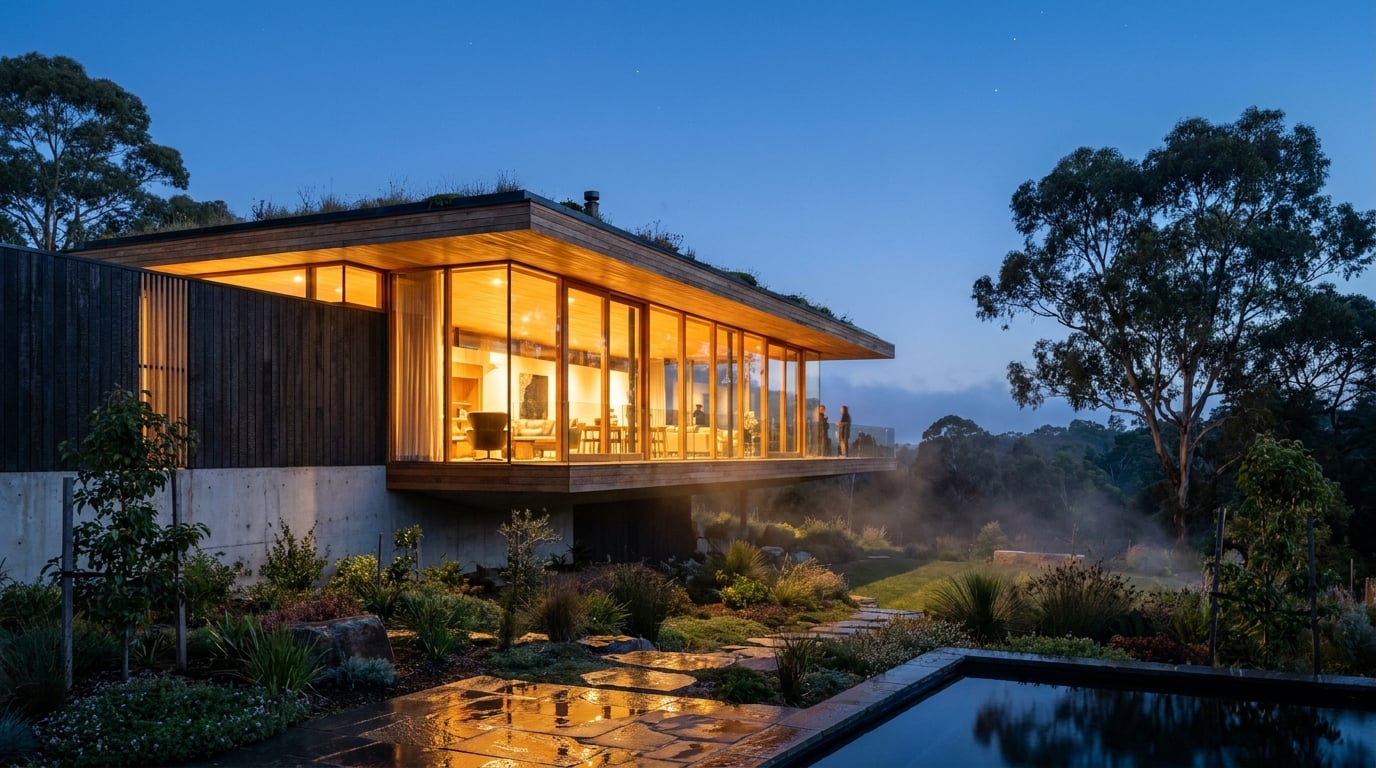
Night renders live or die on contrast control. Here's how to balance interior glow against exterior ambience without blowing out the windows.
Why most architectural night renders fail before they start
The problem is dynamic range, not rendering skill. Interior glow and exterior ambient light sit several stops apart in the real world, and when you flatten that gap into a single exposure you lose one end or the other. That's why night renders go wrong so consistently: it's a lighting and contrast problem first, and only a post-production problem second.
The most common failure is the white rectangle. Windows blow out to pure white with no mullion detail, no furniture silhouette, no sense that a room exists behind the glass. It reads as a lightbox, not an inhabited building. The second failure is the opposite instinct overcorrecting: a scene so dim and grey it looks like a daytime render with the exposure dialled down. Architects call this the day-for-night look, and it's just as unconvincing as the blown window, because nothing about the light itself has changed, only its intensity.
Before you touch a lighting rig, decide what the image is for. A client mood shot can lean dramatic: deep shadow, a single hero glow, painterly sky. A competition board hero image needs enough drama to stop someone flicking past it, but still has to hold up at A1 scale under crit-room lighting. A Design and Access Statement context view needs restraint and legibility above all else. A planning officer isn't looking for atmosphere, they're checking that the massing, glazing ratio and relationship to neighbours reads clearly after dark. Set that brief first. It changes how far you can push contrast, sky drama and painted light later.
Night rendering is a dynamic-range problem before it's a Photoshop problem. Solve the light first, grade second.
Building the interior glow first

Treat interior light as the subject of the image, not an afterthought bolted on after the exterior is modelled. Warm colour temperature, roughly the 2700 to 3000K equivalent of a domestic pendant or a low-hung kitchen light, reads instantly as occupied and inviting. Set that warmth against a cooler exterior and the contrast does most of the storytelling work on its own.
Uniform lighting is the giveaway of an unconvincing scene. If every window in a façade glows at the same intensity and colour, the eye clocks it as a lighting rig, not a lived-in building. Vary it room to room. A kitchen island pendant should throw a tighter, warmer pool of light than a hallway downlight. A bedroom lamp reads dimmer and more amber than a study desk lamp. This is the same logic a lighting designer applies on a real scheme: different rooms, different fittings, different moods, and a night render should reflect that variation rather than treat glazing as one continuous light source.
This is where testing multiple lighting directions pays off before you commit to a final render pass. Use Image to generate or extend interior lighting studies from a base render or reference photograph, trying a warm scheme against a cooler one, or a single hero glow against an evenly lit façade, before locking in the direction you take into the final composition. It's a faster way to compare options than re-lighting and re-rendering a full scene in a DCC package every time you want to see an alternative.
Whatever glow you settle on, keep sightlines readable. Furniture silhouettes, a run of kitchen units, a bookshelf, the edge of a stair, should survive behind the light rather than disappearing into a blown highlight. If you can't tell there's a room back there, the glow isn't doing its job. It's just a light source, not a window into occupied space.
A window should read as a room with light in it, not a light source shaped like a window.
Exterior ambience: the light that sets the mood

The sky is doing more compositional work than most people give it credit for. A deep blue or violet sky holds atmosphere and depth in a way that true black never can. Black skies flatten a composition, they remove the sense of distance and time of day, and they make the building look like it's floating in a void rather than sitting under an evening sky. Blue hour, not midnight, is usually the more convincing reference.
Moonlight or streetlight should do secondary work on the façade, landscaping and hardscape. This is the light that stops the building looking like a dark backdrop with a few lit windows punched into it. A cool, low-intensity wash across stone cladding, timber cladding or render gives the exterior form enough definition that it doesn't disappear into shadow. It's a supporting light, not a competing one, but without it the building reads as a silhouette rather than a piece of architecture.
Reflected glow matters more than most render passes account for. Interior light spilling onto an adjacent terrace, planting bed or water feature sells the whole scene as physically coherent, because that's what light actually does in the real world. A pool of warm light on stone paving next to a lit kitchen window tells the eye there's a real light source behind that glass, casting real light onto a real surface. Skip that step and the interior glow looks pasted on rather than emitted.
Resist the urge to uplight the whole façade. Small practical fixtures, a low bollard along a path, a porch light over an entrance, a single wall-washer picking out a datum line, do far more narrative work than dramatic architectural uplighting across an entire elevation. Uplighting everything looks like a lighting designer's showreel. A few well-placed practicals look like a building someone actually lives in or works in.
Warm interior, cool exterior, and a sky that isn't black: get those three relationships right and the rest of the night render mostly falls into place.
Working the contrast without losing detail
Once the lighting relationships are set, the job is to push exposure so the brightest glow and the darkest sky both sit within a range that still shows texture. That means no pure white masses and no pure black masses anywhere in the frame. If a window is a flat white shape with no gradient, or a section of sky is a flat black with no depth, that's a sign the exposure has been pushed too far in one direction.
This is where independent control over exposure, shadows and highlights earns its place in the workflow. Once a render is generated, Retouch's Adjust panel lets you dial exposure, shadows and highlights independently, recovering detail in a blown window without flattening the rest of the image, or lifting shadow detail on a shaded elevation without washing out the sky behind it. Because the mask and generative fill land on a real new layer, you can brighten one façade or dim one specific window without a global exposure shift wrecking the balance you've already got right elsewhere in the composition.
Non-destructive masking is the difference between a targeted fix and a blunt instrument. If the ground floor glazing is reading too hot against the upper storey, you don't need to re-expose the whole image, you mask that region and pull it back on its own. If a single window looks under-lit compared to its neighbours, brighten just that one. This is standard practice in architectural night-scene finishing, and it's what separates a graded image from one that's simply had a filter applied.
Before locking anything in, compare a straight generated night pass against a manually graded version side by side. The generated pass is often a good starting point for mood and colour relationships, but a manual grading pass is usually what gets an image to the finish line for a client deck or a competition board, because it lets you make the small, specific corrections a single global adjustment can't.
Bringing it into the deliverable
Where the image ends up changes how it should be finished. A single hero night render belongs on a Sheet in Layout, sized to an A1 crit board or competition panel, where scale and contrast need to read correctly at full size, not just on a laptop screen. The Image-led Board and Competition Board templates in Layout are built for exactly this: one dominant image doing the persuasive work, with minimal surrounding text.
For a Design and Access Statement, the night view works best paired with its daytime equivalent, both dropped into a Document template so a planning officer can see the scheme performs credibly in both conditions. The Design and Access Statement template runs at A3 across multiple pages, which suits a side-by-side day and night comparison far better than a single oversized sheet.
Keep type and annotation minimal on night imagery. The light is doing the storytelling, the labels shouldn't be competing with it for attention. A caption stating the view direction and time of day is usually enough. Once the layout is locked, export a PDF or PNG, or share a document as a read-only public link if a client wants to review before sign-off, rather than sending flat files back and forth over email.
Match the drama to the deliverable: a competition board can take a bolder night pass than a planning document ever should.
Common mistakes worth checking before you deliver

Run through this list before a night render leaves your desk. Most convincing-versus-unconvincing night scenes come down to a small number of repeated errors.
- Every window lit identically. Uniform brightness and colour across an entire façade reads as artificial staging, not occupancy. Vary intensity and warmth room to room.
- No colour temperature contrast. If interior and exterior sit at similar colour temperatures, the image feels monochrome and loses the warm-cool relationship that makes night scenes read at a glance.
- Sky too dark or too flat. A pure black or muddy grey sky kills the sense of depth. Deep blue or violet, with some gradient toward the horizon, holds the atmosphere the rest of the image depends on.
- No reflected light. Puddles, glazing, metal railings and polished paving should catch some spill from nearby light sources. If they sit dead black, the scene loses the physical coherence that sells scale and materiality.
- Blown windows with no interior detail. If you can't make out a silhouette, a ceiling line or a hint of furniture behind the glass, pull the exposure back until you can.
| Failure mode | Fix |
|---|---|
| White rectangle windows | Recover highlight detail with masked exposure control; keep furniture silhouettes visible |
| Day-for-night grey scene | Repaint the sky, remove hard sun shadows, add genuine practical light sources |
| Identical window brightness | Vary intensity and colour temperature room to room |
| Flat black sky | Push toward deep blue or violet with horizon gradient |
| Dead-black reflective surfaces | Add reflected spill from interior glow and practical lights onto paving, glazing, water |
A night render succeeds or fails on the strength of a handful of relationships: warm against cool, glow against reflection, drama against legibility. Get the interior light doing the emotional work, let the exterior ambience hold the atmosphere, and save the grading pass for precision fixes rather than trying to invent the mood after the fact. That order, light first, grade second, is what separates a convincing night scene from a darkened daytime render.
Keep reading.


Try ArchAdemia Tools for yourself
Draw it, model it, render it, publish it. One place, built for architects and small practices. Plans from £29 a month, all in.