Rendering Brick and Stone So They Don't Look Plastic.
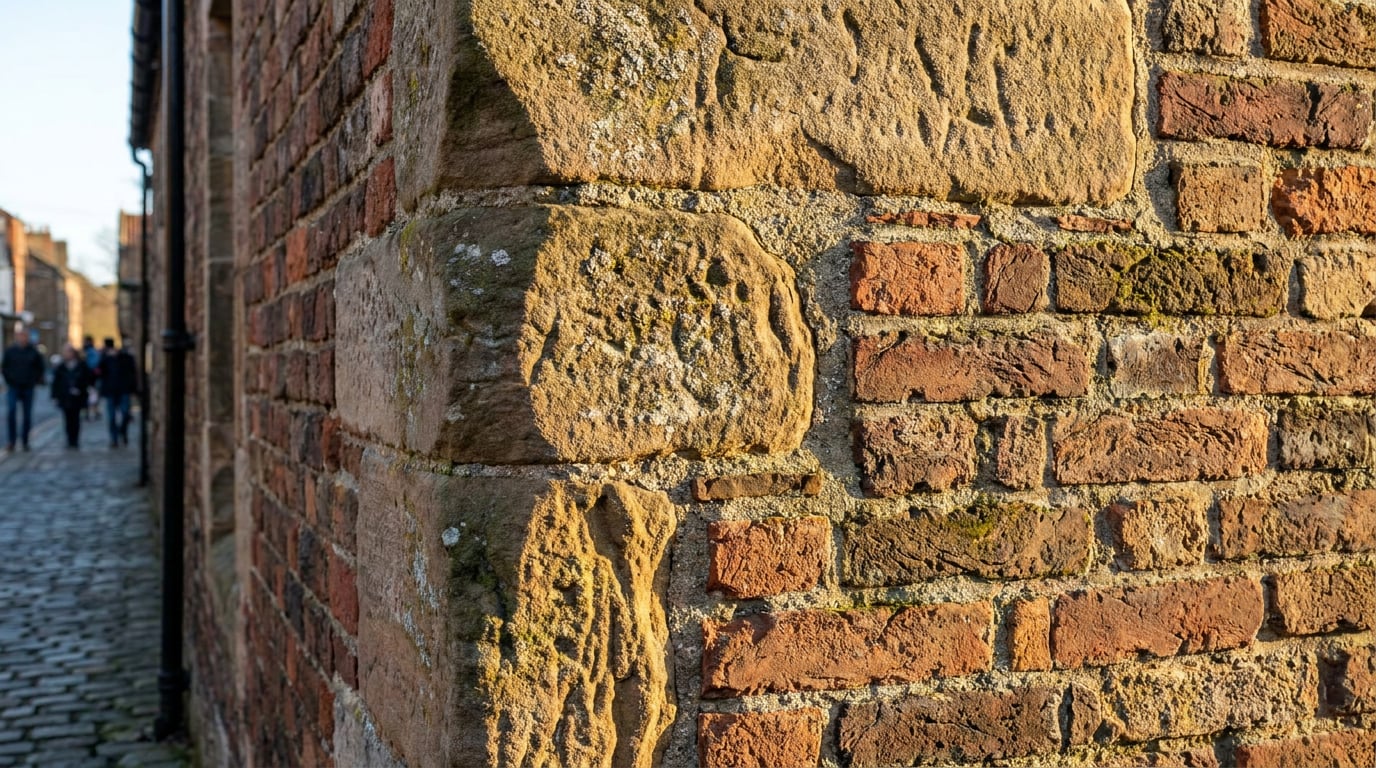
Flat brick renders come from lighting and scale mistakes, not bad materials. Here's how to fix the three things actually causing it.
Why brick and stone read as plastic in the first place
The flat, waxy look on a rendered facade almost never comes from texture resolution. It comes from lighting angle and a lack of surface irregularity. You can drop an 8K brick bitmap onto a wall and it will still look like wallpaper if the light hits it dead-on and every course repeats identically across the elevation.
Front-on, flat lighting is the biggest culprit. Mortar joints and stone coursing depend on shadow to read as physical objects rather than printed pattern. Without a shadow catching the underside of each joint or the arris of a stone unit, the eye has nothing to grip onto, and the wall collapses into a single flat plane of colour, no matter how sharp the texture map is.
The second giveaway is repetition. Real brickwork is never perfectly uniform: fired batches vary in tone, mortar ages unevenly, and no two stone blocks in a coursed wall are identical. A render with a tiled texture that repeats every metre, or a stone facade with completely uniform colour, announces itself as synthetic within about two seconds of looking at it.
This matters for AI image generation too. Models trained on real architectural photography already understand what convincing masonry looks like, but a generic prompt like "brick facade" pulls an average result: clean, regular, low-detail. Naming the specifics, coursing, weathering, joint depth, gets you much closer to what a camera would actually capture on site.
Flat facades are a lighting and detail problem before they're a resolution problem. Fixing the angle of light and breaking up repetition does more than doubling texture size ever will.
Light the facade to reveal the material, not just show it

Raking light is what separates a photograph from a swatch. When sunlight hits a wall at a low angle, roughly 20 to 40 degrees off the wall plane, every mortar joint casts a small shadow and every stone arris picks up a highlight on one edge and a shadow on the other. That's the mechanism that makes masonry legible as a physical, three-dimensional surface rather than a flat colour field.
Flat, overcast light does the opposite. It's genuinely useful for massing studies, where the goal is reading proportion and volume rather than material, but it's the worst possible condition for selling brick or stone texture. Keep overcast lighting for planning context views and site-location diagrams. Reserve raking light for anything where the material itself needs to convince.
When generating images, describe the light direction relative to the wall explicitly rather than describing the weather. "Low afternoon sun raking across the brickwork from the left" reads completely differently to a model than "sunny day", because it's giving the generator a shadow direction and angle to work with, not just a general mood.
This has a real consequence for planning submissions. In a Design and Access Statement, the facade render needs to match the site's actual orientation. A north-facing elevation lit like it's catching afternoon sun from the south is the kind of inconsistency that planning officers who know the site will flag immediately, and it undermines the credibility of the whole submission even if the image itself looks polished.
Match the light angle to the site's real orientation before anything else. A beautifully rendered facade lit inconsistently with its compass direction reads as fabricated the moment someone who knows the site looks at it.
Break the repetition: coursing, weathering and colour variation
Real brickwork drifts in tone across a wall. Different firing batches produce subtly different colours, mortar weathers unevenly as it ages, and rain streaks concentrate in predictable places: under sills, below copings, at the base of downpipes. These aren't flaws to hide. They're the visual evidence that a wall has existed in the world for a while, and they're exactly what separates a photograph from a texture swatch.
Prompt for that imperfection directly. "Reclaimed London stock brick with subtle tonal variation and weathering below the parapet" gives a generator something specific to work towards. "Red brick wall" gives it nothing but an average, and averages look synthetic.
Stone facades need even more precision, because the coursing logic itself changes what the material reads as. Ashlar, rubble, and coursed rubble are genuinely different visual languages: ashlar is regular, tightly jointed, precision-cut; rubble is irregular, rough-faced, loosely coursed. Mixing the language in a prompt, asking for "ashlar" and "rustic" in the same breath, confuses the model and often produces a wall that doesn't commit to either logic convincingly.
| Stone type | Visual signature | Where it reads best |
|---|---|---|
| Ashlar | Regular, tight joints, sharp arrises | Formal civic or heritage frontages |
| Coursed rubble | Irregular units, level courses | Vernacular or rural contexts |
| Random rubble | No coursing logic, varied unit size | Boundary walls, agricultural buildings |
Once a repeating pattern has crept into a generated facade, whether that's an obviously tiled brick bond or a stone course that clones itself across the elevation, don't regenerate the whole image and lose a composition that already works. Use Editing's image tools to spot-fix the specific area: patch in variation on a corner or reveal, and leave the rest of the facade untouched.
Ground floor plinths, string courses and window reveals are where real buildings show the most weathering, because they're the zones most exposed to splash-back, staining and physical wear. Naming these zones directly in a prompt gets variation exactly where a reviewer's eye lands first, since plinths and reveals are also the details a trained eye checks before anything else.
Name the coursing logic and the weathering zone separately in a prompt. A wall that's ashlar in one breath and weathered rubble in the next confuses the model into producing neither convincingly.
Scale tells the eye it's real before texture does

A brick or stone unit with nothing to reference its size against reads as a printed pattern, no matter how convincing the texture itself is. The eye needs an anchor: something with a known, universally understood size that lets it calibrate everything else in frame.
Doorways, downpipes, damp-proof course lines and guttering do exactly this job. These are also, not coincidentally, the details a trained eye checks first when assessing whether a render is genuine or generated, because they're the elements that carry the most information about how a real building actually meets the ground and sheds water.
For competition boards and crit sheets, keep at least one entourage element touching the facade in frame: a figure at the entrance, a cycle rack against the wall, a bin store tucked into a service yard. It's the fastest, cheapest way to stop a render looking like a rendered swatch rather than a building.
Scale problems don't stop at the point of generation, either. When compositing a facade render into a panel using Layout, check that the material scale still reads correctly at the final print size. A joint pattern or stone coursing that looks entirely convincing on a laptop screen can flatten out and disappear at A1, where the eye is viewing the image from further away and at a much larger physical size. What convinces on screen doesn't always survive the jump to a crit board.
Scale reads before texture does. A figure, a downpipe or a cycle rack touching the facade in frame does more to sell the material than another pass of texture refinement.
A practical workflow: from massing model to material-true render

Composition and light direction decisions come first, before material finish is even a consideration. Lock the massing and camera angle in 3D or Scene Composer, working through orientation and framing until the volume and viewpoint are settled. Chasing material quality before the composition is fixed means redoing work every time the camera moves.
Once composition is locked, generate the material pass in Image, prompting with the specific brick bond, stone finish and weathering language covered above rather than a generic material description. This is where coursing type, tonal variation and light direction all get specified together.
Before generating, it's worth pulling together reference photography of the actual specified brick or stone in Boards. Feeding a generator a clear reference of the real material keeps the tonal range grounded in something specific rather than drifting towards a generic average, which is particularly useful when a client or planning authority has already seen the actual brick sample.
Run a second pass through Editing's image tools for local fixes: a corner detail that's gone soft, a repeating tell in the brick bond, a reveal that needs more weathering. Fixing these locally preserves a composition that's already working rather than regenerating the whole facade and risking a worse result.
Bring the final image into Layout to check it holds up at the actual sheet size it will be seen at, whether that's an A1 crit board pinned up across a review room or an A3 page sitting inside a Design and Access Statement. Layout handles both: a single large sheet for the pin-up, or a multi-page document for the report, with page presets running the full ISO A series. It's a layout tool rather than a generative one, so the material work has to be right before it arrives here, but it's the only place to confirm the render actually reads at the size a reviewer or planning officer will see it.
For architects working through unfamiliar material or lighting language, Corb can talk through the phrasing for a specific brick bond or stone coursing before a prompt goes into Image, which is useful when the difference between "coursed rubble" and "random rubble" isn't already second nature.
The takeaway
Convincing brick and stone renders come down to four checks, run in order: light direction relative to the wall, surface depth from raking shadow, tonal and coursing variation across the elevation, and scale cues that anchor the material to something recognisable. Texture resolution matters least of the four. Get light and scale right first, and even a modest texture will read as real; get them wrong, and no amount of resolution will save it.
Keep reading.


Try ArchAdemia Tools for yourself
Draw it, model it, render it, publish it. One place, built for architects and small practices. Plans from £29 a month, all in.