Rendering Glass Without the Grey: A Working Method.
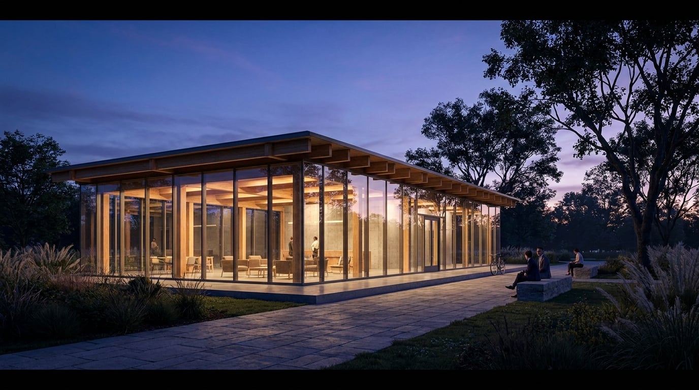
Grey, opaque glazing is the fastest way to make a render look unfinished. Here's the working method that gets transparency right.
Why glass renders grey in the first place
Grey glazing is almost never a material problem. It is an information problem. A pane of glass in a render is doing three jobs at once: reflecting something, refracting something, and letting you see through to something. Ask a model to fill a facade with "glass" and give it none of that, and it defaults to a flat mid-grey panel because there's nothing else to draw. No sky reference, no interior, no adjacent context, so the safest guess is a neutral fill.
This shows up constantly in AI-assisted concept work. A student running a massing study through an image model gets back a building with what should be a glazed atrium rendered as a solid slab of grey. It's not that the model doesn't understand glass as a concept. It's that the scene, as described, gave it nothing to put behind or in front of the pane.
The first check, before touching any settings, is to look at what should logically be visible through the glazing in the view you're generating. A shopfront should show shelving and light. An office curtain wall at dusk should show ceiling grids and desk lamps. A house window should show a hint of a kitchen or a hallway. If your prompt or your base render doesn't specify any of that, the model has nothing to work with, and grey is the honest result.
Flat grey glass is a symptom of missing scene information, not a material setting you forgot to tick.
Build the three-part glass effect: reflection, refraction, interior
Believable glazing is built from three things layered together, and each one is doing different work for the eye.
- Reflection reads first. Even a faint suggestion of sky, cloud, or the building opposite bouncing off the surface is often the single strongest cue that tells the eye "this is glass" rather than "this is a wall."
- Refraction is subtle but real. What's seen through the pane shifts slightly, or softens, relative to what you'd see directly, particularly at oblique viewing angles. You don't need to overdo this. A slight blur or displacement is enough.
- Interior visibility carries the most credibility in architectural work. A hint of a ceiling line, a piece of furniture, a light fixture glowing warm against a cool exterior: these read as depth. Without them, even a well-reflected pane can feel hollow.
Different glazing types want different weightings of these three ingredients. A ground-floor shopfront on a retail scheme wants interior visibility to dominate, because that's the point of a shopfront. A curtain wall thirty storeys up a tower wants sky and cityscape reflection to dominate, because at that height interior visibility through tinted, distant glass would be unrealistic and would actually undermine believability.
In Retouch, this three-part effect can be built as a targeted fix rather than a full re-render. Use material swap on a selected glazing area, feeding it a reference image that already carries the reflection, refraction and interior mix you want, and keep it as a toggleable layer. That means you can dial the effect back if it overshoots, or push it further on a hero shot without touching the rest of the elevation.
Reflection sells "glass," interior visibility sells "architecture." A render needs both, in the right proportion for the glazing type.
Prompting for transparency, not translucency

The word "transparent" is doing almost no useful work in a prompt. It's vague, and different models interpret it inconsistently: some read it as clear and empty, some as reflective, some ignore it entirely under stronger material cues elsewhere in the prompt. Describing the specific visual cues you want gets far more reliable results than relying on a single adjective.
Compare these two prompts for the same office building at dusk:
- "Glass facade, modern office building, dusk lighting."
- "Glazed facade showing lit interior with visible ceiling grid, desks and pendant lights beyond, faint reflection of the street and trees opposite, low evening sun."
The second gives the model concrete things to render, on both sides of the glass. It names the interior content, it names the reflection source, and it names the light condition that governs how strong that reflection should be. Low sun angles produce strong, directional reflection. Overcast light flattens reflection almost to nothing and pushes interior visibility forward instead. Match the prompt's light condition to the mood you actually want in the final image, rather than leaving the model to guess.
The same logic applies in reverse for interior views looking out. If you're rendering a living space with a glazed wall onto a garden, describe the garden: species of planting, time of day, what's beyond the boundary. A prompt that just says "large window with a view" tends to produce a flat, non-committal haze rather than a landscape you can actually read.
Name what's behind the glass, name the light condition, and describe the reflection source explicitly. "Transparent" alone is not a prompt, it's a wish.
Fixing grey glass after the fact in Retouch

Most grey glass doesn't need a full re-render to fix. It needs a targeted edit on exactly the area that's failed, which is both faster and cheaper than regenerating the whole image.
Start with selection. Rather than manually lassoing every pane on a repetitive curtain wall, use select by typed description: "all the glazing" picks up every matching region across the elevation in one pass, saving a lot of tedious clicking on a facade with dozens of identical bays.
With the glazing selected, run material swap using a reference photograph of well-lit, reflective glass, one that already shows the reflection, refraction and interior balance you're after. This corrects flat grey panels without touching the render's structure, massing or surrounding materials, and it lands as a toggleable layer, so it's non-destructive and easy to back off if it reads too strong.
Where the original render already had some usable depth in it, don't fully replace it. Use the layer mask at partial opacity to blend the fix in, keeping whatever the base render got right and only correcting what was missing.
For extra separation between glass and adjacent materials, apply an adjustment layer, masked just to the glazing selection, and push contrast up slightly with a cool tint in the Colour panel. This is a small move, but it's often what makes glazing visually distinct from render, cladding or stonework sitting right next to it.
If one specific glazed bay has gone soft or repetitive at higher output resolution, rather than the whole elevation, Enhance area re-renders just that region at higher resolution and composites it back through the selection, without disturbing anything else on the sheet.
A masked material swap on flagged glazing is almost always faster and cheaper than regenerating the whole image, and it's easier to control.
Match glass treatment to the deliverable
How much reflection and interior detail is appropriate depends entirely on what the image is for. The same building can, and should, be rendered with different glazing treatment for different outputs.
| Deliverable | Glass treatment | Why |
|---|---|---|
| Competition board / hero exterior | Bold reflection, skyline or landscape visible in the facade | Sells context and setting as part of the scheme's story |
| Planning application visual | Restrained, believable transparency | Avoids looking manipulated or misleading to a planning officer |
| Interior view looking out | Reflection kept low, view kept clear | Client is paying to see the view, not the room reflected back |
| Portfolio / crit sheet | Consistent treatment across every glazed view | A panel assembled from mismatched renders reads as sloppy at a glance |
Planning visuals in particular deserve a note of caution. An officer reviewing a submission is looking for an honest representation of how the scheme will actually appear, and glazing that's been pushed to look either implausibly transparent (revealing invented interior detail that won't exist) or implausibly opaque can both raise questions. Restraint reads as credibility here.
For portfolio and crit work, consistency across a set matters more than any single image being spectacular. If you're using a re-light preset or a material reference on one glazed elevation, use the same one across every other glazed view in the set, so the panel doesn't look like it was stitched together from four different sessions. Laying corrected glazing shots into Layout's Image-led Board or Competition Board templates puts a render right next to a section or elevation, which makes any inconsistency in glass treatment obvious immediately, before a crit or a jury sees it.
A quick before-and-after check

Before calling any render finished, zoom into every glazed element at full resolution. Grey glass hides easily at thumbnail size on a screen and only becomes obvious once it's blown up on a printed A1 board in front of a jury, which is the worst possible moment to discover it.
A useful sanity test: could someone unfamiliar with the building tell, from the glazing alone, that it's glass and not timber cladding or a solid render panel? If the answer isn't an immediate yes, the three-part effect needs more work.
Compare against a real photograph of similar glazing in similar light, not just against your own other renders. It's easy to develop a house style that looks consistent within a project but drifts from how real glass actually behaves. Keeping a small, trusted set of reference photographs, shot at different times of day, gives material swap in Retouch a dependable source every time, rather than starting the search for a good reference from scratch on every project.
Check glazing at full resolution, against a real photograph, before the render leaves your desk. A thumbnail will forgive grey glass. A printed board won't.
Glass fails in renders for a specific, fixable reason: the model or the edit didn't have enough information about what the pane should show and reflect. Give it that information explicitly, in the prompt or in a targeted Retouch fix, and grey stops being a recurring problem and becomes a five-minute correction.
Keep reading.

Try ArchAdemia Tools for yourself
Draw it, model it, render it, publish it. One place, built for architects and small practices. Plans from £29 a month, all in.