Weathered Concrete That Doesn't Read as CGI: A Working Method.
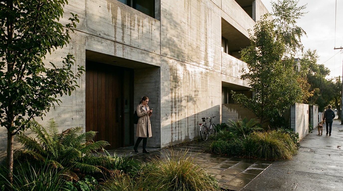
Flat concrete renders come from missing surface logic, not bad models. Here's the layered approach that gets grain, staining and edge wear to actually read.
Why concrete goes flat in the first place
Concrete is not a material. It is a composite that happens to hold together as one surface: aggregate, cement paste, the imprint of whatever formwork cast it, and years of runoff, dirt and mineral bloom sitting on top of all that. Most renders skip straight past this and treat concrete as a single grey shader. That is the fastest way to make a Design and Access Statement image look like a render rather than a building.
A base texture with no variation in roughness or colour reads as plastic, no matter how good the underlying model or lighting rig is. This is true whether you are rendering a board-marked chapel wall or a precast panel on a housing scheme. The eye is very good at detecting uniformity, and uniformity is the one thing real concrete never has.
Think of concrete weathering at three working scales, useful as a rendering framework even though no single technical standard defines them this way:
- Micro-scale: the aggregate grain and cement-paste variation visible at close range.
- Mid-scale: formwork joints, board marks, panel lines and patch repairs.
- Elevation-scale: runoff streaking, general dirt and biological staining across the whole facade.
Each scale needs its own pass. Skipping straight to elevation-scale grime without the mid-scale joint logic underneath it is how you get a wall that looks dirty but not built.
The common mistake is reaching for bump or normal map strength to fake age. Cranking that slider makes the surface bumpier, not older. Age is a colour and roughness problem first, geometry second. A heavily bumped, perfectly clean-toned concrete wall looks like a golf ball. A subtly varied, correctly stained one looks like it has stood outside for thirty years.
Before you touch a render setting, build a small reference set: one close-up shot of the aggregate and paste texture, one mid-range shot of a panel with its joints, and one full elevation shot showing the staining pattern. Match your render against all three distances, not just the hero shot distance you're planning to use.
Concrete fails in renders because it's treated as one grey value instead of three separate scales of visual information, each needing its own treatment.

Build the base material in layers, not one shot
Start with a base grey that carries genuine roughness variation across its surface, not a flat value repeated everywhere. Real concrete has micro-variation in every square metre: slightly duller patches where the paste is thicker, slightly glossier patches where aggregate breaks the surface. If your base material swatch looks even under raking light, it will look even in the final render too.
Layer two is formwork lines and panel joints. This is the pass that tells the eye "this was cast," rather than "this was rendered." A grid of joint lines, subtle board-mark grain running in one direction, the occasional patch repair where a tie-hole was filled: these are what separate a concrete wall from a grey box.
In Retouch, this is where a layer mask earns its place. Isolate horizontal streaking on its own mask, separate from vertical joint lines, so each can be graded independently. Push the horizontal runoff darker without dragging the vertical formwork grid along with it, or vice versa. Trying to grade both together in one pass is how weathering ends up looking like a single flat filter rather than two independent physical processes.
Keep the base material itself desaturated. Colour should come from the staining and grime layers sitting on top, not from the concrete's own base tone. If you push warmth or colour into the base grey, every subsequent staining layer inherits that colour and the whole wall starts to look tinted rather than aged.
A practical example: board-marked concrete at two distances
A Design and Access Statement render of a board-marked facade needs the timber grain from the formwork visible at close range, fading out as the camera pulls back to full elevation. That means two texture resolutions blended by camera distance: a high-frequency board-grain texture for the near-field, and a softer, lower-frequency version for anything beyond mid-range. Rendering one texture resolution across the whole facade either loses the grain entirely at distance or makes the near-field read as noise.
A stronger bump map cannot substitute for correctly scaled colour, roughness and geometry. Age is built through variation, not through pushing one slider harder.
Weathering is directional, not random
Water always moves down. That single fact governs almost everything about how concrete actually ages, and it is the fact most renders ignore in favour of a scattered dirt overlay. Staining should originate at parapets, sills, copings and drip details, then run downward in soft vertical streaks. It should never appear as random speckle distributed evenly across a wall, because that is not how water behaves and the eye knows it.
Precast concrete guidance draws a useful distinction here between general surface staining (dirt accumulation across broad areas) and pattern staining (marks caused specifically by joints, panel breaks and water paths).[11] That distinction is worth carrying into your material layers directly. Pattern staining is the mid-scale pass, tied to real construction lines. Surface staining is the elevation-scale pass, broader and softer.
Efflorescence, the white mineral bloom produced when water carries dissolved salts through concrete and deposits them at the surface, behaves the same way.[9] It concentrates at joints and cracks where water has repeatedly evaporated, not smeared evenly across a wall. A render with efflorescence spread uniformly across a whole elevation looks like a texture filter. Efflorescence concentrated at three or four specific joint lines, fading out elsewhere, looks like a real building with a real drainage history.
Retouch's material swap is useful for testing this before committing. Select a region of the facade, swap in a staining reference, and check whether the direction and density read as plausible against the real geometry of the scheme, rather than defaulting to a generic dirt overlay dropped across the whole wall.
Orientation matters too. It is a reasonable practical observation, not a measured rule, that shaded or north-facing elevations tend to hold moisture and moss longer than sun-facing ones. Match your staining logic to the building's actual orientation in your scheme. A south-facing elevation with heavy moss staining will read as wrong to anyone who has looked at buildings carefully, even if they can't say exactly why.
The single biggest giveaway between a CGI render and a photograph of an aged building is the absence of darker value at horizontal ledges, sills and copings, the places where dirt physically collects because gravity and geometry put it there. Add that darkening deliberately at every horizontal break in the facade. It is a small move with a disproportionate effect on believability.
Water moves down and pools at horizontal breaks. Stain your renders the same way, tied to parapets, sills and copings, and skip the scattered speckle entirely.

Let light do the work light does
Weathered concrete has a rougher, more varied surface than fresh concrete, and it should scatter light unevenly as a result, not throw back one clean specular highlight. A single tight highlight sliding across an aged facade is one of the fastest ways to break the illusion, because it tells the eye the surface is smoother and more uniform than the staining and joint work suggest it should be.
Overcast light is a genuinely useful test condition for concrete studies, though it is worth treating as a controlled setting rather than a universal rule. Flat, diffuse light removes the competing hard highlight and lets the surface's own texture and staining carry the read. If your weathering layers don't hold up under overcast light, raking sunlight won't rescue them; it will just add drama on top of a flat material.
Retouch's one-click re-light presets (Overcast, Golden hour, Dusk, Blue hour, Night, Sunny) are useful for exactly this kind of test. Run the same facade material through Overcast first to check the staining reads honestly without a highlight to hide behind, then try Golden hour or Dusk to see how the same surface performs under a harder, angled light before you lock a final camera position for a client presentation or competition board.
Raking light at a low sun angle is the fastest route to selling aggregate texture and formwork joints, because it throws long shadows off even small surface irregularities. A board mark that is invisible under flat frontal light becomes an obvious, readable line under a low sun angle from the side. If aggregate relief or joint depth needs to be part of the story in a particular view, choose a camera and sun angle that puts light across the wall rather than flat onto it.
Avoid lighting concrete evenly from the camera direction. Real facades always have falloff somewhere: a shadowed recess, a reveal, a grazing angle where the light skims rather than hits. A flat frontal render misses every one of these, and the wall ends up looking like a texture swatch pasted onto a box rather than a piece of a building standing in daylight.
Finish it in post: grade, grain and imperfection
The last ten percent of believability happens after the render, not during it. In Retouch, the Adjust panel's texture and clarity controls add believable micro-contrast to concrete without oversharpening the whole image. Push these on a masked region rather than globally: the concrete should gain definition, but the sky, glazing and landscaping around it shouldn't pick up the same artificial crispness.
A slight dehaze pass on the concrete region only, masked rather than applied across the whole frame, brings back a touch of atmospheric softness that pure CGI output tends to lack. Renders often come out of the engine too clean, too optically perfect. Real cameras and real atmosphere introduce a small amount of softness that the eye reads as authenticity, even when it can't name why.
A very light vignette and subtle chromatic aberration, applied through the same Adjust panel effects, mimic how an actual camera lens captures a large flat surface. Perfectly clean, perfectly sharp edges right to the frame boundary are a tell. Real lenses don't do that, and a trained eye picks up on it even in a fast crit-room scan of a board.
Use Enhance area on any section of the facade that has gone soft or visibly repetitive at higher resolution, particularly where the aggregate pattern has started to tile. This is a common problem on large elevation renders prepared for print: the texture reads fine at screen resolution and falls apart the moment it's blown up for an A1 competition board.
The final check
Zoom to 100% at three points on the wall: top, middle and base. Confirm the weathering density genuinely changes across that vertical run, heavier near the parapet and base, lighter through the middle, rather than looking like the same texture copy-pasted up the facade. This one check catches most of the remaining CGI tells before the image leaves your desk.
Concrete weathering should be a controlled material and post-production layer sitting on top of correct geometry, not something an image generator is left to invent for you. Preserve the joints and openings; edit the ageing.
This layered approach isn't unique to architecture. Product visualisers use the same logic to distinguish manufactured surface finish from handling wear. Heritage documentation separates original material from later repair and staining in exactly this three-scale way. Landscape and interior work do the same with stone, render and timber. The discipline changes; the underlying method, micro-texture, construction pattern, environmental accumulation, does not.
Where AI tools genuinely help in this workflow is as a reference generator, not a truth source. Testing a few alternative runoff densities or efflorescence patterns against a facade before committing to a final grade is a reasonable use of generative tools; letting an image model rewrite your joints, openings or panel lines while it's "ageing" the material is not. Treat weathering as something you apply deliberately in layers, in the order the building physics actually happens: base variation, joint pattern, directional staining, light, then grade. Skip a step and the wall will tell you.
Keep reading.


Try ArchAdemia Tools for yourself
Draw it, model it, render it, publish it. One place, built for architects and small practices. Plans from £29 a month, all in.