Reflections and Puddles: Rendering a Scheme After Rain Without Gimmicks.
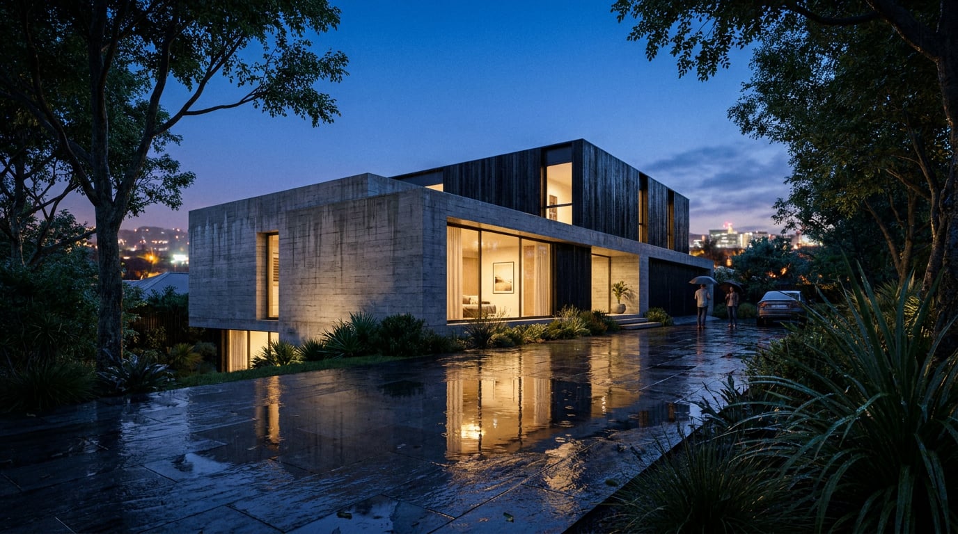
A wet-weather render sells a scheme when the ground does the work. How to build puddles and reflections that read as real, not as a filter.
Why Most After-Rain Renders Look Pasted On
 The usual failure is a glossy sheet laid across the whole ground plane. Every surface becomes a uniform mirror, the reflections repeat at the same strength from foreground to background, and nothing explains why water sits where it does. The viewer cannot name the problem, but they feel it. It reads as a filter.
Real wet ground is never one state. It is a pattern of three: **standing water**, **darkened saturated material** and **relatively dry ground**. A cambered street an hour after a shower has a dark, damp carriageway, pooled water in the gutter line and a few pale patches under a tree canopy. Strip any one of those three and the eye stops believing the scene.
Rain-rendering research supports this thinking. One real-time study builds puddles from depth maps, ripple normals and warped reflection buffers rather than a single reflective overlay, and it blends the ordinary paving normal with a flatter water normal according to puddle depth (Rain rendering study, ref. 14). You do not need to write a shader to learn from that. The principle is that wetness is a **material state**, a graduated condition of the surface, not a colour grade dropped over the top.
Reflection content is the second giveaway. The sky is rarely the problem. What gives the game away is a reflection that does not match the scheme: a generic cloudscape mirrored in a puddle that sits directly beneath a four-storey brick elevation, or a tree reflected where no tree exists. Whatever appears in the water must be something actually above or in front of it.
The usual failure is a glossy sheet laid across the whole ground plane. Every surface becomes a uniform mirror, the reflections repeat at the same strength from foreground to background, and nothing explains why water sits where it does. The viewer cannot name the problem, but they feel it. It reads as a filter.
Real wet ground is never one state. It is a pattern of three: **standing water**, **darkened saturated material** and **relatively dry ground**. A cambered street an hour after a shower has a dark, damp carriageway, pooled water in the gutter line and a few pale patches under a tree canopy. Strip any one of those three and the eye stops believing the scene.
Rain-rendering research supports this thinking. One real-time study builds puddles from depth maps, ripple normals and warped reflection buffers rather than a single reflective overlay, and it blends the ordinary paving normal with a flatter water normal according to puddle depth (Rain rendering study, ref. 14). You do not need to write a shader to learn from that. The principle is that wetness is a **material state**, a graduated condition of the surface, not a colour grade dropped over the top.
Reflection content is the second giveaway. The sky is rarely the problem. What gives the game away is a reflection that does not match the scheme: a generic cloudscape mirrored in a puddle that sits directly beneath a four-storey brick elevation, or a tree reflected where no tree exists. Whatever appears in the water must be something actually above or in front of it.
The test for any wet-weather view: remove the puddles in your head. If the surrounding surfaces would no longer read as recently rained on, the image is relying on gloss alone.
Where Water Actually Collects on Your Scheme
 Water follows the design. It runs to the lowest point, collects against obstructions and lingers in worn or settled areas. Placing puddles is therefore a drawing exercise before it is a rendering one: read your levels, falls and edges, and put water where the site would genuinely pond.
This is design and construction reasoning rather than a universal rule, so treat it as visual logic. Different project types give you different cues.
Water follows the design. It runs to the lowest point, collects against obstructions and lingers in worn or settled areas. Placing puddles is therefore a drawing exercise before it is a rendering one: read your levels, falls and edges, and put water where the site would genuinely pond.
This is design and construction reasoning rather than a universal rule, so treat it as visual logic. Different project types give you different cues.
A planning-application street view
On a carriageway, think camber. The crown stays comparatively drier while water tracks toward the kerb line, collecting at gullies and shallow depressions. Utility covers, patched tarmac and road markings create small irregularities where thin films of water linger. A blocked or visible gully gives you a believable reason for a larger pool. Keep the pavement slabs a different wet state from the carriageway: paving slabs darken and drain differently from asphalt.A courtyard concept
Laid stone behaves differently. Water sits in paving falls, runs along open joints, and gathers at thresholds, planter edges and local depressions where the laying is imperfect. Large-format flags with tight joints hold continuous sheets; setts and small-unit paving break water into fragments held between joints. A drainage channel or slot drain tells the viewer where the water is meant to go, which makes the rest of the surface more credible.Damp is not standing water
This is the transition most renders skip. Around a puddle, paving is **darkened and saturated**, then fades to drier tone further out. A puddle with a crisp dry edge and no damp halo looks cut and pasted. Build the gradient: deepest tone nearest the water, lighter as you move away, with a few drier patches where a canopy, canopy shadow or slight rise would shelter the ground. Edge character depends on material as well. Water on dense stone or tarmac meets dry ground with a **hard edge**. On porous materials such as sandstone or brick slips, the edge softens as moisture wicks outward. Keep puddles **asymmetric and varied in size**: a scatter of one large, two medium and several small shapes reads as natural, while evenly sized ovals read as stamps.| Surface | Where water collects | Edge behaviour |
|---|---|---|
| Cambered tarmac | Kerb line, gullies, utility cuts | Hard edge, thin film |
| Large-format stone flags | Paving falls, thresholds, planter edges | Hard edge, long sheets |
| Setts and small-unit paving | Joints, local depressions | Fragmented, broken by joints |
| Sandstone, brick slips | Below sills, at the base of walls | Soft, wicking edge |
Reading Reflections: Geometry, Fresnel and Edge Falloff
 A reflection shows what is above and in front of the surface, mirrored about its plane. Before you accept any reflection in a render, ask what object in your scene would produce it. A facade, a lamp column, a tree: all are legitimate. An arbitrary environment map pasted across the site is not.
The same research that informs puddle construction recommends rendering proxy geometry into the reflection pass and distorting it directionally with raindrop ripples (ref. 14). The practical lesson for a visualiser is that reflections should be **geometrically anchored to the scheme** and then disturbed, never left as a clean copy.
A reflection shows what is above and in front of the surface, mirrored about its plane. Before you accept any reflection in a render, ask what object in your scene would produce it. A facade, a lamp column, a tree: all are legitimate. An arbitrary environment map pasted across the site is not.
The same research that informs puddle construction recommends rendering proxy geometry into the reflection pass and distorting it directionally with raindrop ripples (ref. 14). The practical lesson for a visualiser is that reflections should be **geometrically anchored to the scheme** and then disturbed, never left as a clean copy.
Camera height changes everything
Reflectance rises as the viewing angle becomes more glancing, a consequence of Fresnel behaviour. From a low camera, looking nearly parallel to the ground, a puddle approaches grazing incidence and reads as a near-mirror. From a steep overhead position, the reflection weakens, and what you see instead is puddle depth and the colour of the ground beneath. This matters for choosing views. A low eye-level shot down a wet street makes puddles the hero. An elevated aerial of the same scheme will show darker tone and a few glints, not mirrors. No reliable source gives a single "correct" puddle reflectivity figure, so do not chase a number. Judge it by angle: the shallower the view, the stronger the reflection.Break the mirror
A perfect reflection is the clearest sign of a gimmick. Real puddles are contaminated. Disturb the surface with:- Ripples from falling or recently fallen rain, distorting the reflected image directionally
- Leaf litter and debris floating or lodged at the margin
- Tyre marks and footprints pushing water and dirt across the surface
- Dirt and silt darkening the edges where water meets dry ground
Do not forget the verticals
Wet vertical surfaces reflect too, though weakly. Masonry turns darker and slightly glossier, glazing carries streaking, and metal cladding picks up fine droplets. This is where much of the mood lives. A facade that has clearly been rained on, with darker brick and run-off streaks under sills, carries the atmosphere with fewer puddles in the foreground.Camera height is a design decision here. Choose a low view for reflective drama, a high one for tonal restraint, and do not apply mirror strength to both.
Light, Sky and Entourage That Sell the Wet
Overcast, low-contrast light suits the subject. Cloud diffuses the sun, shadows soften or vanish and colour saturates in wet materials. A brighter break in the cloud gives you something useful: a **controlled highlight** that catches wet surfaces and the edges of puddles without cooking the entire image into dry-weather contrast.Warm light on cold ground
The strongest case for a wet-weather view in a client presentation or competition board is interior glow. At dusk or in grey afternoon light, lit windows, entrances and shopfronts throw warm reflections across cold, dark paving. The temperature contrast does the emotional work: the building feels inhabited and sheltered while the street feels wet and exposed. It also reveals the scheme's ground-floor activity, which is exactly what a public-realm argument needs.Entourage must agree
Nothing breaks a rain image faster than a summer crowd on a wet street. Check the people and objects against the weather:- Umbrellas, raincoats and darker, heavier clothing
- Bikes, cars and street furniture with wet, beaded surfaces
- Fewer people lingering, more purposeful movement
- Foliage that looks heavier and darker, not sun-bleached
Match the sky to the surface
Soft or absent shadows combined with saturated ground colour read as rain. Hard-edged shadows contradict it, no matter how many puddles you add. Keep sky, shadow density and colour temperature consistent with the wetness: a cool, even light for the overcast base, with warm accents only where the scheme provides a source for them. Across disciplines the same logic holds. A landscape scheme reads wetter when planting is darker and foliage glistens, a heritage retrofit shows weathering as darkened stone and stained lead flashings, and an interior seen through glazing uses condensation and warm spill against cool exterior wet. The visual grammar is shared; the surfaces change.Getting There in ArchAdemia Tools
Done by hand, this is a long sequence of careful masking. In ArchAdemia Tools you can run it as one connected workflow, with your scheme's own geometry driving where the water goes.Start from the drawing, not a dry render
Begin in **Linea**, where the 2D plan and 3D model of the same building are edited together. Set up a perspective view of the massing and ground, so the scheme's actual levels and paving falls inform where water would sit, then send that view to the rendering studio from there. Linea is a drawing and modelling tool for everyday practice work, not a BIM package, but for this job it does the useful thing: it keeps your ground plane honest. New geometry starts in flat painted colour, so any wet-state finish you see later is something you applied, not something the model supplied.Build the wet-weather base in Retouch
In **Retouch**, the **Overcast** re-light preset regenerates a dry view as an overcast scene on a new layer. That gives you the soft, low-contrast light the previous section called for, without redrawing the scheme. Your original stays untouched underneath. Then work through the three wetness states as separate, toggleable steps:- Standing water: use the mask-plus-prompt generative fill on the ground plane to place puddles where your falls, kerbs and thresholds suggest, describing the surface and the objects it should reflect.
- Damp paving: use selection by description, typing something like all the paving, then apply a material swap or a darkening and saturation adjustment so the wider ground reads as saturated, as its own layer you can switch off.
- Dry ground: leave sheltered areas, under canopies and on slight rises, relatively untouched so the transition is visible.
Grade and finish
Close with the **Adjust panel** as a maskable adjustment layer, which keeps contrast and highlight roll-off under control without flattening your work. Pull highlights down so wet surfaces do not clip, and keep the mood cool and even. If any puddle has gone soft or repetitive at wide-view scale, select it and use **Enhance area**, which re-renders the region at higher resolution with no prompt and composites it back through your selection.Work in layers: overcast base, standing water, damp paving, grade. Every wetness state stays independently adjustable, so a client who wants it drier is one toggle away.
Choosing the right output
Stills are the right deliverable for a Design and Access Statement or planning image. If a short atmospheric camera move helps a competition entry, motion tools exist, though vendor pricing for video generation, such as Runway's listed 12 credits per second for Gen-4.5, makes it a deliberate choice rather than a default (Runway pricing page, ref. 15). For the final board, drop the finished image into **Layout** for a crit sheet or competition panel.Rain should be a controlled change in how the surfaces behave. Place water where the scheme would hold it, darken what would be damp, anchor every reflection to something in the view, and the wet-weather render stops looking like a filter.
Keep reading.


Try ArchAdemia Tools for yourself
Draw it, model it, render it, publish it. One place, built for architects and small practices. Plans from £29 a month, all in.