Section and Elevation Drawings That Read at Print Size.
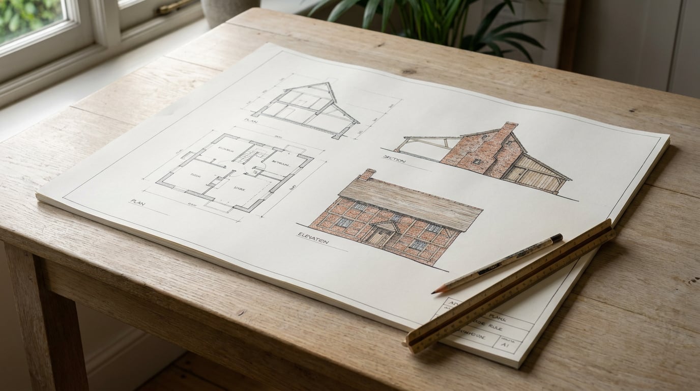
A section that looks crisp on screen can turn to mush on an A1 pin-up. Fix line weights, shadows and entourage so the sheet reads from two metres away.
Why Your Section Looks Fine on Screen and Dead on the Sheet
 A section drawn at the monitor and judged at the monitor will almost always fail on the sheet. On screen you zoom in to a window reveal, tidy a junction, then zoom out and assume the whole drawing behaves the way the detail did. It does not. Line weights are specified in paper millimetres, and the people reading an A1 board stand a metre or two away, not at arm's length with a mouse in hand.
The fastest way to find the problem is a distance test. Print the sheet at 50%, or view it at 100% on screen and step back. Ask one question: is the section cut the first thing the eye lands on? If the eye wanders to a hatch pattern, a tree or a stray dimension string, the hierarchy is wrong, however crisp the drawing looks up close. These are studio conventions rather than formal standards, but they are conventions that survive contact with a real crit panel.
Three failures account for most muddy sections:
- Every line at the same weight. The cut, the furniture beyond and the paving joints all shout at the same volume, so nothing leads.
- Shadows built from heavy black fills. They look dramatic on a backlit monitor and print as dense slabs that swallow the linework underneath.
- Entourage drawn at the wrong scale. A figure two bricks too tall tells a planner the proportions cannot be trusted, and they will stop trusting the rest of the sheet too.
Judge a drawing at the distance it will be read. If the cut line is not the loudest thing on the sheet from two metres, no amount of detail up close will rescue it.
A Line-Weight Hierarchy That Survives Reduction
A workable hierarchy has four tiers, in strict order of dominance. Treat the millimetre figures as a starting point to test, not a rule to obey.| Tier | What it covers | Typical starting weight | Role |
|---|---|---|---|
| 1. Cut line | Walls, floors, roof and ground sliced by the section plane | 0.5 to 0.7 mm | The primary line. The eye lands here first. |
| 2. Beyond the cut | Elements seen in elevation behind the section plane | 0.25 to 0.35 mm | Builds depth without competing with the cut. |
| 3. Surface and material lines | Joints, cladding lines, glazing bars, paving | 0.13 to 0.18 mm | Describes the building's skin. |
| 4. Hatch and texture | Timber grain, insulation, brick coursing, tone | 0.09 to 0.13 mm | Whisper-quiet. Present, never dominant. |
Fix the four tiers once, scale the cut weight to each drawing's scale, and reuse the same key on every sheet in the set.
Shadows That Add Depth Without Muddying the Drawing
 Shadows are the cheapest way to make a flat elevation read as a three-dimensional building, and the easiest way to wreck a drawing that was otherwise working. The discipline is restraint and consistency.
### One sun angle for the whole sheet
Pick a single sun direction and apply it to every section and elevation on the board. A 45 degree shadow cast from the upper left is the common studio convention, and the point is not the number but the agreement. Shadows that fall left in one elevation and right in the next read as carelessness, and the eye registers the conflict even when the reader cannot say what is wrong.
### Put shadows where the façade has depth
Elevation shadows do real work in a few specific places: a recess, a deep reveal, a projecting balcony, a brise-soleil, a canopy. These are exactly the moments where a flat line drawing cannot show depth by linework alone. A flush rendered wall with punched windows gains almost nothing from a shadow; a façade with a metre-deep colonnade gains everything. Spend your shadow budget where the architecture is three-dimensional and leave the rest alone.
### Flat tone, never solid black
Build shadow from a flat mid-tone or a light hatch rather than a heavy black fill. The shadow should sit behind the linework, never compete with it at print size. A useful comparison: on a brick elevation, a 25 to 35% grey shadow under a projecting sill keeps every coursing line visible through it, while a black fill erases the coursing and leaves a hole in the wall. The first reads as shade; the second reads as a mistake.
### Shade the interior side of the cut lightly
In section, the cut line and the poche must remain the loudest element. Shade the interior faces beyond the cut, such as wall faces and soffits, lightly so they recede. If the interior tone competes with the poche, the section loses its spine. The test is simple: squint at the drawing, and the cut should still be the darkest, most continuous thing you see.
### Test density at final print size
A fill that looks subtle on a backlit monitor often prints two tones darker, particularly on uncoated stock or a large-format plotter. Never approve shadow density on screen alone. Print the sheet, or an A3 reduction of it, and adjust the tone there. This one habit prevents more muddy boards than any other.
Shadow earns its place only where the façade has real depth. Keep it a flat mid-tone, behind the linework, at one agreed sun angle.
Entourage That Reads at Print Size: Scale, Style and Restraint
Entourage is the people, trees, cars and furniture that make a drawing feel inhabited. It is also the area where otherwise strong sheets most often come apart, because it is placed last, in a hurry, and judged by whether it looks pleasant rather than whether it does a job. ### Figures are the scale check A human at the correct height against a door or a floor-to-ceiling dimension tells the reader the proportions are true. Draw figures to scale before you style them. A figure at 1.7 to 1.8 m beside a 2.1 m door confirms the door is a door; a figure that is visibly too tall shrinks the building and invites the question of what else is off. Treat the figure as a ruler first and decoration second. ### One entourage style for the whole set Choose a single register for the entire set, whether silhouette, line figure or tonal cut-out, and keep trees, cars, furniture and people in that same register. Mixing a photographic person with a line-drawn tree breaks the sheet, because the eye reads two different drawing languages fighting for the same space. A consistent, slightly restrained style looks deliberate; a mixed one looks assembled from leftovers. ### Fewer, larger, better placed At A1 viewing distance, a cluster of tiny figures becomes visual noise, a grey stipple that reads as a smudge. Three or four well-placed figures animate a section far better than twenty small ones. Larger figures also hold their silhouette when the sheet is reduced for a report or a planning PDF. ### Use entourage to explain the scheme The strongest entourage tells the reader how the building works. Show people using a double-height atrium, climbing a stair, crossing a threshold, queuing at a counter, sitting in a reading window. Compare two versions of the same library section: in one, eight figures are scattered across the floor plates to fill space; in the other, two figures share a long reading table under a rooflight and a third pauses on the stair. The second explains the brief. The first only occupies the paper. ### Keep entourage lighter than the architecture Entourage must sit below the cut line and the main building outline in weight. It supports the drawing; it must never out-compete the architecture it is there to describe. If a tree canopy is the heaviest thing on the sheet, the section has been inverted. For entourage that stays consistent across a whole set, Vector is useful: import or draw a north point, scale bar or silhouette tree as real linework, then place it on each sheet and reweight it with the Width tool so every figure and tree shares one line language. Vector also takes a vector SVG straight onto the current sheet as its own layer, which is how a practice's signature tree or figure set travels from board to board unchanged.Every figure should do a job: confirm scale, show use, or mark a threshold. If it only fills space, delete it.
Sheet Setup, Export and the Print Test Before You Send
 A well-weighted drawing can still be spoiled by a careless sheet or a lossy export. The setup stage is where consistency is either locked in or lost.
### Build the sheet at true size
In ArchAdemia Tools, Layout opens in Sheet mode at A1 landscape by default, one large surface for the crit board, the competition panel or the pin-up. Turn the layout grid on (Manuscript, Columns or Modular) so the section, elevation and key plan snap to a consistent rhythm and align across the board. The grid is a reference overlay only and never appears in an export, so it costs you nothing visually. A drawing set that shares a grid reads as one authored document rather than a collage.
### Carry weights from the drawing to the sheet
In Linea, sections and elevations are cut from the model as real linework, and a drawing sheet exports as a PDF at true plotted scale on a chosen paper size, with a title block. Because the linework is real, line weights are set once in the drawing and carry through to the sheet, rather than being re-guessed at layout stage. That is the practical reason to resolve the hierarchy in the drawing environment first.
### Reweight imported CAD by hand
If the base drawing arrives from CAD, Vector imports a vector PDF or DXF as editable linework. Its Width tool lets you vary a line's weight along its length, so a cut line or a ground line can be reweighted or tapered by hand before the board goes out. Imported CAD is rarely weighted for presentation; this is where you apply your four tiers rather than accept whatever the plot style produced. Where a sheet carries several drawings, Vector can crop the import to the single section or elevation you need, so you are not dragging a whole model space along with it.
### Export vector, not raster
Export a vector multi-page PDF at true sheet dimensions from Layout, adding bleed and crop marks if the board is going to a print shop. Avoid a raster PNG for anything with fine line weights: raster export bakes in a resolution and softens the thinnest lines, which are exactly the surface and hatch tiers you drew carefully. Keep a PNG for the web preview if you want one, but send the PDF to print.
### Run the print test before the full run
Check the sheet at 100% on screen, then print one at actual size or an A3 reduction before committing the full run. Work through a short checklist:
- Does the cut line dominate the sheet from a step back?
- Does the poche stay legible, with no filled areas clogging or washing out?
- Are the shadows a quiet tone behind the linework, not a competing mass?
- Does the entourage show occupation, with figures at true scale?
- Is the line-weight key consistent with the other sheets in the set?
Decide who reads the sheet and from how far, fix a four-tier weight hierarchy once, then prove it with an A3 print before the A1 plot.
Keep reading.
Try ArchAdemia Tools for yourself
Draw it, model it, render it, publish it. One place, built for architects and small practices. From £19 a month, all in.