How to Use Context to Sell a Render's Site Fit.
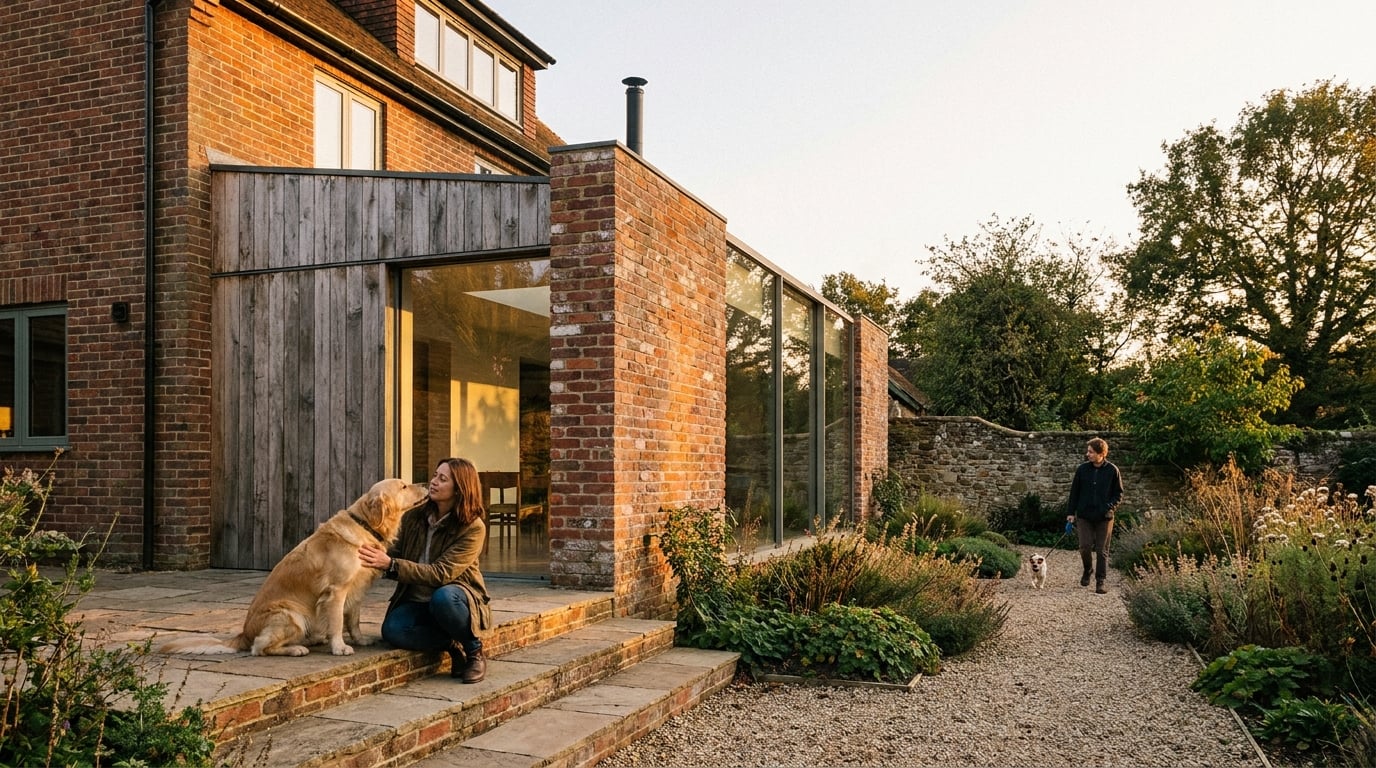
A render that ignores its neighbours reads as fake, no matter how good the building looks. Here's how to build context that convinces.
Why unconvincing context kills a good scheme
A render can nail the massing, the material palette and the light, and still fail the moment a reviewer clocks a shadow falling the wrong way, a neighbouring building drawn two storeys too short, or a site that reads as a backdrop dropped in behind the hero building. Planning officers and design review panels are trained to spot this. They know the sun angles on that site. They know the street width. They know what's actually next door. A mismatch doesn't just look wrong, it reads as carelessness, and carelessness in the context makes people question the parts of the drawing they can't verify at a glance: the massing, the materials, the buildability.
Clients do the same thing, just less consciously. Show a director a beautifully rendered facade sitting in a streetscape that looks like stock photography, and they won't articulate "the context is generic." They'll say "does this actually fit?" and start picking at details that have nothing to do with the problem. The fix isn't rendering the building harder. It's putting the same discipline into everything around it: sun path, scale, depth, one light source, one photographic reality.
Context isn't decoration around the building. It's the evidence that convinces a viewer the building is real.
Match real site conditions before touching materials

Site fit starts before a single material is applied. Pull the actual sun path and orientation for the site rather than guessing a flattering angle. A south-facing elevation lit as if from the north is the kind of error that a planning officer, or any local resident who's stood on that street at 4pm, will spot in seconds. Use Research to check real adjacent building heights, street widths and existing streetscape character before you start modelling context blocks: cross-reference the drawing set's stated orientation against what's actually on the ground, and interrogate anything that looks like a convenient assumption rather than a measured fact.
This is also where a language model earns its place in the workflow, not as an image generator but as a reasoning check. Ask it to work through the sun path for the site's latitude and orientation at the stated time of day, and flag whether a rendered shadow direction is even physically possible. It won't approve or reject a scheme, and it shouldn't be asked to, but it will catch a north arrow that doesn't match the shadows, or a stated site orientation that contradicts the massing as drawn.
In Linea, place the massing on its real location with the ground and surrounding buildings modelled at true scale and true distance. This matters more than it sounds. A context block that's the right shape but ten metres too close reads fine in a wireframe and completely wrong once it's rendered, because the shadow it casts, and the shadow it receives, will be geometrically dishonest. When the surrounding buildings are laid out at their actual footprint and height, sightlines and shadow casts come out right without extra effort. Reference actual site photos for ground texture, kerb lines and existing planting too. Generic tarmac and hedging are the fastest way to make a real site look invented.
Geometry decided honestly at the modelling stage saves hours of trying to fake believable shadows in post.
Use entourage scale to prove the building is real
People, cars and street furniture at the correct scale do more to sell a render's believability than any material upgrade ever will. A viewer doesn't consciously measure a doorway against a figure standing in it, but they register instantly when something is off. One figure at the wrong height relative to a door, one car drawn slightly too large for the kerb it's parked against, and the whole image drops in credibility faster than a rough render finish would. Vary the entourage. Repeated identical figures, or the same car copied along a street, read as library filler the moment someone looks twice. Mix poses, mix scale within a believable human range, stagger positions so nothing lines up in an obvious grid.
This is where 3D context tools earn a real place in an architectural workflow, not as a novelty but as a way to generate honestly-scaled surroundings quickly. Meshy and Tripo are both now positioned explicitly at architects and urban designers rather than purely at games work: Meshy markets itself directly as an AI 3D architecture model generator, and Tripo's comparison content lists urban designers and architects as a target audience for generating neighbouring building blocks, street furniture and planting at correct scale. Tripo 3.0 Ultra in particular is a native 3D diffusion model producing engine-ready meshes directly in 3D space, useful for populating a streetscape with context blocks fast enough that scale checking stays part of the workflow rather than a step that gets skipped under deadline. Treat vendor claims of speed gains as marketing rather than fact. What matters for site fit isn't how fast the asset was generated, it's whether it sits at the right height, the right distance, and the right scale relative to the hero building.
In Retouch, use generative fill on a masked area to add or adjust entourage on its own layer. Because the fill lands as a real layer rather than being baked into the base render, a figure's scale and position can be tuned, nudged or replaced without touching anything else in the image. That matters when a client or a reviewer asks for "fewer people" or "a van instead of a car" two days before a committee date.
A correctly-scaled figure in a doorway convinces a reviewer faster than a week of extra material work on the facade.
Build depth so the building sits in space, not on a backdrop

Foreground occlusion does more to convince a viewer of real depth than any amount of background detail. A tree branch crossing the top corner of the frame, a railing cutting across the lower third, a passing figure cropped by the edge of the composition: these are cues a camera produces naturally and a flat render often skips, because nothing in the scene is close enough to the lens to interrupt it. Add that interruption deliberately and the image stops looking like a diagram and starts looking like a photograph.
The same logic applies to distance. Push background context into atmospheric haze rather than rendering the far end of the street as sharp as the hero building. Real depth of field falls off, real atmosphere softens distant edges, and viewers register that falloff as truth even when they couldn't explain why a render with everything in perfect focus feels artificial.
The single biggest tell that an image is a composite rather than a photograph is inconsistent light. One dominant light source, striking the building and everything around it at the same angle and the same colour temperature, is what makes a scene read as one photographic moment. Two light sources, or a hero building lit for golden hour sitting in a streetscape lit flat and grey, is the fastest way to break the illusion.
Retouch's six one-click re-light presets, Golden hour, Dusk, Blue hour, Night, Overcast and Sunny, exist for exactly this problem. Because each preset regenerates the whole document rather than one selected layer, the building and its context shift time of day together. That consistency is the point: a scene that looks lit twice, once for the building and once for the surroundings, is the single fastest way to lose a reviewer's trust.
Fix mismatched context after the fact, without rebuilding the scene
Context problems rarely show up until late. A neighbouring building's brick doesn't match the actual material on site, a background street reads soft and repetitive after upscaling, or a client wants the parked cars swapped for cyclists two days before submission. None of that should mean re-rendering the scene.
Material swap in Retouch replaces a selected area's texture to match an attached reference, landing as a toggleable layer. That's the direct fix when an adjacent building's finish is close but not accurate, without touching the render underneath it. Enhance area re-renders a selected region at higher resolution and composites it back through the selection, useful for pulling a soft, repetitive background streetscape into focus without reprocessing the hero building alongside it.
Adjustment layers sit over the whole composite so building and context share one grade, one contrast curve, one white balance, rather than being colour-matched separately and never quite agreeing. And because entourage, planting and neighbouring buildings can sit on their own layer masks, client feedback on context, "move that tree," "fewer pedestrians," "that van is blocking the entrance," can be actioned without starting the render again.
Non-destructive layers mean context feedback is a five-minute edit, not a re-render and a missed deadline.
Read the image the way a planning officer will

Before an image goes into a Design and Access Statement or onto a competition board, step back and read it the way a committee will. Check the horizon line. Check the scale bar, whether that's a person in a doorway, a car at the kerb or a door leaf at a believable height. Check whether the shadow direction actually matches the orientation stated on the drawing set. These are the first three things a trained eye checks, and they take under a minute to verify properly.
Cross-check the render against the site photos already in the statement. Same trees, same street furniture, same neighbouring roofline. If the DAS includes a photo of the site from the same vantage point as the render, any mismatch between the two is the first thing a reviewer will find, and it's the easiest thing to fix before submission rather than after a query comes back.
A render that survives this scrutiny earns trust faster than one that simply looks more polished. Committees aren't judging render quality in the abstract, they're judging whether what's shown matches what will actually be built on that actual street. Correct kerb heights, matching lamp posts, a believable pedestrian density: these small consistency wins build more credibility with a panel than dramatic lighting or a hero material ever will.
The context doesn't need to be beautiful. It needs to be correct, in the same way the drawing set needs to be correct.
The takeaway
Site fit is won or lost in the surroundings, not the building. Get the sun path right before modelling anything, model context blocks at true scale and true distance in Linea, populate them with entourage that's varied and correctly proportioned, and hold the whole scene under one light with Retouch's re-light presets so building and context read as one photograph. When something's wrong after the fact, fix it with a masked layer rather than a full re-render. Then check the image the way the person reviewing it will: horizon, scale, shadow, and a side-by-side against the actual site photos. That's the discipline that gets a scheme through committee looking exactly as credible as it actually is.
Keep reading.

Try ArchAdemia Tools for yourself
Draw it, model it, render it, publish it. One place, built for architects and small practices. Plans from £29 a month, all in.