Overcast Sky Lighting for Renders: Why Flat Light Sells Materials.
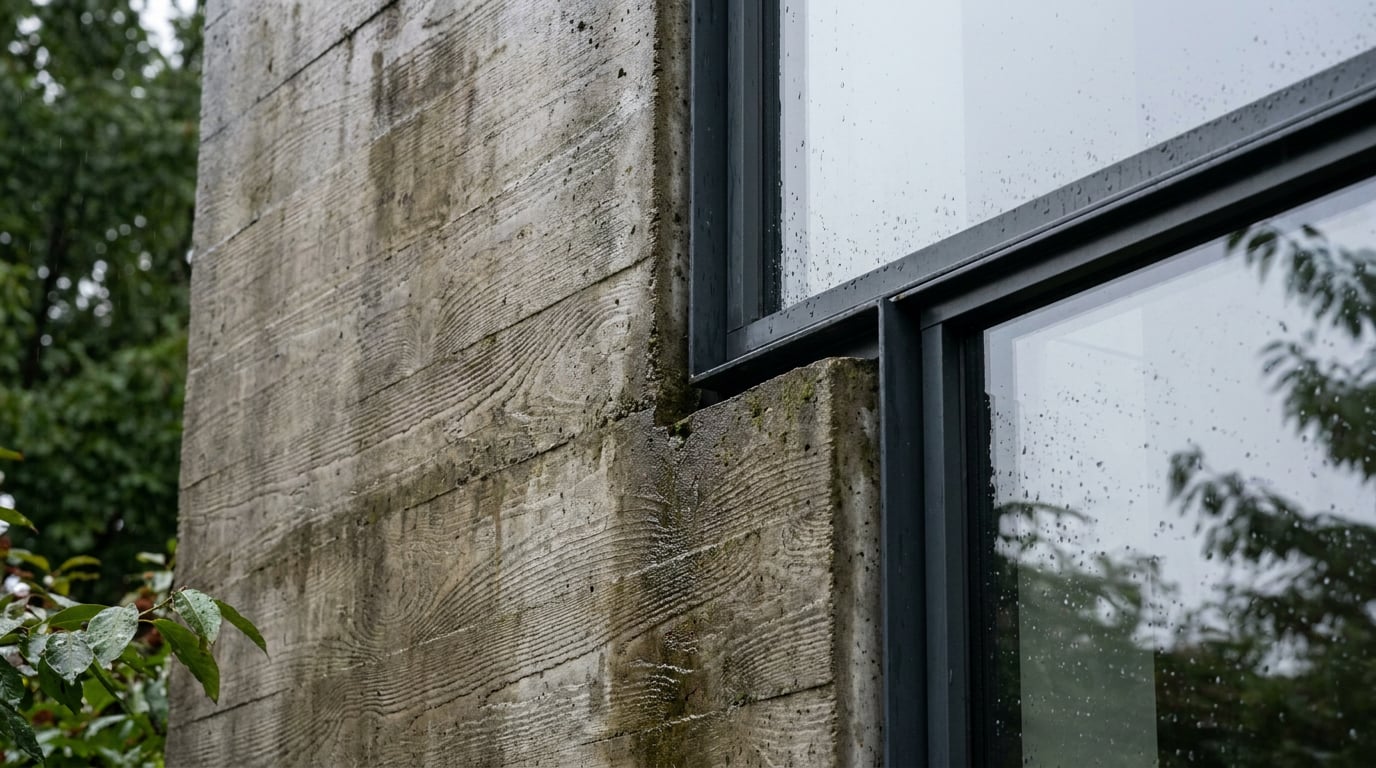
Golden hour gets the likes, but flat overcast light gets planning approval and client sign-off. Here is why it shows materials honestly, and how to set it up.
Why Flat Light Beats Golden Hour for Selling Materials
 If the image has to answer "what is this made of?", render it under an overcast sky. Low sun makes a better mood piece, but it is a worse specification. Directional light carves a façade into bright and dark zones, and the zones become the subject. The material becomes the backdrop.
Think about what you are actually trying to show. Brick bond, board-formed concrete, timber grain, standing-seam joints: these are all low-relief textures. They read through small differences in tone along fine lines. A hard cast shadow from a parapet or a balcony slab lays a dark band across the surface, and everything inside that band collapses to near-black. A specular hotspot does the opposite on glazing, white render and pale stone, where highlights clip and the surface turns to a flat white patch.
A soft, even sky gives every elevation a similar luminance. The client reads the façade as a set of materials rather than a pattern of light and dark. Overcast also reduces the amber bias of low sun, so the colour you specified is closer to the colour on screen. Stensyl, an architectural visualisation publisher, recommends overcast diffuse light for material studies for exactly this reason: it softens shadows and takes the amber cast out of the image. Maquete, another archviz vendor, positions overcast lighting for accurate finishes and surface evaluation. Both are industry guidance rather than peer-reviewed evidence, but they match what most visualisers see on screen.
### A test you can run in ten minutes
Take one masonry elevation. Lock the camera, the exposure, the materials and the vegetation. Render it twice: once with a low sun at around fifteen degrees, once under a clean overcast sky.
The sunlit version looks dramatic. Long shadows, warm face, a bright sky behind. But look at the mortar joints on the shaded return and they have vanished. Brick-to-brick colour variation, which is the whole reason you chose a multi-stock facing brick, has disappeared into shadow on one side and washed out under the sun on the other. Pale lintels have clipped.
The overcast version is quieter. It also shows the mortar, the colour variation, the lintel profile and the reveal depth in a single frame. This is a controlled visual comparison rather than a measured result, but the pattern is consistent enough that it is worth running on your own scheme before you commit to a hero image.
If the image has to answer "what is this made of?", render it under an overcast sky. Low sun makes a better mood piece, but it is a worse specification. Directional light carves a façade into bright and dark zones, and the zones become the subject. The material becomes the backdrop.
Think about what you are actually trying to show. Brick bond, board-formed concrete, timber grain, standing-seam joints: these are all low-relief textures. They read through small differences in tone along fine lines. A hard cast shadow from a parapet or a balcony slab lays a dark band across the surface, and everything inside that band collapses to near-black. A specular hotspot does the opposite on glazing, white render and pale stone, where highlights clip and the surface turns to a flat white patch.
A soft, even sky gives every elevation a similar luminance. The client reads the façade as a set of materials rather than a pattern of light and dark. Overcast also reduces the amber bias of low sun, so the colour you specified is closer to the colour on screen. Stensyl, an architectural visualisation publisher, recommends overcast diffuse light for material studies for exactly this reason: it softens shadows and takes the amber cast out of the image. Maquete, another archviz vendor, positions overcast lighting for accurate finishes and surface evaluation. Both are industry guidance rather than peer-reviewed evidence, but they match what most visualisers see on screen.
### A test you can run in ten minutes
Take one masonry elevation. Lock the camera, the exposure, the materials and the vegetation. Render it twice: once with a low sun at around fifteen degrees, once under a clean overcast sky.
The sunlit version looks dramatic. Long shadows, warm face, a bright sky behind. But look at the mortar joints on the shaded return and they have vanished. Brick-to-brick colour variation, which is the whole reason you chose a multi-stock facing brick, has disappeared into shadow on one side and washed out under the sun on the other. Pale lintels have clipped.
The overcast version is quieter. It also shows the mortar, the colour variation, the lintel profile and the reveal depth in a single frame. This is a controlled visual comparison rather than a measured result, but the pattern is consistent enough that it is worth running on your own scheme before you commit to a hero image.
The practical benefit of overcast is lower contrast, not the absence of shadow. You still want depth. You just do not want the light deciding which half of the façade the client can read.
- Planning submissions. The image sits next to elevations and a materials schedule. It has to agree with them.
- Design and Access Statements. A façade study in a DAS is evidence for a design decision. The reader needs to see the material, not a sunset.
- Tender and technical packs. A contractor pricing brickwork needs to see the bond and joint, not a silhouette.
 Cloud cover turns the whole sky into one huge, diffuse light source. A technical paper on sky geometry distinguishes direct sunshine from the secondary diffuse sky component, and that distinction is the physical basis for treating cloud as a large-area light. Because the source is so broad, shadow edges soften until they are a faint contact darkening under eaves, reveals and balconies. There is no hard edge for the eye to follow.
### Colour holds side by side
Overcast daylight sits cooler and more neutral than direct sun. Visualisation vendors commonly describe it at roughly 6,000 to 7,500 K: ArchiGPT gives 6,500 to 7,500 K, Maquete gives 6,000 to 7,000 K. Treat those as working ranges for render settings, not as atmospheric constants. Real overcast skies vary.
What matters in practice is the result. A warm cedar cladding and a cool zinc roof both hold their true hue when they share a frame, because the light is not pushing everything towards orange. If your cladding palette depends on the relationship between warm and cool materials, that relationship survives.
### Fewer blown highlights
Lower contrast range means fewer clipped values. Glazing, white render and pale stone are where sunlit renders most often lose detail, because they sit at the top of the tonal range and a direct sun pushes them over. Under overcast light they stay inside the range. Chaos, the maker of V-Ray, recommends exposing for the building rather than the sky and controlling sky brightness separately, because preserving a bright sky can otherwise overexpose the façade and lose material detail. The same logic is why overcast is forgiving: there is less sky-to-façade difference to fight.
### Why reviewers read it as plausible
A planning officer or a neighbour looking at an overcast render sees a plausible British Tuesday, not a sales brochure. That is a judgement about tone, not a regulatory fact, but it is a real one. An image that does not look like it is selling something is easier to take at face value, and that carries into how people judge the scheme.
Cloud cover turns the whole sky into one huge, diffuse light source. A technical paper on sky geometry distinguishes direct sunshine from the secondary diffuse sky component, and that distinction is the physical basis for treating cloud as a large-area light. Because the source is so broad, shadow edges soften until they are a faint contact darkening under eaves, reveals and balconies. There is no hard edge for the eye to follow.
### Colour holds side by side
Overcast daylight sits cooler and more neutral than direct sun. Visualisation vendors commonly describe it at roughly 6,000 to 7,500 K: ArchiGPT gives 6,500 to 7,500 K, Maquete gives 6,000 to 7,000 K. Treat those as working ranges for render settings, not as atmospheric constants. Real overcast skies vary.
What matters in practice is the result. A warm cedar cladding and a cool zinc roof both hold their true hue when they share a frame, because the light is not pushing everything towards orange. If your cladding palette depends on the relationship between warm and cool materials, that relationship survives.
### Fewer blown highlights
Lower contrast range means fewer clipped values. Glazing, white render and pale stone are where sunlit renders most often lose detail, because they sit at the top of the tonal range and a direct sun pushes them over. Under overcast light they stay inside the range. Chaos, the maker of V-Ray, recommends exposing for the building rather than the sky and controlling sky brightness separately, because preserving a bright sky can otherwise overexpose the façade and lose material detail. The same logic is why overcast is forgiving: there is less sky-to-façade difference to fight.
### Why reviewers read it as plausible
A planning officer or a neighbour looking at an overcast render sees a plausible British Tuesday, not a sales brochure. That is a judgement about tone, not a regulatory fact, but it is a real one. An image that does not look like it is selling something is easier to take at face value, and that carries into how people judge the scheme.
An overcast render asks the viewer to evaluate the building. A golden-hour render asks them to enjoy the evening.
 The failure mode for overcast is the dead render: a perfectly uniform grey dome, no gradient, no structure, every surface lit identically. It reads as a studio backdrop. Overcast is not literally uniform, and your sky should not be either.
### Start with the sky gradient
An overcast sky is typically brighter towards the zenith and darker near the horizon. That is an architectural inference from sky-light geometry rather than a standard with a single prescribed gradient, so there is no universal figure to copy. Set the gradient by eye: enough that the sky has a top and a bottom, not so much that it reads as a sunset.
### Give the cloud some structure
Add subtle tonal variation inside the cloud itself. You want soft density changes and slightly darker bands, so the sky has structure without any visible sun disc or hard-edged light direction. If you can point to where the sun is, it is not overcast.
### Keep a trace of directionality
Pure flatness looks CGI-dead. Keep volumes readable with three small things:
The failure mode for overcast is the dead render: a perfectly uniform grey dome, no gradient, no structure, every surface lit identically. It reads as a studio backdrop. Overcast is not literally uniform, and your sky should not be either.
### Start with the sky gradient
An overcast sky is typically brighter towards the zenith and darker near the horizon. That is an architectural inference from sky-light geometry rather than a standard with a single prescribed gradient, so there is no universal figure to copy. Set the gradient by eye: enough that the sky has a top and a bottom, not so much that it reads as a sunset.
### Give the cloud some structure
Add subtle tonal variation inside the cloud itself. You want soft density changes and slightly darker bands, so the sky has structure without any visible sun disc or hard-edged light direction. If you can point to where the sun is, it is not overcast.
### Keep a trace of directionality
Pure flatness looks CGI-dead. Keep volumes readable with three small things:
- A faint light fall-off across the façade, brighter on the side facing the open sky.
- Slightly darker undersides to soffits, canopies and balcony slabs.
- A soft ground contact shadow where the building meets paving and landscape.
The brief for overcast is low contrast with readable volume. If you can see the form and cannot see the sun, you have it right.
- Material swap. If a façade has gone glossy or oversaturated in the re-light, select the area and swap its texture to match an attached reference. The result lands as a toggleable layer, so it is easy to compare against the version before.
- Select by typed description. Instead of lassoing brickwork by hand, describe it. Typing "all the brickwork" selects every matching region, and that selection can feed a grade, a mask or a Material swap.
Keep the camera and the entourage fixed and change only the weather. That is what makes the comparison honest.
- Planning pack hero: overcast, materials-honest, matched to the elevations.
- Client presentation: dusk or golden hour, the version with atmosphere.
- Interior study: overcast daylight through the glazing.
Flat light for the question "what is this made of?"; warm light for "what will it feel like to occupy?". Pick the light the question needs, then keep everything else constant.
Keep reading.

Try ArchAdemia Tools for yourself
Draw it, model it, render it, publish it. One place, built for architects and small practices. Plans from £29 a month, all in.