Building Your Architecture Practice Website From Scratch.
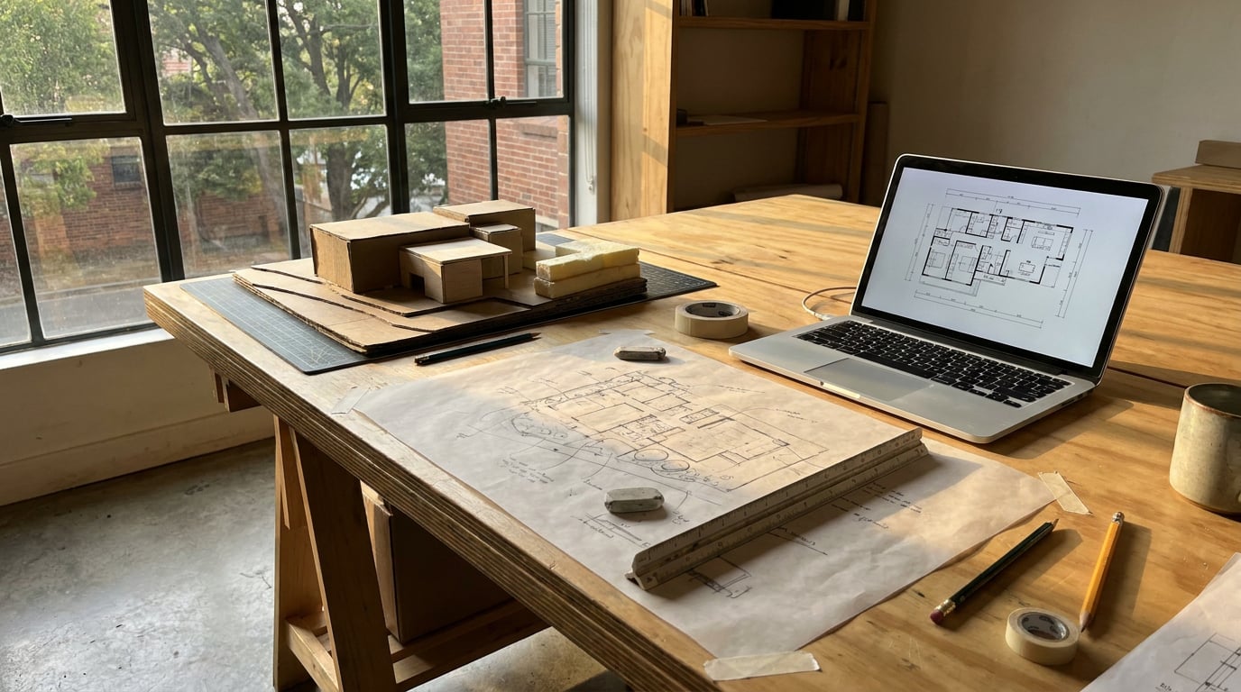
A working process for launching a practice website in a weekend: brand, portfolio, contact forms and publishing, all in one place.
Why Most Small Practice Websites Never Get Built
Two blockers stop most small practices from having a proper website, and neither is the design itself. The first is a developer quote that lands well into four figures for something the marketing budget can't stretch to. The second is a DIY builder that fights you on layout: fixed grids, template lock-in, a homepage that never quite matches the crit-board feel of the work. Both are enough to make a two-person studio give up and default to Instagram as its front door.
That default costs more than it looks like it does. A planning officer researching an applicant, a prospective client following up on a recommendation, a collaborator checking credentials before a competition team is finalised: all of them land on a feed you don't fully control, sorted by an algorithm, sitting next to whatever posted before it. You lose the first impression the moment you hand it to a platform that wasn't built for architecture.
The fix isn't fifty templates half-configured. A practice site needs six things done properly: a homepage that states what the practice does, a portfolio that reads like a crit board, a way to say who's behind the work, a clear services offer, a contact route that actually reaches an inbox, and project pages that carry enough narrative to stand in for a mini Design and Access Statement. Get those six right and the rest is decoration.
This workflow walks through building exactly that, using Web (/web), the platform's tool for generating and publishing multi-page sites. By the end you'll have a published site with a working portfolio, a contact form wired to your inbox, and a domain that's actually yours.
A practice website is not a design exercise in disguise. It's six jobs done well: homepage, portfolio, about, services, contact, and project pages. Everything else is optional.
Step One: Decide the Structure Before You Touch a Template
Map the pages before opening a builder. For most small practices that's: Home, Selected Work, About/Team, Services, Contact, and a project detail page per scheme. Write one line for each page describing the job it has to do. This is the brief a solo practitioner usually skips, going straight from idea to layout, and it's the single biggest reason DIY sites drift into looking like nothing in particular.
The language for project pages is often sitting in your files already. What you'd write in a Design and Access Statement about a scheme's approach to context, massing and materiality is frequently the same paragraph that belongs under a project's hero image. Pull from that register rather than writing marketing copy from scratch. It reads as considered because it is considered; you did the thinking during the planning application.
One decision changes the page order more than anything else: is this a portfolio-led site or a services-led one? A visualisation studio or an interior designer chasing high-end residential work is often portfolio-led, work first, everything else secondary, so Selected Work sits right under the homepage hero. A small architectural practice chasing planning and residential extension work is usually services-led: what you do, who it's for, then the evidence. Decide this before you build, because retrofitting page order later means rebuilding navigation, not just moving a menu item.
| Site type | Typical page order | Best suited to |
|---|---|---|
| Portfolio-led | Home → Selected Work → About → Services → Contact | Visualisers, interior designers, exhibition designers |
| Services-led | Home → Services → Selected Work → About → Contact | Small practices chasing planning and residential work |
Write one line describing each page's job before you open the builder. That line is the brief most solo practitioners skip, and it's why their sites drift.
Step Two: Build the Pages in Web

Use Web (/web) to generate the structure from your brief rather than building each section from a blank page. Feed it the page list and the one-line job description for each, and the multi-page skeleton comes out in the shape you specified rather than a generic template you then have to fight.
Set the SEO panel per page as you go, not at the end. Web gives every page its own title, description and social image, and filling these in while you build means the site is discoverable the day it publishes rather than retrofitted months later when someone finally notices the practice doesn't show up in search. A project page's SEO description is a good second use for that Design and Access Statement language: tight, specific, and already written.
Add the site favicon early and check typography and colour hold steady across every page rather than drifting as you add sections. A practice site loses credibility fast if the Services page uses a different heading weight to the homepage. Consistency here is the difference between a site that reads as one practice and one that reads as five separate pages stapled together.
Selected Work deserves particular care. For a two-person practice this page needs to read like a mini crit board: tight captions under each image, not paragraphs of text. "Two-storey rear extension, brick slip and zinc, planning granted 2025" does more work than three sentences about the client's brief. Save the longer narrative for the project detail page and let the grid stay visual.
Set SEO fields as you build each page, not after launch. A site that's discoverable from day one beats one that's retrofitted for search months in.
Step Three: Bring In Real Project Imagery, Not Placeholder Renders

Placeholder imagery is the fastest way to make a real practice look unfinished. Pull finished visuals straight from Shoot (/shoot), which generates a full set of camera angles for a scheme, exterior and interior handled separately, or from exported renders you've already graded in Retouch (/retouch), and bring those directly into the Web builder.
Crop and grade hero images before upload, not after. Match eye level and lighting logic across every project thumbnail so the Selected Work grid reads as one coherent body of work rather than a scrapbook of angles pulled from different stages of different projects. If one project's hero shot is a low eye-level exterior at dusk and the next is a high interior shot at midday, the grid never settles. Decide the visual language once, then apply it to every project you add.
A practice with thin visual output, a young studio with two or three completed schemes, doesn't need to pad pages with process sketches and site photos to look busy. One strong Shoot set per project, four or five well-composed stills, reads as more confident than a page cluttered with concept diagrams and half-finished renders. Depth comes from consistency, not volume.
The mistake to avoid: uploading full-resolution, unretouched exports straight from a render engine. Oversized files slow the page down, and unretouched output undercuts work that's actually better than it looks raw. Run hero images through Retouch first, grade them, tidy stray geometry or reflections, then export at a size that suits web delivery. The polish on the page should match the polish in the work.
Match eye level and lighting across every project thumbnail. A Selected Work grid reads as one body of work only when the visual language stays consistent project to project.
Step Four: Wire Up Contact, Enquiries and Any Paid Work
A published Web page comes with a working contact and newsletter form out of the box, no setup required. Submissions are spam-protected, land as an email in the owner's inbox, and collect in a Forms inbox inside the studio, so nothing depends on remembering to check a second platform. For a practice that just needs enquiries to reach someone, this alone covers the job.
If the practice already runs a mailing list, connect it rather than exporting contacts by hand. Web supports a connector to push submissions to an existing Brevo or Mailchimp list, or to a generic webhook if the practice runs something else. This matters more than it sounds: a studio sending a quarterly update on new planning submissions, or an invite to an open studio evening, needs the list wired at the point of capture, not stitched together from spreadsheet exports six months later.
On cost: Brevo's Free tier covers around 300 emails a day at no charge, enough for a small practice list under a couple of thousand contacts sending the occasional update. Mailchimp's Free tier covers up to 250 contacts and 500 emails a month before you need to move to a paid plan. Neither is the blocker; the blocker was always thinking a mailing list needed a developer to wire up.
If the practice sells anything, drawing packs, planning document templates, a paid consultation slot, the Commerce panel in Web wires a CTA button straight to an existing Stripe Payment Link, Gumroad, Lemon Squeezy, Shopify or PayPal.me link. There's no separate storefront to build. A residential architect offering a fixed-fee feasibility consultation can set up a Stripe Payment Link once and point the "Book a consultation" button at it.
Pro and Max plan users running genuine product sales, several drawing packs at different price points, ongoing consultation slots, can connect their own Stripe account directly through Stripe Connect. That gives a real basket and checkout on the site, with an orders inbox and stock tracking in the studio. The money, receipts, tax and refunds still run entirely through the practice's own Stripe account; the platform never touches or holds the funds.
Contact forms work with zero setup the moment a Web page publishes. Everything after that, mailing lists, payment links, a full Stripe checkout, is added on top when the practice actually needs it, not before.
Step Five: Publish and Keep It Current

Building the site costs nothing on any plan. Publishing it to a live domain, whether an archademia.app subdomain for a practice that just wants something up quickly, or a custom domain the practice already owns, is the step gated to Pro tier and above. That split matters: a student or a practice testing the waters can build and preview the whole thing for free, and only pays when they're ready to go live with their own address.
Treat the finished site as a living document, not a launch-and-leave project. The habit worth building is adding a project page the same week a scheme goes to planning submission, not months later once the excitement has faded and the details are harder to recall accurately. A project page written while the Design and Access Statement is still fresh takes twenty minutes. Written six months on, it takes an afternoon and reads thinner for it.
A practice website that only gets updated once a year isn't a website. It's a brochure with a URL.
Re-check the SEO fields every time a new project page goes up. Each page carries its own title, description and social image, so a new project needs its own thirty seconds of attention here, not a blanket setting left over from the homepage. It's a small habit that keeps the whole site discoverable as it grows, rather than leaving early pages well-optimised and everything added later invisible to search.
The workflow that got imagery out of Shoot and into the Web builder in Step Three is the same one that keeps the site current every time a project finishes. Generate the stills, grade the hero shot in Retouch, drop it into a new project page, write the caption from language you already have in the planning file, publish. Once that loop is set up, adding a project stops being a task that needs scheduling and becomes something that happens the same week the scheme goes to planning.
The Takeaway
A practice website doesn't need fifty pages or a developer's quote. It needs six things done well: a homepage that states the offer, a portfolio that reads like a crit board, an about page, a services page, a contact form that actually reaches an inbox, and project pages written while the thinking is still fresh. Build that structure once in Web, wire the contact form and any paid work through tools the practice already trusts, and treat the site as something that grows with every submission rather than a brochure frozen at launch. The barrier was never the cost. It was starting without a plan for what each page had to do.
Keep reading.

Try ArchAdemia Tools for yourself
Draw it, model it, render it, publish it. One place, built for architects and small practices. Plans from £29 a month, all in.