Build a Practice Website From Your Projects, No Developer Needed.
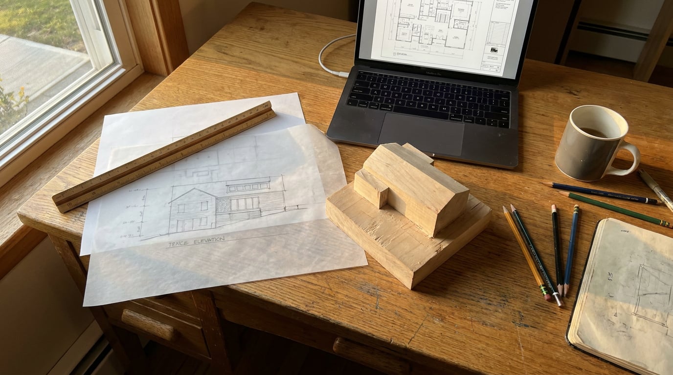
A practice website does not need a developer or an agency. Here is the end-to-end workflow, from project imagery to a published, indexed site on your own domain.
Decide What the Site Has to Do Before You Generate Anything
 A practice website has three jobs: show built and proposed work, say who you are, and make an enquiry easy. Everything else is optional. Before you open any tool, write those three jobs at the top of a blank page and refuse to add a fourth until the first three are working.
The page structure follows from that. A five-person practice rarely needs more than this:
A practice website has three jobs: show built and proposed work, say who you are, and make an enquiry easy. Everything else is optional. Before you open any tool, write those three jobs at the top of a blank page and refuse to add a fourth until the first three are working.
The page structure follows from that. A five-person practice rarely needs more than this:
- Home: a one-line positioning, a hero project and three more behind it.
- Projects: the index, ordered by what you want to be commissioned for next, not by date.
- A page per project: the same pattern every time.
- Studio: who you are, how you work, who is in the room.
- Contact: a form, an address, a phone number.
Three jobs, five pages, one line of positioning. If the site cannot be described that briefly, no generator will rescue it.
Prepare Project Imagery That Holds Up on a Screen
 The temptation is to upload the whole job. Resist it. Pick **three to six images per project**: one hero exterior, one interior or detail, one plan or diagram. That range is a recommendation from editorial judgement, not a researched benchmark, but it holds up in practice. A deliberately edited set communicates the work faster than a gallery of every view, and it makes you decide what the project is actually about.
Match the third image to the project type, because it is where a practice shows how it thinks:
The temptation is to upload the whole job. Resist it. Pick **three to six images per project**: one hero exterior, one interior or detail, one plan or diagram. That range is a recommendation from editorial judgement, not a researched benchmark, but it holds up in practice. A deliberately edited set communicates the work faster than a gallery of every view, and it makes you decide what the project is actually about.
Match the third image to the project type, because it is where a practice shows how it thinks:
- Housing scheme: the planning diagram showing massing, access and amenity space.
- Education: a circulation or safeguarding diagram that explains how the building is supervised.
- Heritage retrofit: a before and after of the fabric detail.
- Workplace: a section annotated with the environmental strategy.
- Landscape: a seasonal montage of the same view.
- Interiors: the material schedule laid out as a board.
- Competition entry: the one concept panel, not all six.
Close the gaps in Retouch
A set only reads as one project if the images agree with each other. In Retouch you can fix a blown-out sky, remove a parked van from the foreground, or re-light a flat overcast render with the Golden hour or Dusk preset so the exterior matches the warmth of the interior shots. Re-light presets regenerate the whole document at a different time of day or weather as a new layer, so the original stays untouched underneath. Where a wide render has gone soft or repetitive across a façade, select the region and use **Enhance area**. It re-renders that selection at higher resolution with no prompt and composites it back through the selection, so you fix the brickwork without redoing the view.Turn a CAD sheet into a clean web graphic
Plans are the images practices most often get wrong, usually by screenshotting a drawing and pasting it in. A better route: import the DXF into Vector. A practice CAD file routinely holds twenty-odd drawings in one model space, and the import report finds the separate drawings and outlines each one. Click the plan you want and the import is cropped to just that drawing, cut clean at the edge. Tidy the linework, then export an SVG or a PNG. An SVG stays sharp at any size and loads light, which matters on a project page carrying several images.Name things consistently from the start
Settle a file-naming convention and write alt text as you go. Something like school-name-hero-exterior.jpg, with alt text that describes what is shown ("Timber-clad classroom wing viewed across the playing field at dusk"). It costs ten minutes now and saves a day of tidying later, and it gives search engines and screen readers something real to read.Three to six images per project, edited to agree with each other. The plan or diagram is what separates a portfolio from a gallery.
Generate the Site and Edit It Like a Document
 In the Web studio, generate a multi-page microsite from a written brief. Name your practice, your one-line positioning and your page list, and the studio returns a multi-page site you can edit. Building is free on any plan, so you can generate, discard and regenerate until the structure suits you without spending credits on the attempt.
Be honest about what you get. Generation gives you a strong first structure, not a finished identity. Budget a real afternoon for editing, and treat the generated pages the way you would treat a junior's first draft of a Design and Access Statement: good bones, wrong detail.
In the Web studio, generate a multi-page microsite from a written brief. Name your practice, your one-line positioning and your page list, and the studio returns a multi-page site you can edit. Building is free on any plan, so you can generate, discard and regenerate until the structure suits you without spending credits on the attempt.
Be honest about what you get. Generation gives you a strong first structure, not a finished identity. Budget a real afternoon for editing, and treat the generated pages the way you would treat a junior's first draft of a Design and Access Statement: good bones, wrong detail.
Work project by project
Replace placeholder copy and imagery page by page, and give every project page the same pattern:- Hero: the single strongest image, full width.
- Brief and outcome: one paragraph. What the client needed, what was built or proposed, what changed.
- Supporting images: the interior or detail and the plan or diagram.
- Credits: client, collaborators, photographer, status.
Set the type and colour system once
Choose a restrained system early: one typeface pairing, a neutral palette with at most one accent, and a rule for image captions. Apply it once and leave it. Then open the site on a phone. Prospective clients may well meet your practice there, so check that the hero crops sensibly, the plan graphics stay legible and the contact link is easy to reach. Once the site is live, your analytics will show how people actually arrive, and that is better evidence than any assumption about mobile traffic.Generation is the fast first draft; the afternoon you spend editing copy and imagery is what makes it your practice's site and not a template.
Set Up Search, Enquiries and Your Domain
A site nobody can find or contact is a brochure in a drawer. Three small jobs fix that.Search titles and descriptions
Use the SEO panel to write a title, a description and a social image for every page. The discipline is naming. A project page called "Project 04" tells a search engine and a client nothing. Name it for the building type and the place: "Primary school extension, Bristol" or "Listed barn conversion, Wiltshire". Your one-line positioning from the first step becomes the homepage title, so the site says the same thing everywhere. Add a favicon too. It is a small detail, but a practice with a blank browser tab looks unfinished.Enquiries that need no setup
Contact forms on published pages work with zero setup and are spam-protected. A submission lands in your inbox and also collects in a Forms inbox inside the studio, so an enquiry sent while the person who normally watches the mailbox is on leave is not lost. If you keep a mailing list, an optional connector can push submissions to your own Brevo or Mailchimp list, or to a webhook.Domain and going live
Publish first to an archademia.app subdomain and review it as a client would: on a phone, on a laptop, on a slow connection. When you are happy, connect your custom domain. Going live and custom domains need Pro or above (£49 a month), and that is the single paid step in the workflow. The 7-day free trial is long enough to build and edit the whole site before you decide.| Step | What you do | Plan needed |
|---|---|---|
| Generate and edit the site | Brief, build, edit page by page | Any plan, including the free trial |
| Set titles, descriptions, favicon | SEO panel, per page | Any plan |
| Receive enquiries | Contact form and Forms inbox | Any plan, once published |
| Go live and connect your domain | archademia.app subdomain, then custom domain | Pro or above |
Name project pages for the building type and place, never "Project 04". Search titles are the cheapest marketing a practice has.
Keep It Current in Thirty Minutes a Month
Most practice sites fail slowly, not at launch. The newest project is three years old, the Studio page lists someone who left, and the homepage hero is a scheme the practice no longer wants to be known for. A light routine prevents it.Set a trigger, not a calendar reminder
You will ignore a recurring reminder. Tie updates to events instead: a scheme gets planning consent, reaches practical completion, or wins something. Any of those means a new project page, drafted the week it happens while the images and the story are fresh.Reuse the sheets you already make
You have already done the hard work. A crit board or competition panel built in Layout can be exported as a PNG or a PDF, and the imagery lifted straight onto the project page. A planning-stage sheet from the Design and Access Statement is a ready-made source for the diagram image. Nothing needs redrawing for the web.Review quarterly
Four times a year, refresh the homepage hero and the top three projects, and retire work that no longer represents the practice. Removing a project is not a loss. A site with six strong schemes beats one with twenty mixed ones.Keep the source in one place
Store the brief, the image folder and the copy for each project in Projects, so the next update starts from one location whoever on the team does it. The practice's site then survives staff changes: the person adding the next project finds the last one's decisions already written down.A note on optional media
A short animated teaser for a project is possible, but it is not automatically cheap. Vendor-published comparisons put video generation at anywhere from under a dollar to several dollars for a few seconds of footage, and prices and plan entitlements shift often, so check the current figures on the relevant pricing page before you plan around them. For most practices, the edited stills, a plan and a clear paragraph carry the work better than motion does.Start with the three jobs, edit hard, publish to the subdomain, and add your next consented scheme the week it is approved. That habit, more than any generator, is what keeps the site worth visiting.A practice website is a working document, not a launch event. Thirty minutes triggered by real project milestones keeps it truthful.
Keep reading.
Try ArchAdemia Tools for yourself
Draw it, model it, render it, publish it. One place, built for architects and small practices. Plans from £29 a month, all in.