Cloudy Sky Renders: Getting Overcast Light Right for UK Planning.
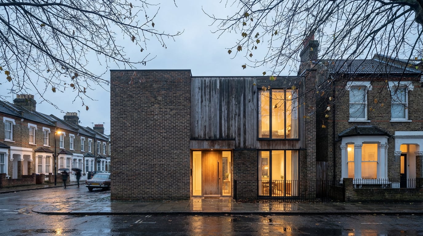
UK planning officers see through golden-hour renders instantly. Here's how to light a scheme in honest, flat, believable overcast light.
Why planning officers distrust blue sky and low sun
A planning officer looking at forty applications a week has seen every trick in the visualisation playbook. Golden hour, deep blue sky, a scattering of lens flare across the top corner of frame: it reads as marketing before anyone has assessed a single window proportion. That reaction isn't snobbery. It's pattern recognition built from years of images that oversold a scheme and images that told the truth, and the two rarely look alike.
Overcast light is the UK's default weather. Most sites sit under grey sky more days of the year than not, so a scheme rendered under cloud looks like it belongs on that site rather than staged for a brochure. That's the whole credibility argument in one sentence: a render that matches what a committee member will actually see when they visit the site does more work than one that matches what a marketing brief wanted.
Design and Access Statements are judged partly on trust. An officer reading a DAS forms an opinion of the whole document from its weakest part, and a sunset render sitting next to a daylight and overshadowing analysis is a credibility gap that's easy to spot and hard to recover from. If the imagery looks curated for effect, the technical content gets read more sceptically too, even when it's sound.
There's a harder, more practical problem underneath the trust issue. Low sun throws long, dramatic shadows that can visually mask or exaggerate a scheme's real impact. A low, raking light can hide overshadowing on a neighbouring garden that would show up starkly under midday sun, or it can make a modest massing look taller and more sculptural than it will read on an ordinary Tuesday afternoon. Committees and objectors have picked up on this. A shadow study that looks generous under a stylised sunset and stingy under the officer's own overshadowing assessment is exactly the kind of discrepancy that gets raised at committee stage, or worse, at appeal.
A render that matches the site's real weather is doing planning work. A render that matches a brochure is doing marketing work. Know which document you're building before you choose the sky.
What overcast light actually does to a building

Overcast sky isn't a single light source, it's the whole sky acting as one enormous diffuse lamp. That single fact changes almost everything about how a building reads in the frame, and it's why simply desaturating a sunny render doesn't produce a convincing cloudy one.
Shadows soften to near-invisible. There's no strong directional cast shadow defining a cornice line or throwing a window reveal into sharp black. Form has to read through edge, proportion and material contrast instead, which is a harder thing to render well and a much easier thing to get wrong. A massing model that relies on shadow to sell its depth will go flat under cloud unless the edges and material breaks are doing genuine work.
The sky itself becomes the fill light. Surfaces facing up towards the sky pick up slightly more light than surfaces facing the ground, a subtle top-lit quality rather than a directional one. Soffits go slightly darker, upward-facing sills and copings slightly lighter. It's a small cue, but it's one of the first things that separates a genuinely overcast render from a flat, artificially even one. Miss it and the building looks lit from nowhere, which reads as fake even to a viewer who couldn't say why.
Colour saturation drops. A red brick that glows warm under afternoon sun looks noticeably flatter and cooler under cloud, closer to a muted terracotta than a rich red. Renders that skip this step and simply drop the sun out of frame while keeping sunlit material values look artificially vivid: too warm, too saturated, wrong for the sky above them. And the contrast between building silhouette and sky is much lower under cloud than under a clear blue sky. A roofline that pops crisply against deep blue sits far more gently against pale grey, which changes the whole composition, not just the lighting.
Desaturating a sunny render isn't the same as relighting it for overcast. The direction of light, not just its colour, has to change.
Setting up the shot for honest grey-sky light
Getting this right starts before the render, at the point of deciding what the image is for. A planning visual and a marketing hero shot are different documents with different jobs, and they should look different.
Rather than re-running an entire model from scratch to test overcast light, ArchAdemia Tools' Retouch surface has a one-click re-light option built for exactly this. Retouch carries six presets, Golden hour, Dusk, Blue hour, Night, Overcast and Sunny, each of which regenerates the whole document at that time of day or weather as a new, non-destructive layer. Run a scheme visual through the Overcast preset and it produces a genuinely relit version sitting above the original, toggleable, adjustable, never overwriting the source render. That means a practice can keep a golden-hour hero shot and an overcast planning version of the same view in the same document, switching between them rather than maintaining two separate files.
Camera setup matters just as much as sky. Eye-level or slightly raised viewpoints read as credible, close to how a site visit or a street walk actually sees a building. Wide, dramatic angles with an exaggerated lens and a low camera reads as marketing regardless of what's happening in the sky above. If a scheme needs a hero angle for a competition board, keep it, but don't submit it as the primary planning view.
Resist the temptation to render a flat white sky with no texture. A believable overcast sky still carries tonal variation, subtly darker overhead, lighter towards the horizon, without a visible sun position or a hard cloud edge anywhere in it. A pure white sky reads as a placeholder, not weather.
Frame generously. Clear-sky renders lean on haze and shadow length to sell depth and distance; overcast light removes both of those cues almost entirely. Compensate by including more context: neighbouring buildings, street trees, the kerb line running into the distance. Depth in an overcast image comes from what's in frame, not from atmospheric perspective doing the work for you.
An overcast render with a tight crop and no context looks unfinished. Give it room to breathe and the flat light stops feeling like a limitation.
Materials and entourage under flat light

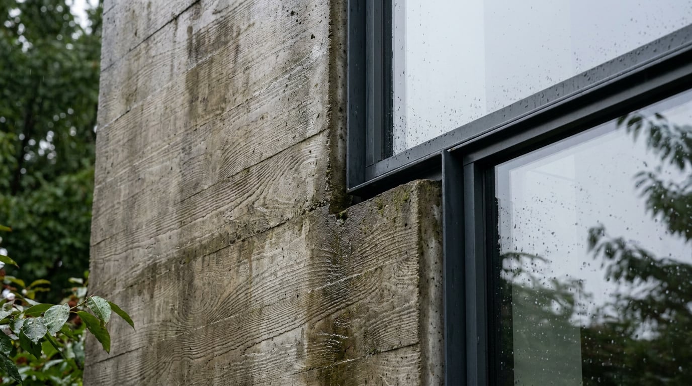
Flat light removes some of the free contrast that sunlight gives a material for nothing. Compensating for that is a grading job, not a lighting one. In Retouch's Adjust panel, the Light and Colour controls plus the HSL bands let you nudge contrast and separation back into stone, render and glazing without inventing a shadow that isn't there. Push clarity slightly, separate the HSL band for the render finish from the band for the brickwork, and the building starts to read with proper material definition again, without looking sunlit.
Ground planes are one of the most common tells in a weak overcast render. A dry, sun-baked-looking pavement sitting under a grey sky is an immediate giveaway that the sky was swapped in after the fact rather than genuinely considered. UK overcast weather reads convincingly with a wet-look ground plane: subtle reflections of the facade smeared into the paving, a slight sheen rather than a hard, dry matte finish. It's a small adjustment that does a disproportionate amount of work in selling the image as honest.
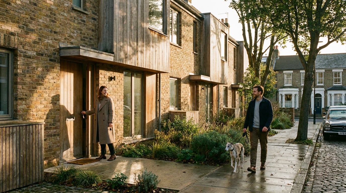
Entourage needs the same discipline. People and vehicles under overcast sky carry soft, barely-there shadows, not the hard drop shadows that a sunlit render calls for. And because flat light removes some of the depth cues that would otherwise help hide a scale mismatch, errors in entourage scale become more visible under cloud, not less. Check figure heights against door heads and window cills carefully; a slightly oversized car or an undersized figure is far easier to spot in flat grey light than in a busy, high-contrast sunny scene.
Before committing to a material finish, use Material swap in Retouch to test how it reads under the Overcast preset specifically. A stone that looks crisp and warm-toned under a sunny render can look muddy and undifferentiated under grey sky, and it's much cheaper to catch that during review than after the DAS has gone out.
Fixing and finishing the render without starting over

Committee feedback often lands on a detail, not the whole image: a repeated brick texture that's gone visibly tiled across a long street elevation, or a section of render that's softer than the rest of the frame. Rather than re-running the entire visual, Retouch's Enhance area re-renders just the selected region at higher resolution and composites it back through the selection. A wide street run that's lost detail across its middle third gets fixed in the middle third, not regenerated from scratch.
Because layer styles and adjustment layers in Retouch stay live and editable rather than baked into the image, a grade built for overcast light can be revisited later without redoing the work. If a planning officer asks for a different viewpoint, or wants to see the scheme under winter conditions specifically, the same non-destructive stack of adjustment layers, masks and presets can be nudged rather than rebuilt.
The DAS or committee report itself belongs in Layout. Its Design and Access Statement template keeps overcast visuals consistent in tone and crop across every page, so a reviewer isn't distracted by one view looking noticeably warmer or more saturated than the next. Consistency across the document is part of what reads as rigour rather than assembly.
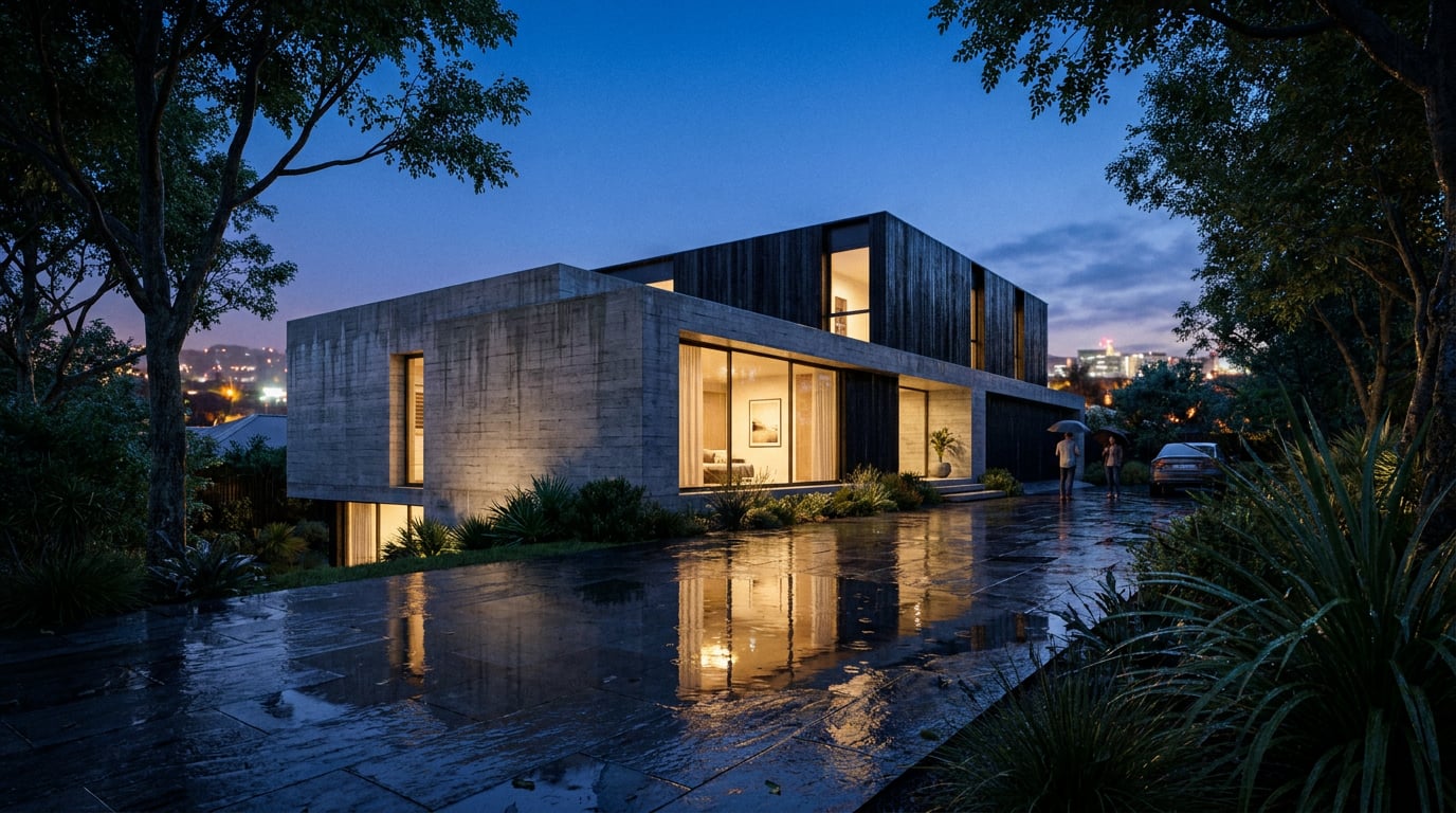
Keep both versions of your key views in the same project: the overcast render that carries the planning submission, and a golden-hour version for competition boards, the practice website, or a client presentation where a bit of drama earns its place. They're doing different jobs. Nothing about producing an honest, credible overcast set for a DAS should mean giving up a striking hero shot elsewhere; it just means knowing which document each one belongs in.
The most convincing planning render isn't the most dramatic one. It's the one that looks like the site on an ordinary day.
Takeaway: Overcast light is a craft decision with a planning payoff. Diffuse the shadow, drop the saturation, wet the ground plane, keep the camera honest, and build the discipline into a repeatable layer stack rather than a one-off grade. A scheme that looks credible under grey UK sky earns more trust from the people deciding its fate than one that looks perfect under a sky it will never actually stand under.
Keep reading.
Try ArchAdemia Tools for yourself
Draw it, model it, render it, publish it. One place, built for architects and small practices. Plans from £29 a month, all in.