Golden Hour or Overcast: Which Light Sells a Scheme?.
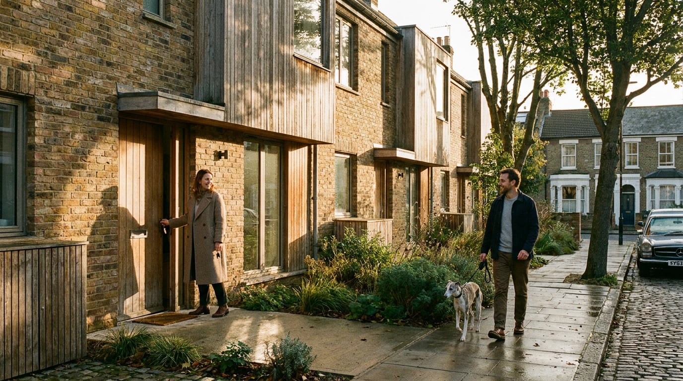
Golden hour flatters a scheme, overcast tells the truth about it. Here is how to choose the right light for planning visuals and client presentations.
The Light Is an Argument, Not a Backdrop
 **Golden hour is for people deciding whether they want a scheme. Overcast is for people deciding whether they can allow it.** Everything else in this article is a consequence of that sentence.
Lighting tells the viewer what to conclude before they have read a word of the caption. Warm, low and directional reads as aspiration: someone lives here, and the evening has gone well. Soft, grey and even reads as credibility: this is what the building looks like on an ordinary day, standing next to its neighbours. Neither is more truthful than the other. They answer different questions.
Take a four-storey residential block with a brick façade and recessed balconies. Render it in low sun and it becomes a lifestyle. The brick glows, the balconies cast crisp shadows, the windows hold a warm interior. Render the same massing in flat light and it becomes a neighbour: a building with a height, a footprint and a relationship to the terrace next door. A developer client wants the first image. A planning officer needs the second.
So the first question is never "which light is prettier?". It is **who is looking, and what decision are they making?** A planning officer is judging impact. A committee is judging impact in a room full of objectors. A developer client is judging whether the scheme will sell. A competition jury is judging whether it has an idea worth remembering. A crit panel is judging whether you understand your own project. Each audience needs a different image, and the same scheme can honestly supply all of them.
The same split runs through other disciplines. A product designer approves form in neutral light and launches in dramatic light. An interior designer checks daylight and material colour on an overcast day and sells a restaurant at dusk. A landscape designer shows planting in soft light to prove it will read as built, then shows the evening version to the client who is imagining the terrace. A graphic designer proofs colour under controlled light and photographs the finished print in a flattering one. Evidence and atmosphere are different jobs. Light is how you tell them apart.
**Golden hour is for people deciding whether they want a scheme. Overcast is for people deciding whether they can allow it.** Everything else in this article is a consequence of that sentence.
Lighting tells the viewer what to conclude before they have read a word of the caption. Warm, low and directional reads as aspiration: someone lives here, and the evening has gone well. Soft, grey and even reads as credibility: this is what the building looks like on an ordinary day, standing next to its neighbours. Neither is more truthful than the other. They answer different questions.
Take a four-storey residential block with a brick façade and recessed balconies. Render it in low sun and it becomes a lifestyle. The brick glows, the balconies cast crisp shadows, the windows hold a warm interior. Render the same massing in flat light and it becomes a neighbour: a building with a height, a footprint and a relationship to the terrace next door. A developer client wants the first image. A planning officer needs the second.
So the first question is never "which light is prettier?". It is **who is looking, and what decision are they making?** A planning officer is judging impact. A committee is judging impact in a room full of objectors. A developer client is judging whether the scheme will sell. A competition jury is judging whether it has an idea worth remembering. A crit panel is judging whether you understand your own project. Each audience needs a different image, and the same scheme can honestly supply all of them.
The same split runs through other disciplines. A product designer approves form in neutral light and launches in dramatic light. An interior designer checks daylight and material colour on an overcast day and sells a restaurant at dusk. A landscape designer shows planting in soft light to prove it will read as built, then shows the evening version to the client who is imagining the terrace. A graphic designer proofs colour under controlled light and photographs the finished print in a flattering one. Evidence and atmosphere are different jobs. Light is how you tell them apart.
What Golden Hour Does for a Scheme, and What It Hides
Low sun is the most generous light a façade will ever get. Raking light across a surface exaggerates relief, which is exactly what a flat elevation lacks. Reveals gain depth. Brick coursing becomes legible. Timber cladding shows its grain. A recessed entrance turns into a defined threshold rather than a dark rectangle. Add warm interior light against a cooling sky and you get instant atmosphere with very little effort. That makes golden hour the right choice for four kinds of image:- Competition entries, where the jury needs to remember your scheme among dozens of others.
- Client pitches, where the aim is to make someone want the building before they have scrutinised it.
- Marketing imagery for sales and lettings, where desire is the whole point.
- The hero shot on a portfolio sheet, which carries the project in a single glance.
- One dominant light direction. Every shadow, highlight and glow should agree. Two competing suns are the quickest way to lose credibility.
- Shadows that agree across every object. Cars, trees, people, street furniture and the building itself should all cast shadows at the same angle and a matching length.
- A sky gradient that matches the sun angle. A sun low in the west should warm the western horizon and cool the opposite side. A pale blue sky with an orange sun pasted on top is the tell-tale sign of a composite.
Golden hour models form and sells desire. It also shortens apparent bulk and warms the eye towards whatever is brightest. Use it where persuasion is the brief, not where judgement is.
Why Overcast Is the Planning Visual's Quiet Advantage
 Overcast light has no hero. It does not flatter, which is precisely why it works. Soft, shadowless illumination shows true massing and honest material colour without drama. A Design and Access Statement needs a contextual view that lets a reader compare the proposed building with what is already there, and flat light makes that comparison fair. Nothing is exaggerated, nothing is hidden.
It is also the safer condition for verified views, townscape comparisons and sensitive sites. A flat sky and neutral light let a building sit beside its neighbours rather than competing with them. And it removes an argument before it starts: nobody can accuse you of waiting for the one good evening of the year.
To be clear about the status of this claim, overcast is a professional convention for planning imagery, not a measured fact about the UK. No independent source establishes it as the most representative condition, and this article does not claim that it is. The case for it is a case about defensibility, not statistics. An overcast image makes fewer implicit promises, so it is harder to challenge.
Consider a mixed-use infill beside a listed terrace. In grey light, the new building reads as a considered neighbour: its cornice line sits against the existing parapets, its brick tone is legible next to the old, its windows relate to the rhythm of the street. In orange light the same building reads as an intruder. The warm cast separates it from the terrace, the shadows pick out its edges, and the contrast makes it look like something that has arrived rather than something that belongs.
The craft challenge is real, though. With no shadows to model form, depth has to come from somewhere else. A flat overcast render with nothing to do will look like a clay model. The tools that carry depth in soft light are:
Overcast light has no hero. It does not flatter, which is precisely why it works. Soft, shadowless illumination shows true massing and honest material colour without drama. A Design and Access Statement needs a contextual view that lets a reader compare the proposed building with what is already there, and flat light makes that comparison fair. Nothing is exaggerated, nothing is hidden.
It is also the safer condition for verified views, townscape comparisons and sensitive sites. A flat sky and neutral light let a building sit beside its neighbours rather than competing with them. And it removes an argument before it starts: nobody can accuse you of waiting for the one good evening of the year.
To be clear about the status of this claim, overcast is a professional convention for planning imagery, not a measured fact about the UK. No independent source establishes it as the most representative condition, and this article does not claim that it is. The case for it is a case about defensibility, not statistics. An overcast image makes fewer implicit promises, so it is harder to challenge.
Consider a mixed-use infill beside a listed terrace. In grey light, the new building reads as a considered neighbour: its cornice line sits against the existing parapets, its brick tone is legible next to the old, its windows relate to the rhythm of the street. In orange light the same building reads as an intruder. The warm cast separates it from the terrace, the shadows pick out its edges, and the contrast makes it look like something that has arrived rather than something that belongs.
The craft challenge is real, though. With no shadows to model form, depth has to come from somewhere else. A flat overcast render with nothing to do will look like a clay model. The tools that carry depth in soft light are:
- Material contrast. Matt against gloss, rough against smooth, light against dark. Let the façade do the modelling that shadow would otherwise have done.
- Wet-ground reflections. A damp pavement mirrors the building and anchors it to the street.
- Interior light spilling out. Lit windows add warmth and life without compromising the neutral reading of the façade.
- Planting and people. Scale, movement and a sense of use, placed with restraint.
- Atmospheric falloff into distance haze. Contrast and colour saturation fall away with distance, which separates foreground, middle ground and background without a single hard shadow.
Overcast keeps the image defensible. When the building has to hold up against its neighbours, not against a sunset, flat light is the more honest argument.
Matching Mood to Audience: A Decision Frame
The simplest way to choose is to start from the document, not the light. Here is a working frame for the situations most practices meet.| Context | Lead image | Supporting image |
|---|---|---|
| Planning submission, Design and Access Statement | Overcast or soft sun | Golden hour as a secondary view, never the headline |
| Client presentation or pitch | Same viewpoint in both moods | Let the client choose with evidence |
| Competition board | Golden hour or dusk | Neutral daylight beside it, showing the scheme holds up without the drama |
| Portfolio or crit sheet | Golden hour or dusk hero | Neutral view to show the building itself |
| Interior view, material and daylight check | Overcast daylight | Dusk with practical lighting for atmosphere |
Planning and Design and Access material
Lead with overcast or soft sun, and keep any golden hour view as a secondary image rather than the headline. If the committee sees the warm render first and the neutral one second, the order tells them which one you think is the real picture.Client presentations
Show the same viewpoint in both moods. A client who sees only one image has no way to know what they are choosing between. Two images from the same camera let them see exactly what changed and decide with evidence instead of a single image sold as the only option. It also protects you: if the client picks the neutral version, nobody can later say you oversold it.Competition boards, portfolio and crit sheets
Use golden hour or dusk for the hero, and place a neutral daylight view beside it. The pairing does quiet work. The dramatic image attracts, and the plain one shows the scheme holds up without help. Crit panels in particular notice when a project only looks good in one condition.Interiors
Decide which question the image answers. Overcast gives honest daylight levels and true material colour, so it answers "what will this room be like to use?". Dusk with practical lighting gives glow, warmth and layered light, so it answers "what will this room feel like to be in?". A hotel lobby needs the second. A residential kitchen being assessed for daylight needs the first. Be clear which one you are showing. The test that ties it together is editorial guidance rather than an industry rule, but it holds up well in practice: if the viewer is approving it, show it plainly. If the viewer is buying it, show it at its best. Then be consistent about which is which across the sheet, so nobody mistakes an atmospheric image for an evidential one.If the viewer is approving the scheme, show it plainly. If the viewer is buying it, show it at its best. Label which is which, and never let the second pass for the first.
Testing Both Moods Without Rebuilding the Scene
 The practical problem is that testing both moods usually means rendering twice. For a small practice that means either a second round of lighting setup and render time, or paying an outsourced visualiser for another pass. One 2026 architecture article puts outsourced visualisation at roughly $500 to $1,500 per project for small practices, with multi-day turnaround and revision fees, but that is a secondary industry estimate rather than a published fee survey, so treat it as colour rather than a benchmark. The point is simply that a second lighting pass has a cost, and that is why it tends not to get done.
You can compare the two moods far more cheaply if you hold everything else still.
The practical problem is that testing both moods usually means rendering twice. For a small practice that means either a second round of lighting setup and render time, or paying an outsourced visualiser for another pass. One 2026 architecture article puts outsourced visualisation at roughly $500 to $1,500 per project for small practices, with multi-day turnaround and revision fees, but that is a secondary industry estimate rather than a published fee survey, so treat it as colour rather than a benchmark. The point is simply that a second lighting pass has a cost, and that is why it tends not to get done.
You can compare the two moods far more cheaply if you hold everything else still.
Start from one approved still
Fix the camera and the geometry. Vary only the light. If anything else changes between the two images, you are no longer comparing lighting, you are comparing two different pictures, and the client will respond to the wrong difference.Use Retouch for a quick side-by-side
In Retouch on ArchAdemia Tools, six one-click re-light presets (Golden hour, Dusk, Blue hour, Night, Overcast and Sunny) regenerate the whole document at a different time of day or weather as a new layer. That means your approved still stays intact underneath, and the alternative sits on top of it, ready to toggle. It is a fast way to see whether the scheme still reads in flat light or whether it only works in warm light.Use Corb on the Canvas for a controlled set
On the Canvas, Corb can spawn a set of two to six variations off one image he has been shown, varied along a single axis such as lighting or weather. Every prompt in the set carries a clause, composed by the server, that tells the model to hold the massing and openings still. It is a preservation instruction to the model, not a geometric lock, so do not treat it as a guarantee. The variations land idle, which means nothing is charged until you choose to run them. Corb is reading an image you already have in different light. He is not proposing alternative schemes.Check every variant against the scheme itself
This step is not optional. A re-lit image is still a statement about the building. Check storey heights, roof form, openings and any relationship to neighbours against the approved model before an image goes anywhere near a client or a case officer. AI relighting is a comparison aid, not a substitute for checking the image against the design. Shadows, in particular, can quietly change the apparent proportion of a façade.Grade and lay out
Finish in Retouch with the Adjust panel's grade as a maskable adjustment layer, so the colour and tone sit non-destructively in the layer stack and can be refined or switched off. Then lay the final pair out in Layout as a single sheet, for the client or the pin-up, with each image labelled for what it is. Manual layout work costs no credits, and the sheet can be exported as a vector PDF at true dimensions or shared as a read-only page.The result is two images from one viewpoint, one for judgement and one for desire, honestly labelled. That is the whole technique: decide who is looking, show the scheme in the light that answers their question, and keep the other image beside it so nobody has to take your word for which is which.Lock the camera, change only the light, label which image is evidence and which is atmosphere. The client then chooses with their eyes open.
Keep reading.
Try ArchAdemia Tools for yourself
Draw it, model it, render it, publish it. One place, built for architects and small practices. Plans from £29 a month, all in.