How to Lay Out a Competition Board That Judges Can Scan in 30 Seconds.
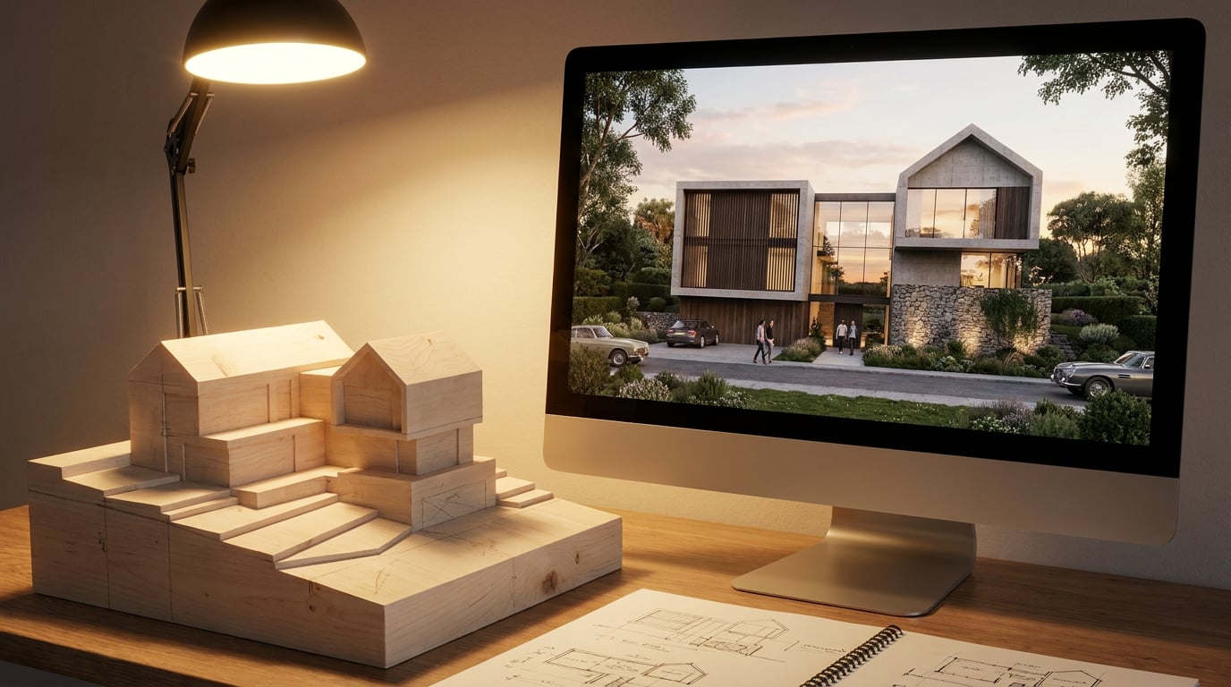
Competition judges give each board seconds, not minutes. Here's how to structure the panel so your strongest idea lands before they move on.
Why most boards lose before anyone reads a word
Design juries move through a stack of boards in a single sitting, and the number is high enough that no board gets a careful read on first pass. Attention is triaged, not consumed line by line. A judge's eye lands, decides in a few seconds whether there's something worth stopping for, and moves on unless the board earns a second look.
That decision happens before anyone reads a caption. If a board has no clear hierarchy, the eye has to hunt for the idea, and hunting reads as weak design even when the underlying scheme is genuinely strong. A judge will not credit you for effort they had to work to find.
Try the scan test on your own board: hold it at arm's length, or shrink it to thumbnail size on screen, and ask what registers in the first three seconds. If the answer isn't the idea, the layout has failed, regardless of how good the drawings underneath it are.
Compare that to a shortlisted board. It's almost always built the same way: one big image doing the work, one line of concept text sitting near it, and everything else, plans, sections, diagrams, playing a clearly supporting role. Nothing competes with the hero for attention. That's not a lack of content, it's a decision about what the content is for.
A board has one job in the first three seconds: tell the judge what the idea is. Everything else on the sheet earns its place only after that job is done.
Establish the hierarchy before you place a single drawing

Before you open a single drawing file, decide the one thing the board has to communicate. Is it the concept move, the section relationship, or the site response? Pick one. A board trying to say all three at once usually ends up saying none of them clearly, because every drawing is fighting for the same amount of visual weight.
Starting from a blank A1 sheet and building hierarchy as you go is where most boards go wrong: the layout ends up reflecting the order things were finished, not the order they should be seen. Layout's Competition Board template gives you a starting grid built around exactly this problem, with a hero frame and supporting frames already proportioned, so you're placing content into a hierarchy rather than inventing one under deadline pressure.
Size drawings by importance, not by what happens to fit. The hero image should be three to four times the area of any supporting plan or diagram. If your section is doing the real explanatory work of the scheme, it should look like it's doing that work, not sit at the same scale as a site location plan nobody needs to study closely.
Before opening any real assets, sketch the hierarchy as thumbnails: boxes and labels only, nothing rendered. This forces the sequencing decision early, when it's cheap to change, rather than after you've spent an evening placing final drawings into a layout that doesn't actually support the idea.
If you can't sketch your board's hierarchy in boxes and labels in under five minutes, you haven't decided what the board is about yet.
Use the layout grid to keep alignment honest
Misaligned frame edges and inconsistent margins are the fastest way to make a strong scheme look unresolved. Judges notice sloppiness in the frame before they notice quality in the drawing. Toggle on Layout's grid overlay, Manuscript, Columns or Modular, so every frame edge and text baseline snaps to the same underlying structure instead of eyeballing it.
The choice of grid matters. A Modular grid suits boards mixing photography, diagrams and text blocks at different scales, which is most competition boards: it gives you a consistent unit to size frames against without forcing everything into strict columns. A Columns grid suits a more text-heavy statement panel, where the priority is readable paragraph widths rather than juggling image blocks of different proportions.
The grid is a reference overlay only. It never appears in the exported PDF or PNG, so there's no risk of a stray guideline leaking into the submission the way it can when grids get drawn manually in other tools and someone forgets to hide the layer before export.
Consistent margins and gutters do more for perceived professionalism than any single rendering choice on the board. A judge who has just looked at forty boards will register clean alignment almost subconsciously, the same way they'll register a wandering margin as a small but real mark against the entry.
Typography that reads from across the room
A board is read at two distances: close up during detailed review, and across a room during a pin-up or a first pass down a corridor of entries. Type that only works at the first distance is failing at the second. Pull the project title and concept line from a type library built for exactly this: Layout's self-hosted library runs 300 families across sans, serif, mono and display faces, all openly licensed, and the default, Inter, holds up well at both distances because it was designed for screen and print legibility rather than decorative flourish.
Set a strict type scale and stop at three sizes: title, section labels, drawing captions. More than three creates noise on a large sheet, and noise is exactly what works against you in a thirty-second scan. If you find yourself reaching for a fourth size to distinguish some element, that's usually a sign the element doesn't need distinguishing, it needs cutting or merging into an existing tier.
If the submission needs to match a house style, upload the practice's own brand font. Layout accepts TTF, OTF, WOFF and WOFF2 files, including variable fonts, and the same uploaded font is shared with Retouch, so a title set in Layout and a caption baked into a hero image in Retouch will actually match.
Captions belong next to the drawing they describe, not gathered into a separate legend the judge has to cross-reference. Legends slow down scanning because they force the eye to travel back and forth between drawing and key, and a board being scanned in seconds doesn't have time for that round trip.
Three type sizes, captions kept beside their drawings, one font family doing the talking. That's the whole typography brief for a board meant to be read at a glance.
Sequence the eye path deliberately

Western reading order runs left to right, top to bottom. That means your hero image or concept diagram belongs top-left or dead centre, not tucked into the bottom-right corner where it competes with a page number for attention. This isn't a stylistic preference, it's simply how eyes move across a page by default, and fighting that default costs you the seconds you don't have.
Use alignment and distribute tools in Layout to build a deliberate visual path: concept sketch through plan through section, rather than scattering drawings in whatever order they happened to finish. A judge should be able to follow the logic of the scheme by following the layout, without needing the accompanying text to explain the sequence.
Leave deliberate white space around the hero image. A board crowded edge to edge with no breathing room reads as unresolved rather than thorough, because it signals that decisions about priority were never actually made. White space is doing work here, not wasting space.
Test the sequence properly: cover everything on the board except the top third, and ask whether that alone conveys the idea. If it doesn't, the sequence needs rework, because the top third is roughly what a judge sees before deciding whether to keep looking.
Export at the size judges will actually see it

How the board will actually be seen should decide how you export it. If it's being printed for a physical pin-up, export as a vector PDF at true sheet dimensions, with crop marks if the printer needs them. Layout's PDF export handles this at true dimensions with optional bleed, which matters more than it sounds: a board that's a few millimetres off true A1 size looks wrong the moment it's next to boards that are correctly sized.
Check the board at both A1 print scale and as a small thumbnail. Many digital submission portals show boards first as a small preview image before anyone opens the full-resolution file, which means your board is being judged on the scan test twice: once as a thumbnail, once in full. A layout that only works at full size is a layout that fails the first triage.
Before the deadline, share a read-only public link from Layout with a tutor or colleague and ask for the two-second reaction rather than detailed feedback. That link stays current as you keep editing, so it's a genuinely live preview, and catching a hierarchy problem while there's still time to fix it is worth far more than catching it after submission.
Keep a PNG export on hand once the deadline has passed. A strong competition board, built around one clear hero image and a legible hierarchy, is also strong portfolio content, and there's no reason to rebuild that layout from scratch when the version that already worked for a jury will work just as well in a portfolio review.
Export for the smallest version judges will see it at, not just the largest. A board that only survives at full resolution is a board that's already lost the thumbnail scan.
The boards that get a second look aren't the ones with the most drawings on them. They're the ones where a judge, scanning fast, knows within three seconds what the scheme is trying to do. Build that hierarchy first, hold the grid, keep the type scale tight, and export for the size the board will actually be seen at. Everything else on the sheet is in service of that first glance.
Keep reading.
Try ArchAdemia Tools for yourself
Draw it, model it, render it, publish it. One place, built for architects and small practices. Plans from £29 a month, all in.