Exhibition Stand Renders That Still Read at A0.
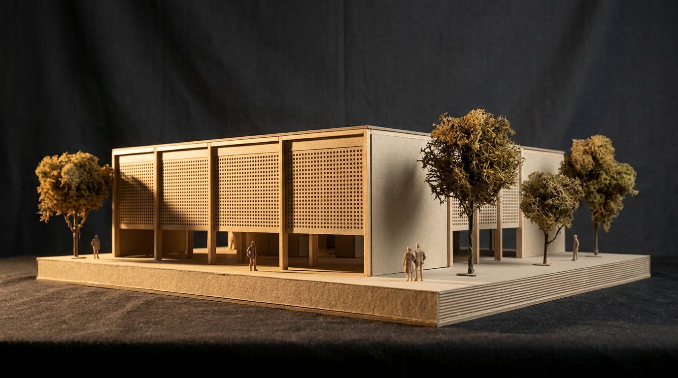
A hero render that looks stunning on screen can turn to mush on a 3-metre banner. Here's how to build one that holds up at any scale.
Why screen-perfect renders fail on the stand
A render that looks flawless at 1920 pixels wide on a laptop screen can fall apart completely once it's printed at 3m x 2m and hung as an exhibition fascia. Screens are forgiving. Soft edges, compression noise and low-resolution textures all get smoothed over by pixel density and backlighting. Print has no such mercy. Every softness, every repeated tile, every jagged cut-out edge gets magnified to a scale where a visitor standing two metres away will see it instantly.
Exhibition stands are unusual in that they get read at two completely different distances within the same event. A visitor walking the hall floor sees the stand from fifteen or twenty metres, where colour blocking and silhouette do the work. The same visitor then walks up to read a graphic panel from less than a metre, where every texture, edge and gradient is under direct scrutiny. A render built for one distance and not the other will always disappoint at the other end.
The failure points are predictable once you know to look for them. Repetitive tiled textures, timber cladding or perforated metal panels that looked fine as a small preview, suddenly read as an obvious repeating grid once stretched across a 4-metre back wall. Hero surfaces, the branded fascia, the feature wall behind the reception desk, go soft exactly where they need to be sharpest, because that's the surface furthest from camera in the original render and the one that gets least detail. Cut-out entourage, people, planting, signage, pick up jagged edges when the render's alpha channel wasn't generated with print in mind.
The real workflow for a stand designer rarely stops at "generate an image." A concept gets built in Image or Shoot, gets approved by the client, and then has to survive a journey through Retouch and out to a printed panel that a fabricator will cut, mount and light. Treating that journey as an afterthought is where most stand renders go wrong.

An exhibition stand render has to work at two viewing distances at once: across a hall floor and pressed up against a graphic panel. Most renders are only tested at one, usually neither.
Build resolution in from the start, not at the end
The single biggest determinant of whether a stand render survives print is the model and settings chosen before generation, not the rescue work done afterwards. This mirrors a hard limit in the underlying models: image generation caps out well below the pixel counts large-format print demands. A 3m x 2m fascia viewed at 1-2m needs something in the region of 100-150 dpi at final size, which works out to roughly 11,800 x 7,870 pixels at 100 dpi. No single-pass AI image model gets close to that natively. Treat any model capped below around 4 megapixels, that's roughly 2048 x 2048 pixels, as insufficient for a full-size stand panel without upscaling and selective re-rendering.
This isn't a reason to avoid AI-generated stills for stand design. It's a reason to plan the shot list properly. In Shoot, generate the full set of camera angles for the stand: the hero exterior view for the competition pitch, close-up material shots of the fascia and feature wall, an eye-level walk-through shot that shows how a visitor actually experiences the space. Don't generate one hero image and stretch it to cover every use from the pitch deck to the print panel. Each shot has a different destination and a different resolution requirement.
Flag which stills are destined for large-format print early in the process. That fascia panel and that feature wall need the highest-resolution generation setting available, applied deliberately to those specific shots, not blanket-applied across a whole set where most images only need to look good in a PDF deck. This is exactly the discipline architects already apply to competition boards: an A1 presentation sheet gets shot and composed differently to a quick internal sketch render, because one is going in front of a jury at full scale and the other isn't.
Generate deliberately for destination. A hero shot for a pitch deck and a fascia panel for print are different jobs, even if they show the same stand.
Rescue soft areas with Enhance Area before you commit to print
Even with a well-planned shot list, some surfaces will come out softer than they need to be, particularly long, continuous surfaces like back walls and fascias, which is exactly where tiling artefacts and low-frequency blur show up first once printed at scale. This is where Retouch earns its place in the workflow rather than starting the render again from scratch.
Enhance area re-renders a selected region at higher resolution with no prompt required, and composites it back seamlessly through the selection. This is precisely the tool for a wide render that has gone soft or repetitive across a stand's long back wall. Select the branded fascia panel or a graphic-heavy surface separately from the rest of the composition. That's the area a visitor will stand closest to and study for longest, and it's the area that most needs a resolution boost that the rest of the composition can live without.
Material tiling is a related but distinct problem. A timber batten wall or a perforated screen might read perfectly well on screen but reveal an obvious repeat pattern once printed at 4 metres wide. Material swap replaces a selected area's texture to match an attached reference, applied as a toggleable layer, without needing to re-render the whole scene. This lets a designer correct a single problem material without disturbing lighting, shadows or anything else in the composition that's already working.
Once the resolution and material fixes are in place, the Enhance panel's clarity and dehaze controls add a final layer of crispness to edges before the file goes anywhere near a printer. This is a small adjustment, but on a large panel viewed up close, a touch of clarity is the difference between edges that read crisp and edges that read slightly hazy under exhibition hall lighting.

Don't re-render a whole stand because one wall looks soft. Select that wall, run Enhance area, and leave everything else that's already working alone.
Grade and finish for the material, not the monitor
A grade that looks correct on a calibrated screen will not necessarily look correct once printed onto the actual substrate a fabricator uses. A backlit fabric panel, a rigid foam board and a vinyl wrap all reproduce colour and contrast differently. Backlit fabric tends to lift highlights and desaturate mid-tones as light passes through the material. Rigid printed board holds contrast more faithfully but can flatten under harsh overhead hall lighting. Vinyl wraps shift depending on the laminate finish, gloss versus matte, in ways a monitor simply cannot preview.
This is where Retouch's Adjust panel earns its keep as more than a cosmetic filter. Light, colour, point curves and HSL bands work as a non-destructive adjustment layer, which means the grade can be tuned per print method without touching the base render underneath. A designer producing the same stand graphic for a backlit fabric panel and a rigid board insert can keep two separate adjustment layers stacked on the same source file, rather than exporting and re-editing from scratch for each substrate.
As a general rule, push contrast and saturation slightly higher than feels natural on a monitor. Both large-format print and ambient hall lighting flatten punch that reads correctly on a screen. A grade that looks slightly overcooked in Retouch at 100% zoom on a calibrated display often lands exactly right once printed and viewed under trade-show conditions.
The most important habit here is restraint at the finishing stage. Keep adjustment layers live rather than baking them in. If a stand contractor sends back a print proof and the blacks are crushing on the fabric panel, a live adjustment layer means a quick re-grade rather than starting the whole edit over from an already-flattened file.
What looks right on a monitor rarely looks right on backlit fabric. Grade slightly hotter than feels natural, and keep the adjustment live so a printer's proof feedback is a five-minute fix, not a re-edit.
Assemble the final panel in Layout, not in the render itself
One of the most common mistakes in stand production is trying to make the render itself do the job of the final print file. A render's native aspect ratio was never designed to match a real stand panel's dimensions, and stretching or cropping a finished image to fit is where cropping errors and last-minute panic tend to happen.
Build the actual print-ready sheet in Layout instead, working at the panel's true dimensions from the start. Layout exports a vector PDF at true sheet size, with optional bleed and crop marks for print, which is exactly the file format a fabricator or print house expects to receive. Set a custom page size in millimetres that matches the real stand panel: if the fascia is 3000mm x 2000mm, the Layout document should be set to exactly that, not left to whatever aspect ratio the render happened to come out at.
Bring the finished render in as a placed image, then add typeset copy from Layout's type library alongside it. This keeps all text output as crisp vector shapes even though the background render underneath is raster, which matters enormously at print scale: a logo lockup or a hall directory number rendered as part of the AI image will degrade at large size, while type set natively in Layout stays perfectly sharp regardless of how far it's blown up.
Guides and the layout grid keep branding, logos and hero imagery aligned to the panel's real proportions. This catches cropping issues, a logo sitting too close to a bleed edge, a hero shot cut awkwardly by a structural join in the stand, before the file ever reaches the printer, rather than after the panel has already been produced and hung.

Proof before you commit the print run
The final safeguard, and the one most often skipped under deadline pressure, is proofing at true scale before committing to a full print run. Export a test crop from Layout at 100% scale of a small but critical section, a logo lockup, a corner detail, a section of the fascia graphic, and check the actual pixel density before signing off on the whole panel. This catches resolution problems on a single sheet of A4 or A3 rather than discovering them on a fascia that's already been cut and mounted.
Check the render's weakest area first. This is almost always a distant background element, a repeated material, or a low-contrast shadow area, since these degrade fastest under large-format print. A hero product shot in the foreground will usually hold up fine; it's the softly blurred hall background or the shadow detail under a display plinth that reveals itself as noisy or blocky once printed at scale.
Cross-check colour against the print method's known behaviour rather than trusting a calibrated monitor alone. Fabric backlit displays shift colour differently to rigid board, and proofing on the actual substrate, or at minimum requesting a physical swatch proof from the print supplier, catches problems that a screen will never reveal. This is standard practice in large-format print production generally, and exhibition stand graphics are no exception: what looks correct in Retouch at 100% zoom on a studio monitor and what comes off a large-format printer under warehouse lighting are not always the same thing.
Keep the Retouch document open with its layers intact rather than flattening early. If a printer's proof comes back with feedback, a colour shift needed on the fascia, a material that's still tiling slightly at the edge, an unflattened file means that feedback becomes a quick adjustment on an existing layer stack rather than a full re-render from the original prompt.
| Check | What to look for | Where to fix it |
|---|---|---|
| 100% crop test | Pixel density on logos and fine detail | Layout export, small test area first |
| Weakest area review | Background blur, repeated material, low-contrast shadow | Retouch, Enhance area or Material swap |
| Substrate colour check | Backlit fabric vs rigid board vs vinyl shift | Retouch Adjust panel, live layer |
| Layer state | Flattened too early loses editability | Keep Retouch document unflattened until sign-off |
Proof a small crop at 100% before you proof the whole panel. A logo lockup the size of a postage stamp on screen will tell you everything you need to know about the full 3-metre fascia.
The takeaway
An exhibition stand render that survives large-format print is decided far earlier than the printing stage. It's decided at generation, when the right camera angles and the right resolution settings are chosen for the shots that are actually destined for a fascia panel rather than a pitch deck. It's decided in Retouch, where Enhance area and Material swap fix the specific surfaces a visitor will stand closest to. It's decided in the grade, adjusted for the real substrate rather than a calibrated monitor. And it's assembled properly in Layout, at true panel dimensions, with type kept as crisp vector output rather than baked into a raster image. Treat the render as the start of the print production process, not the end of it, and the panel that comes off the printer will look exactly like the one the client approved on screen.
Keep reading.
Try ArchAdemia Tools for yourself
Draw it, model it, render it, publish it. One place, built for architects and small practices. Plans from £29 a month, all in.