Golden Hour Without the Gimmick: Selling a Facade With Light.
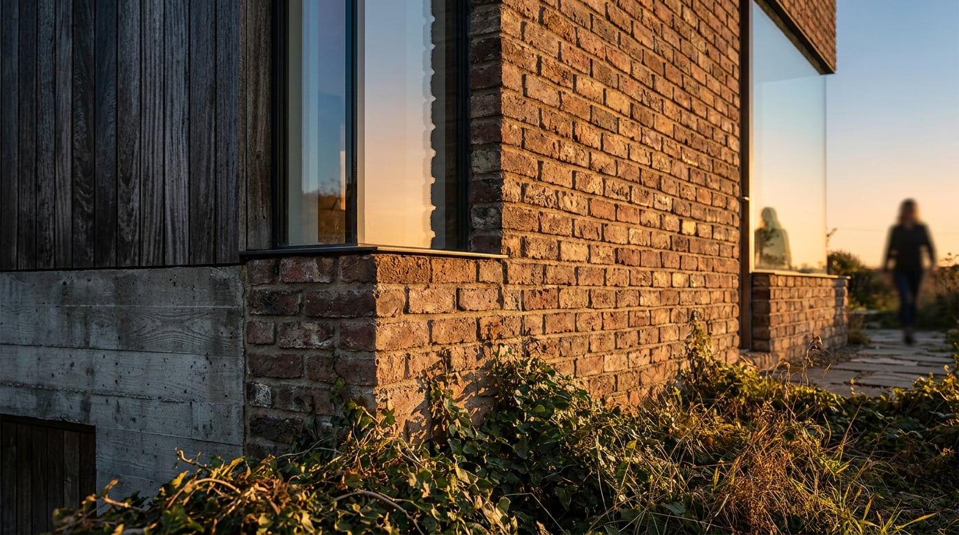
Golden hour sells a facade when the light does real work. Here's how to use warm light on materials, not as a filter over a flat render.
Why golden hour renders so often look like a filter, not a time of day
The tell is easy to spot once you know what you're looking for: every material in the image goes the same shade of amber. Brick, glass, render, timber cladding, the ground plane, the sky, all pushed towards the same warm cast, as if someone dropped an orange gel over the whole frame. That's not golden hour. That's a colour filter wearing golden hour's name.
Real golden hour is a lighting condition, not a palette. It's defined by a low, raking, single dominant light source: the sun sitting close to the horizon, throwing long shadows and cutting across a facade at a sharp angle. That geometry produces strong value contrast between the planes catching light and the planes falling into shadow. A projecting bay will have one face blazing and the return face nearly black. A recessed entrance will read as a deep, cool pocket against a lit wall around it. The warmth is real, but it's a consequence of low sun angle, not the point of the image.
This is why the fix has to start before you touch colour at all. If the sun can't actually rake across the elevation you're presenting, no amount of grading will sell the effect. A camera angle that faces the building dead-on, with the sun somewhere behind the camera, gives you flat, even illumination no matter what time of day you claim it is. Warm it up and you get exactly the problem described above: a uniform orange wash sitting on top of an image that was never lit for the time of day it's pretending to be.
Compare that to an overcast render of the same facade. Under flat, diffuse light, the elevation reads as an even tonal value across every plane. There's no drama, but there's also no lie. The material depth that's genuinely there, joint lines, panel breaks, texture, shows up honestly, just without the theatrical contrast golden hour brings. An overcast image never overclaims. A badly-angled golden hour image always does, because it borrows the emotional register of low sun without doing the geometric work to earn it.
Golden hour is a sun-angle problem first and a colour problem second. Get the raking light right and the warmth looks inevitable. Get it wrong and the warmth looks applied.

What warm light should actually be doing to your materials
Once the geometry is right, warm light has a job to do on every material in the frame. If it isn't changing how a material reads, it's decoration, not lighting.
Brick and stone respond to raking light more dramatically than any other material on a typical elevation. Low-angle light exaggerates every joint line, every unit of texture, every subtle variation in the coursing. This is the single biggest tell separating a convincing golden hour render from a flat one: does the brickwork have relief, or is it a smooth amber plane with a texture map pretending to be brick? Raking light should carve real shadow into every recessed joint.
Glass and glazing behave completely differently to masonry, and treating them the same is where a lot of renders go wrong. Golden hour light on glazing should produce a directional reflection, a bright streak of sky or sun catching the pane at the correct angle, or a warm interior glow bleeding through if the building is occupied. What it should never produce is a flat, uniform tint smeared evenly across the whole curtain wall. Glass reflects; it doesn't absorb colour the way a masonry facade does.
Render and painted finishes are the quiet test of whether your raking light is doing anything at all. These are largely featureless materials under flat light, smooth, matte, with almost no inherent texture to catch shadow. That means the low sun angle is doing all the work of proving the material is real render on a real building, not a flat card standing in front of the camera. Kill the raking angle and painted render goes dead instantly.
Metal cladding and window frames should catch a hot, narrow highlight on whichever edge faces the sun, while the rest of the material stays comparatively cool and neutral. Metal doesn't diffuse light the way brick does. It's specular. A parapet capping or a mullion should show one bright line and a lot of quieter, cooler surrounding surface, not an even warm glow across the whole profile.
If warm light doesn't change how a material behaves, it isn't lighting the scene. It's sitting on top of it.
A practical light-and-material workflow using Retouch
Once you understand what warm light should be doing to each material, the workflow becomes a lot more deliberate than "add a golden filter and hope." Working in Retouch, a facade image, whether it started as a render or a site photograph, can go through a structured relight-and-refine pass rather than a single flat adjustment.
Start with the document open in Retouch and apply the Golden hour one-click re-light preset. This regenerates the whole document as a new layer, sitting cleanly above the original, which stays untouched underneath. That matters: you're never committing to the relight blind. If the raking direction the preset produces doesn't suit your camera angle, you still have the source to fall back on.
With that new layer in place, open the Adjust panel and use its Light and Colour controls directly on the relit layer. The instinct is to push everything warmer and flatter. Resist it. Use those controls to widen the contrast between the lit and shaded facade planes instead, so the value difference the raking sun should be producing actually reads. A golden hour image that's warm but low-contrast still looks like a filter. A golden hour image with real value separation between light and shadow looks like a time of day.
Then bring in a layer mask on that relit layer and paint back some of the original, cooler colour into the reveals, soffits, and recessed window openings that should logically stay in shadow. This is often the single move that separates convincing warm light from an applied wash: shaded areas staying comparatively neutral or cool while sunlit planes carry the warmth. Directional light means some parts of the building simply don't get warm.
If one area of the facade needs a different material read entirely, a zinc parapet capping that should stay cool and reflective while the brick below goes warm, for instance, don't fight it with colour grading alone. Use Material swap on that specific area, matching a reference image so the zinc keeps behaving like zinc under the new lighting rather than getting dragged into the same warm grade as everything around it.
Finally, before committing to golden hour as the final answer, generate the Dusk or Blue hour presets on the same document and look at all three side by side. The point isn't to default to whichever preset looks most dramatic. It's to judge which time of day actually serves this particular material palette and massing. Sometimes the honest answer is that golden hour isn't it.
Relighting on a new layer, adjusting contrast rather than flattening warmth, and masking cooler tone back into shadow: that sequence is what turns a preset into a considered lighting decision.

When golden hour is the wrong choice for the facade you're selling
Golden hour isn't the correct answer for every scheme, and knowing when to reach for something else is part of the craft.
A highly reflective glazed facade often reads better under Overcast or Blue hour conditions, where the ambient light stays soft enough for reflections to remain legible. Low, intense golden hour sun hitting a curtain wall at the wrong angle can blow reflections out completely, turning what should be a nuanced, layered surface into a flat sheet of blinding highlight. If the point of the image is to show how the glazing reflects the sky and surrounding context, a lower-contrast lighting condition usually serves that better than raw low sun.
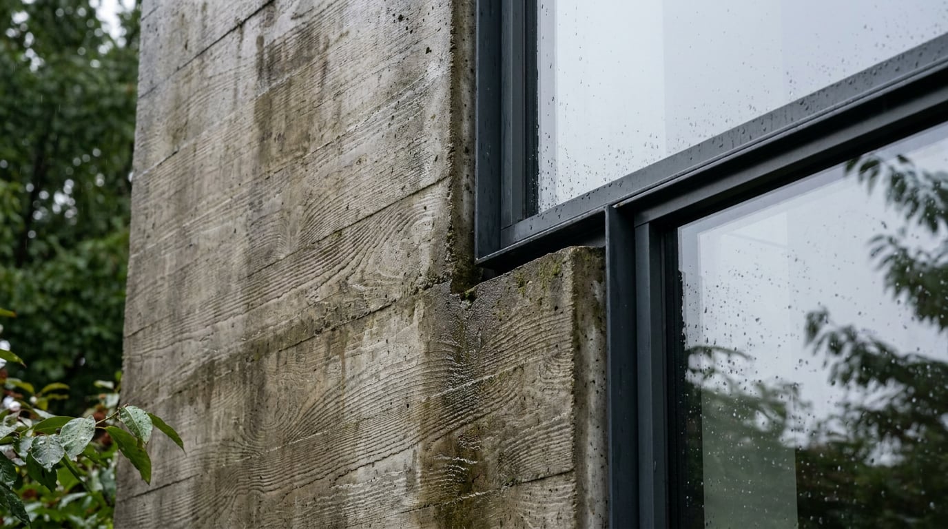
A scheme built around subtle material texture, fair-faced concrete, a fine sand-finish render, benefits from restraint. Push the raking angle too far and every minor imperfection or panel line gets thrown into hard shadow, which can look dramatic but actually obscures the quality of the finish rather than revealing it. Subtle materials want subtle light. A softer, more oblique sun angle, or an overcast condition, often shows the material more honestly than a full theatrical golden hour treatment.
For a planning application or a Design and Access Statement image, the calculation changes again. A neutral daylight or overcast read is very often the more credible choice in front of a planning officer. Golden hour drama can start to look like an attempt to distract from the material palette rather than present it clearly. A DAS image needs to demonstrate what the building is actually made of and how it actually sits in its context, not sell an atmosphere. Save the mood for the images where mood is the job.
That's exactly where client presentations and competition boards differ. Those audiences want to feel something, and golden hour or dusk lighting earns its place there in a way it doesn't on a technical elevation study. Knowing which register a given image is being asked to work in, evidential or persuasive, should decide the lighting condition before anything else does.
| Facade condition | Better lighting choice | Why |
|---|---|---|
| Textured brick, stone, timber | Golden hour | Raking light reveals joint lines and surface relief |
| Highly reflective curtain wall | Overcast or blue hour | Keeps reflections legible instead of blown out |
| Fair-faced concrete or fine render | Soft daylight or overcast | Preserves subtle texture without exaggerating flaws |
| Planning application / DAS | Neutral daylight or overcast | Reads as evidence, not persuasion |
| Competition board / client deck | Golden hour or dusk | Mood is appropriate to the audience and purpose |
Composing the shot so the light has something to do
None of the material or workflow guidance above matters if the composition doesn't give the light something to work with. The camera angle needs to put the sun's direction genuinely crossing the facade at an angle, not staring straight into a flat elevation that a warm grade is being asked to rescue. If you find yourself compensating for head-on lighting with colour work, go back and move the camera instead.
Entourage has to agree with the lighting condition you've chosen. Trees, people, parked cars, they all need to cast shadows at the correct low-sun length and direction for golden hour, not the short, near-vertical shadows of midday. Mismatched shadow length between entourage and the building itself is one of the fastest ways an image breaks its own illusion. A tree throwing a short midday shadow next to a building throwing a long raking one reads as wrong immediately, even to a viewer who couldn't articulate why.
Let the building's shadow actually fall across the ground plane and onto adjacent surfaces, a neighbouring wall, a section of paving, rather than isolating the facade against an empty sky. A shadow that lands somewhere and interacts with the site roots the building in its context. A building floating against a golden sky with no shadow falling anywhere looks staged, no matter how warm the light is.
If a wide facade shot goes soft or repetitive after relighting, particularly across a long run of identical window bays or repeated brick coursing, use Enhance area in Retouch to re-render that specific region at higher resolution. It composites back through the selection without needing a prompt, which makes it a fast way to recover detail in exactly the part of the image under the most scrutiny, without redoing the relight across the whole document.
A composition that gives the sun somewhere to rake, entourage that agrees on shadow length, and a shadow that actually touches the ground: that's what makes golden hour look observed rather than applied.

Golden hour is worth reaching for when the material and the message call for it, and worth setting aside when they don't. The decision starts with sun angle and camera position, gets tested against how each material actually behaves under raking light, and only becomes a grading exercise once the geometry has already done the convincing. Build the facade image in that order and the warmth stops looking like a filter. It starts looking like a Tuesday evening in October, exactly when you said it was.
Keep reading.
Try ArchAdemia Tools for yourself
Draw it, model it, render it, publish it. One place, built for architects and small practices. Plans from £29 a month, all in.