Golden Hour Renders: Why the Low Sun Angle Sells a Scheme.
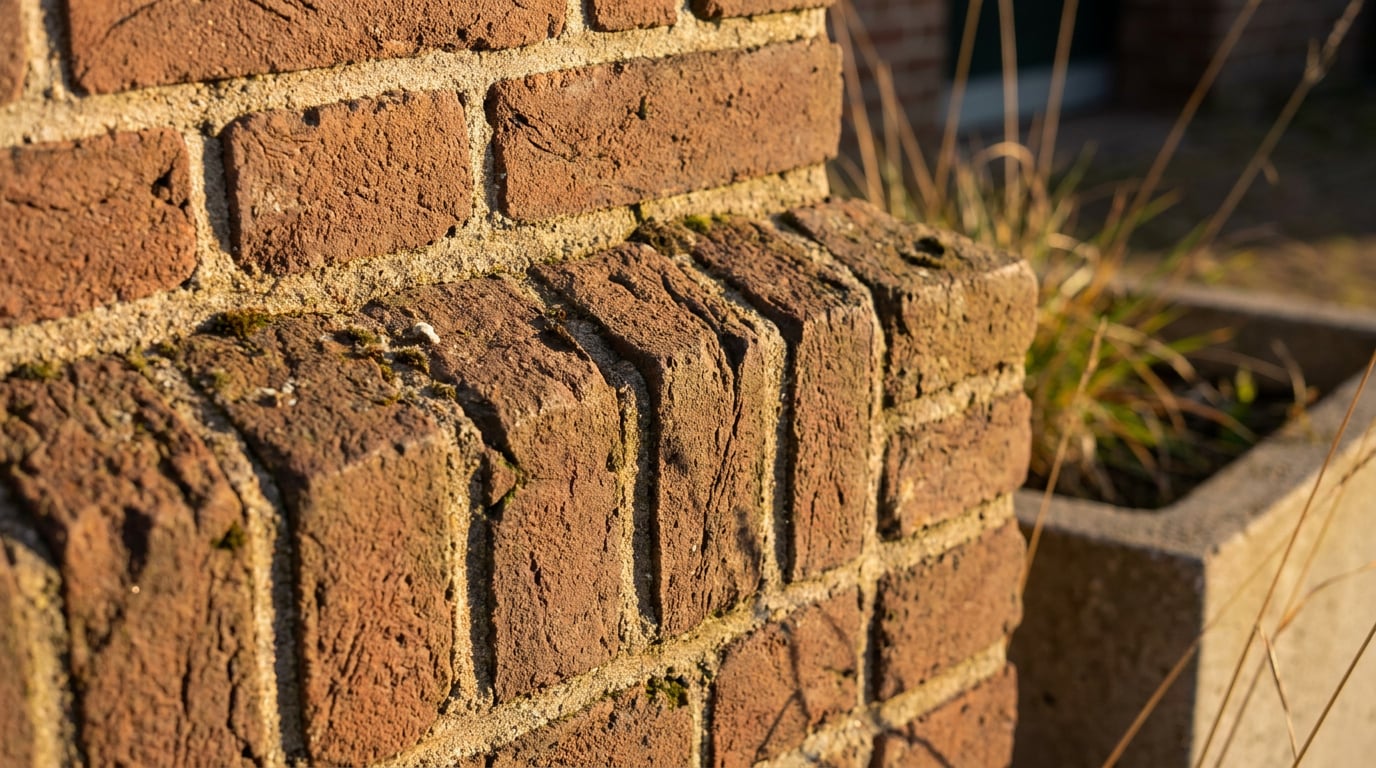
Long shadows and raking light do more selling than any camera angle. Here's why golden hour works and how to get it without waiting for sunset.
What the low sun angle is actually doing to your image
A render lit at 10-15° sun elevation behaves differently to the same render at midday, and the difference isn't just mood. Raking light hits a facade at a shallow angle, which means every joint, reveal and change of plane throws a shadow. Brick coursing that vanishes under flat overhead light suddenly has depth. Render texture that reads as a uniform grey under midday sun starts showing the trowel marks. This isn't decoration, it's information: the low sun angle is doing the job that a texture map or a material call-out does in a spec, except it does it visually and instantly.
Shadow length is the other half of the story. At 10° sun elevation, a 10m parapet throws a shadow roughly 57m long, purely from the geometry of height divided by the tangent of the sun angle. That's a scale cue a viewer reads in a fraction of a second, faster than they'd clock a human figure standing at the entrance. A long shadow cast across a plaza or a car park tells the eye "this building is tall" before anyone has consciously measured anything. Architects have used this trick with physical models under raking studio light for decades; it works exactly the same way in a rendered scene.
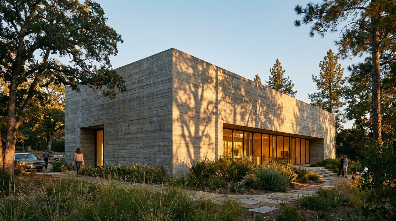
Colour temperature matters too. Golden hour direct sun sits around 2700-3500K, warm enough to push stone, timber and brick into their most flattering range, while the sky itself stays cooler, adding blue-grey shadow fill that increases contrast without anyone needing to reach for HDR tone-mapping tricks. And because the light is coming from the side rather than from directly overhead, a stepped facade, a recessed entrance or a cantilevered canopy actually separates into distinct planes instead of collapsing into a flat silhouette.
Put a midday top-down render of a housing scheme next to the same view at golden hour and the difference is stark. Midday: flat, shadowless, reads like a massing study with a material applied. Golden hour: the same geometry now has weight, depth and a sense that light is actually falling on real surfaces.

Raking light does the job a material call-out does in a spec, except a client sees it instead of reading it.
Why golden hour outperforms overcast and midday in client presentations
Overcast light is honest. It's even, it doesn't create blown highlights or crushed shadows, and it's genuinely the right choice for a Design and Access Statement where the goal is accurate material colour and unambiguous facade reading. Nobody wants a planning officer squinting at a shadow to work out where a window actually is. But that same evenness is exactly why overcast fails as a hero image. It reads as flat, neutral, informational, which is the wrong register when the job of the image is to persuade rather than to document.
Midday sun has the opposite problem. It comes from almost directly overhead, so shadows sit tight under balconies and soffits instead of raking across the facade, and glazing tends to blow out into a flat white glare rather than showing depth or reflection. It's a common failure mode on competition boards: the lead image looks harsh and clinical because the sun angle was never considered as a compositional choice, just left at whatever the default render setting produced.
Golden hour sits in a different emotional register entirely: warmth, arrival, the sense of a place already being lived in. That's precisely the feeling a planning committee or a competition jury needs before they start reading the drawings critically. A client deck opener shot at flat midday looks like a render. The same view re-lit at golden hour looks like somewhere you could actually arrive at on a Tuesday evening.
The practical answer isn't to pick one lighting condition and stick with it across the whole set. It's to split the job: overcast for the technical elevations and material call-outs in the appendix, golden hour reserved for the one or two images that need to do the actual selling.
| Lighting condition | Best use | Weakest at |
|---|---|---|
| Overcast | DAS material accuracy, technical elevations | Hero images, competition covers |
| Midday | Massing studies, plan diagrams | Facade depth, glazing reflections |
| Golden hour | Hero shots, client decks, arrival views | Precise colour matching for material specs |
Golden hour doesn't replace overcast, it works alongside it: one lighting condition for the drawings that get scrutinised, one for the image that gets remembered.
Getting golden hour without waiting for the actual golden hour
Waiting for the real thing has always been the practical obstacle. Site photography can wait for the right evening, but a render doesn't get that luxury when a submission deadline is fixed. This is where re-lighting a finished visualisation, rather than re-running the whole pipeline, earns its place in the workflow.
In Retouch, the one-click re-light presets cover six lighting states: Golden hour, Dusk, Blue hour, Night, Overcast and Sunny. Running one regenerates the whole document at that new lighting condition and lands it as a new layer, so the original render stays intact underneath. That matters practically: a scheme rendered at midday for technical clarity in the DAS doesn't need to be re-rendered from scratch to also produce a client-facing hero shot. Re-light the same document, keep both layers, and now one file holds the overcast version for the appendix and the golden hour version for the front cover, without duplicating source files or re-running the render engine.
At the generation stage itself, Shoot produces a full set of camera angles for a scheme, both exterior and interior handled separately. Choosing golden hour as the lighting condition before generating that set means the exterior hero shots and the interior views come out consistent with each other. This is worth dwelling on: interiors read side light through glazing very differently to the way exteriors read raking light on a facade, and if the two are generated under different lighting logic they won't sit together convincingly in the same document.
It's also worth testing the same viewpoint under both Golden hour and Sunny before committing. Sunny gives a harder, higher-angle light, better suited to a midday leisure or retail scheme where the brief calls for bright, active daytime use. Golden hour suits residential and civic work where warmth and a sense of arrival matter more than clarity of activity.

Composing for the low sun, not just switching it on
Choosing golden hour as a lighting preset is only half the job. Composition has to respond to where the sun actually sits, or the effect works against the image rather than for it.
Position the sun behind or to the side of the camera. A low sun angle placed directly into the lens either blows out the sky entirely or requires a deliberate lens flare treatment, which is a specific stylistic choice, not a default. Point it the wrong way by accident and the result is a facade in shadow against an overexposed sky, which reads as a lighting mistake rather than atmosphere.
Let shadows fall into the foreground rather than off to the side. A shadow running toward the camera reads immediately as a depth cue; a shadow sitting off in the periphery of the frame goes unnoticed and does none of the scale-reading work it's capable of.
Landscaping behaves differently at golden hour too. Trees and hedging catch rim light along their edges and throw long, articulated shadows across paving, which means entourage and planting placement matter more at this time of day than they do at midday, when shadows sit tight and unremarkable underneath. A tree placed carelessly at golden hour throws a 15-metre shadow straight across a building's entrance in the render; the same tree at midday barely registers.
Interior shots benefit hugely from the same low sun raking through glazing onto internal floors and walls. That single detail, a bar of warm light stretching across a timber floor from a west-facing window, sells a competition entry's daylighting strategy far more convincingly than a flat, evenly-lit interior ever will. It's the same principle as the facade: raking light reveals what flat light hides.
One practical craft note: raking light also reveals rendering artefacts that flat light conceals. A facade that's gone slightly soft or repetitive after a re-light pass will show it under grazing sunlight in a way it never did under overcast conditions. In Retouch, running Enhance area over the affected facade re-renders that region at higher resolution and composites it back through the selection, cleaning up exactly the kind of softness that low-angle light exposes.
Golden hour rewards deliberate composition: sun position, shadow direction and entourage placement all do more work at a low sun angle than they do at midday.
When golden hour is the wrong choice
Golden hour isn't a universal upgrade. A scheme whose primary selling point is daytime activity, a retail unit, a school playground, a sports facility, is better served by harder, higher-angle Sunny light that shows the space in active use rather than in a moody evening register that undersells its actual function. A material palette that depends on accurate colour reading for a planning submission is genuinely better served by overcast light, where warm golden tones won't shift a client's or officer's perception of what the render brief specifies. And a north-facing facade, or a scheme where the whole point is to demonstrate daylight penetration on a specific elevation at a specific time of year, needs sun positioning driven by the actual site orientation and daylighting study, not by whichever preset looks best. The rule of thumb: golden hour is for the images that need to persuade. Everything that needs to inform, measure or verify still belongs in flatter, more honest light.
Reserve golden hour for the images that sell the scheme, not the ones that have to prove it.
The low sun angle isn't a filter, it's a lighting decision with the same weight as choosing a camera height or a lens. Use it where the job is persuasion, keep overcast and midday where the job is clarity, and let the two work together in the same document rather than picking one condition for everything.
Keep reading.
Try ArchAdemia Tools for yourself
Draw it, model it, render it, publish it. One place, built for architects and small practices. Plans from £29 a month, all in.