How Interior Designers Test Finishes and Layouts Before Sign-Off.
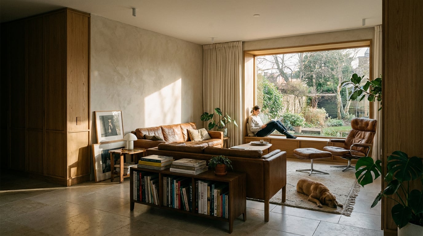
Swapping a stone finish or reshuffling a layout used to mean a fresh render pass. See how interior designers now test both in minutes, before the client meeting.
The bottleneck in interior fit-out sign-off is never a shortage of ideas. It's the time between "what if we tried walnut instead of oak" and having something to actually put in front of the client. Every finish swap has traditionally meant a new render. Every layout question has meant remodelling before anyone can even see whether it works.
The old problem: every finish swap meant a new render
The traditional workflow runs the same loop, project after project: model the scheme, render it, present it, take the feedback, remodel the finish that got questioned, re-render, present again. Each round costs hours, sometimes a full day if the render engine is slow or the model complex. And clients rarely want to see one revision at a time. They want three or four options side by side, a proper comparison, before they commit to anything.
Small practices and sole interior designers absorb most of that time cost without billing for it, because clients have come to expect "show me some options" as a baseline part of the service, not an extra. The actual friction isn't imagination. Designers know instantly what a walnut-clad kitchen island versus an oak one will feel like. The friction is turnaround: the gap between having that thought and having an image the client can react to.
The real cost of the old workflow isn't render time. It's the hours spent rebuilding a scene just to test one material decision.
Material swap: changing a finish without rebuilding the scene

In Retouch, material swap replaces the texture inside a selected area with a reference the designer attaches, landing as a toggleable layer rather than a change baked permanently into the image. Nothing else in the composition moves. The lighting, the reflections, the surrounding joinery, the room beyond, all of it stays exactly as it was.
In practice: select the joinery run in a kitchen render, attach a reference photo of a different stone worktop or timber veneer, and the swap sits alongside the original as a layer that can be switched on and off. That's the useful bit for client meetings. Instead of exporting two static images and asking the client to hold both in their head at once, the designer flips the layer visibility live in the session: "here's the oak, here's the walnut, which do you prefer." No re-export, no waiting, no second file to find.
Paired with the Adjust panel's HSL bands, a designer can go further without another swap at all, shifting a stain colour warmer or cooler within the same material rather than reaching for a whole new reference. It's the difference between "let's try a different timber" and "let's just warm this timber up a touch," and both live in the same non-destructive stack.
Testing lighting and mood without a new photoshoot
A finish only reads correctly under the right light, and clients often ask to see a room at a different time of day precisely because that's where doubts creep in. A living room that looks calm at midday might feel cold once the lamps go on at seven.
Retouch's one-click re-light presets, Golden hour, Dusk, Blue hour, Night, Overcast and Sunny, regenerate the whole document at a different time of day or weather condition as a new layer, without a second photoshoot or a re-render from the base model. A single interior shot becomes the source for a full mood range: daylight streaming through south-facing glazing, or the same room read at dusk with lamp light doing the work instead.
Layer masks make this selective rather than all-or-nothing. A designer can keep a task-lit kitchen island bright and functional in one preset while letting the rest of the room shift into a dusk mood, which is closer to how these spaces actually get used than a uniform lighting change across the whole frame. Because the six blend modes and adjustment layers stay live and editable in the stack, a mood test isn't a dead end. If the client asks for the blue hour version to feel slightly less cold, that's an adjustment layer tweak, not a rebuild.
The win isn't a better-looking render. It's testing more finish and lighting combinations before the client meeting without multiplying the production load.
Furniture layout options: generating and comparing quickly

Layout decisions are harder to sell on plan alone, because clients struggle to picture how a sofa orientation actually feels in a room until they see it rendered. Composer poses 3D models with gizmos and renders them to photorealistic stills, which means a designer can test furniture placement inside a scene before committing to a final layout, rather than committing on paper and hoping.
A Worlds environment can act as the backdrop for this, so the same room shell hosts several furniture arrangements without remodelling the space each time the layout changes. Practically, that means testing a sofa-facing-the-fireplace arrangement against a sofa-facing-the-window arrangement, both rendered from the same saved camera view. That last part matters more than it sounds: a fair comparison depends on holding the angle, the framing and the eye height constant between options, so the only variable the client is judging is the furniture arrangement itself.
Saved views make this repeatable. Move the sofa, re-render from the same saved camera position, and the comparison stays consistent for the client deck rather than turning into two images shot from slightly different angles that make the decision harder to read, not easier.
Refining the render itself before it goes in front of a client
Even a strong composition can have a soft patch. Wide living-room shots in particular tend to lose detail in busy areas, a rug pattern that's gone slightly mushy, joinery detailing that's blurred at distance. Retouch's Enhance area re-renders a soft or repetitive region at higher resolution and composites it back through the selection, cleaning up exactly the part of the image that needs it without touching anything else.
Non-destructive selections speed this up considerably, including the option to select by typed description. Typing "all the upholstery" selects every matching region across the frame at once, rather than manually masking a sofa, two armchairs and a footstool separately. Clone Stamp and Healing Brush handle the smaller artefacts, a stray reflection in a glazed cabinet door, a duplicated cushion that shouldn't be there, before the image reaches the client's inbox.
Layer styles, drop shadow, glow, stroke, stay live and editable throughout, which matters for presentation images that carry annotation. A callout pointing at a finish swatch, or a subtle stroke separating a floor plan inset from a render, can still be adjusted after the fact rather than requiring the whole graphic to be rebuilt.
Non-destructive editing means a spot-fix stays a spot-fix. Nothing forces a full re-render just because one detail needed sharpening.
Bringing it together for client sign-off

None of this matters if it doesn't land cleanly in front of the client. Layout's Presentation Board or Client Deck templates give a ready structure for showing finish options and layout variants side by side, with placeholder frames already set up for before/after pairs, so a designer isn't laying out a comparison sheet from scratch for every project.
A toggleable layout grid, Manuscript, Columns or Modular, keeps material swatches, render comparisons and floor plans aligned on the same sheet without manual guesswork over spacing. It's a reference overlay only, so it never shows up in the export. And because export includes a vector multi-page PDF at true sheet dimensions, the finish comparisons stay print-ready for a physical client meeting rather than something that only holds up on a screen.
The point of tightening this whole loop isn't a flashier render. It's shortening the distance between "the client asks for an option" and "the option is on the table." That gap, more than anything else, is the actual bottleneck in most interior fit-out sign-offs.
| Old workflow step | Where it lives now |
|---|---|
| Remodel and re-render a finish swap | Material swap as a toggleable layer in Retouch |
| Book a new photoshoot for a mood shift | One-click re-light presets in Retouch |
| Remodel the room for each layout test | Composer poses against a saved camera view |
| Manual masking for spot-fixes | Select by typed description, Enhance area |
| Build a comparison sheet from scratch | Layout's Client Deck template with layout grid |
The same fast-iteration logic is showing up beyond interiors, too. Product designers use it for finish boards, hospitality teams for mood-led room variants, retail fit-out teams for rapid layout testing before a lease commitment. The common thread is the same one interior designers will recognise: the client isn't asking for a single perfect image. They're asking to see options, quickly, without paying for the production cost of building each one from the ground up.
Get the comparison in front of the client faster, and sign-off stops being the slowest part of the project.
Keep reading.

Try ArchAdemia Tools for yourself
Draw it, model it, render it, publish it. One place, built for architects and small practices. Plans from £29 a month, all in.