Massing Study to Competition Board in One Afternoon.
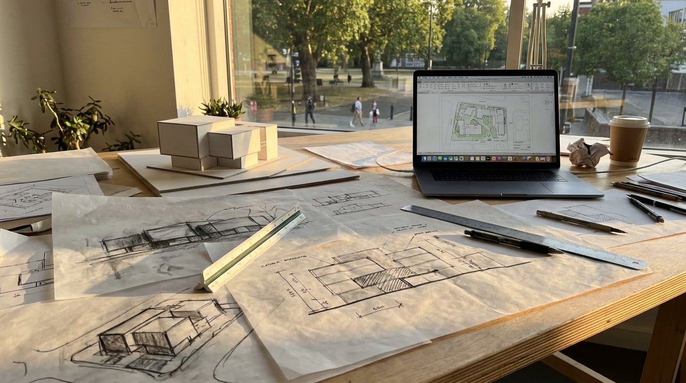
A working sequence from rough massing to a submitted competition board, using Linea, Shoot and Layout in one sitting, no all-nighter required.
Why the Gap Between Massing and Board Is Usually Wasted Time
Most competition entrants lose the afternoon before they ever start thinking about the board itself. The pattern is familiar: massing gets blocked out in SketchUp, exported to a renderer for a hero shot, then dragged into InDesign or PowerPoint where the layout fights the images at every turn. Each of those handoffs is a small tax. None of them is design work.
The real bottleneck isn't modelling speed, it's round trips. Every export and reimport carries its own overhead: file naming, re-linking materials, checking scale survived the transfer, discovering the camera angle you rendered doesn't match the plan you cropped. Architecture practices running early-stage BIM workflows routinely report this adding up to significant lost time per round trip once coordination and file management are factored in, and it's the same story for anyone hopping between disciplines' tool stacks, whether that's a product designer moving CAD to render to Illustrator or an urban designer moving GIS to 3D to layout.
The goal for a one-afternoon board isn't to work faster inside each app. It's to stop treating the process as five separate files that need reconciling. One continuous pass, from massing block to submitted PDF, with the massing model, the render set and the board living close enough together that a late change doesn't mean starting over.
In practical terms, "one afternoon" breaks down roughly like this: thirty minutes refining the massing into something presentable, ninety minutes generating and pushing the visualisation set to submission quality, and ninety minutes laying out and proofing the board itself. That's four hours, not a miracle. It only works if the tools between those stages don't cost you the twenty minutes you were counting on.
The bottleneck in competition boards isn't drawing or rendering speed, it's the time lost re-exporting and re-linking between disconnected tools. Fix the round trips and the afternoon takes care of itself.
Step One: Take the Massing Study From Blocks to a Presentable Form

Start in Linea's Massing workspace (Alt+M). This is direct modelling over the same drawing you'll eventually build up further if the scheme needs it: place a footprint, and it becomes a real solid with a pickable face graph. Push and pull faces to get proportions right, split faces where a roof pitch needs to break, and cut clean openings straight into a face using face-profile rather than rebuilding the block from nothing every time the brief shifts.
Keep the working scaffolding rather than deleting it. Group blocks to hide the bits you're not showing the jury, the underlying grid, the massing alternatives you tried and discarded, so the presentable form and the working model stay in the same file. This matters more than it sounds: when the board needs revising the night before submission, you want the model that got you there, not a stripped file with no memory of how you arrived.
Import a hand sketch or an existing DWG or DXF site plan as a base before you start pushing volumes around. Massing that sits on a real site context, with real neighbouring buildings and boundaries, reads more convincingly to a jury than a floating block with no ground truth. Linea parses DXF and DWG in the browser, so the site plan a practice already has on file becomes the base layer rather than something to trace by eye.
Switch to Build only where the board genuinely needs the hint of a real building; a door, a stair core, a glazing rhythm on the principal elevation. You don't need to model the whole thing. A competition board rewards legibility over completeness, and over-modelling a scheme that's still at concept stage usually reads as slower, not more resolved.
Once the massing reads well from at least two angles, a perspective view goes straight into rendering. No export dialog, no file format decision, no re-linking materials that didn't survive the trip.
Step Two: Generate the Visualisation Set, Not Just One Hero Shot
A competition board typically needs three to four images, one or two drawings, and a few hundred words of text on an A1 or A0 sheet. That's the brief you're actually designing for, not "one beautiful render." Shoot is built around generating a full set of camera angles from one massing export in a single pass: an aerial context shot that shows how the scheme sits on the site, an eye-level approach that puts the jury on the pavement outside, and an interior or courtyard view if the brief calls for it. Exterior and interior generation are kept as separate passes rather than one prompt trying to do both, which tends to produce weaker results on each.
Before generating anything, decide the set the layout actually needs. If the board template has room for four images, shoot four with intent, not forty and a long culling session. That decision belongs at the start of the ninety minutes, not the end.
The untextured massing itself is a legitimate input, not just a placeholder to be replaced. Corb, working inside Canvas, can read a plain SketchUp or Linea massing shot and comment on footprint, roof form, opening rhythm and how the building meets the ground, all without inventing materials it has no basis to guess at. That's a useful sanity check before you commit a whole visualisation set to a massing decision that hasn't been stress-tested. Corb reads the project brief and stage it's wired into as well, so the feedback is scoped to what a jury would actually expect at concept stage rather than generic commentary.
Decide the image set before you generate. Three to four images, chosen against the board layout, beats a folder of forty renders you'll spend an hour culling.
Step Three: Push the Renders From Passable to Submission-Ready

A render that's 80% there rarely needs regenerating from scratch. Bring stills into Retouch for targeted fixes rather than rolling the dice again on the whole image. If a wide aerial shot has gone soft or repetitive somewhere in the mid-ground, Enhance area re-renders just that region at higher resolution and composites it back through the selection, with no prompt required.
Mood consistency across a set of four images matters more to a jury's read than any single image's polish, and it's easy to lose if each render was generated in a slightly different light. Retouch's one-click re-light presets, Golden hour, Dusk, Blue hour, Night, Overcast, Sunny, regenerate the whole document at a different time of day or weather as a new layer, so the aerial shot and the eye-level approach can be pulled onto the same light without hand-grading each one.
If a reviewer's brief specifies a material the base render got wrong, material swap replaces just the selected area's texture to match a reference, sitting as a toggleable layer rather than forcing a full regeneration of the composition around it. Useful when the jury brief tightens a spec after the render's already been through two rounds of feedback.
Finish with adjustment layers, Light, Colour, HSL bands, as a non-destructive pass across the whole set before export. Because the grade sits as its own maskable layer in the stack rather than being baked in, a late change to the jury brief doesn't mean re-exporting from the original file; it means nudging a layer.
| Fix needed | Old workflow | Retouch workflow |
|---|---|---|
| Soft patch on a wide render | Re-render the whole image, hope the rest holds up | Enhance area on just that region |
| Inconsistent light across a set | Manual colour grade per image | One-click re-light preset applied per image, matched |
| Wrong material on one facade panel | Full re-render with corrected prompt | Material swap on the selected area only |
Step Four: Lay Out the Board Without Fighting the Grid

Start from the Competition Board template in Layout, an A1 landscape sheet already carrying placeholder image and text frames in roughly the right proportions. That head start matters more than it looks; the blank-canvas decision paralysis around "where do the drawings go" is exactly what eats the first thirty minutes of layout time.
Turn on the layout grid, Columns or Modular, so renders, plans and diagram text align without manual nudging. This is the difference between a board that reads as considered and one where the eye keeps catching a half-millimetre misalignment between the site plan and the section above it.
Drag section or plan exports straight from Linea's PDF sheet export onto the board, or pull diagrams drawn cleanly in Vector. Both keep the linework vector-sharp at A1, which matters far more at full sheet size than it ever does on a laptop screen. A plan that looks crisp at 100% zoom in SketchUp can turn to mush once it's stretched across an A1 panel if it was exported as a raster image rather than real vector geometry.
For simple diagram arrows or circulation lines directly on the board, use Layout's Pen tool rather than round-tripping to another app for a single arrow. It draws freeform lines and curves, editable afterward, and both the drawn path and a plain line shape carry arrowhead presets at each end, useful for showing pedestrian routes or a sun path diagram without leaving the document.
Set type once from the 300-family library and apply it as a consistent hierarchy: title, statement, drawing labels. Five ad hoc font choices across a board is one of the fastest ways to make competent design work read as unresolved.
A board with one grid and one type hierarchy reads as considered. A board with four fonts and hand-nudged alignment reads as rushed, no matter how good the renders are.
Step Five: Proof, Export and Submit
Check the board at full size before exporting anything. A1 forgives nothing that a laptop screen quietly hides: label text that looked fine at 60% zoom can be illegible from three metres away on a pin-up wall, and a render that seemed sharp on screen can reveal compression artefacts once it's blown up to sheet scale.
Export as a vector PDF at true sheet dimensions, with crop marks if the competition wants a printed panel, or as a PNG if the submission is digital-only. The distinction matters: a vector PDF keeps text and diagram lines crisp regardless of how the printer or the projector scales the file, where a flattened raster export is fixed at whatever resolution it was rendered.
If the brief allows online review, share a read-only public link before the final submission goes out. That's a useful internal step too, letting a studio lead or a course tutor sign off on the board without a separate file being emailed around and going out of sync with the version everyone thinks is final.
Keep the Linea model and the Layout document in the same project. A near-miss competition entry, shortlisted but not won, is often the starting point for the next open call with a similar brief, and there's real value in not rebuilding the massing and board structure from a blank file each time.
The board that wins isn't the one with the most polished single render. It's the one where the massing, the visualisation set and the layout all agree with each other, because they never had to be reconciled across five separate files in the first place.
Takeaway: the afternoon works when the handoffs disappear, not when each individual tool gets marginally faster. Block the massing in Linea with the working model intact, generate a deliberate image set in Shoot rather than a pile of options, push consistency through Retouch's non-destructive layers, and lay out on a template that already knows what a competition board looks like. Four hours, one continuous pass, and a file structure that's ready for the next brief the moment this one closes.
Keep reading.
Try ArchAdemia Tools for yourself
Draw it, model it, render it, publish it. One place, built for architects and small practices. Plans from £29 a month, all in.