Rendering Concrete So It Actually Reads as Concrete.
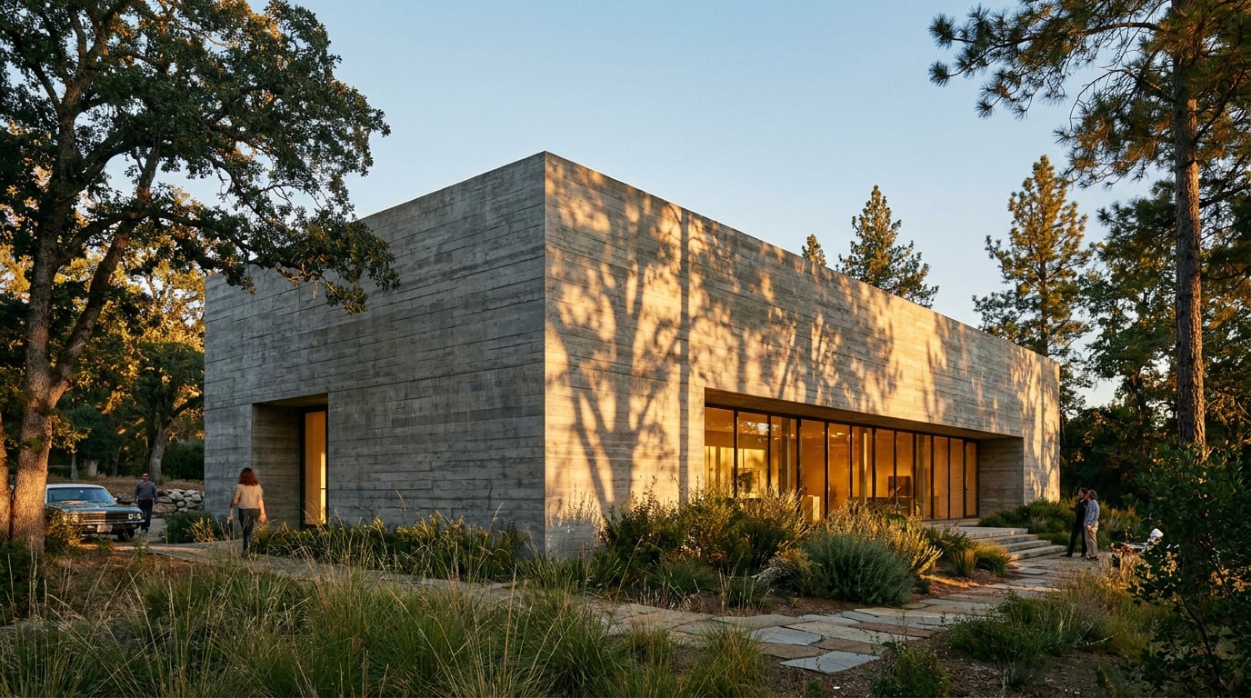
Concrete renders flat when it's too clean and too grey. Here's how to add the tonal variation, texture and imperfection that sell the material.
Why concrete is one of the hardest materials to fake
Concrete is not one grey. It is a field of tonal shifts driven by pour sequence, aggregate exposure, shutter type and years of weather hitting the same panel differently depending on where water runs off. Get close to a board-marked wall by Tadao Ando or a Peter Zumthor thermal bath and no two panels read quite the same: timber grain varies with the batch of formwork, blow-holes cluster unevenly, and staining builds where drips have run for a decade. That variation is the material telling you how it was made and how it has lived.
Most AI-generated concrete skips all of that. General image and video models such as Luma, Seedance, Runway Gen-3 and Kling are tuned for cinematic light and camera motion, not material truth, and their vendor demo reels rarely show accurate aggregate or pour marks under scrutiny. Independent testers routinely describe the concrete in early outputs from generic prompts as plasticky: uniform value, no grain, no weathering logic. It looks like a render pretending to be a photograph rather than a photograph of a real wall.
This matters because the eye is trained on real concrete buildings whether or not the viewer can name why. A planning officer or competition juror who has seen dozens of exposed concrete schemes in journals and site visits will clock a dead-flat panel as "off" within a second, even if they can't articulate the tonal uniformity as the cause. Fixing that uniformity is what raises trust in the rest of the image too: if the concrete is right, the viewer stops interrogating the render and starts looking at the design.
A render's credibility is judged on its hardest material first. Get the concrete right and the rest of the image gets the benefit of the doubt.

Building tonal variation before you add texture
Start with a base grey that already carries a hue lean rather than a neutral swatch pulled from a material library. Concrete mixed with limestone aggregate in southern Europe reads warmer than a Scottish granite-aggregate mix, and that regional lean should be decided before any texture goes on, because texture applied over the wrong base tone will never sit right.
Then build the marks that come from age and geometry rather than from the mix itself: subtle darkening where two panels meet at a junction, drip staining below window heads, a soft grey-black band beneath any coping or projection where rainwater has run for years. This is where concrete tells its age, and it is entirely predictable if you think about where water goes on the building.
In Retouch, the Adjust panel's HSL bands and point curves let you break a flat render pass into these zones without repainting the whole surface. Rather than one uniform fill across an entire façade, mask off a band beneath a coping and pull it half a stop darker and slightly cooler; mask a junction line and deepen it a touch. None of this needs to be dramatic. The goal is that no two square metres of concrete are pixel-identical, because that is exactly what real concrete never does.
- Guess less, reference more: pull actual site photography or a material library reference rather than eyeballing a tone. Shutter type, mix and climate change concrete more than most designers expect.
- Work in zones, not layers of noise: targeted HSL and curve masks read as real weathering; a global grain filter reads as a filter.
Concrete's tonal variation is not random noise, it is a record of water flow and construction sequence. Mask by logic, not by texture filter.
Getting the surface texture to hold up at different distances
Board-marked concrete needs to do two jobs at once: hold visible timber grain and joint lines in a close-up detail shot, then recede to a quiet rhythm of panel joints at an elevation-scale view. A texture that only works at one distance will fall apart in a full camera set, and most render passes fail because the texture was tuned for a single hero shot rather than the whole sequence.
Fair-faced concrete has its own failure mode: it needs a fine aggregate texture and the odd blow-hole imperfection, not the smooth CG plastic finish that base models default to. A wall with zero surface incident reads as a rendered material sample, not a built object.
Retouch's material swap is built for exactly this problem. Bring in a real photographed concrete reference, match it to a rendered panel, and the tool keeps that reference consistent as a toggleable layer across multiple camera angles in the same set, so the board-marked wall in the entrance perspective matches the same wall in the courtyard view. For wide shots where a distant façade has gone soft or repetitive, use Enhance area to re-render just that region of concrete at higher resolution, without disturbing the grade on the rest of the image.
| Distance | What the concrete needs to show | Common failure |
|---|---|---|
| Detail / close-up | Timber grain, joint lines, blow-holes, fine aggregate | Smooth CG plastic finish |
| Mid-distance elevation | Subtle panel rhythm, soft tonal zoning | Texture too loud, reads as a pattern |
| Wide context shot | Correct overall value and colour, texture recedes | Surface goes flat and soft, loses all incident |

Imperfection is what sells it: streaks, stains and edge wear
Perfectly clean concrete reads as unbuilt, or worse, diagrammatic. Real buildings start weathering within their first year on site, well before a client ever sees the finished photography a practice puts out. A render with zero imperfection is quietly telling the viewer that this is a computer model, not a building.
Two moves do most of the work. First, rain streaking: any horizontal projection, sill, coping or balcony edge will send water down the face below it, and staining concentrates directly beneath that drip line rather than spreading evenly. Second, arris wear: the corners of a concrete element chip and round very slightly over time, and a perfectly sharp CG edge is one of the fastest tells that a surface hasn't been touched by weather or by a site team's shuttering strike.
Layer these effects using Retouch's layer masks so nothing is baked in. A streak painted onto its own masked layer can be dialled back to near-invisible for a clean client-facing image, then pushed harder on the same file for a grittier competition board. That editability matters more than getting the first pass perfect, because the right amount of weathering depends entirely on who is looking at the image next.
Keep every imperfection on its own mask. The same file should be able to go from boardroom-clean to competition-gritty without a repaint.
Lighting concrete so texture actually reads
Texture that exists in the model but doesn't show in the render is wasted work. Concrete needs raking light, ideally low and near-parallel to the surface, to throw the shadows that reveal board-marking, aggregate and any subtle relief. Flat overcast light does the opposite: it fills in every shadow and flattens the most carefully modelled surface into a grey plane with no information at all.
This is a lighting decision to test before committing to a final pass, not to fix afterwards. Retouch's one-click re-light presets, including Golden hour, Overcast and Sunny, let you regenerate the same document under different lighting conditions and compare which one actually recovers the material. A midday flat pass on a board-marked façade can look almost featureless; the same geometry under a golden hour pass with a single dominant light direction will show the same wall with every joint and grain line legible in shadow.
The principle underneath this is simple: one dominant light direction with visible shadow inside the surface texture sells a material far more convincingly than soft ambient fill from every angle. Diffuse light is flattering to a face; it is the enemy of concrete.

When to hold back: knowing where imperfection stops helping
Imperfection has a ceiling, and where that ceiling sits depends entirely on the document. A Design and Access Statement image needs enough weathering to feel like a real building will exist in the real world, but not so much that a brand-new scheme reads as an aged or distressed structure. Planning officers are assessing a proposal, and a render that looks decades old can undercut the description of materials in the statement itself.
Competition boards sit at the other end. Here, atmospheric, weathered concrete supports mood and narrative, and juries are generally reading for design intent rather than literal material specification, so pushing grittier streaking and staining for effect is legitimate as long as it doesn't misrepresent the finish actually specified in the drawings.
The safest rule is to match imperfection level to stage. Concept sketches can stay clean and diagrammatic; nobody expects weathering logic in a massing study. Detailed planning visuals need material accuracy because they will be scrutinised against the written specification. And whatever level you land on, hold it consistent across the full camera set. A building that looks freshly poured in the entrance view and decades weathered in the courtyard view reads as two different buildings, and that inconsistency is more damaging to trust than a slightly under- or over-weathered single image.
- Concept stage: clean, diagrammatic, tonal variation only.
- Planning stage: accurate to the specified finish, moderate weathering consistent with a new-build.
- Competition stage: atmosphere and mood can push further, provided the specified material isn't misrepresented.
- Full camera set, any stage: one weathering level applied consistently across every view.
This discipline extends beyond architecture. Product designers rendering concrete furniture and terrazzo surfaces face the same tonal-consistency problem across a product shot set. Landscape architects visualising precast steps and retaining walls for public realm consultation need weathering patterns and water streaks that read as credible without alarming a planning committee about durability. Civil engineering teams presenting bridge and viaduct visuals for public consultation increasingly rely on photographic overlays for streaking and spalling rather than trusting a generic AI pass, for exactly the reason this article opened with: material truth is still a human job layered onto a machine-generated base.
Corb, the assistant available across ArchAdemia Tools, can help scope this decision inside a project: ask it what level of material detail suits a Design and Access Statement image versus a competition board, and it will reason from the project's own stage and brief rather than a generic answer, though the actual grading and masking work still happens in Retouch.
Concrete rewards patience more than any other material in an architectural render. Build the tonal base first, add texture that survives every distance in the camera set, layer imperfection on masks you can dial up or down, and light it to reveal what you've modelled rather than flatten it. Do that consistently across a project and the concrete stops being the weak point in the image, and starts being the reason the image is believed.
Keep reading.
Try ArchAdemia Tools for yourself
Draw it, model it, render it, publish it. One place, built for architects and small practices. Plans from £29 a month, all in.