What RIBA Stage 2 and 3 Visuals Should Look Like (Most Get It Wrong).
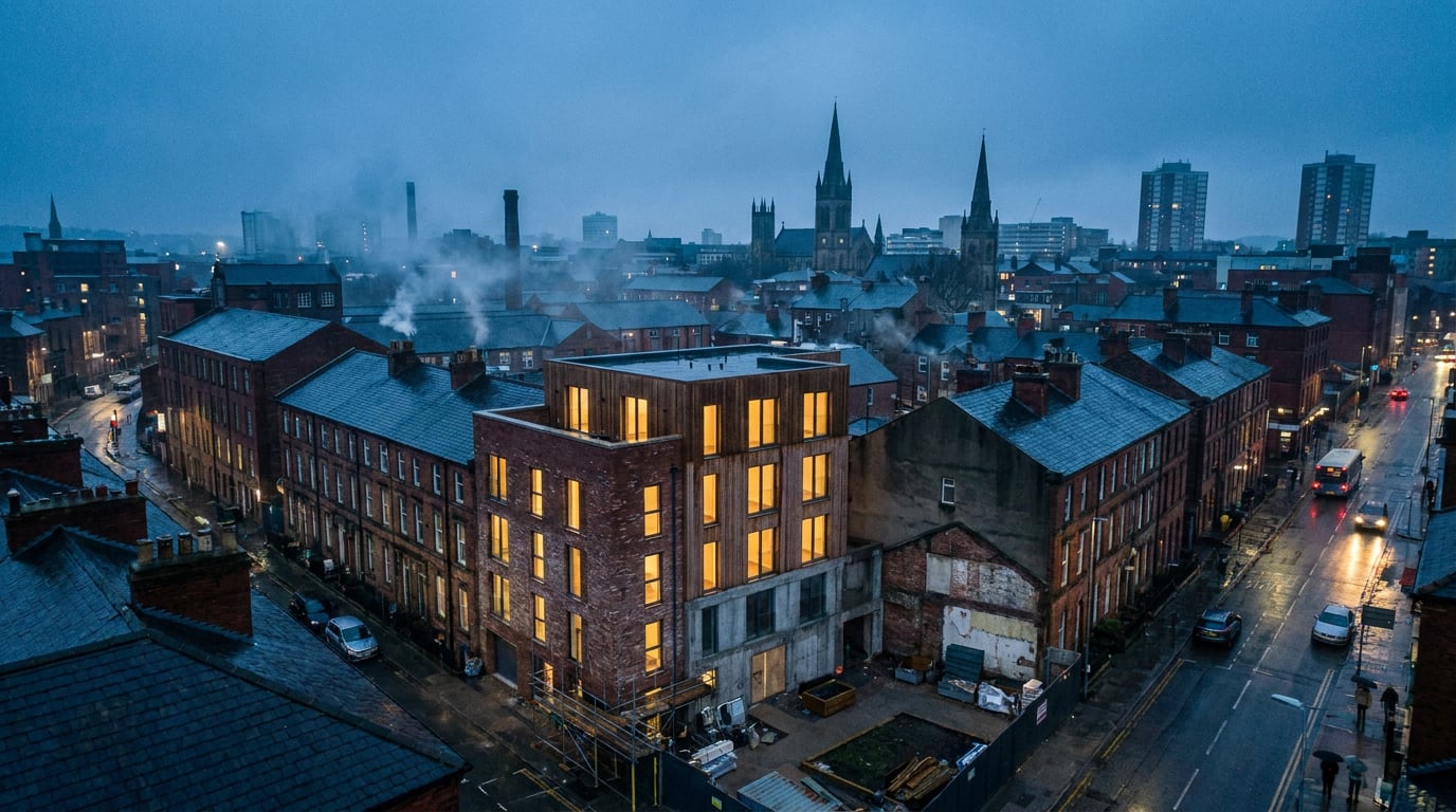
Most practices render Stage 2 and 3 like it's a competition board. Here's what the client and planners actually need to see at each stage.
The mistake: rendering Stage 2 like it's Stage 4
Most practices know the RIBA stages by heart, but the visuals coming out of them tell a different story. Concept design meetings routinely arrive with brick textures, dressed kitchens and depth-of-field skies, three stages before any of that should be settled. The pressure is understandable: a client wants to feel confident, and a polished image feels like reassurance. But a fully rendered Stage 2 image doesn't reassure, it commits. It tells the client, whether you meant it to or not, that the material palette and interior layout are decided. When the design inevitably shifts, as it should during option testing, the client feels like something has been taken away from them rather than resolved through proper process.
The RIBA Plan of Work 2020 is explicit that information at each stage should be proportionate to the decisions being made.[1] Stage 2 exists to test concept design and strategic options. Stage 3 exists to demonstrate a technically coordinated proposal ready for planning submission and cost testing.[1] Neither of those outcomes needs a hero shot with raking evening light and a family barbecue on the terrace. What they need is a set of images that answer the actual questions on the table at that point in the job: does the massing work, does it sit correctly on the site, does the roof form respond to context, does the entrance sequence make sense.
Overworking the visuals doesn't just create a communication problem, it slows the job down. Stage 2 is meant to move fast through option testing: three or four massing variants, quick daylight checks, a look at how the scheme reads from the street. If every option gets the full render treatment before anyone's chosen a direction, that iteration speed disappears. Teams end up defending a single polished image instead of comparing a spread of honest ones.
A Stage 2 image should answer questions about form, orientation and site relationship. It has no business answering questions about brick colour or furniture brand.

Stage 2: massing, options, and honest ambiguity
Untextured massing reads better at concept stage precisely because it doesn't pretend to know things it doesn't know yet. A white or grey-toned volume study shows footprint, height, roof pitch and site relationship without implying that the material decision has been made. That ambiguity isn't a limitation, it's the point. It keeps the conversation on the decisions that are actually live.
This is where Linea's Massing workspace earns its keep. It's built specifically for this stage of thinking: place a footprint, push it into a solid, pitch a roof by dragging an edge, cut an opening with a face profile, group blocks to test an option without deleting the last one. None of it commits to a material, because new geometry in Linea is born in flat painted colour, never a texture. A wall is white. A roof is light grey. If you want photographic finish, you have to paint it there yourself, which means a Stage 2 model stays honestly unfinished until someone deliberately decides otherwise.
Comparing two or three options side by side matters more than making one option beautiful. A client or a planning committee benefits far more from seeing a hipped roof next to a mono-pitch next to a flat parapet, all at the same level of finish, than from one gorgeous render of a single scheme nobody's tested against the alternatives.
Getting feedback at the right level
Corb in Canvas is useful here in a specific, bounded way. Fed an untextured massing shot alongside the project brief, Corb can comment on footprint, on height relative to neighbouring buildings, on roof form, on entrance position and how the building meets the ground. It stays silent on material, because an untextured model genuinely can't show material, and Corb doesn't invent what isn't there. That's exactly the right register of feedback for Stage 2: comment on the decisions the model actually represents, and nothing else.
Corb never says a scheme complies with anything, and it never fills in a dimension the project hasn't given it. At Stage 2, that discipline matters as much as the massing itself: the feedback should be as honestly incomplete as the model.
If a massing model can't show material, don't let the feedback on it pretend to.
Stage 3: coordinated, not decorated

Stage 3 asks a different question. By this point the design should be technically tested: spatially coordinated, ready to go in front of a planning officer and a cost consultant. The visuals need to prove that, not distract from gaps that are still there. A beautifully lit hero render that shows a window arrangement contradicting the drawn elevation doesn't strengthen a submission, it undermines it. A planning officer who spots the mismatch loses confidence in the whole package, not just the one image.
This is the argument for keeping the 2D drawing and the 3D model as a single edited object rather than two things produced separately and reconciled by eye. Linea's parametric walls, doors, windows and roofs work this way: edit the plan and the model updates, edit the model and the plan updates. The render and the drawing set can't drift apart because they were never two separate files pretending to agree.
Material choices at Stage 3 should be realistic enough to test against context and planning policy, brick that reads as brick, glazing proportions that reflect what's actually specified, not the fantasy-grade finish that photographs beautifully but won't survive first contact with a cost plan. This is the stage where materiality earns its place in the image, but only the materiality that's actually been through some testing.
| Stage | Visual should show | Visual should avoid |
|---|---|---|
| Stage 2 | Massing, orientation, roof form, site relationship | Material finish, interior fit-out, dressed landscaping |
| Stage 3 | Coordinated form, realistic materials, tested proportions | Fantasy finishes, unresolved detail hidden by polish |
If the rendered hero shot and the drawn elevation disagree, the render is lying about how developed the design actually is.
Producing the right visual at the right stage without redoing the model
The practical worry with all of this is time: does treating Stage 2 and Stage 3 differently mean building two separate visual sets from scratch? It doesn't have to. Shoot generates a full set of camera angles from the same underlying scheme, so a rough Stage 2 set and a coordinated Stage 3 set can come from the same model without rebuilding anything. The difference between the two sets is what's been painted onto the surfaces and how the images are dressed, not the geometry underneath.
When a planning officer asks the inevitable "what if it were brick instead of render", Retouch's material swap tool answers that without a full re-render. Select the area, attach a reference material, and the swap sits as a toggleable layer on the existing image. That's a five-minute conversation instead of a five-day one.
Time of day and weather matter too, and not just for atmosphere. A planning appearance question and a client mood-board question are often the same image shown differently. Retouch's six one-click re-light presets, Overcast, Sunny, Golden hour, Dusk, Blue hour and Night, regenerate the whole document at a different lighting condition as a new layer, so one Stage 3 image can do both jobs without a second shoot.
For the images that need to go on a submission sheet at full print size, Enhance area re-renders a soft or repetitive region at higher resolution and composites it back through the selection. Useful for the wide context shots where the middle distance goes soft, exactly where a reviewer's eye tends to land.
Packaging it for the submission and the client meeting

A Design and Access Statement needs a different visual register to a client deck, and treating them as the same document is where a lot of practices lose clarity. Layout's dedicated Design and Access Statement template keeps the two apart. Use Sheet mode for the pin-up boards and competition-style panels, one large surface built for a crit or a jury. Use Document mode for the paginated DAS and reports, built at A3 across many pages. Both sit on the same underlying document model, so moving content between the two registers doesn't mean starting again.
Keep Stage 2 pages visibly diagrammatic: line weight, muted tone, the untextured massing shots described earlier. Keep Stage 3 pages visibly resolved: real material, real light, the coordinated views that prove the design has actually moved on. A planning officer reading a resubmission should be able to see the development between stages just from the visual register, without reading a word of the accompanying text.
A read-only shared link from Layout means a Stage 2 option set can go to a client for comment without exporting a fresh PDF every time something changes. The link stays current as the document is edited, which matters when option testing is still live and the document underneath it is moving daily.
A resubmission should look developed, not just re-rendered. If Stage 2 and Stage 3 pages look identical, the design probably hasn't moved as far as the submission claims.
The takeaway: match the visual to the decision being made
Before deciding how finished an image needs to look, ask what decision it needs to support. If the answer is "does this massing sit right on the site", an untextured volume study answers that better than a render ever could. If the answer is "will this survive a cost plan and a planning committee", the visual needs the material and proportion testing to back it up.
Stage 2 visuals sell the idea. Stage 3 visuals prove the idea survives coordination. Neither should borrow the other's finish, and conflating them is how practices end up defending decisions in a client meeting that were never meant to be decisions at all.
Practices that get this right spend less time re-rendering, not more time being careful. When the model, the drawing and the image all stay honest to the same stage of design, there's nothing to walk back later. The polish arrives exactly once, at the point the design has actually earned it.
Keep reading.
Try ArchAdemia Tools for yourself
Draw it, model it, render it, publish it. One place, built for architects and small practices. Plans from £29 a month, all in.