Screenshot to Render: Keep Your Geometry, Lose the CAD Look.
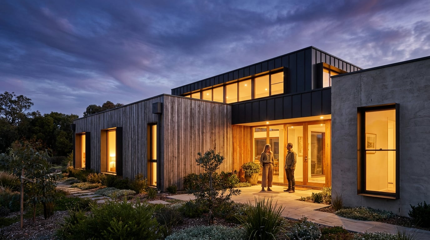
A viewport screenshot has all the geometry you need and none of the atmosphere. Here's how to bridge that gap without redrawing anything.
Why a straight viewport export never looks finished
A default SketchUp shaded view reads as a diagram. A Revit realistic export with basic materials assigned reads the same way: flat greys, glazing that looks like grey card, a light source that has no logic behind it because nothing in the scene is actually simulating sun position. Turn on shadows, add ambient occlusion, and you get a slightly more convincing diagram. It still isn't a render, and clients know the difference even when they can't articulate why.
This matters more than it should, because the design underneath might be completely resolved. Massing sorted, fenestration considered, materials specified down to the brick bond. None of that lands if the image looks like a working drawing. A planning officer scanning a Design and Access Statement forms an impression fast, and a flat viewport screenshot next to a competitor's polished still says "unfinished" even when the opposite is true. The same goes for a client meeting: show someone a grey SketchUp export next to a golden-hour render of the same scheme and watch which one they respond to.
The actual problem isn't the render engine you're avoiding by staying in-viewport. It's that geometry and atmosphere get solved as two separate problems in most studio workflows: model the building, then separately light and texture it, often in different software entirely. That gap is exactly what image-to-image AI tools now close, provided you understand what they're doing to your geometry while they do it.

A flat viewport and a finished render can show an identical design. Only one of them gets read as a resolved scheme.
What "keeping the geometry" actually requires
Image-to-image and reference-based generation tools take your screenshot as a starting substrate and generate materials, light and atmosphere around it. Done well, wall lines stay where you drew them, window proportions hold, roof pitch doesn't shift. Done badly, the AI treats your screenshot as loose inspiration and redraws the building: an extra storey appears, a ribbon window becomes three punched openings, a flat roof grows a pitch it never had.
That second outcome is not a style choice, it's a liability. A render that quietly changes your fenestration pattern is unusable for a planning submission, because the image no longer represents the scheme you're seeking consent for. It's also unusable for a client presentation if the client later compares it against the drawn proposal and asks why the balcony in the render doesn't exist in the plans.
The fix is a mindset shift as much as a technical one. Treat the viewport screenshot as a structural constraint, not a sketch you're asking the AI to interpret freely. Your prompt should describe materials, light and atmosphere, and where the tool allows it, should explicitly instruct the model to preserve massing, window count and roofline. Vendors building AI render tools for architects are already leaning into this distinction. Chaos's Veras, for example, has moved toward prompt-based geometry control, where phrasing like "strictly preserve massing and fenestration pattern" tightens fidelity, and looser style-only prompts allow more reinterpretation. Other tools marketed at architects, such as Vizbase's sketch-to-render mode, claim to encode spatial structure from the input image specifically so walls stay vertical and window positions hold. Treat claims like that as vendor positioning worth testing against your own screenshot, not a guarantee, and always compare the output against your source image before you trust it.
Set the expectation early, for yourself and for anyone in the studio using these tools: this workflow finishes a design. It doesn't reinterpret one. If you want a different massing, go back to the model.
The single most useful discipline in AI rendering for architects: prompt for materials and light, never for form. If you want the massing to change, change it in the model, not in the render.
A working pipeline from viewport capture to presentation image
The process holds together whether you're working from SketchUp, Revit, or Rhino, and it starts before you touch any AI tool at all.
- Set the camera properly. Frame the eye-level view you actually want to present, not the default isometric. Whatever perspective is in the screenshot is what the AI locks onto, so get the composition right at source.
- Export clean. Turn off guides, dimensions and section marks. Leave shadows on. Shadows give the generator depth cues to read the geometry against, which noticeably improves how well proportions hold through the render pass. Export at the highest resolution your viewport allows, and match the aspect ratio to wherever the image is going: A3 landscape for a DAS page, 16:9 for a pitch deck.
- Use the screenshot as a reference input, not a text prompt starting point. In Image on ArchAdemia Works, bring the viewport capture in as the reference for the generation, so the output is anchored to your existing geometry rather than built up from a description alone. This is the difference between "render a modern house" and "render this house".
- Prompt for material and atmosphere, not massing. Describe brick coursing and mortar colour, glazing reflections, whether the light is flat overcast or low golden hour, what's planted at ground level. Avoid any language that reads as an instruction to redesign, such as "improve the facade" or "make it more interesting". You want the model finishing your building, not auditioning alternatives to it.
- Run more than one pass. If the first result drifts on window count, roof pitch or storey height, generate again rather than accepting the first output. Multiple passes are cheap in time now that generation runs in seconds rather than minutes, so there's no excuse for shipping the first result if it's wrong.
- Compare side by side before you pick a final. Put the original screenshot and the generated render next to each other and check them against the same criteria you'd use in a design review: does the opening rhythm match, does the roofline match, is the massing the same building.
If you're working in a project chat rather than checking every frame manually, Corb can act as a second pair of eyes on this. Ask it to flag whether a generated result has changed window count or roofline compared with the source capture, and use that as a sanity check before the image goes anywhere near a submission.

Run the comparison every time: original screenshot next to generated render, same criteria you'd use in a design review. If the window count doesn't match, the image isn't ready.
Composition moves that sell the scheme once geometry is locked
Once you trust that the geometry is holding, the composition decisions are where the image actually starts to sell the design.
Crop to the eyeline a real visitor would have. The isometric your model defaults to is useful for internal design review, but it's rarely how anyone experiences the building. A pedestrian arriving at a housing scheme sees the entrance from the street at roughly 1.6 metres above ground, not from a drone thirty metres up. Set the camera there before you export.
Match entourage to the brief. A family housing scheme needs people who look like the people who'll live there, and planting that reads as established rather than newly turfed. A civic building or public square needs pedestrian activity at a scale that communicates use: people crossing, sitting, gathering, not a single figure standing awkwardly in an empty plaza. This is a comparison worth making across disciplines: it's the same principle a product designer applies when they show a chair in a lived-in room rather than on white seamless, or an exhibition designer applies when they populate a gallery render with visitors rather than an empty hall. Context sells scale and use, not just form.
Match light direction to the elevation you're presenting. If you're showing the south-facing garden elevation, the light should plausibly come from that direction. Inconsistent shadow logic across a set of images is one of the fastest ways to undermine confidence in a planning package, because it reads as generated rather than considered, even when the underlying design is sound.
Push contrast and material clarity last. Once you've confirmed the geometry pass is correct, that's the point to sharpen materials, deepen shadow contrast and clean up any small artefacts. Doing this before you've locked geometry just means polishing an image you might have to throw away.
| Stage | What you're controlling | What to avoid |
|---|---|---|
| Viewport export | Camera angle, resolution, shadows on | Guides, dimensions and section marks left visible |
| Reference generation | Material, light, atmosphere prompting | Prompt language that implies redesigning form |
| Geometry check | Window count, roofline, storey height vs source | Accepting the first pass without comparison |
| Final polish | Contrast, material clarity, entourage fit | Polishing before geometry is confirmed correct |
Where this fits alongside a full walkthrough
A hero render answers one question: what does this look like. It's the right tool for a DAS cover sheet, a competition board, a single striking image in an investor deck. But a client sitting across the table asking "what does it feel like to actually walk through this" is asking a different question, and a still image, however good, doesn't answer it.
That's where Linea comes in. It takes a GLB export of the same SketchUp or Revit model you used for the still and drops the client inside it at eye level for a first-person walk with proper collision, so they can't accidentally clip through a wall mid-tour. You share it as a /play link that opens in any browser, with no software installed on the client's end. It's not competing with a desktop GPU renderer for cinematic fly-throughs; the point of it is that the client experiences the space themselves, on their own laptop, in the meeting.
The practical split in a live project looks like this: the still render goes on the DAS cover sheet, the competition board, the page of the pitch deck that needs to stop someone scrolling. The walkthrough link goes into the client meeting where they want to move through the entrance sequence themselves, or stand in the double-height space and look up. Both outputs start from the same source model, which is the point that matters most: geometry stays consistent across every format you hand over, because you're not modelling twice or reconciling two different files that have quietly drifted apart.

One source model, two outputs: a still for the page, a walkthrough for the room. Neither one drifts from what you actually designed.
The workflow only works if you trust the geometry at every stage, which is why the discipline of locking form and only prompting for atmosphere isn't a shortcut, it's the whole method. Get that right and the screenshot you took for your own reference becomes the same image you put in front of a planning committee, without a second model, a second software licence, or a second week of work.
Keep reading.
Try ArchAdemia Tools for yourself
Draw it, model it, render it, publish it. One place, built for architects and small practices. Plans from £29 a month, all in.